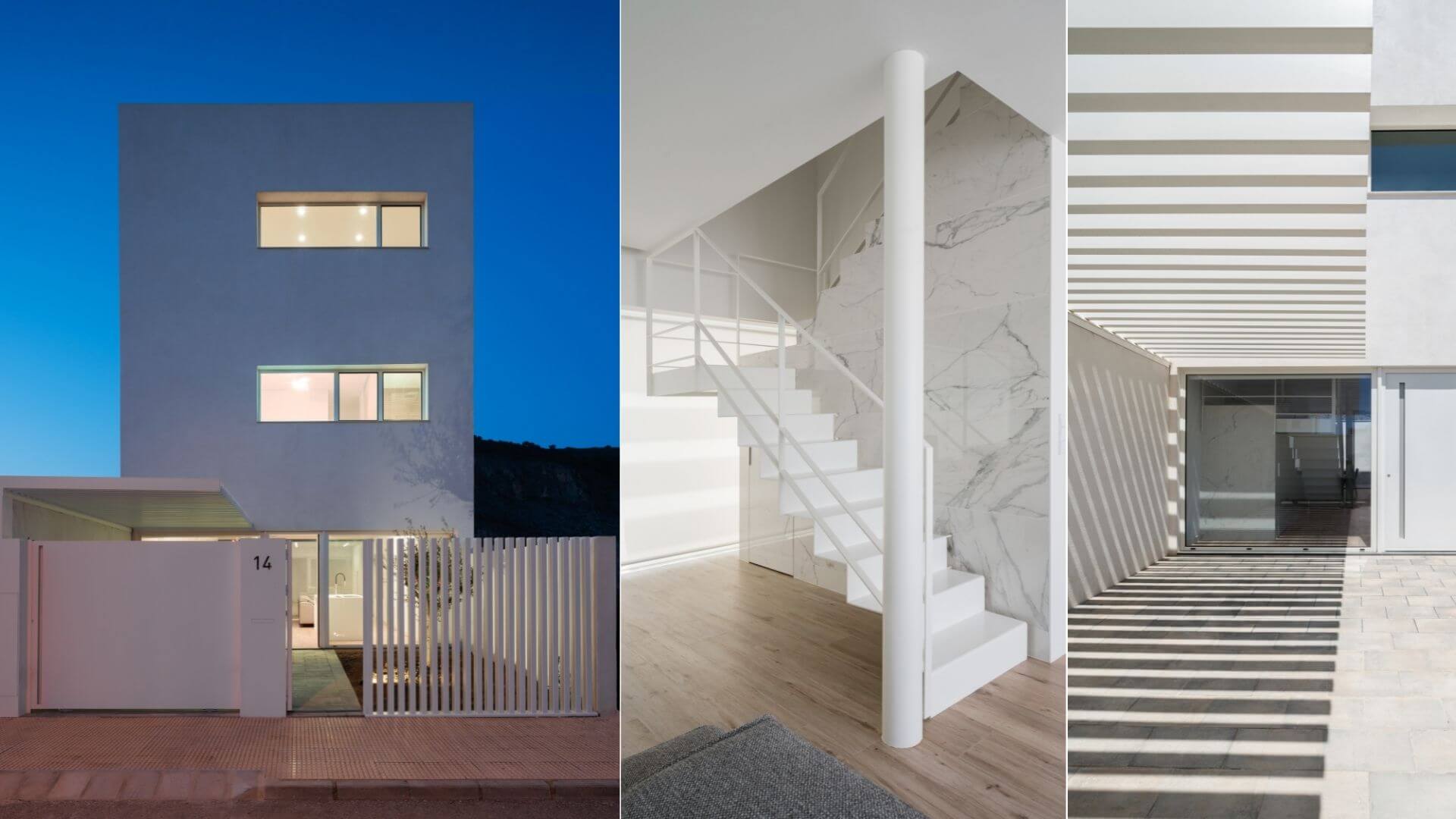
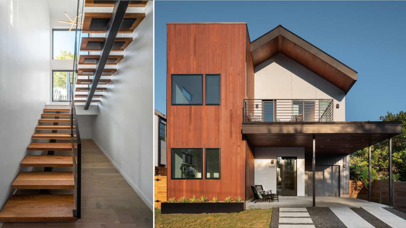
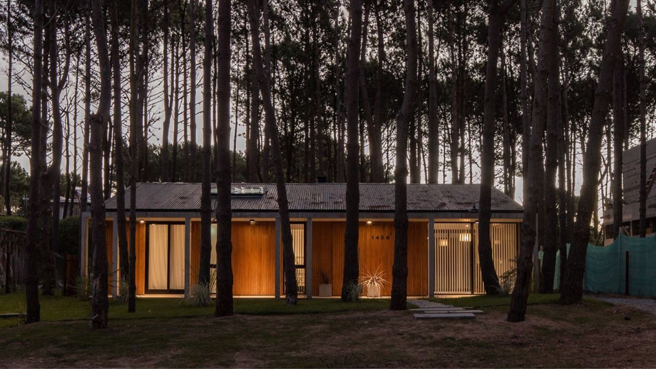
Carles Faus Arquitectura: We were faced with practically a square of just 56 square metres to design this house. It is shaped from a simple linear extrusion up to the third floor where we made a small inclination in the back part, where a terrace with views of the mountain and the castle of Cullera will appear.
This linear extrusion is totally permeable on the ground floor at both ends, and by means of small linear tears on the first and second floors, favouring correct lighting and protecting us from prying eyes due to the proximity to the exterior.
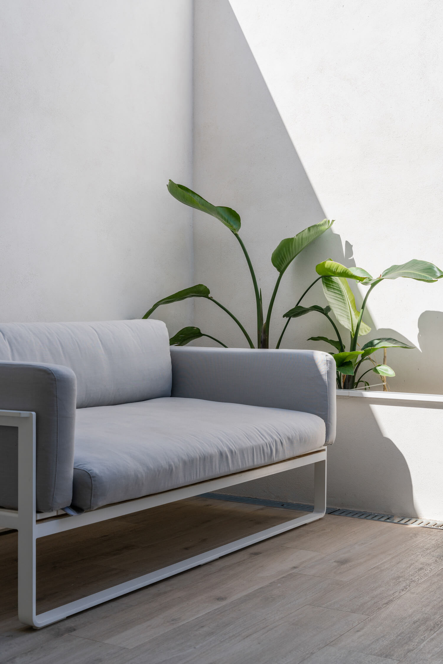
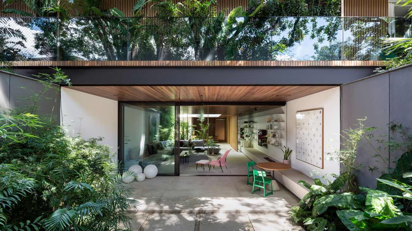
The ground floor is used entirely for the day area, with a patio in the front area and another in the back area, with gardens in both areas to generate a more pleasant and wider field of vision, thanks to the fact that we generated two completely linear glass tears from one end to the other, in both directions. Thus, inviting the interior space to unite with the exterior.
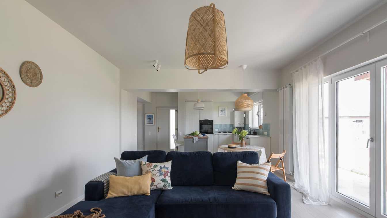
At this level we wanted the kitchen to become a backbone of the space, so we designed a continuous storage space, which integrates both the television area, storage area and kitchen area in the same space.
 image © Adrián Mora Maroto
The other most important piece that helps us to structure and finish configuring the space is the staircase. First of all, we designed it so that it would have a light presence, which is why the first section of the staircase is made from a folded steel sheet lacquered in white, thus reducing a significant visual weight. And secondly, it had to behave as a sculptural element, as it housed two accesses inside, one to the basement and the other to a small guest toilet, which we wanted to mimic as much as possible. For this reason, we carried out a continuous cladding of all vertical walls, including the access doors.
The staircase is also set back from the main façade for two reasons, the first being that the planned opening in the façade would not be interrupted by an opaque element, at the same time achieving greater interior lighting and a better visual interpretation of the elements that make up the space. The other reason was to achieve, by means of a forward movement of about 60 centimetres, that the zenithally lighting that we had projected through a skylight in the upper part of the façade could vertically cross the entire communication nucleus, emphasising it and giving it greater illumination throughout the day.
 image © Adrián Mora Maroto
The entrance to the house is through a previous area of about five metres deep, where we located a porch and a small green area. We defined the porch as a multifunctional space, it serves both as a leisure area and as a parking area, thanks to the pergola of metal slats that protects from the sun in the hottest months of the year. In order to generate continuity throughout this area, we chose the same material for the whole space. The chosen paving stone is a large-format anthracite grey piece that ends at the garden area.
On the first floor there are two bedrooms with bathrooms included, and the second floor is used as a study and laundry area.


