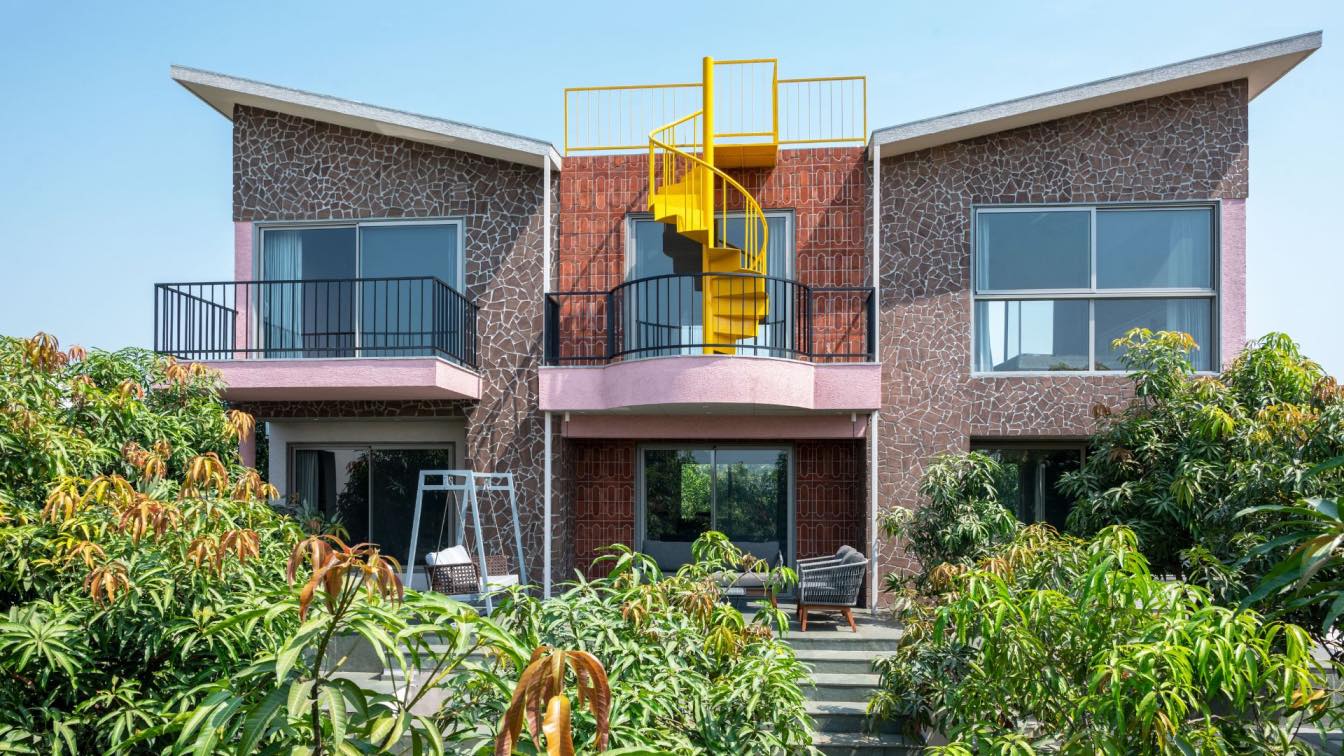
The Melbourne-based Architecture & Interior Design Studio Taylor Knights have completed an extension to the Brunswick West House, located in Melbourne, Australia.
Architect’s Statement: Home to a creative couple with a teenager, the goal for this Californian Bungalow extension in Brunswick West was to create a considered, flexible space that would adapt alongside the family. Often, the nature of heritage homes can call for fiddly solutions when contemplating alterations, particularly in negotiating the traditional corridor and room arrangements. Our design strategy looked to avoid a significant reconfiguration of the existing spaces, instead repurposing the generous ivy-lined side access to create a lush and unassuming new entry point at the centre of the home. The dwelling now operates in two parts of a whole: the original structure housing bedrooms, with a new addition forming the social heart of the home.
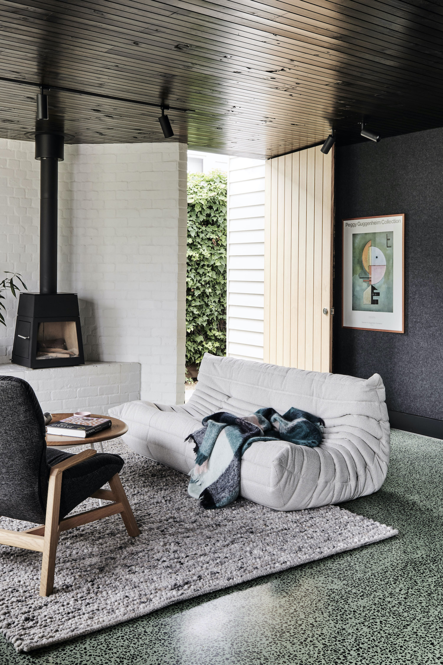 image © Tom Blachford
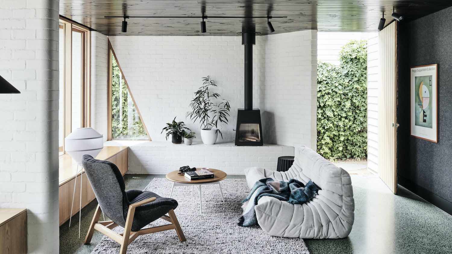
The new primary living spaces are arranged in and around three sculptural masonry walls, creating nooks and intricate zones within the open plan — intimate spaces to sit and share with family, or to retreat within at other times.
An essential part of the brief from our client was to craft a space that would accommodate their diverse collection of artwork and literature. With the family-favourite, much-loved Kadinsky Upward (Empor) print a planned centrepiece, we were able to draw upon the artwork’s geometric and tonal elements to reference the interior palette within the pavillion. The result is the stunning interplay between the white walls and light-reflecting timber-lined black ceiling, and perhaps most noticeably, the striking sage green concrete floor flecked with dark local bluestone.
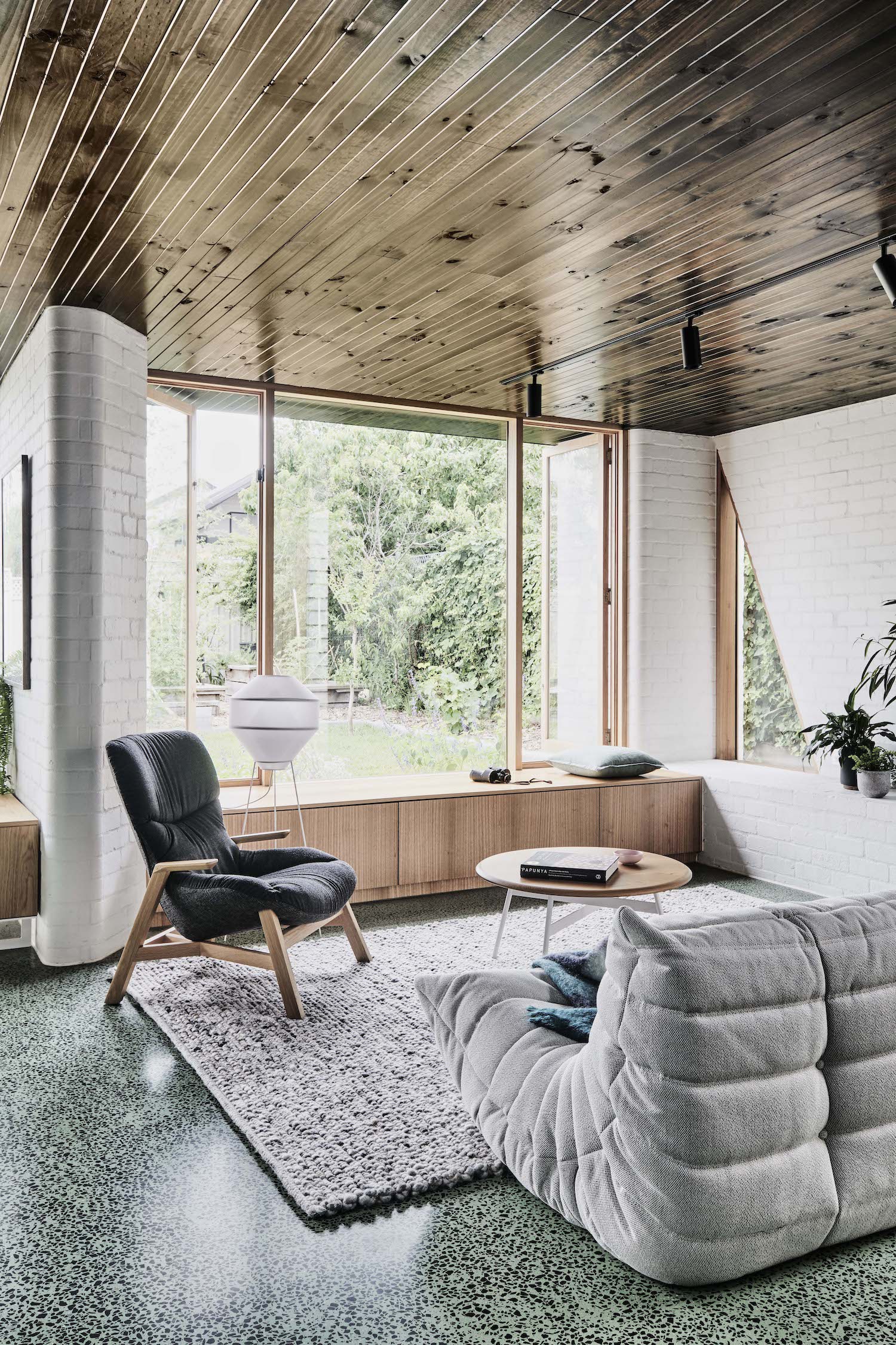 image © Tom Blachford
What was the brief?
Working in quite demanding industries, our clients ultimately wanted to create a calm and comfortable space to retreat within. Also essential to the brief was to create moments of privacy and seclusion within the open plan. In response, our strategy was to arrange these spaces in and around three sculptural masonry walls, curating view lines across the space and creating nooks and reveals within the open plan of the addition – spaces that could offer a place to sit and share with family, or to withdraw to at other times to read a book by the garden window.
For the client, creating a space that would also accommodate their diverse collection of artwork and literature was also an essential part of their brief – a family favourite being the much-loved print of Kandinsky’s ‘Upward (Empor)’, 1929. This offered an opportunity for us to draw upon some of the artwork’s beautiful geometric and tonal elements, which in turn formed a reference for the interior palette within the new pavilion space.
What was the idea behind the concept?
Central to concept was to create a space that would be a truthful reflection of the client’s eclectic and playful sensibility. Pragmatically, it was essential to establish better connections between the new primary living spaces and the garden beyond.
 image © Tom Blachford
What were the key challenges and the design response?
As with many projects of this scale, making incisive moves early on is essential to managing the design and construction process. From the beginning, the project was always about achieving ‘quality over quantity’, and our client was keen to follow through on this idea. As a result, we looked to avoid significant (and potentially fiddly) reconfiguration of the existing internal spaces by repurposing the generous ivy-lined sideway, creating a lush and unassuming new entry point at the centre of the home. This approach enables the home to operate quite cleanly and disparately in two parts of a whole: the existing rooms now accommodate bedrooms, while the addition forms the new social heart of the home.
What were the sustainability considerations?
The key sustainability driver in this project was to produce a highly efficient, low - volume addition that ‘did a lot with very little’. Simple moves were also made to re-orientate living spaces towards the north, and by introducing eaves to block the sun in summer and allow light into the space in winter. The space can also be naturally ventilated, with large openings along the northern façade and high-level openings to the south of the new pavilion space.
The unique floor treatment (which is essentially a topping screed) also enabled us to include a two-pour concrete slab method, allowing us to insulate between the two slabs, and thereby making the space highly thermally efficient. Energy efficient glazing and sustainable timber selections have also been used throughout the project.
 image © Tom Blachford
 image © Tom Blachford
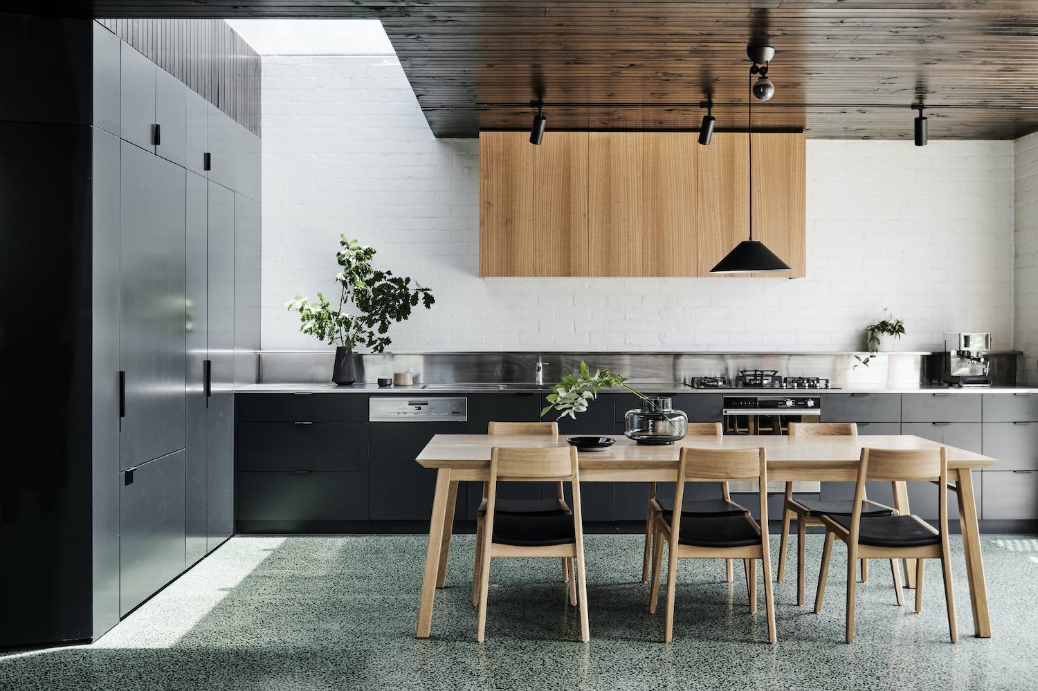 image © Tom Blachford
 image © Tom Blachford
 image © Tom Blachford
 image © Tom Blachford
 image © Tom Blachford
 image © Tom Blachford
 Floor Plan
 Plan Sketch
 Sketch

