Memola Estudio & Vitor Penha: The project transforms an old bar in Vila Madalena, in São Paulo, into the headquarters of Mãe Terra, a food company. The objective was to bring together the administrative, innovation and product development areas, as well as spaces for experimenting with food and experiencing the company's work philosophy.
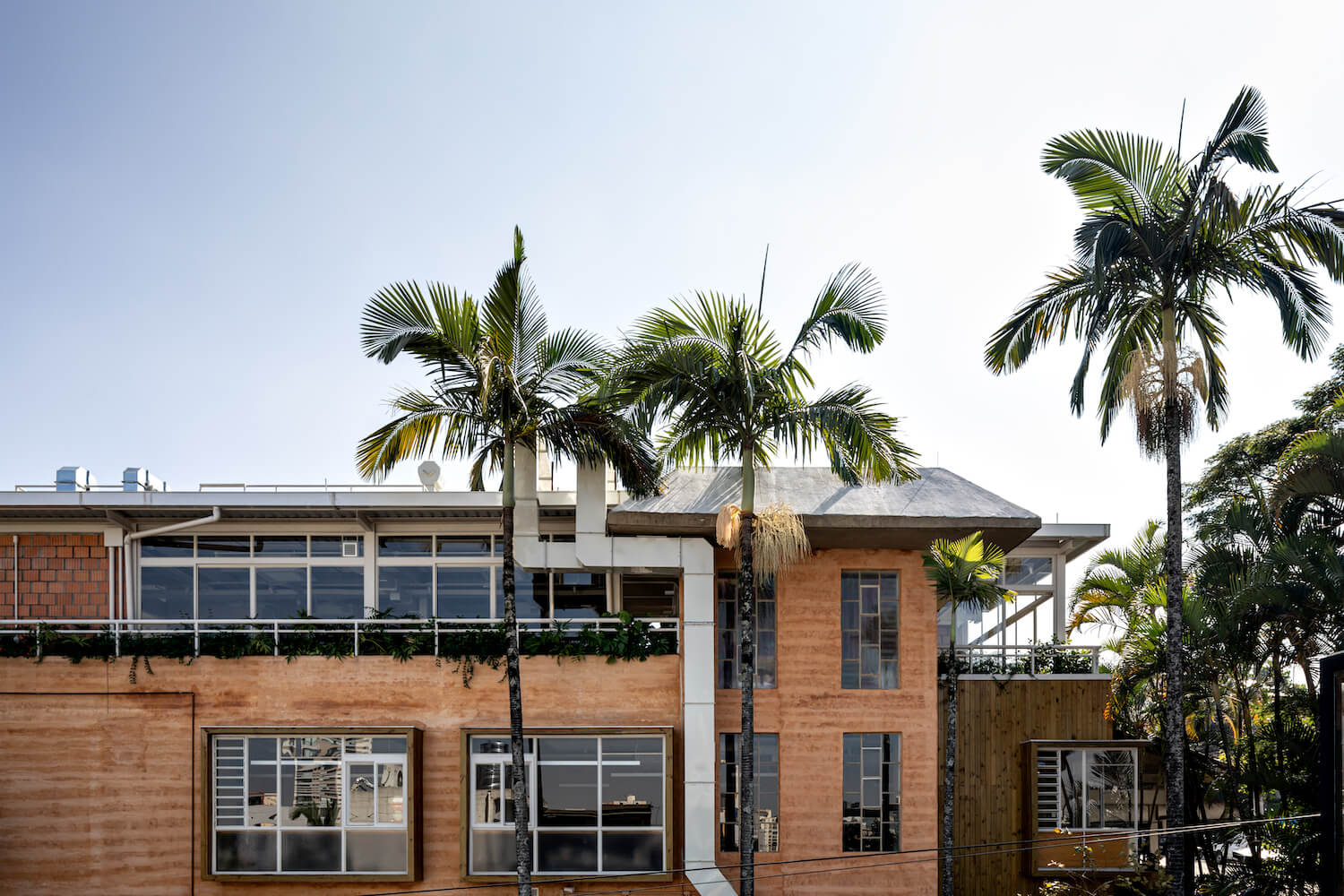
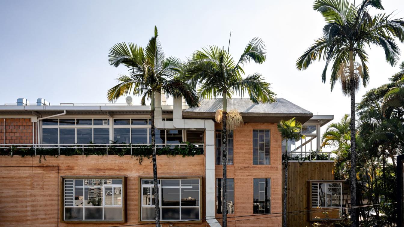
From the beginning, the earth was thought of as the project's synthesis material, capable of expressing the values of connection with nature and acceptance to which the name Mãe Terra refers. Conceived in the image of a house open to everyone, employees, consumers and even regulars in the neighborhood, the architecture has a materiality composed of variants of the earth: raw (in mud) and cooked (in ceramic blocks).
Although the projection area of the property has not changed, it is a reform with expansion. There was a complete internal remodeling, with the elimination of walls that compartmentalized environments, the removal of coatings, the redesign of vertical flows, the execution of structural reinforcements and a new infrastructure network, and the space under the roof was occupied - also rebuilt .

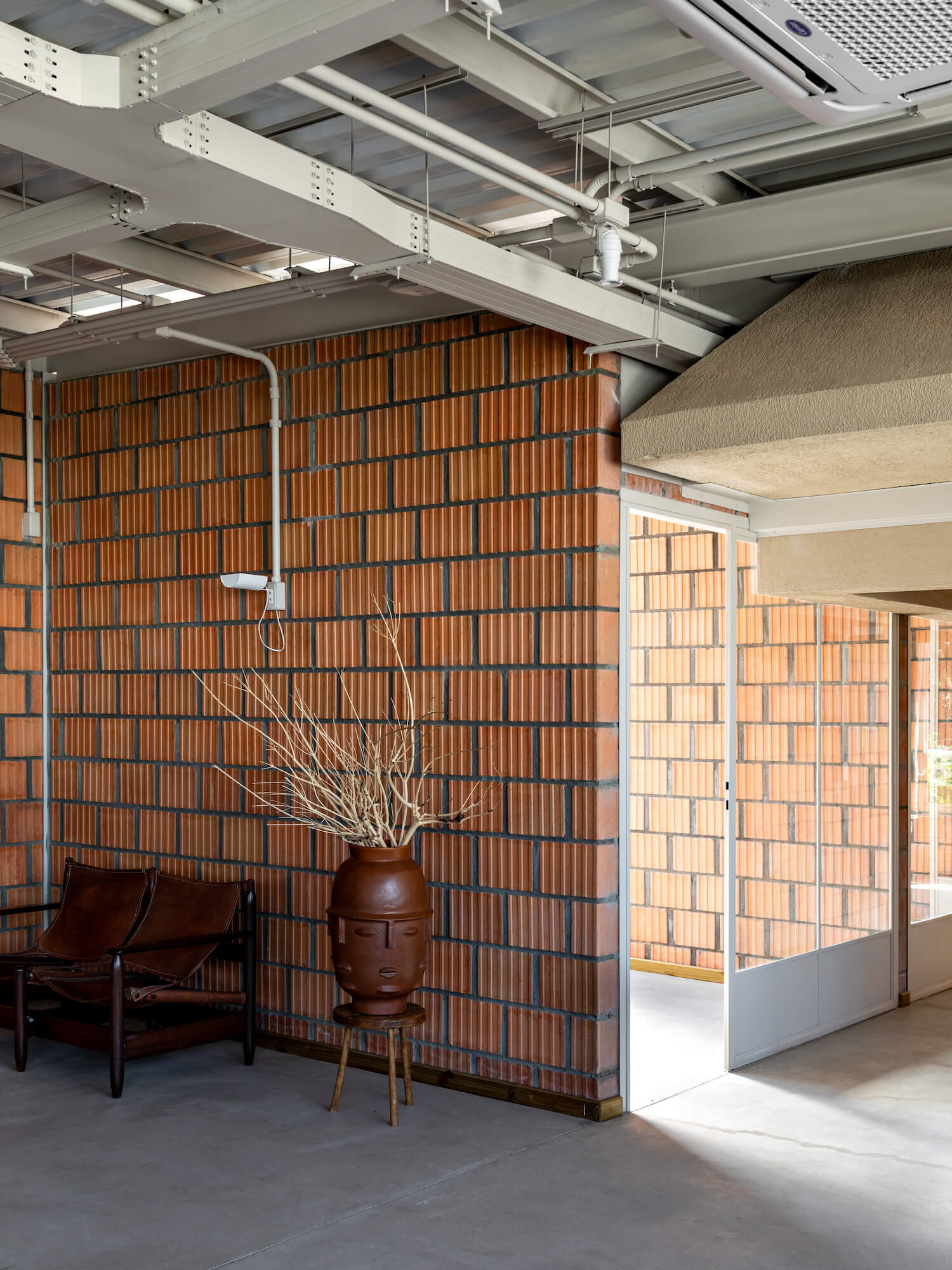
The objective was to use a ceramic block different from the conventional one on the new walls, with larger ribs as selected in the research of project references. Once a related product was identified in the construction market, the work together with the manufacturer was to expand the load bearing capacity of the block and allow its apparent use, without coatings. This partnership resulted in one of the project's outstanding materials, used both internally and on the facades. Its layout is alternating, of the mooring type, and the expansion joints are larger than usual, equivalent to the width of the ribs of the product.
The coatings on the maintained walls are also related to the earth. Thus, an external layer of rammed earth was applied to the facades, with horizontal friezes and shades and textures similar to those of the ceramic block. Complementarily, the pre-existing internal walls were coated with natural components paint and earthy color.
In the midst of the complete transformation of the property, witnessed by the beams that cross the environments with their layout alien to the new uses, windows and doors were all redone. As usual in the Studio's work, the sawmill brings together fixed panels with those that open, lift or shutters, depending on the surrounding occupation. But in Mãe Terra's project, the windows also configure volumes that, standing out, signal the intention to bring the user closer to the tops of the numerous surrounding trees.

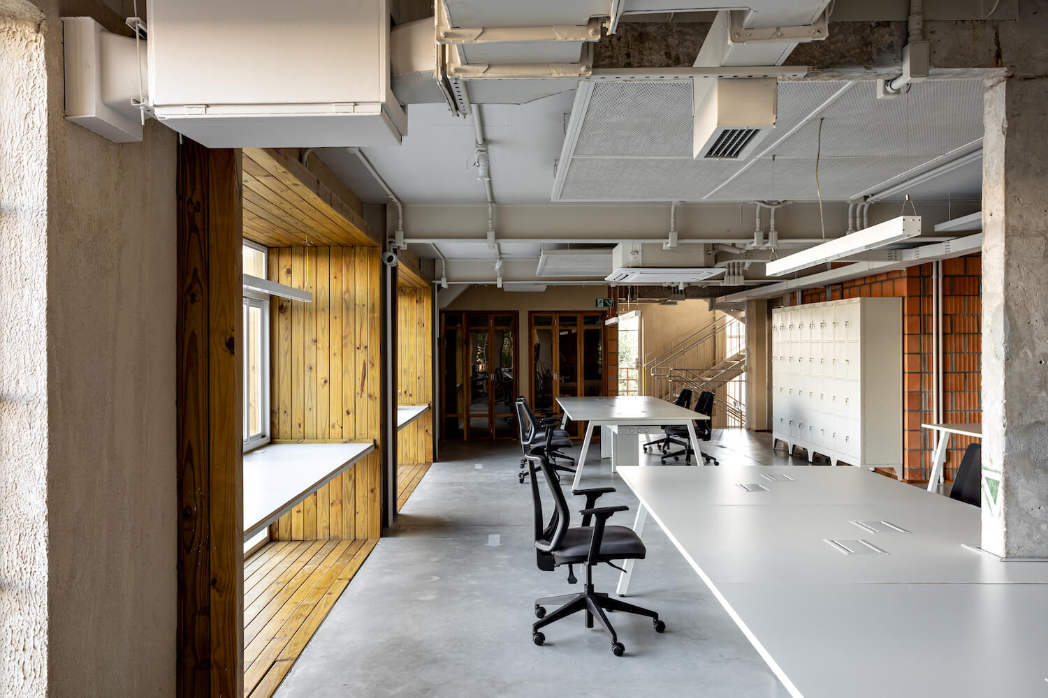
They are present on the first floor, fully adapted to receive the company's office, and both outside and inside the property its envelope is made of pine wood. Metal beams embedded in the slab support the floor of the spare volumes which, furnished with fixed seats, are spaces for socializing and contemplative nature, and whose playful character communicates the informality that characterizes the project. In the corner of the house, located in the corner, the sofa and the window have an L-shaped design.
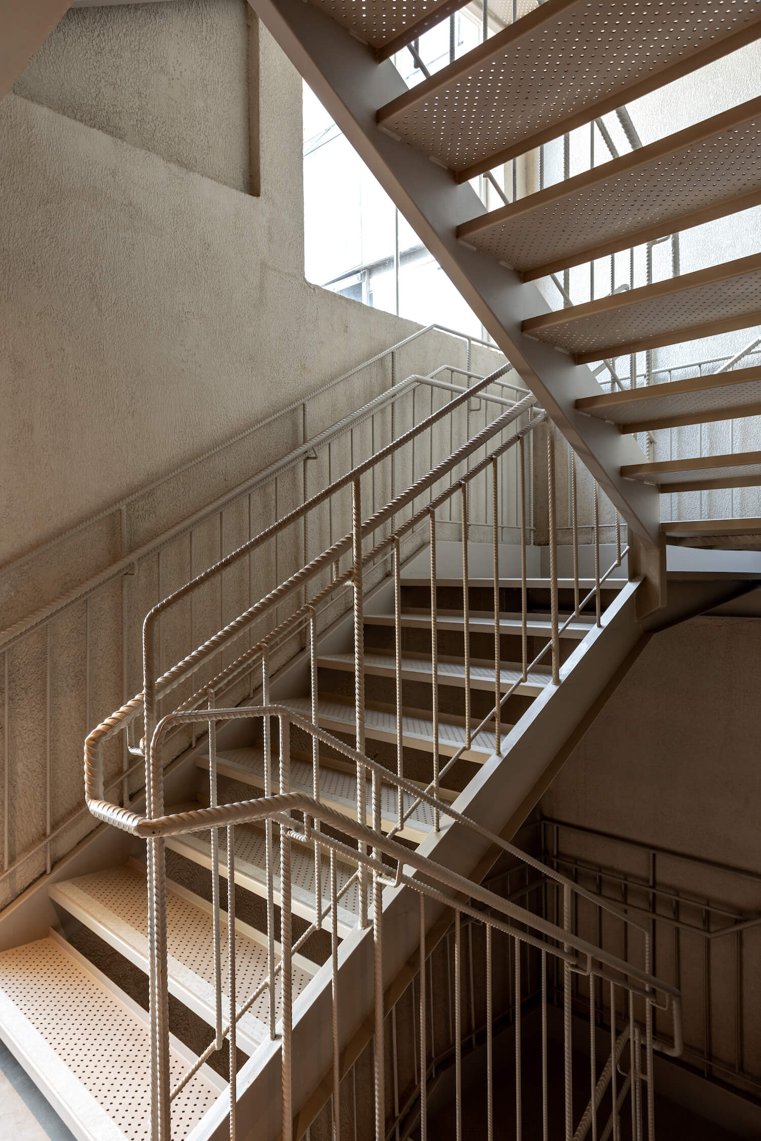
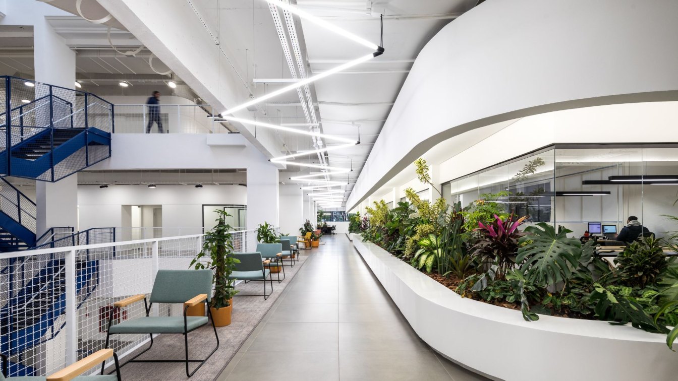
There is plenty of natural lighting in the interiors, made possible both by the redesign of the windows and by the distribution of light through the cracks in the new metal staircase (perforated sheet metal floor and rebar railing), inserted at the back of the building. Also the upper floor, designed to accommodate different meeting areas - some compartmentalized others of the open space type - and the events area, is surrounded by glazed facades which, set back in plan, are flanked by planters with dense landscaping.
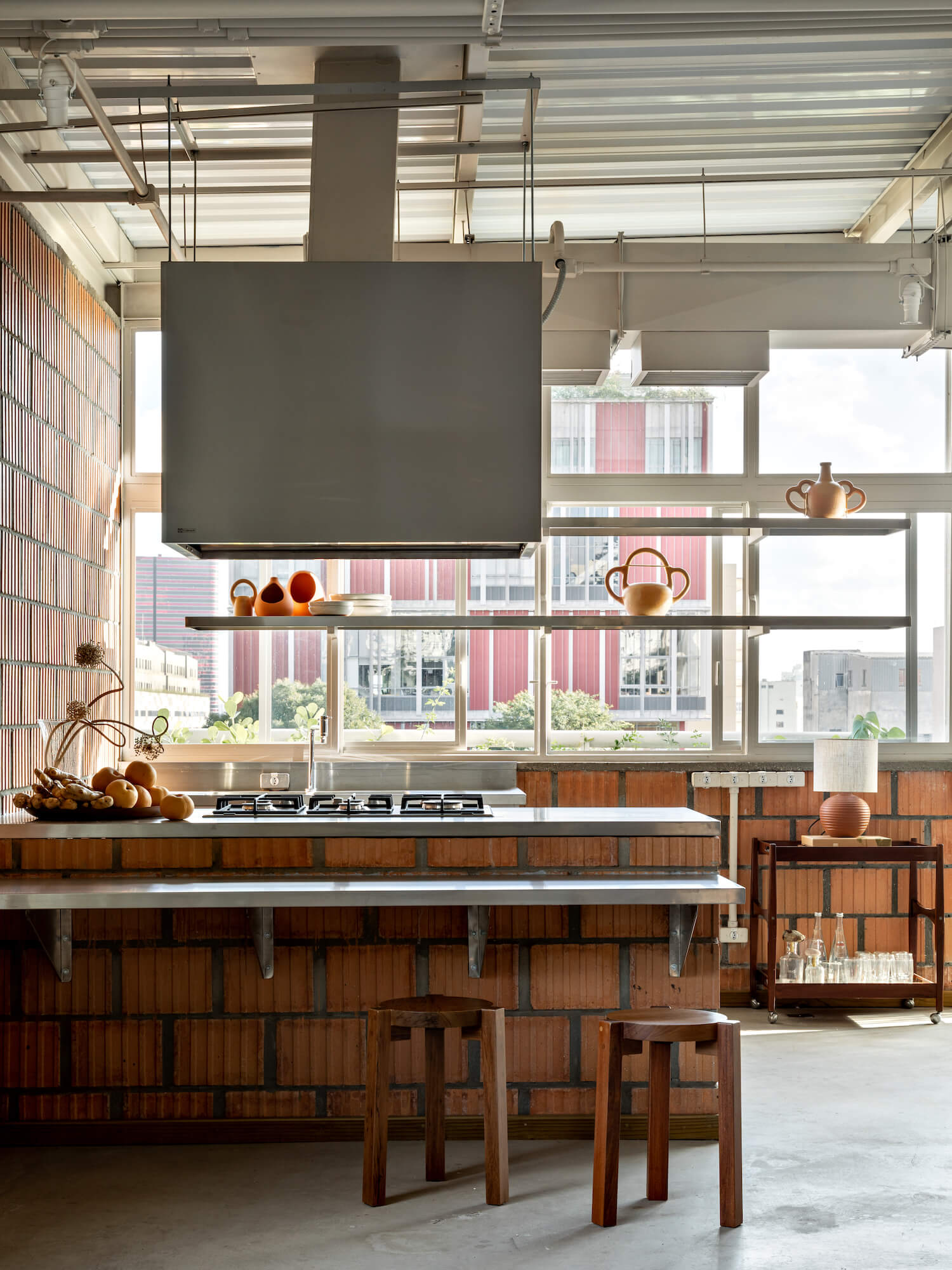
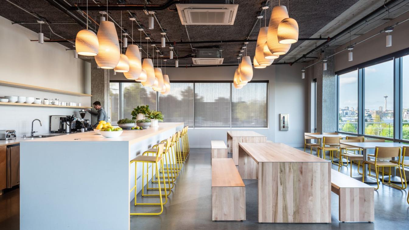
The ground floor, where there is a café, kitchen and spaces for innovation/product development, is equipped with a kitchen prepared for courses. The back patio is visible through the large window in the hall and the coexistence of materials and elements - new and old - echoes the visual language of the project as a whole.


