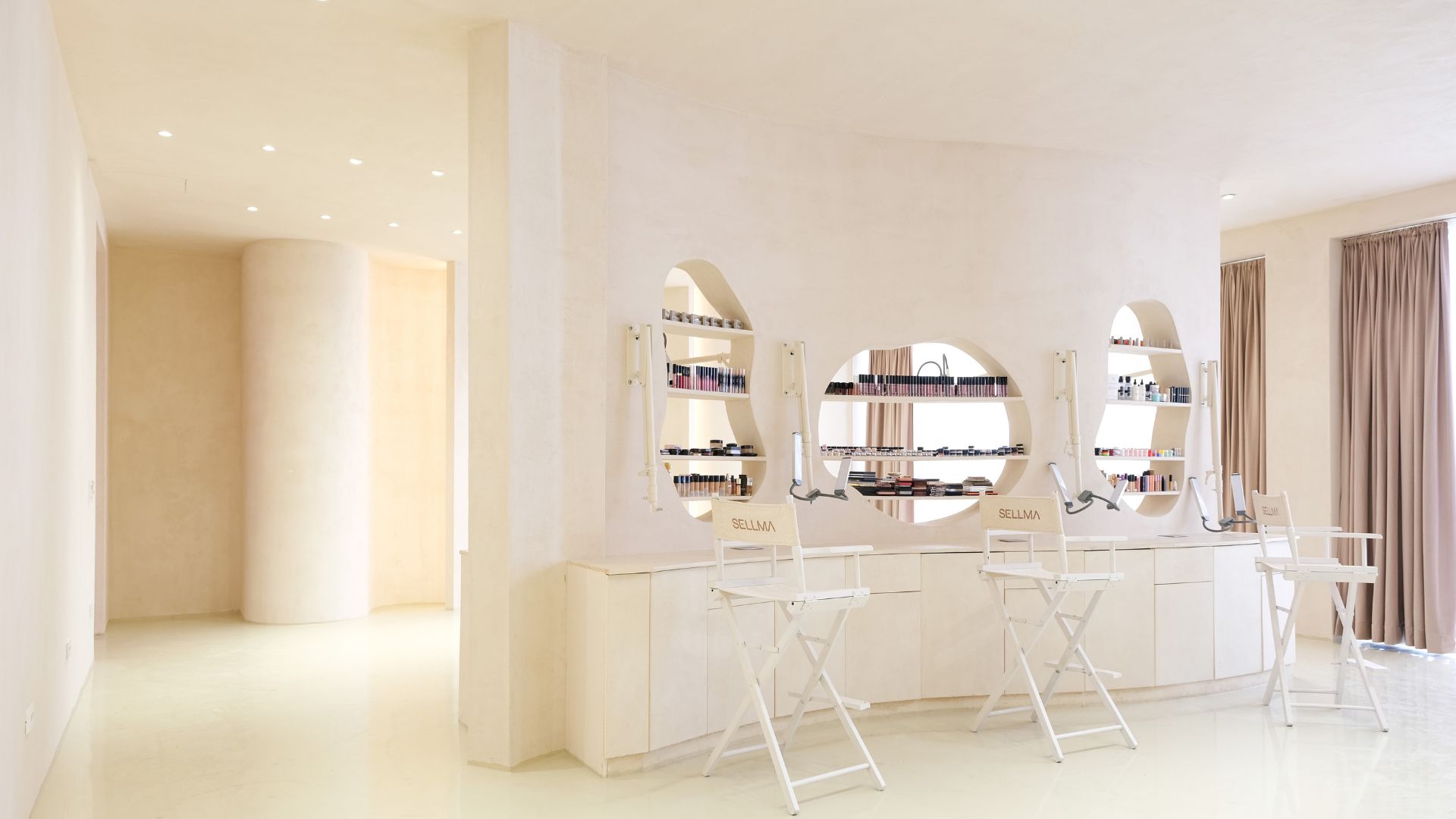
StudioHB: Imagine a space where health and beauty converge; where the clinical meets the natural. This is the vision behind the wellness centre, which combines a clinic specializing in nutrition and cosmetology with a retail space offering natural skin care products. The design challenges? To seamlessly integrate these two distinct characters within the building's envelope.
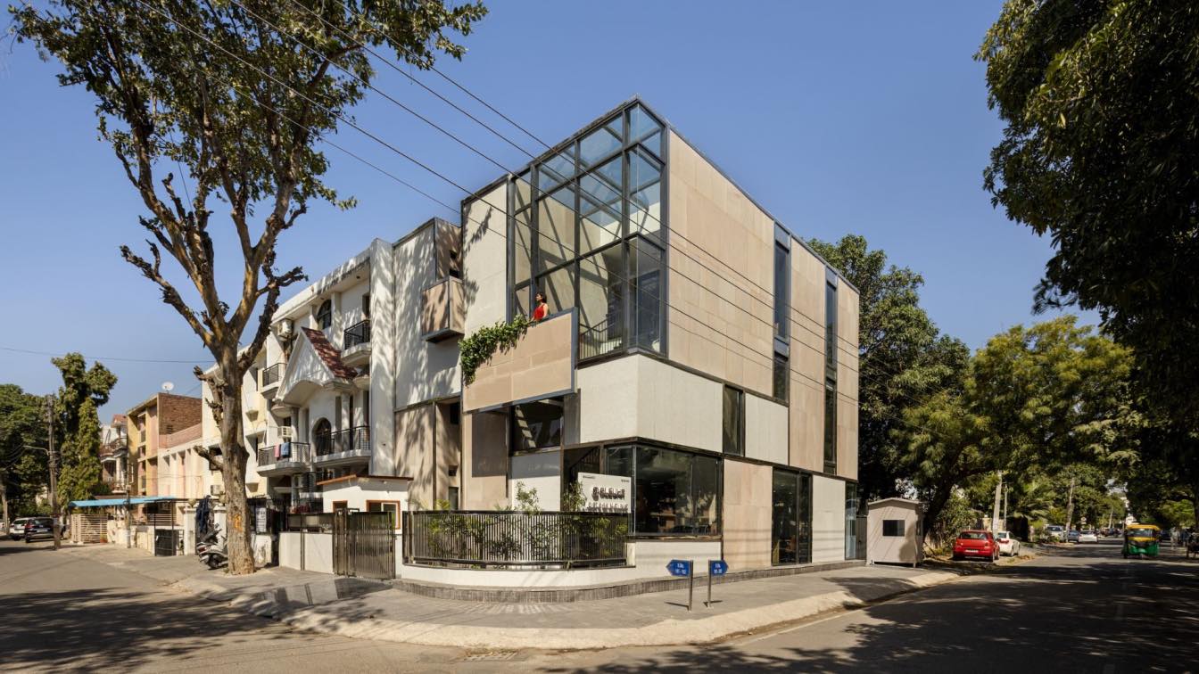
The concept behind the design is one of balance and harmony. On one hand, there are the cold and sterile attributes of a clinic; on the other, the natural, warm, and earthy quality of the skin care products. This dual nature of materiality is reflected in the facade where the indigenous Bijolia sandstone is juxtaposed with white terrazzo, glass and stainless steel. The dynamic and superfluous composition of surfaces strikes an unusual balance between the conflicting materials and creates an interesting superstructure.
Located in a residential neighbourhood, the clinic was cautiously designed to stand apart and yet be respectful to the Corbusian aesthetic of “frame controlled” houses of Chandigarh. The clean and bold forms reflect the sophistication and modernity of the clinic's offerings. The sandstone imbues the building with a sense of place, connecting it to the local context, as white terrazzo walls and glass facade create a harmonious contrast to the natural stone. The entire composition is framed with stainless steel accents, lending the building an air of sleekness and dynamism by reflecting light and the surroundings, ever changing throughout the day.
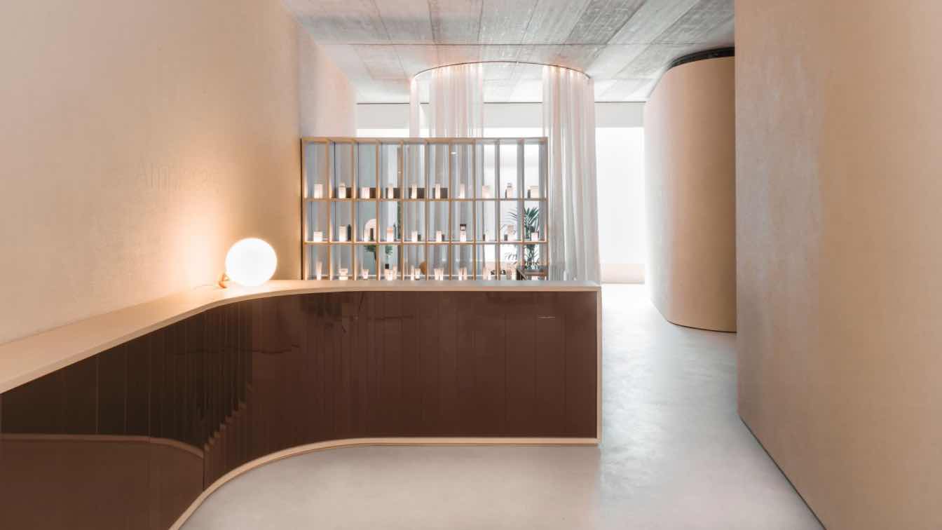
The basic form has been optimized with respect to the site conditions to allow natural light to enter inside the volume. Hence, we created a triple height cutout for the south facing entrance atrium that lets in daylight and brings psychological tranquillity and warmth. The atrium extends into a waiting area around which the consultation rooms and OT’s are cantered. The outer design vocabulary flows inside creating a homogeneous experience with fenestrations that frame views of the surrounding landscape, creating a sense of expansiveness and further consolidating the synergy between the inside and the outside.


