BALCON Studio: A stylish and fashionable space with design icons for a young couple.
1. Features of the layout?
Symmetrical arrangement of the laundry room and guest bathroom in the hallway.
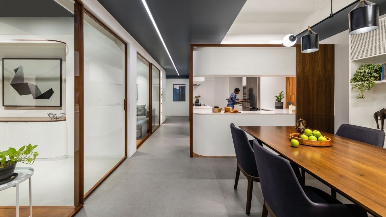
The main room is a living room and the kitchen is a walk–through room. There are no corridors. A small hallway, where the laundry room and guest bathroom are symmetrically located. Master zone: bedroom, dressing room and master bathroom.
2. A few words about the customers. The main wishes of customers? What did they want or maybe they definitely didn't want?
A young couple, they did not want a separate kitchen and did not want a kitchen set in the classical sense - they wanted a non-trivial solution.
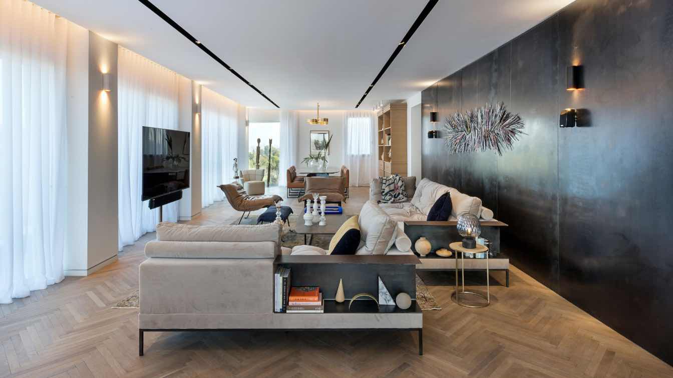
As a result, it turned out that the kitchen and the living room are not separated, in fact it is one zone, the largest area in the apartment, the customers wanted to make the largest possible living room.
The main wish of the owners is a fashionable interior with objects that are design icons. The study and the guest room are two in one, the sofa is disassembled.

3. What decorative and architectural techniques did you use in the design of this interior?
1. The arch in the hallway is made in a minimalist style. In general, the project is playing with architectural forms.
2. In order not to distract from the form, we chose a dark hallway, a black ceiling, a shadow skirting board and hidden doors to the guest bathroom and the cleaning room.
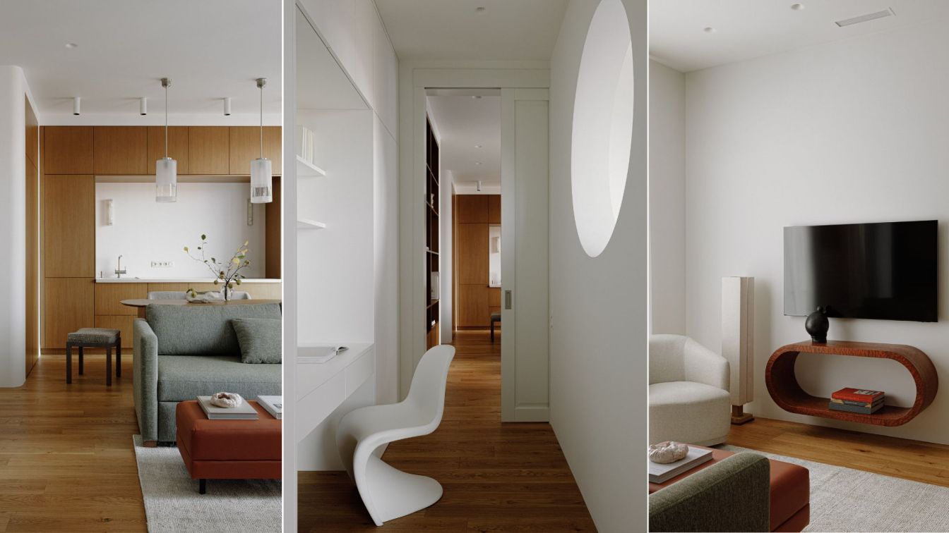
3. A single area – shelving and built–in kitchen - everything is hidden under a single veneer surface. All items are hidden, as the customers wanted.
4. Layout features, allocated one large walk-through room, this is the living room.
5. The designer wanted to make the most of natural materials – wood wool rattan, the palette is also neutral, natural.
6. The wardrobe is not a separate room, but in fact it is located behind the wall. There are 2 colors in the bedroom - blue and white. There is a hidden door to the master bathroom.
7. In general, architectural forms are emphasized throughout the interior.

1. The most unusual, interesting object in this interior. What is the most important thing for you in this project? What are you particularly proud of?
The island in the living room is the most difficult object to perform. We ourselves did not immediately believe that we were able to implement this object. A couple hundred kilograms are hanging in the air.
Also, in addition to the composition, it turned out to be a problem to find completely white lamps. As a result, we found them - Louis Pulsen pendant lamps.
2.What should you pay special attention to in each of the rooms? What is the most important thing in the living room? In the kitchen? The dining room? The bedroom? In the bathroom?
Hall. Everything is painted black so as not to distract attention from the arch. The floor is white marble. Everything else is black, including the ceiling. In the niches there is a closet, invisible doors (guest bathroom and laundry room). There are no baseboards and platbands.
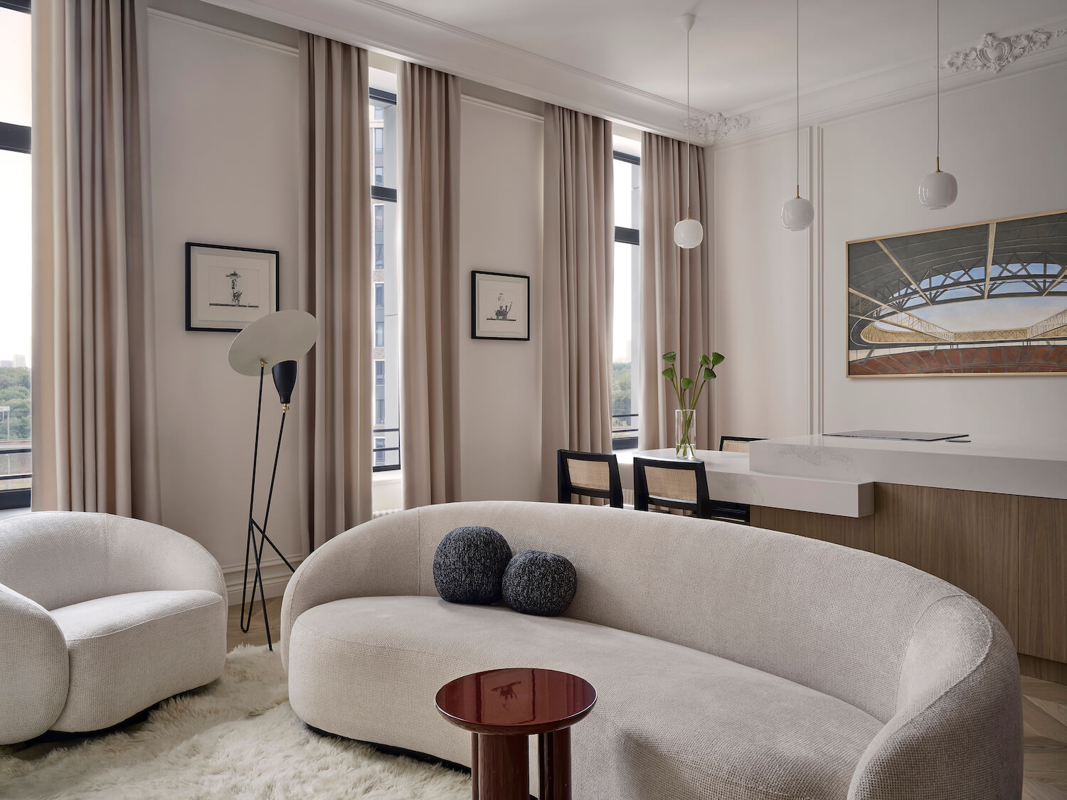
Living room. The main element: an arch and a single veneer wall. It was necessary to highlight the doorway, chose the architectural form of the arch. The arch is an accent detail (it can be seen from all sides), it is high, the ceilings allow.
The trick is that the whole kitchen is hidden behind a wooden wall. That is, in fact, there is no kitchen, everything is hidden. The island is the main work surface and table, the hostess sometimes works there.
The trick is that the hood for the island goes through a screed in the floor into the shaft.
Heavy marble table without support - floating to facilitate the construction. Since it is quite large - 5 meters in length. In another part of the living room, shelves are built into the wall - storage for books and accessories. The wall surface is uniform - oak veneer.
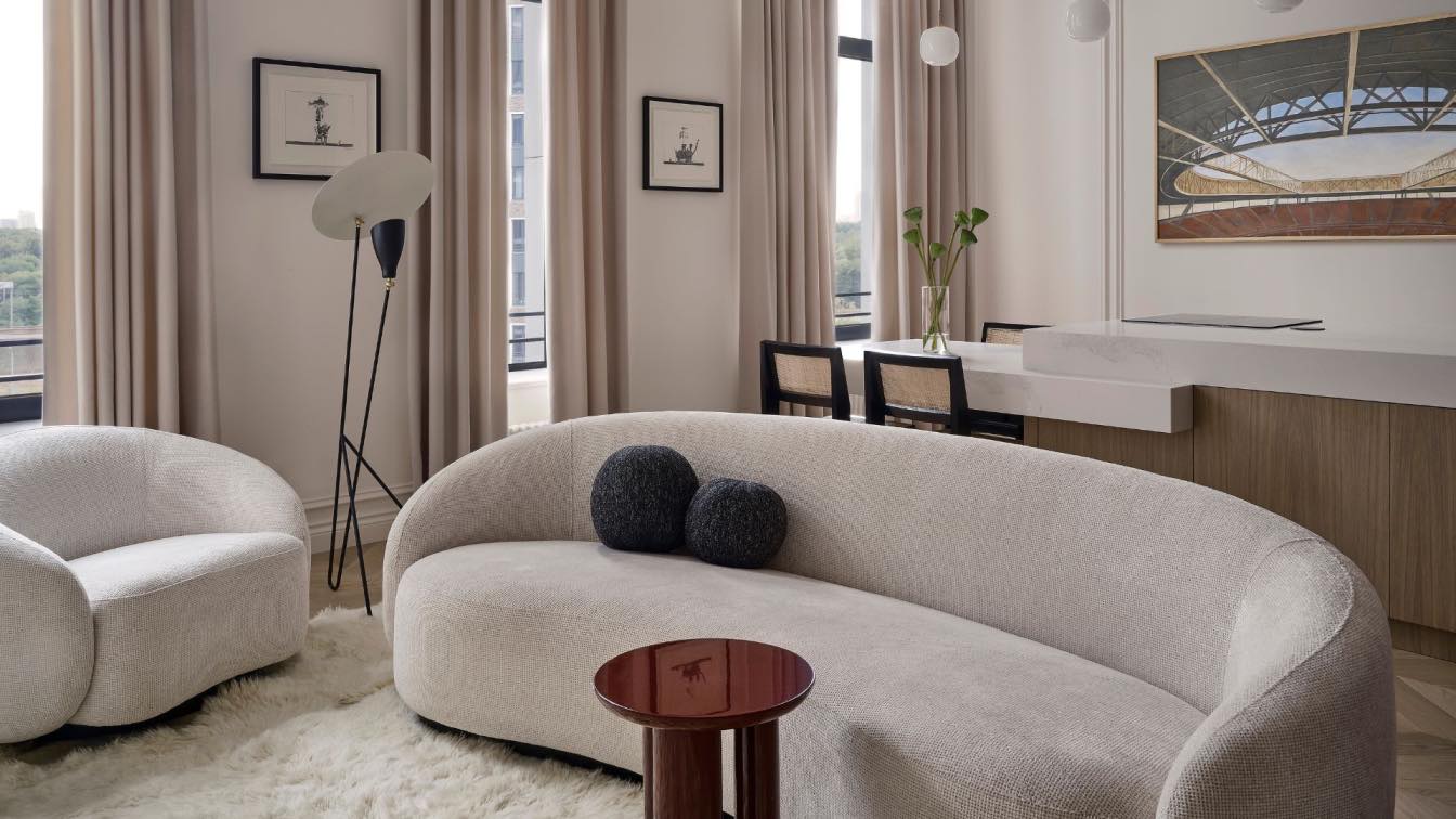
In the center of the other wall, behind the island, hangs a painting by Irina Zyuskina, from a distance resembles a tiara with rays of light. and in fact it is a deserted sports arena, an architectural object that echoes other architectural forms. In the wall between the windows - works by Viktor Pivovarov (graphics, repeatstory shop)

The architectural chair from Normann Copenhagen
Chandelier in the living room Phantom Lamp, brand Normann Copenhagen
Above the island - Louis Pulsen pendant lights.
Doors from the Gothic side to the bedroom and study with a false transom to give height.
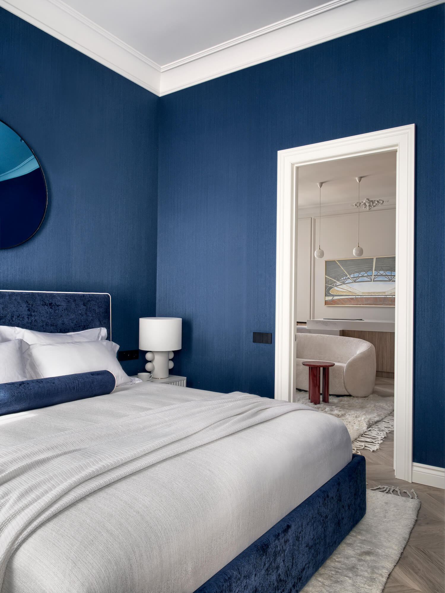
Bedroom. We didn't want anything superfluous, a minimum of decor and objects to relax. The dark bedrooms are more intimate, so they chose a deep blue color. White Kelly Wearstler lamps on bedside tables are an accent. Blue mirror on a blue background (decorative element on the wall above the headboard). Textile wallpaper. The carpet perfectly complements the blue color scheme.
There is a wardrobe behind the wall, inside and outside finishing with textile wallpaper (cotton with texture). The invisible doors to the master bathroom are also covered with textile wallpaper.
The master bathroom is classic with moldings. There is a mirror on the entire wall behind the bathroom to expand the space - marble with brown veins on the floor (looks luxurious). Black matte sconces Rubn. (they resemble a technical light). The countertops are natural granite, reminiscent of coal with a sheen. Customers wanted a freestanding bathtub. Art (Francois Sauk, carres des artistes gallery) adds charm to the room.
We get into the study (aka the guest bedroom) from the living room, it is very small, but due to the fact that large windows on 2 sides it seems more spacious. There are wooden blinds on the windows.
Shadow Profile
The window is framed in plaster. Therefore, the cornice was abandoned, it was necessary to choose one thing. Textile wallpaper.
Part of the wall and ceiling are painted in the same color so that there is no feeling of a well. The border is erased.
There is also a painting by Irina Zyuskina “Institute of Eye Microsurgery” in the cabin.
Wall sconce from Le Corbusier (Nemo) - Retro charm. the lamp gives light for reading, and also reflects beautifully on the ceiling at the same time.
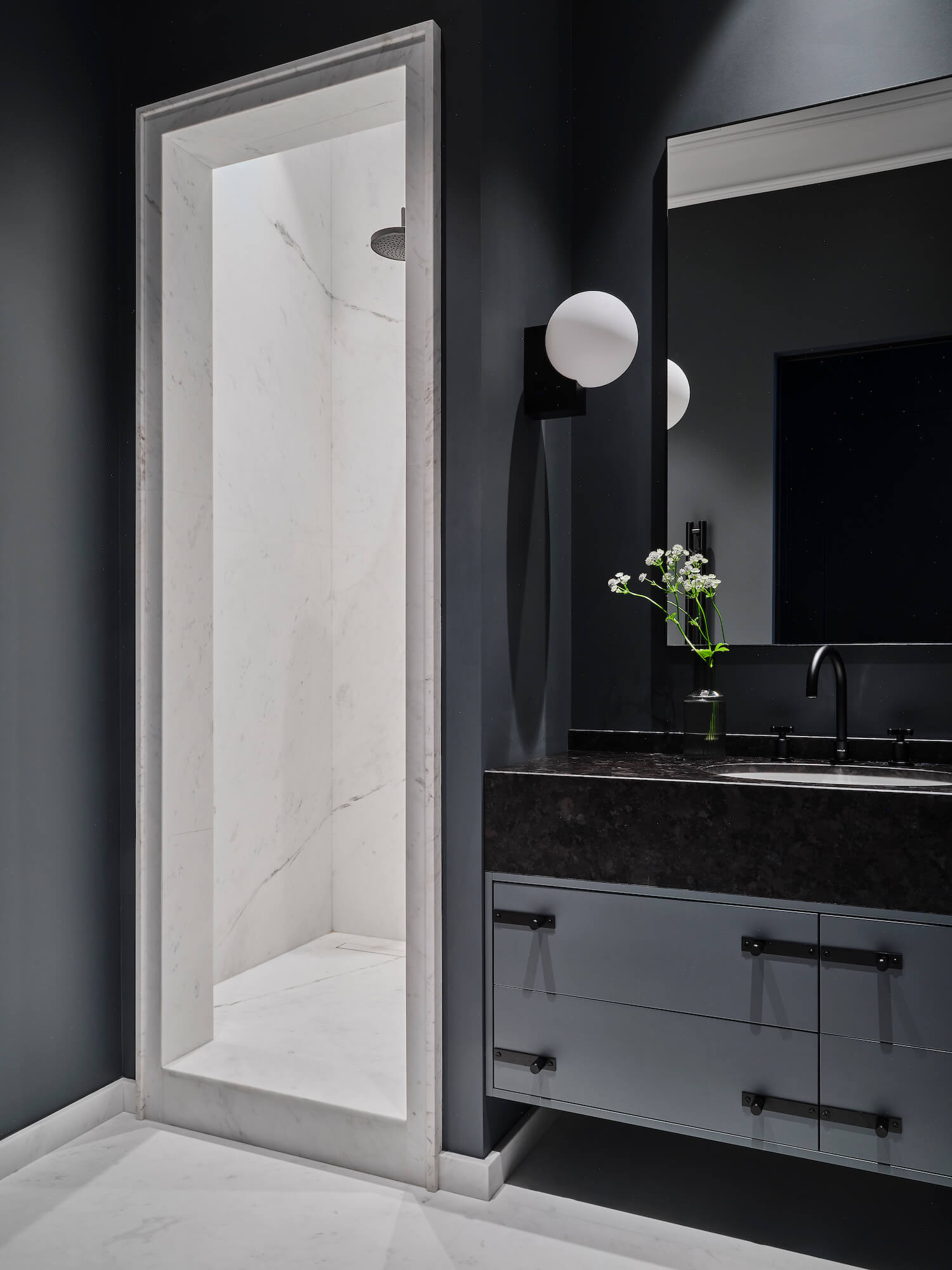
The guest bathroom is dark gray. The transition from a black shade in the lobby.
Snow-white marble and purity of forms plus strict architectural framing of the shower.
Buster and punch (English brand of handles) was chosen for the cabinet under the sink
Sconces &Tradition are a clear architectural form.
3. Remember some funny story related to some piece of furniture or an incident during the repair.
Hallway – mirror Gubi
Living room –
Phantom Lamp chandelier, Normann Copenhagen brand
Above the island - Louis Pulsen pendant lights.
Art Viktor Pivovarov, Irina Zyuskina.
Floor lamp – Warm Nordic Silhouette 1956
Table &Tradition
Bedroom Lamp Kelly Wearstler
Dantone home bed
Office
Sofa and table Danton home
Attribut Doors


