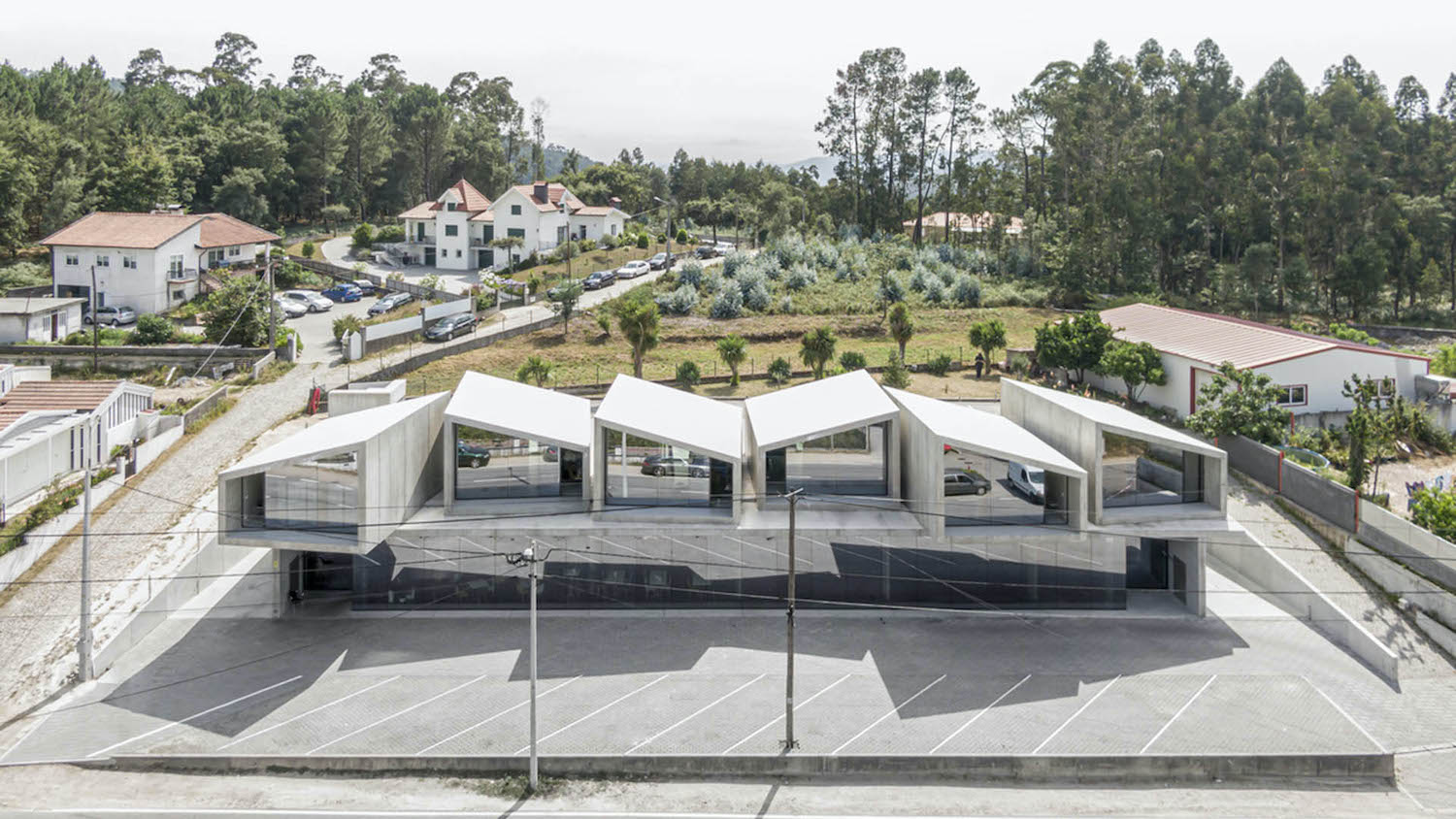
The Porto-based architectural studio SUMMARY unveils the newest project using their prefab and modular building systems, ''1000 m² Prefabricated'' that is located in Vale de Cambra , Portugal.
Architect's statement: The requirements for this project were boldly defined from the beginning: the construction should be fast, cost effective and changeable over time, which prompted the studio to use prefabricated elements and to leave parts of the project undefined, assuming the immediacy, flexibility and resources optimization as core themes.
The strategy was clear: a ground floor level for the multi-services program connected with the public space, crowned by the individual habitational units (six cabins with 45m2). Due to the differences between these two programs, it was created an independent access for each one, placing them in different levels and taking advantage of the natural ground’s slope.
The ground floor is shaped by prefabricated slabs and structural panels in the external perimeter. This area was conceived in a very flexible way: it’s possible to add or remove compartments or let the whole floor functioning as a big open space. Thus, the users may adapt the space according to their needs.
The first floor is all composed of Gomos System units. Considering that the maximum building area permitted by law was quite small, the requested empty space was used to separate the housing units. Designed and licensed as a collective housing building, with this feature this project offers the main advantages of single houses: clearly individualized entrances and a complete acoustic separation between the different units.
In the whole building, the structural material - precast concrete - is directly exposed, without any additional finishing, thus reducing the resources, the manpower and the arts involved in the construction process and, consequently, reducing its environmental impact. This approach has a direct effect in the acceleration of the building process: all its components are fully prepared in factory and quickly assembled in situ, performing at once as structure, insulation and cladding elements.
 image © Fernando Guerra | FG+SG
What were the key challenges?
Logistics. Differently of many Soviet prefab cities, where the streets had specific dimensions to allow the total rotation of the cranes and the proper handling of the modules, in this case we needed to improvise solutions for each step of the assembling process. For instance, we needed to elevate manually electrical/illumination cables in the street so the trucks could pass underneath them and we need to create space to park our crane to assemble the buildings’ modules not interfering with the traffic. The apparent simplicity of prefabricated systems hides a lot of preparation effort to make it work.
How does the neighborhood looks like?
It is in a typical road side (EN 224-1: “Estrada Nacional 224-1”). It’s one of these territories without clear references: it’s discontinuous, without a specific building alignments to follow. The neighbourhood is composed by completely different constructions… a kitsch individual house, an anonymous collective housing building, some commercial and industrial facilities – you can find them all within a radius of 500 meters from the building.
There’s a Portuguese author (Álvaro Domingues) who describes this kind of territories as “Rua da Estrada” (it’s also the title of one of his books). He uses this term to describe this kind of urbanization, supported in the road network, mixing different uses and building types, hard to describe through the traditional definitions of “urban” and “rural”.
In this sense, there are no specific references to follow, neither any traditional image to respect - we had very few limitations in terms of form, volumetry or materiality. So the design is a faithful representation of its building system, composed exclusively of prefabricated concrete pieces – they are visible in any part, inside or outside the building, “no makeup”, without any additional cladding, exposing the joints and all the tectonic elements of the construction
Film by Building Pictures
How did the clients hear about your practice?
In 2016 we exhibited this modular building system in the Venice Biennale. In that frame, we got featured in a Portuguese journal where the client saw us. He said he wanted something cheap and quick to build, and those where the main triggers to choose us, rather than any aesthetical feature about our work.
How does the program distribution works, and how do the different uses relate each other?
The ground floor is directly connected with the public space. It’s a big compartment (more than 700m2) that you that can either subdivide or use the whole floor as a single office or commercial facility. So far, the owner divided it into 2 spaces: one of them is occupied with a bakery, the other one is empty so far, and he uses it for punctual events.
The houses will be for low-cost renting. Three of them for long-term renting, the other 3 for short term renting (this area is in the foot of a beautiful mountain range, called "Serra da Freita", where people go for a few days to enjoy some activities such as tracking and MTB, so some of the houses will be assigned to this kind of public). It is planned for a maximum of two people each one. However, for those who stay for a short period, it’s acceptable to host a third person. Over each bathroom there’s a small alcove, allowing staying overnight in unusual but also comfortable conditions. This “extra room” has a window, visible in the upper part of the back façade – kids love it!
The most interesting part about this division between 2 floors/2 programs (ground floor = public area, upper floor = housing) is that they are completely independent. There are no vertical connections between them, such as stairs or elevators. So, the way we “place” the housing units in the upper floor was totally free, as we don’t have any constraints in terms of position or orientation. Therefore, the ground floor works as a “structural table”, at the top of which stands a group of six freely placed objects.

image © Fernando Guerra | FG+SG
 Ground Floor Plan
 First Floor Plan
 image © Fernando Guerra | FG+SG
 image © Fernando Guerra | FG+SG
 image © Fernando Guerra | FG+SG
 image © Fernando Guerra | FG+SG
 image © Fernando Guerra | FG+SG
 image © Fernando Guerra | FG+SG
 image © Fernando Guerra | FG+SG
 image © Fernando Guerra | FG+SG
 image © Fernando Guerra | FG+SG
 image © Fernando Guerra | FG+SG
 image © Fernando Guerra | FG+SG
 image © Fernando Guerra | FG+SG
 image © Fernando Guerra | FG+SG
 image © Fernando Guerra | FG+SG
 image © Fernando Guerra | FG+SG
 image © Fernando Guerra | FG+SG
 image © Fernando Guerra | FG+SG
 image © Fernando Guerra | FG+SG
 image © Fernando Guerra | FG+SG
 image © Fernando Guerra | FG+SG

image © Fernando Guerra | FG+SG image © Fernando Guerra | FG+SG
 image © Fernando Guerra | FG+SG
 image © Fernando Guerra | FG+SG
 image © Fernando Guerra | FG+SG
 image © Fernando Guerra | FG+SG
 image © Fernando Guerra | FG+SG
 image © Fernando Guerra | FG+SG
 image © Fernando Guerra | FG+SG
 image © Fernando Guerra | FG+SG
 image © Fernando Guerra | FG+SG
 image © Fernando Guerra | FG+SG
 image © Fernando Guerra | FG+SG
 image © Fernando Guerra | FG+SG
 image © Fernando Guerra | FG+SG
 image © Fernando Guerra | FG+SG
 image © Fernando Guerra | FG+SG
 image © Fernando Guerra | FG+SG
 image © Fernando Guerra | FG+SG
 image © Fernando Guerra | FG+SG
 image © Fernando Guerra | FG+SG
 image © Fernando Guerra | FG+SG
 image © Fernando Guerra | FG+SG
 image © Fernando Guerra | FG+SG
 image © Fernando Guerra | FG+SG
 image © Fernando Guerra | FG+SG
 image © Fernando Guerra | FG+SG
 image © Fernando Guerra | FG+SG
 image © Fernando Guerra | FG+SG
 image © Fernando Guerra | FG+SG
 image © Fernando Guerra | FG+SG
 image © Fernando Guerra | FG+SG
 image © Fernando Guerra | FG+SG
 image © Fernando Guerra | FG+SG
 image © Fernando Guerra | FG+SG


