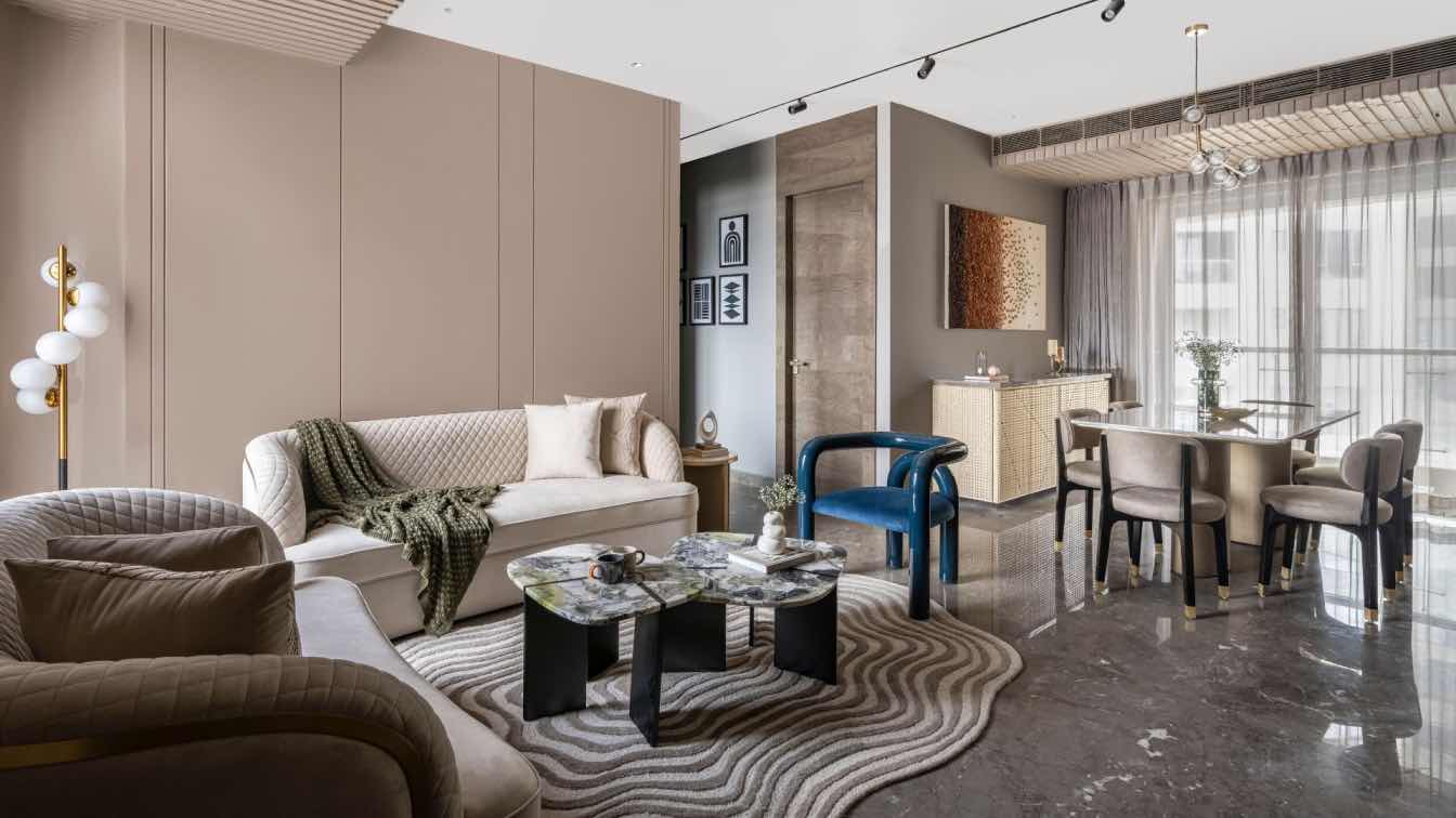
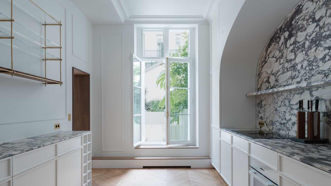
Modern apartment of 210 m2 in Moscow by interior designer Olimpiada Arefieva, founder of the Well Done Interiors bureau.
When a young entrepreneur, engaged in business across several countries, approached Well Done Interiors for a contemporary makeover of his apartment in a burgeoning Moscow center, it was the beginning of a remarkable transformation. The design, as envisioned by the studio's founder Olimpiada Arefieva, pivoted on concepts of 'simplicity, cleanliness, and clarity', a reflection of the client's cosmopolitan lifestyle.
Initially, the client's vision was to conceptualize and bring to life a design that harmonized with the rhythm of his life. The endeavor began with a detailed exploration of various interior styles, guiding the client towards defining his preferences. He was drawn to spaces that exuded a minimalist elegance, punctuated by striking art pieces and distinctive furnishings.
As the project progressed towards its deadline, the focus was on meticulously developing the interior design, managing engineering aspects, procuring essential components, and swiftly executing the finishing touches immediately after receiving the keys. The team was all set for construction when, quite unexpectedly, the client discovered and instantly fell in love with a neighboring two-story apartment, compelling a shift in plans.
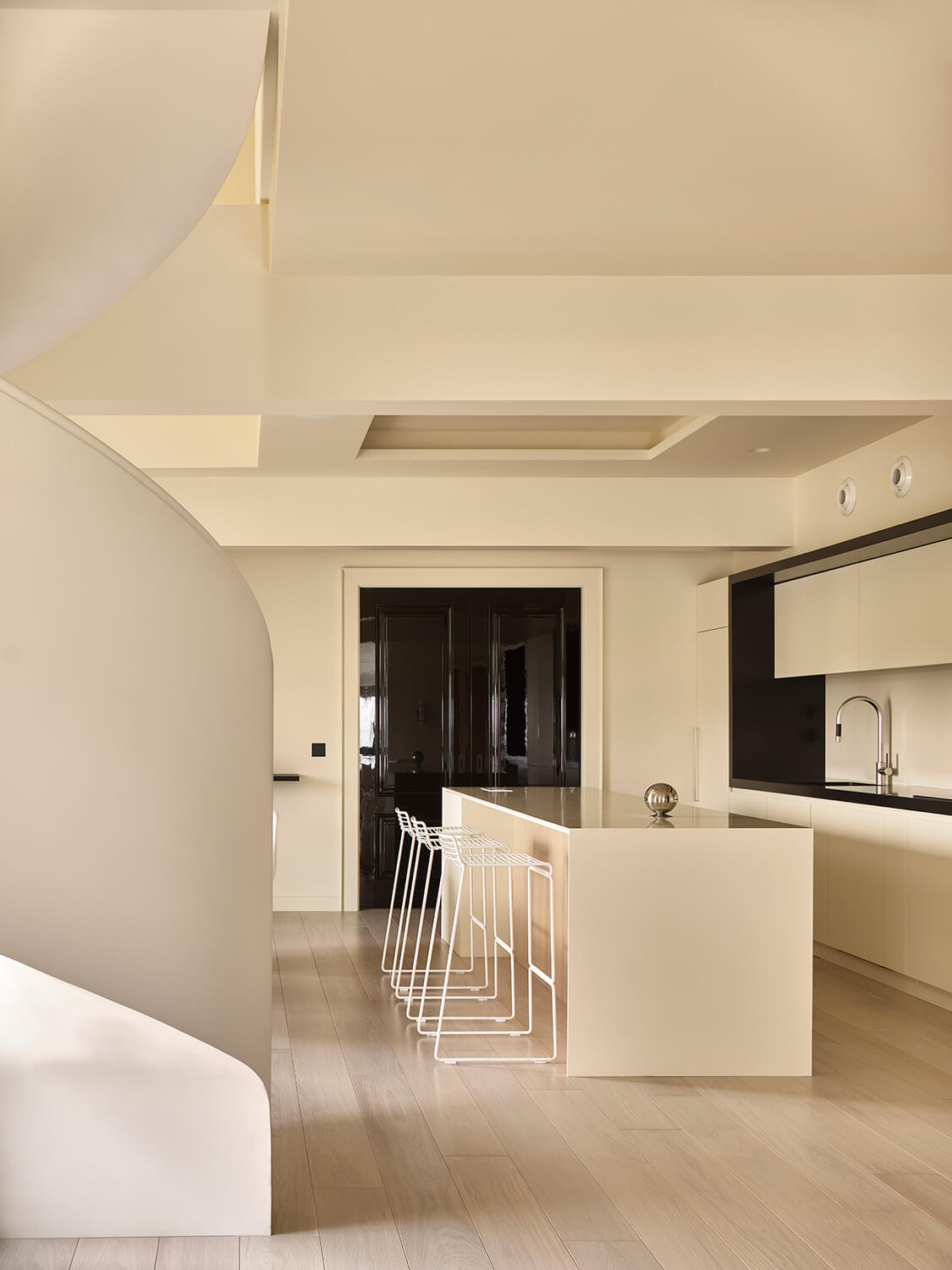
In this new space, a two-level apartment with an airy, loft-style ceiling, there was an enchanting interplay of architectural elements. Massive beams, typically not a designer's favorite, here lent a distinct character, almost serving as decorative highlights. This led to a decision to transition the nearly complete design to this duplex, a choice that infused the project with new possibilities. Every purchased item, from furniture to finishings, found its rightful place, enhancing the original concept of simplicity in a more intriguing context.

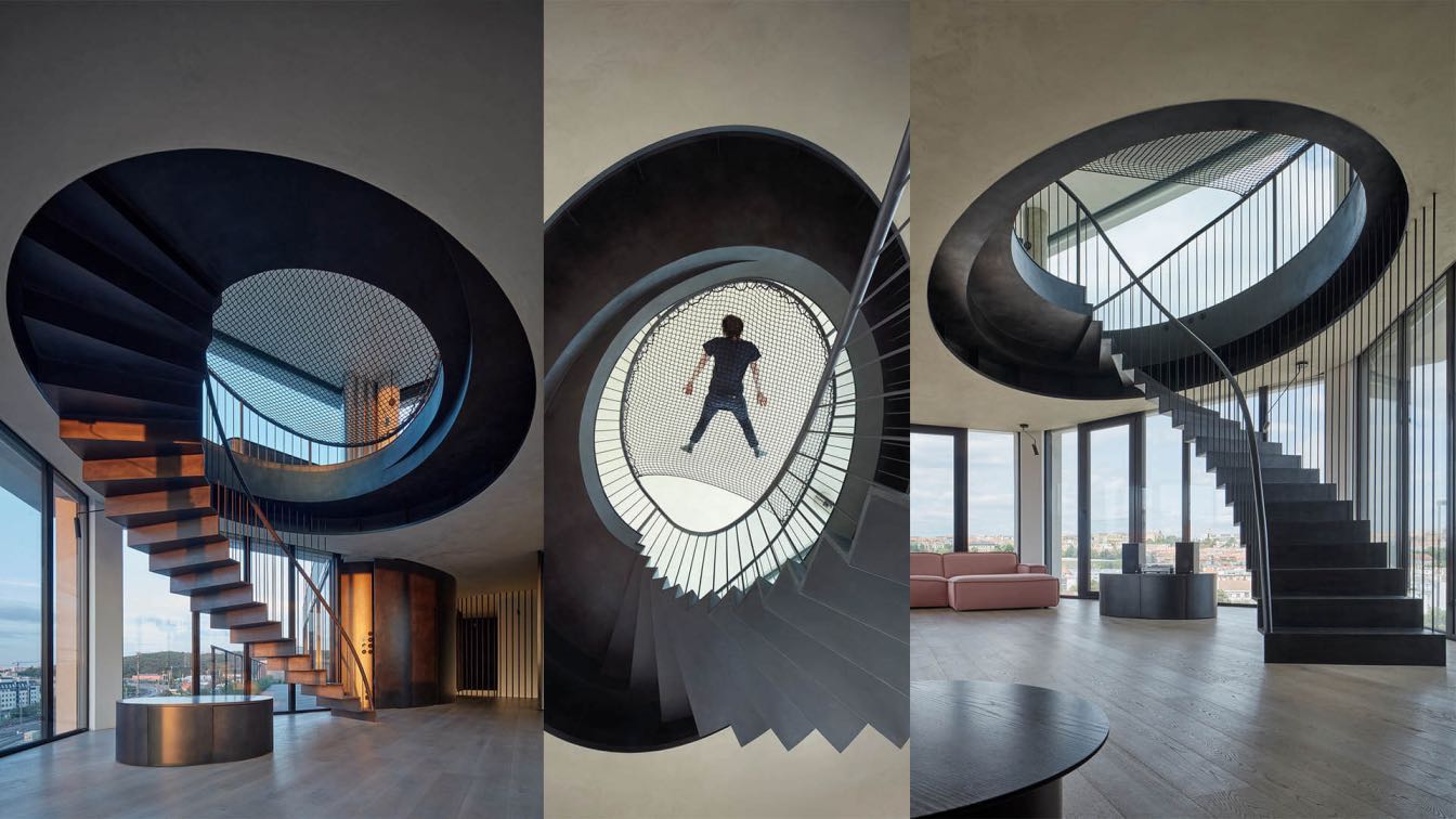
The apartment's layout was reimagined with future accommodations in mind. A reconfiguration of spaces between the two levels expanded the living area to 210 sqm. The chosen spiral staircase became not just a functional element but a sculptural centerpiece, symbolizing the fusion of utility and aesthetics. The first level embraced an open-plan living, dining, and kitchen area, along with a cozy office, guest facilities, and a laundry room. The upper attic floor was dedicated to a serene master suite, complete with a spacious bedroom, walk-in closet, and an inviting bathroom.
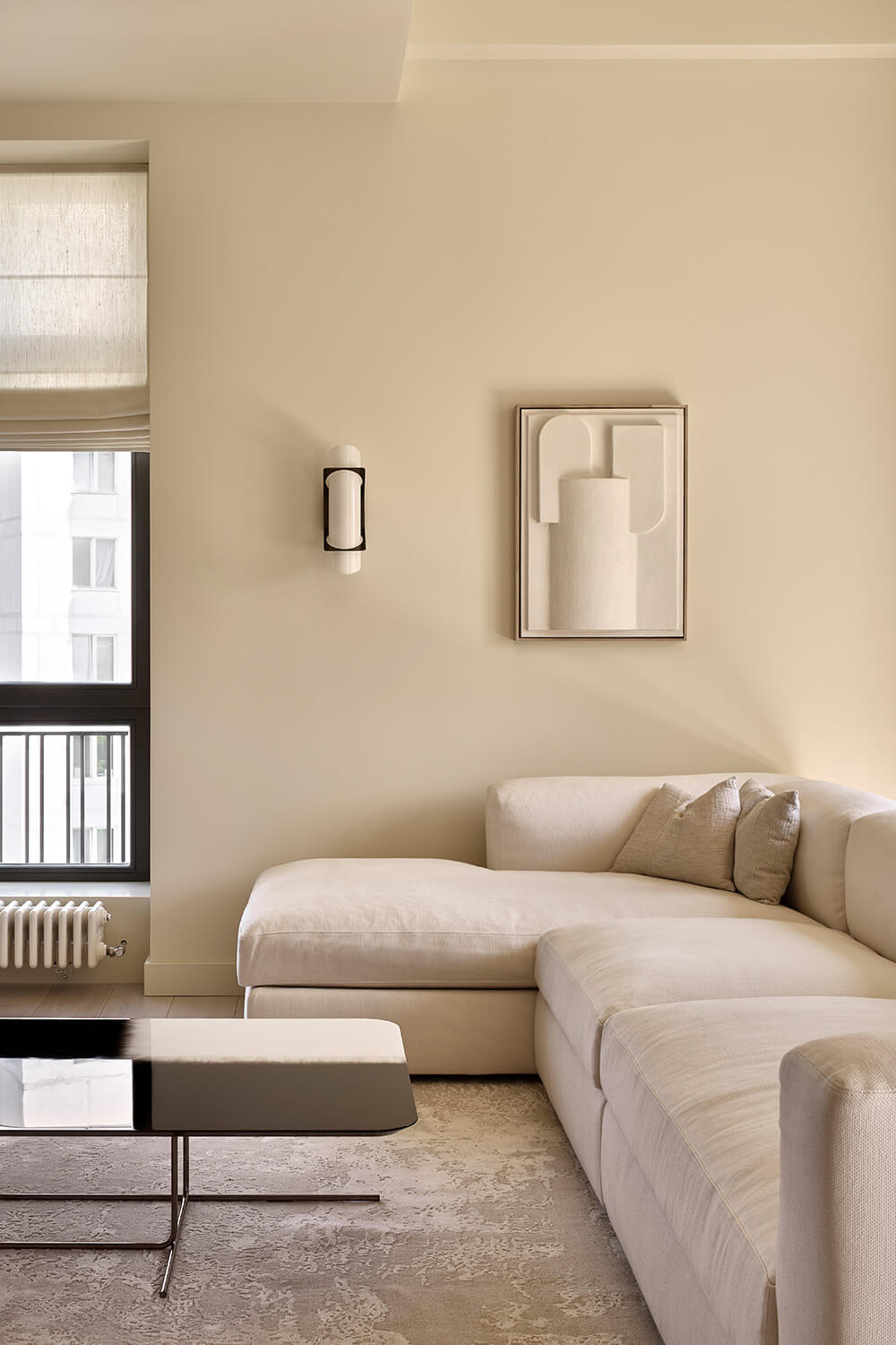
In the realm of decor, the client's penchant for simplicity was met with thoughtful restraint. The design eschewed ornate lighting for soft, diffused illumination, subtly embedded in architectural niches. The apartment's complex geometry inspired a paper origami-like design concept, where light played dramatically across angular surfaces, creating an illusion of living within a giant, artful sculpture.
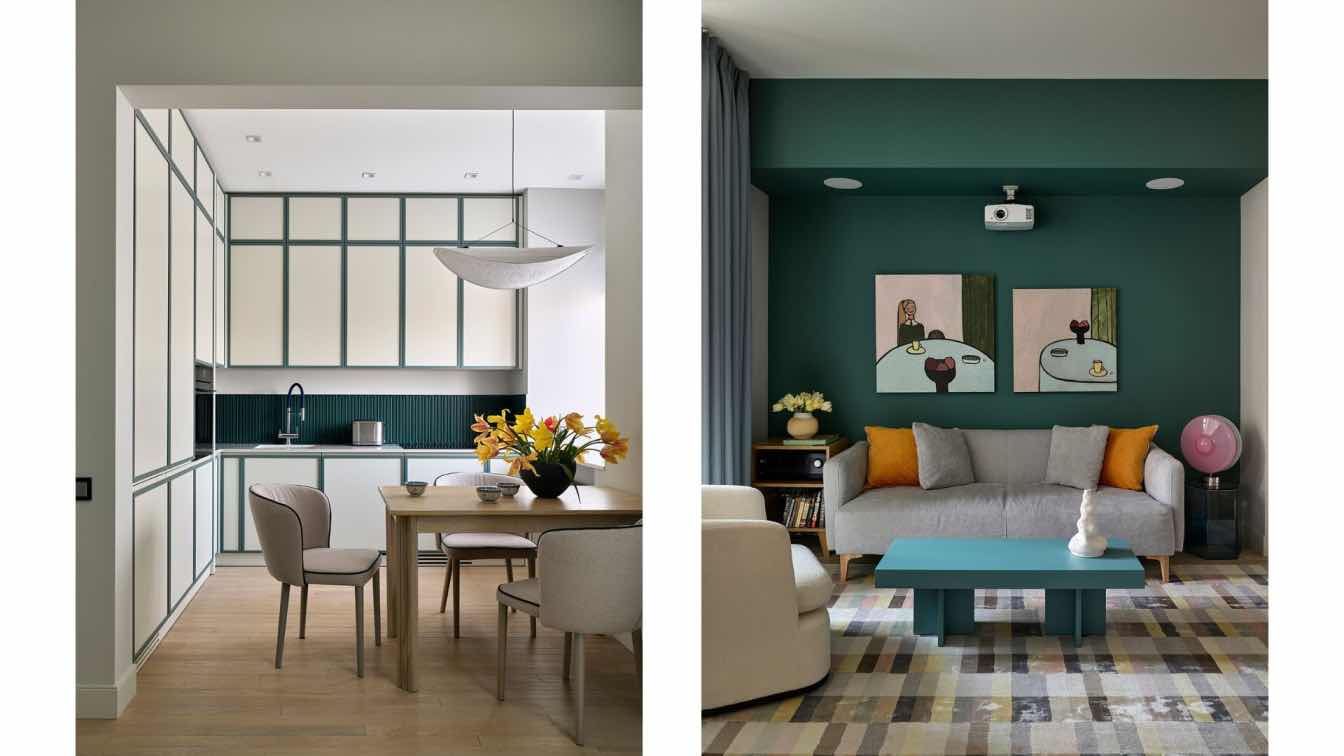
The color palette was a delicate balance between the client's initial desire for lightness and the final inclusion of bold contrasts like a striking black guest bathroom and a sophisticated gray office. The choice of hues, particularly the living room's 'creamy cream', was a meticulous process, ensuring the colors remained vibrant yet soothing in the evening ambiance.
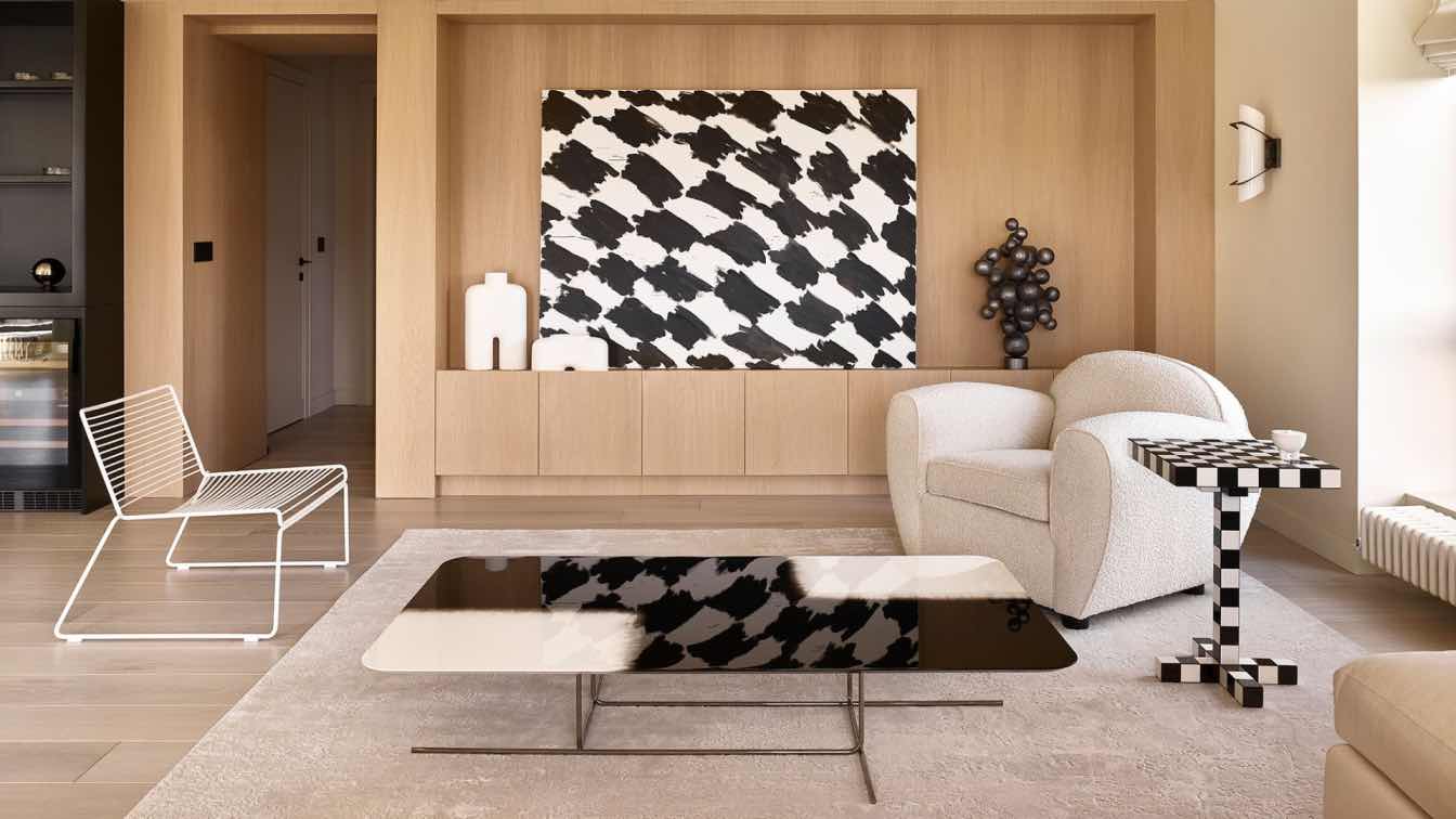
Furnishings and decor were meticulously curated, with the client's sole request being a comfortable Poliform sofa. This was complemented by a cloud-like armchair in bouclé fabric and a sleek, contrasting Hay armchair. The dining area featured a Desalto table, initially met with hesitation but now a cherished piece, harmonizing beautifully with Verner Panton chairs that echoed the spiral staircase's form.
The centerpiece of the interior was Eric Musin's dynamic light installation, a tableau of shifting hues that transformed the master bedroom's ambiance. Ivan Glazkov's painting in the living room, along with expressive art and sculptural elements throughout the space, underscored the apartment's artistic ethos.
This project, with its emphasis on simplicity, was a journey of discovery for Olimpiada Arefieva, allowing her to venture beyond her usual realm of richly decorated interiors. "This experience reaffirmed my belief in the power of expressiveness in design, where stylistic nuances can be explored through a diverse array of techniques," she reflects, encapsulating the essence of this transformative project.


