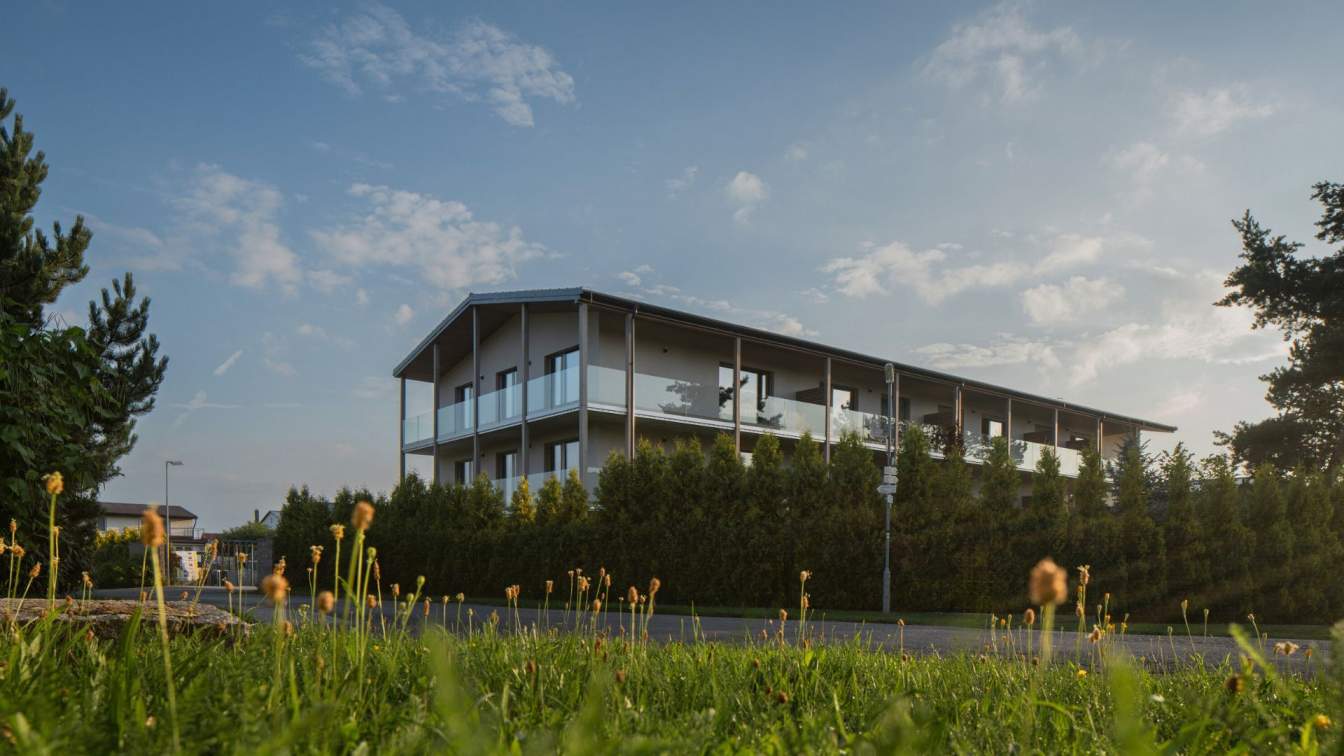
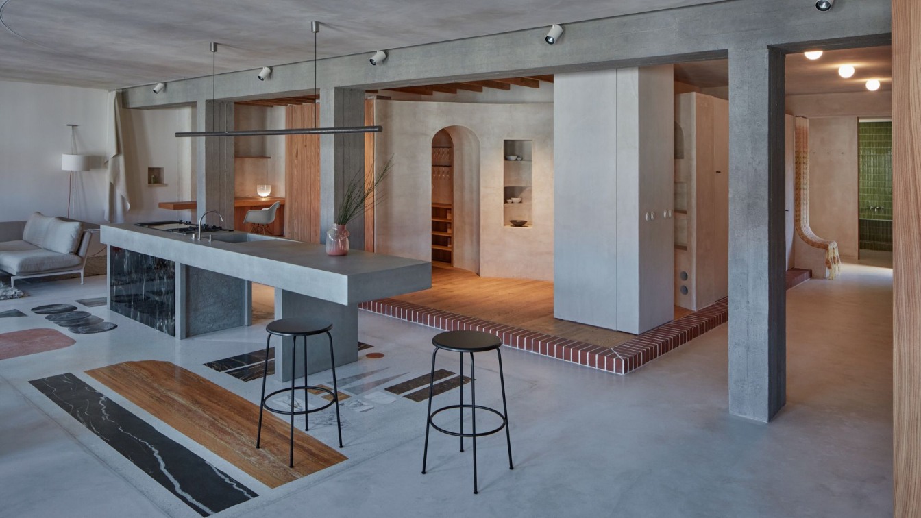
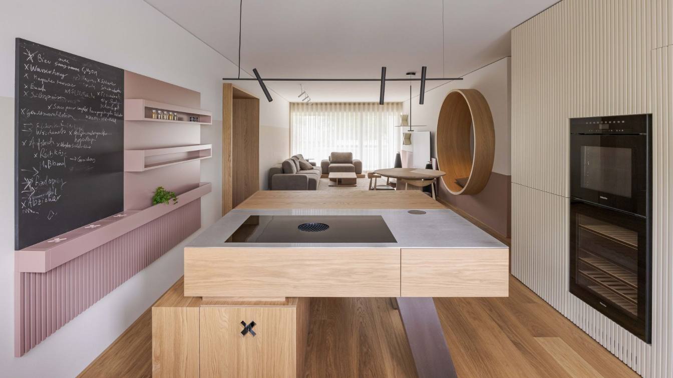
Welcome to the Ramat HaSharon penthouse of a couple in their 40s, with two growing children, designed by Tzvia Kazayoff, who skillfully blurred the boundaries between interior and exterior, subtly integrating the family's love for the sea while creating a vivid palette that precisely defines each function within the space. Here's how it looks from the inside. We all strive to return daily to a living environment tailored precisely to our needs, as well as our passions and hobbies. This is also the case for the tech professional and the couple's caregiver—both in their 40s, with two growing children.
They acquired a spacious contractor's apartment in the heart of the city and turned to interior designer Tzvia Kazayoff, who transformed it into a sophisticated, precise, and experiential space. "I've been involved with this penthouse for about 5 years, from the moment they purchased it. Since we started planning before its construction, we were able to make structural changes," Kazayoff recounts. "For example, we canceled a planned adolescent unit at the entrance and significantly expanded the kitchen. Adjusting the proportions of the original bedrooms allowed us to create a spacious master bedroom, children's sleeping suites, and guest facilities near the public wing.
Upon receiving Form 4, we converted the open balcony adjacent to the kitchen into a spacious dining area and lounge, enclosed it with glass walls, and installed a retractable skylight that can separate this unique corner from the interior of the house, as needed. This area is located behind the living room, allowing the fireplace to warm both areas simultaneously on cool days." "Within the master bedroom, we utilized part of the intimate balcony of the couple for a well-equipped closet room with sliding wardrobes—also enveloped by a retractable skylight that can be opened up at any moment. That's how it is when the family patriarch is a tech enthusiast—a dedicated lover of gadgets, innovations, all of which we integrated into every corner."

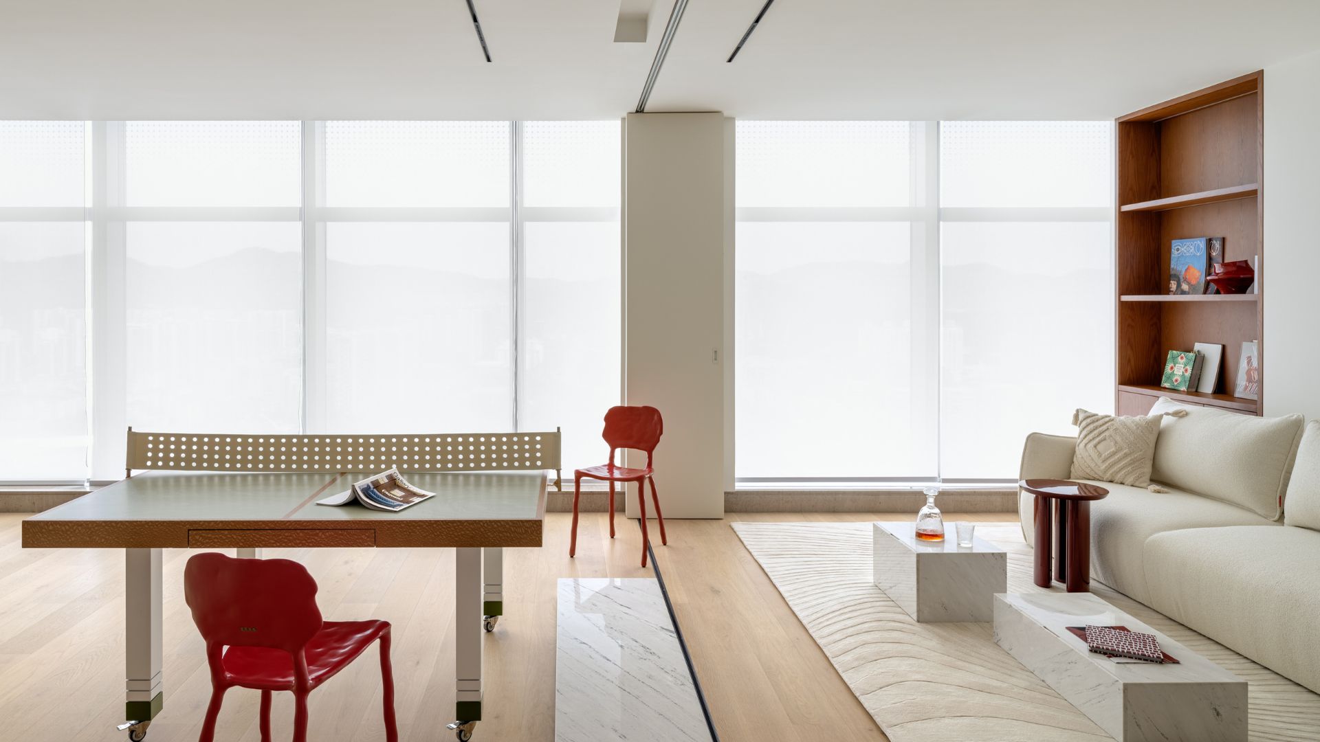
Indeed, it is evident that the flow in this apartment is both fantastic and unconventional: "We delved into and examined the various scenarios—from how the family operates on a day-to-day basis to times when they entertain guests. The spaces are highly versatile, suitable for any situation, and sync according to demand. We've created an optimal connection system between the hosting functions, allowing for an instant decision on where it would be more comfortable and appropriate to sit and entertain—whether on the large balcony, perhaps in the living room, or even in the dining and lounge area."
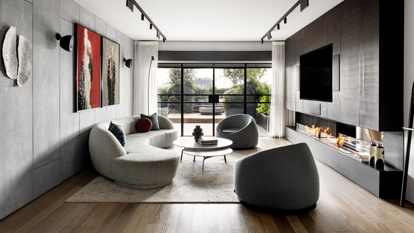
The airy fluidity is also reflected in the color schemes, which Kazayoff used as a central planning tool: "We defined different color schemes in each of the public functions, according to the nature of use and time of day. For example, the living room, primarily used by the family and guests in the evening, is dark, dramatic, and elegant, while the kitchen, where they concentrate from morning hours, is bright and illuminated. Overall, the resulting look resembles a slightly industrial American loft, and hence elements like the concrete ceiling, linear lighting fixtures, smoked oak plank flooring, and variable-sized tiles on the entrance wall—behind which concealed doors house electrical and communication cabinets."
The graded design begins in the living room, mainly used by the family in the evenings and designed in darker tones. In its center lies an amorphous sofa upholstered in French fabric and round armchairs. The aim of the rounded geometry is to soften the straight geometry, but there's an added dimension here: the family loves the sea, and the maritime wonder is reflected throughout the apartment in subtle ways," explains Kazayoff. "We chose not to go for obvious sea motifs and instead inserted distinct maritime elements in organic and amorphous forms with sandy hues that mimic the movement of the waves. The fireplace wall in the living room blends iron construction, black-stained veneer, and glass, serving as storage while housing a drinks bar.

The guest amenities, designed as an extension of the living room, also sport a dramatic style. The walls are clad in a geometric mosaic of blue and gray, and in the intimate space, a concrete sink stands atop a sink stand crafted with shelves for displaying candles, magazines, etc. "The iron and black-stained veneer present in the living room are also the materials from which we created the library that stands against the wall leading to the kitchen, designed in much lighter tones," says Kazayoff. "Despite its darkness, it's light and airy, serving as a connecting element between the spaces: a sort of pause between the current drama in the dark living room and the open, bright, and airy kitchen."
The kitchen cabinet fronts were cut and painted in a light gray shade. Two asymmetrical surfaces were integrated into the tall wall, with reflective glass panels and internal lighting, where serving dishes and food are stored. Above the island hangs an iron construction that serves as a decorative installation for displaying elegant utensils: "This element, made of Belgian profile, anchors the island in the space and stands out prominently against the light background. It acts as a connecting axis between the kitchen and the dining and lounge areas through the adjoining terrace enclosed by dark Belgian profile. For this area, we created a transparent, retractable, and foldable canopy ceiling, which can be closed to turn the open terrace into an internal room usable in any weather.
We placed a large round dining table there, perfect for family meals, and next to it, a deep and comfortable L-shaped sofa for relaxing during or after meals." The main terrace, accessible from the living room, is spacious, dramatic, and has it all: "Spanning an area of no less than 75 square meters, it includes an especially large dining area under a pergola that can be opened and closed, along with a green wall housing a large TV screen. The outdoor kitchen, also in green, includes all the necessary functions and indulgences: a fridge and ice-maker, a sink, and a B.B.Q. unit. At the center of the lounge area stands a fire table, and through the lush vegetation that envelops the terrace, evening lighting illuminates the entire area."

The fact that one of the originally planned bedrooms was canceled allowed for spacious suites for the son and daughter, each including a sleeping area with a large wall-to-wall wardrobe and an ensuite bathroom, separated by a glass wall surrounded by Belgian profile: "Since the children's suites are not very large, the bedrooms and bathrooms were designed as one unit in the same calm color palette, making the bathroom area a direct continuation of the room, and if the door is left open, it creates a homogeneous and intense space.
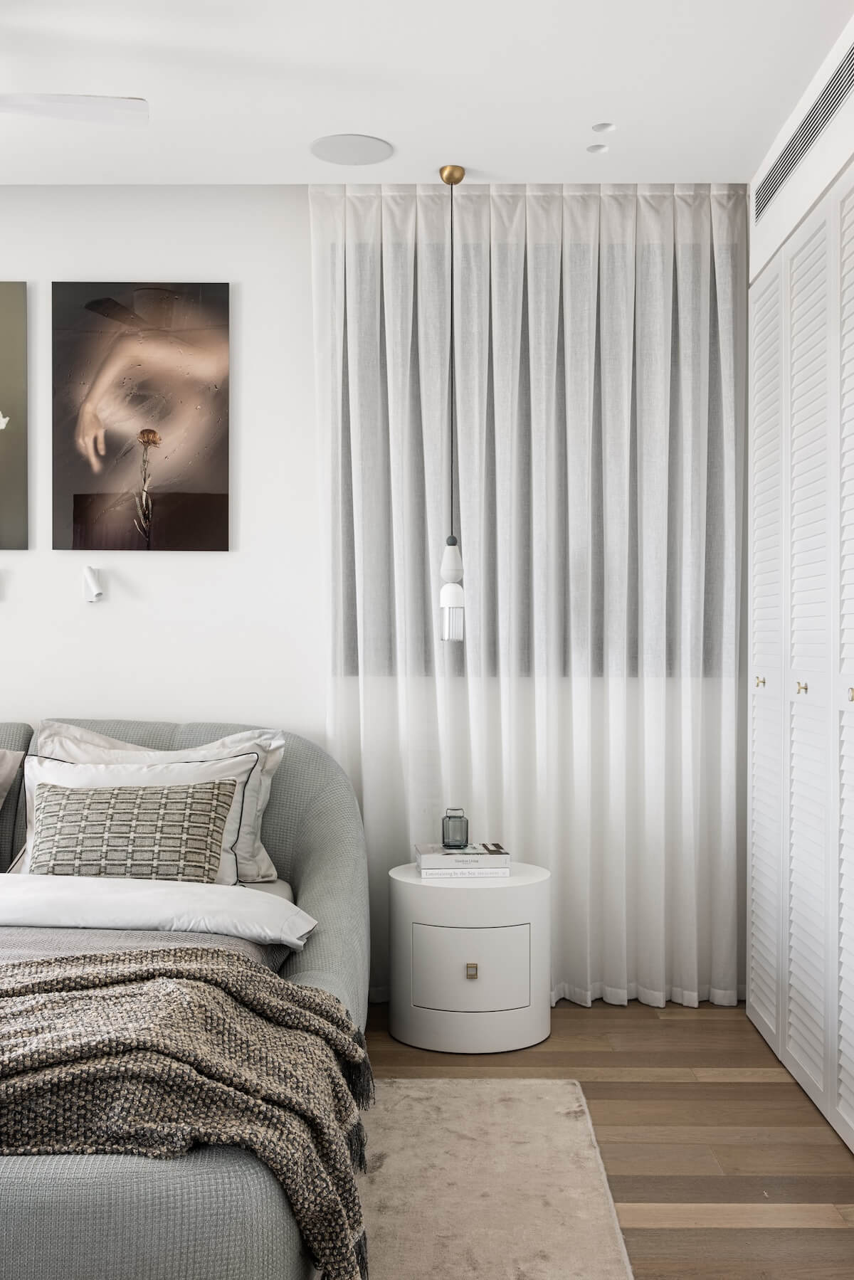
The color scheme chosen for the son's room is bold and intense against the backdrop of gray tones, while for the daughter's room, we opted for softer shades. The standout feature in her bathroom is the specially designed tiles with delicate relief resembling paper cuts. The ambient lighting installed in the rear part of the circular mirror above the sink creates an atmosphere throughout the space, including the bedroom." Thanks to the new layout and a different approach to the master parents' functions, it has become much more spacious. Now, between the sleeping area and the bathroom, a tall wardrobe axis separates them, with two fluttering fronts, two of which serve as the entrance door to the bathroom.
"We integrated the maritime presence here as well and amplified it," explains Kazayoff. "In the center of the master bedroom, painted in a light sandy hue, stands a round bed in a shade of deep blue – a representation of the sea. The freestanding wardrobe dividing the functions is light, airy, and metallic, reminiscent of the open design prevalent in the Mediterranean basin countries – one can imagine the sea breeze passing through. The master bedroom's terrace section turned into a wardrobe room defined by a ceiling and glass walls, which can be opened at any time. The wardrobes are on wheels, allowing their positions to be changed as needed."


