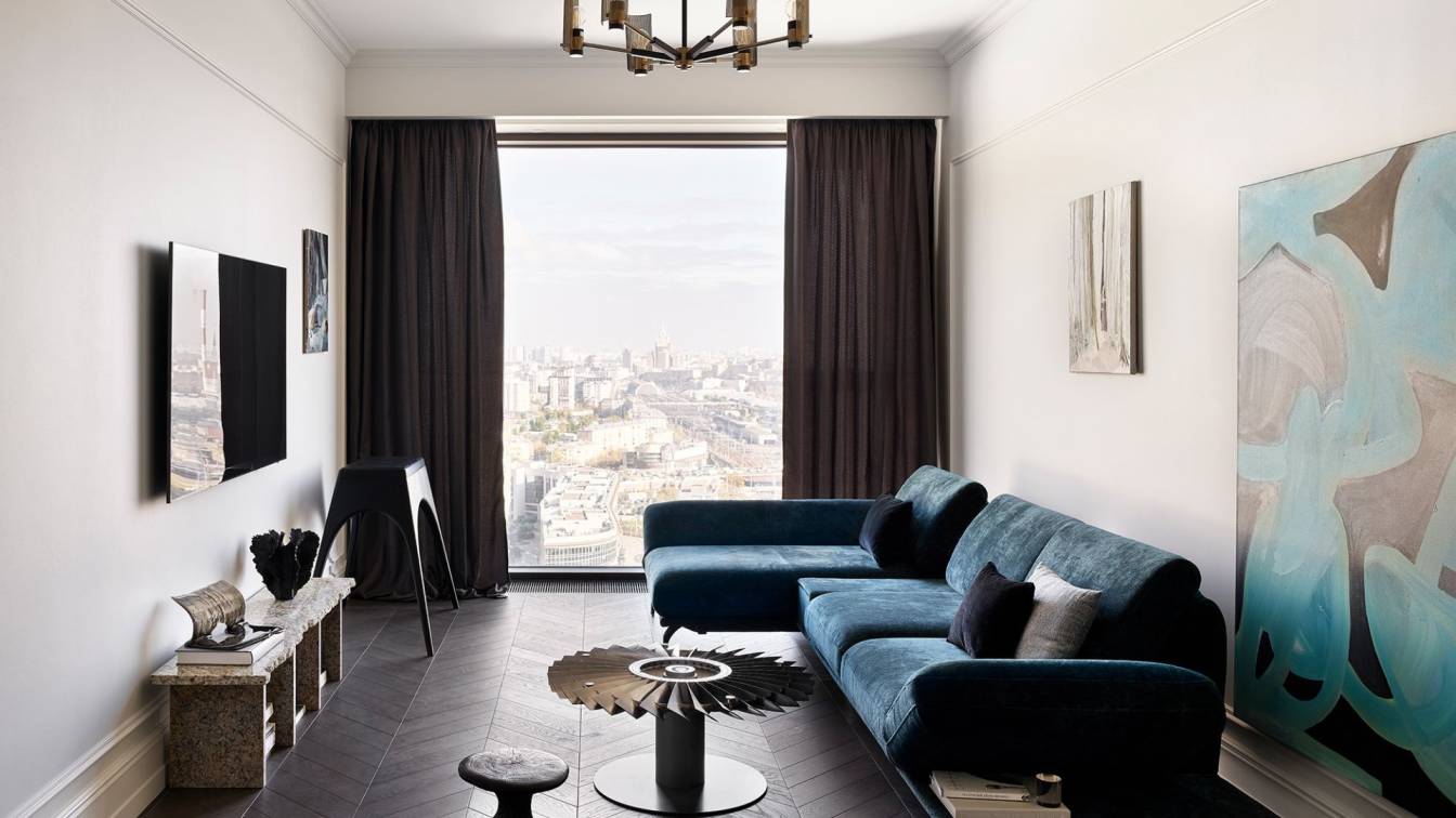
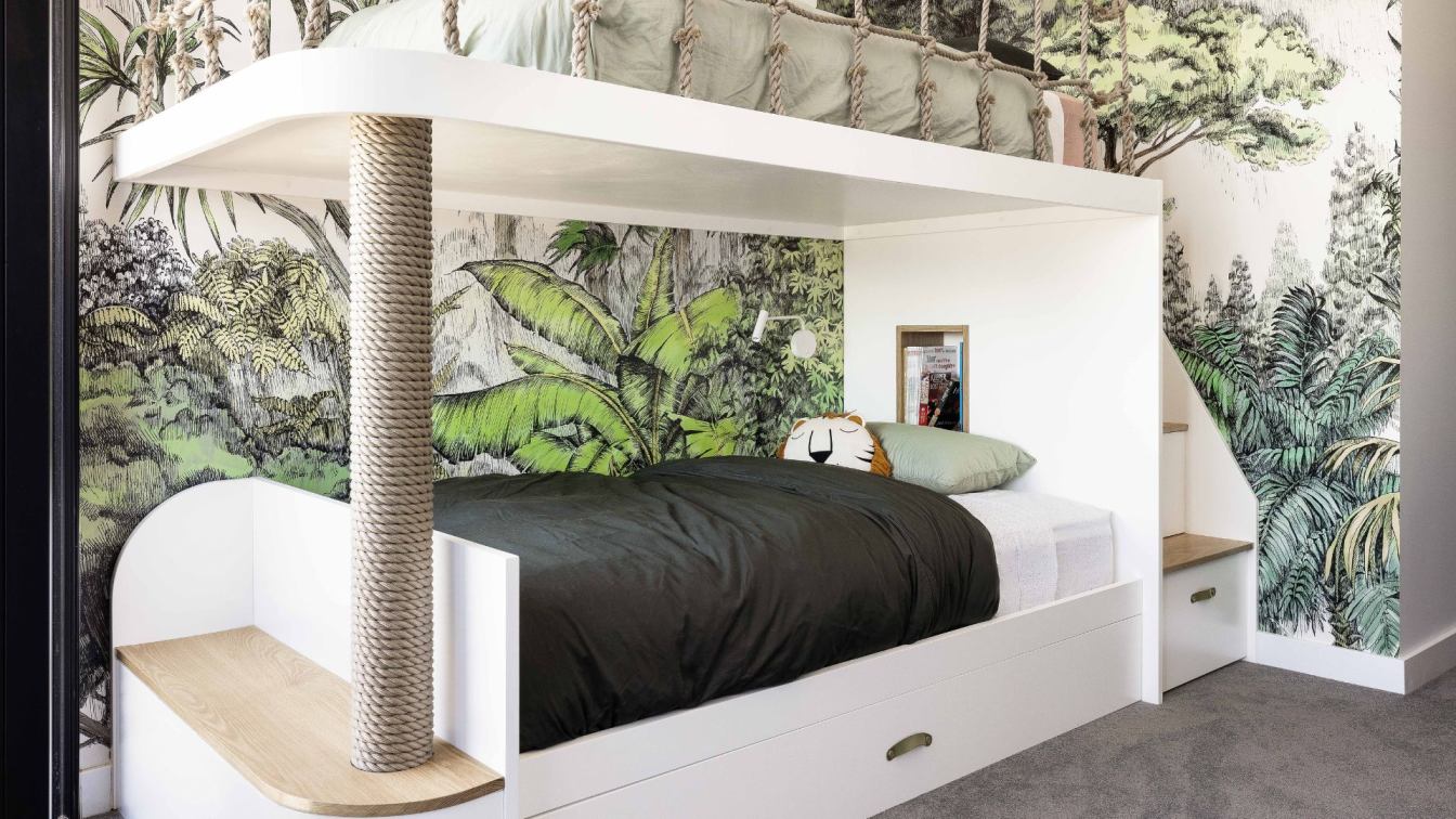
Skarlakidis Architecture Studio: The project is the result of a radical design of a 120 -square meter new constructed apartment. The owners required the "atmosphere" of the apartment and its transformation into a modern space that exudes aesthetic calm and tranquility, expresses their personality and covers their way of life and their needs.
For the reasons above, clean-minimal lines along with natural materials were chosen, and the absence of any sophisticated architectural form was preferred. The combination of all these gave birth to a simple and intimate composition, shaping a cozy space, a neutral and discreet setting, that gives the ability to the owners to express themselves while living in it. A modern "pot" of life.
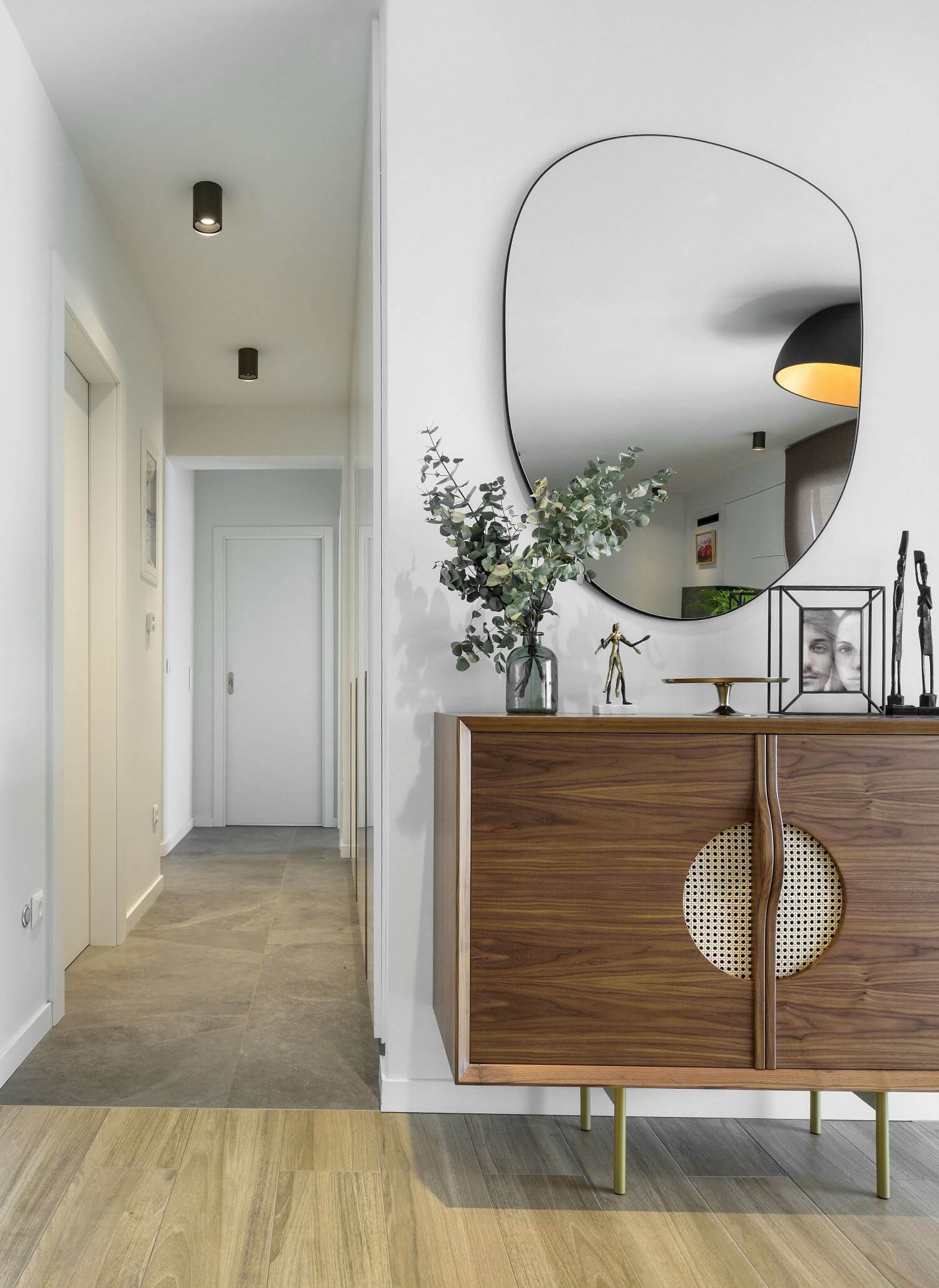
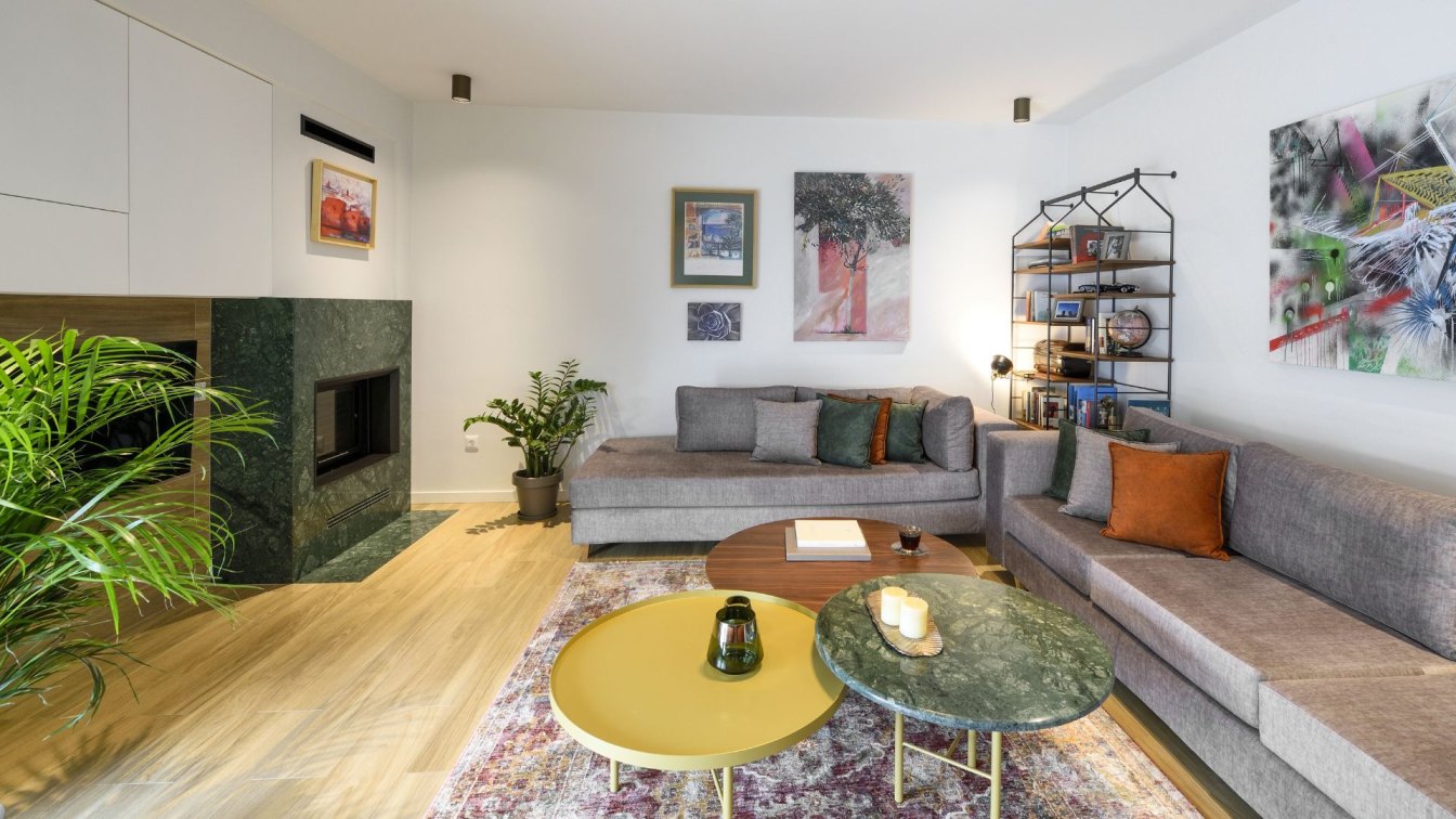
The architect in charge for the design, supervision and construction phase, took the decision without sacrificing the functionality for the good of aesthetics, to put together a group of comfortable spaces for the daily needs of the family. In the common areas, the main concept was to remove the internal separations and create an articulated room. The materials and textures have strictly natural vocabulary. In this logic of spatial unification, the whole room is covered with tiles that exudes the glamor of the wooden floor in a natural shade of walnut was chosen to cover the entire floor of the living room and to be combined with the tile in a grey shade and texture of natural stone for the corridor and the area of the kitchen. The walls were painted a soft and warm shade of grey.
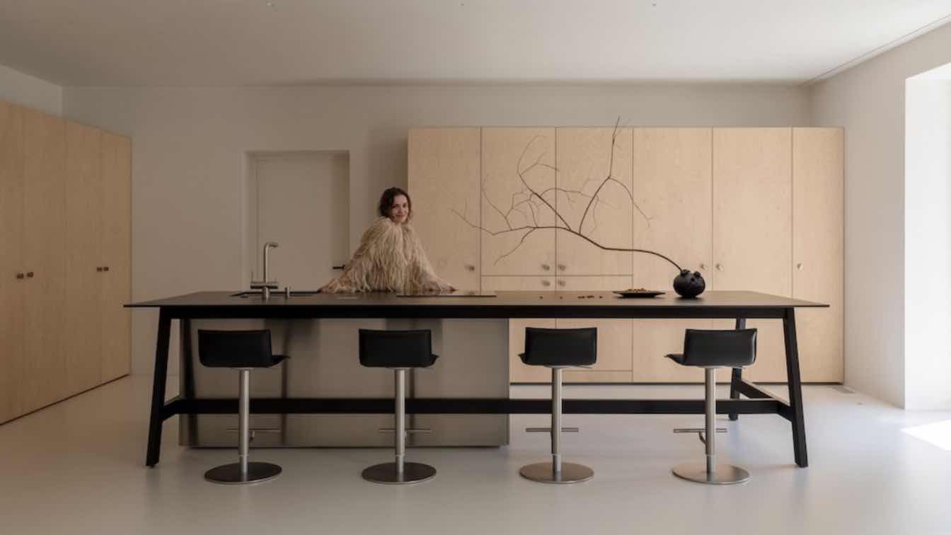
In contrast to this neutral coloring that covers all the common areas of the residence, the metallic elements of the space such as the kitchen, the fireplace profile and the lighting fixtures, are charcoal gray. This contrast creates an interesting dialectical relationship that gives an ascetic luxury to the space, while it is intensified even more with the solid wooden tables and shelves.
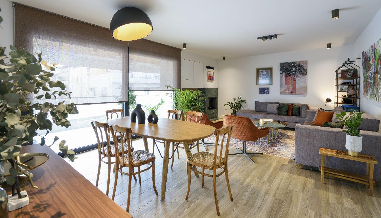
The dining room was designed to harmoniously combine reclaimed Viennese (authentic antique thonet) chairs with a contemporary ellipse-shaped table. The space is crowned by a dominant ceiling light that combines the warmth of wood surrounded by an elegant metal shell. The composition is completed by the walnut sideboard with its specially designed details such as the circular straw tray in its appearance being a connecting link with the chairs.
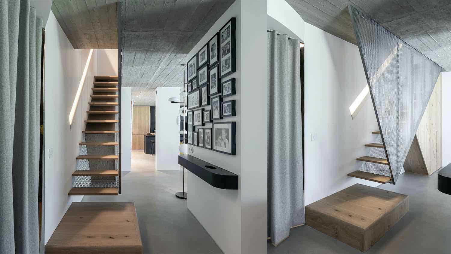
In the bathroom, a tile with a matt texture and a pressed style feel was chosen for the walls, and wood-type tiles in a natural walnut shade were chosen for the floor. A toy that directs the eye and selectively emphasizes geometries and points. In contrast to the tonal scale play from white to black, the benches are made of oak, giving a more natural and intimate aura to the space.
Finally, something that needs to be mentioned is that the renovations is a quite interesting sector because is a demanding area where the architect needs to test the limits of his skills. The “renaissance” of existing areas, by doing small or big changes makes the whole building able to host the needs of the contemporary way of life.


