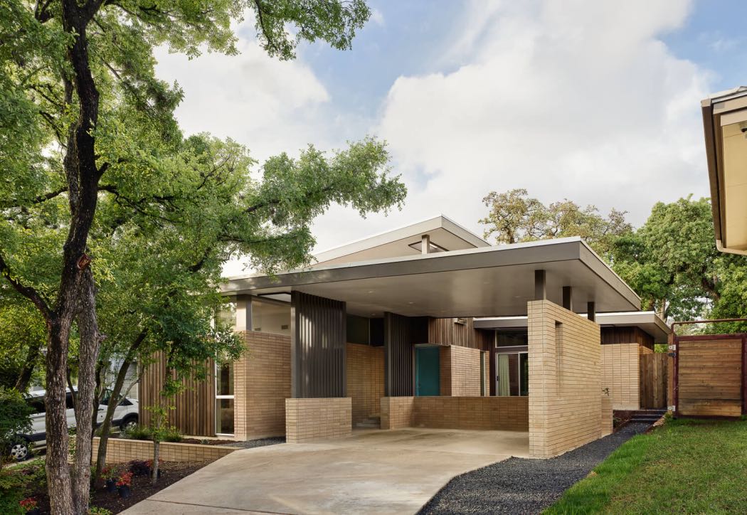
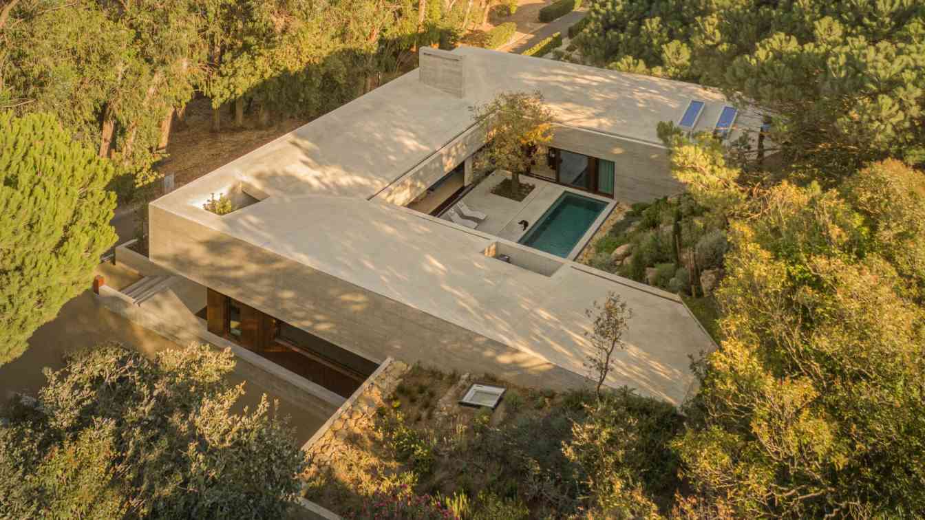
This stunning new build in Austin, Texas is a study in Midcentury Architecture and Designed by Mark Odom Studio.
The Inglewood Courtyard Residence a 2,400 square foot light-filled home was designed around an entry sequence and circulation pathway that focuses on the courtyard and natural light. The existing trees were an integral element in the design of the home, both in terms of site preservation and heightening the relationship between the interior and exterior.
 image © Casey Dunn
The homeowner (also the civil engineer on the project) has a deep appreciation for mid-century architecture and expressed wanting all the elements you would find in a quintessential MC home. Vertical windows set into the masonry walls, views into lush and inviting courtyards, exterior materials used on the interior, indoor planters, slatted screen walls, and of course terrazzo floors – which was a tremendous team building experience, as 1800 pounds of various colored glass was hand spread into the three-tiered foundation as the concrete was setting up. The finished floor Is truly a-one-of-a-kind finish that won't be duplicated.
 image © Casey Dunn
An abundance of floor to ceiling windows lines each space. Terraced zones are created internally that help strengthen the interior programming as well as maintain visual perspective. A continuous brick wall acts as a circulation spine and moves through the center showcasing the north-south axis of the house and connects each space. “The intended experience is to feel continuously connected with nature while moving through the house,” says Mark Odom, Mark Odom Studio. “The design inspiration was based on the “courtyard house,” centered around the existing trees as well as making sure natural light spilled into all interior spaces.”
 image © Casey Dunn
The size of the house is subtle, staying sensitive to its residential location and choices to preserve the site’s natural resources. Sustainable building methods and materials were used throughout. Builder Doug Cameron of ESS, cited the most challenging aspect of this light-filled house was “combining clean aesthetics with structural strength and energy efficiency.”
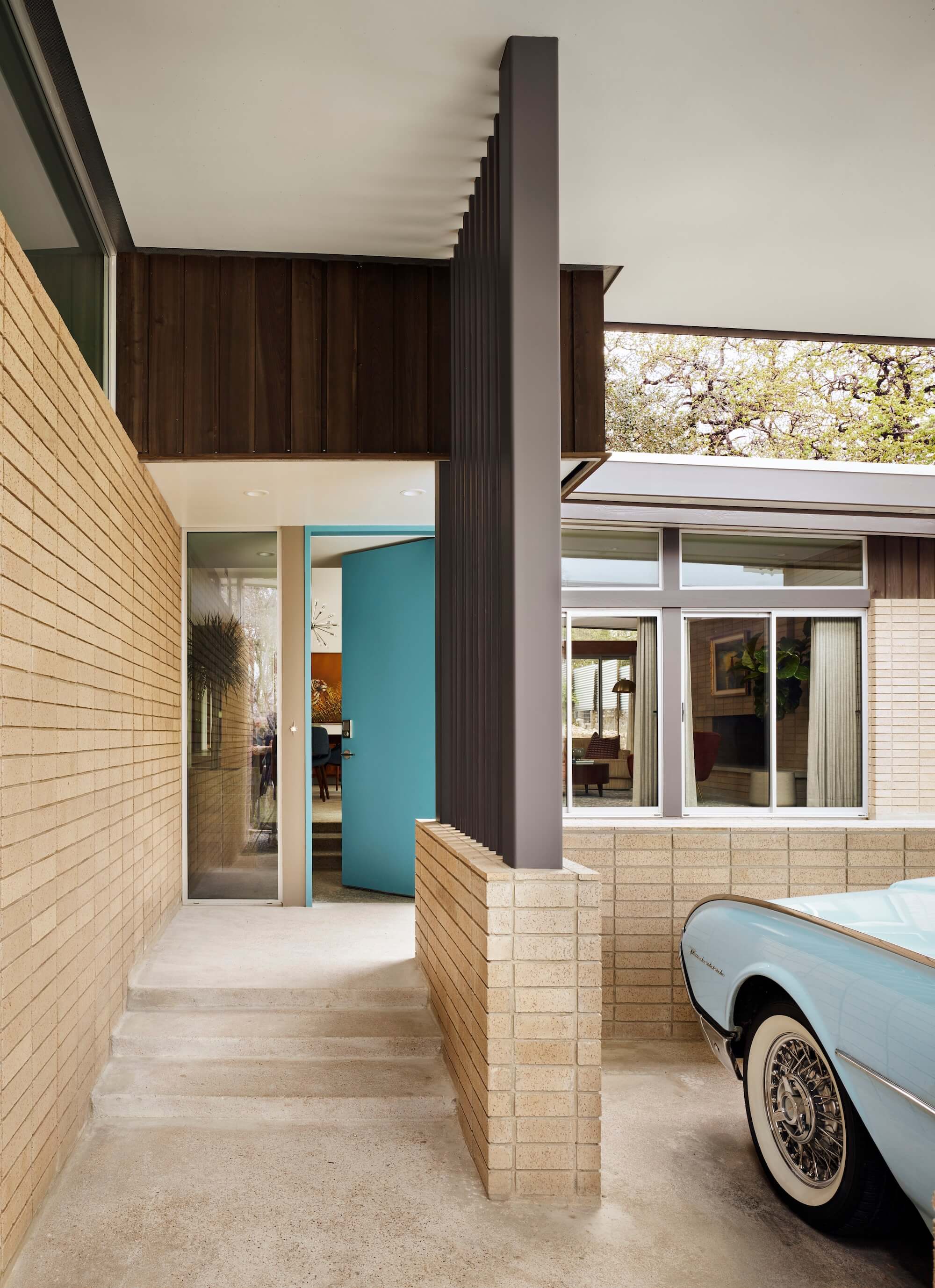 image © Casey Dunn
Other fun details and highlights:
The turquoise color of the front door was inspired by the client’s appreciation of a vintage El Camino in the classic blue/aqua of the era.
The build incorporated repurposed wooden bookshelves into the master corridor that originally came from our client's father's class room, a former Texas school teacher responsible for much of our present-day public-school math curriculum.
The low-pitched roofs are covered with a pebbled ballast, a feature of 1950’s homes.
 image © Casey Dunn
 image © Casey Dunn
 image © Casey Dunn
 image © Casey Dunn
 image © Casey Dunn
 image © Casey Dunn
 image © Casey Dunn
 image © Casey Dunn
 image © Casey Dunn
 image © Tobin Davies
 image © Tobin Davies
 image © Tobin Davies


Connect with the Mark Odom Studio

