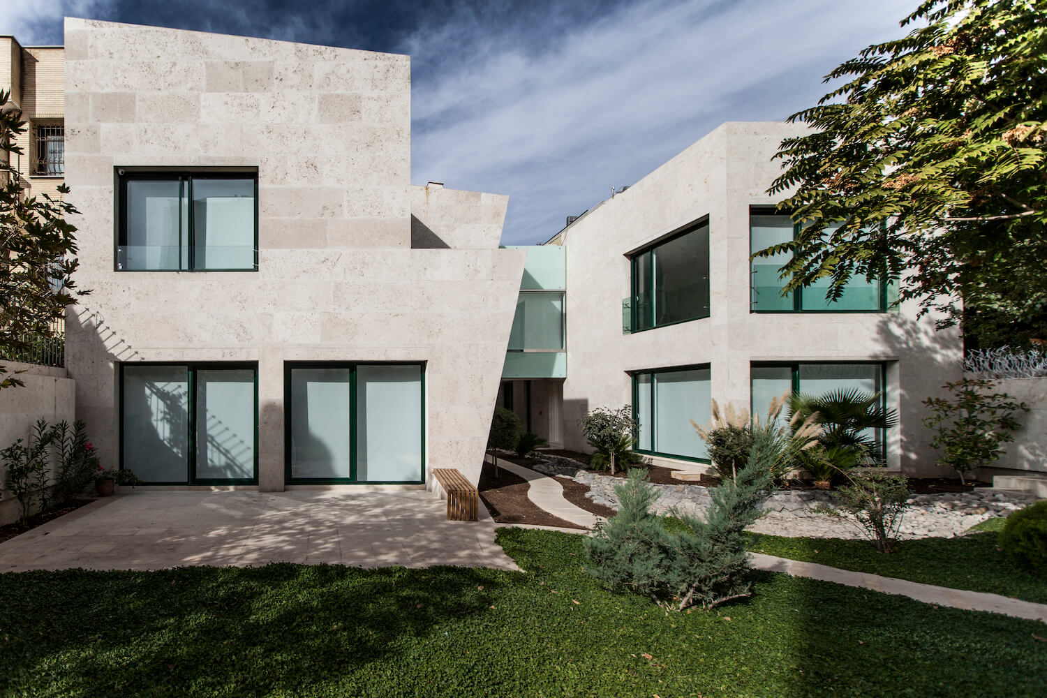
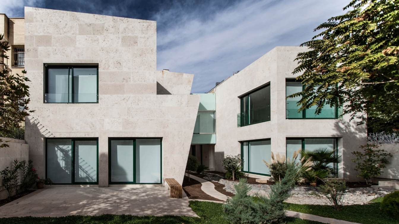
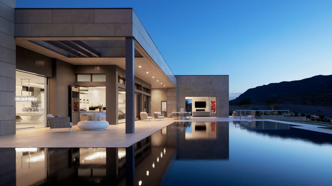
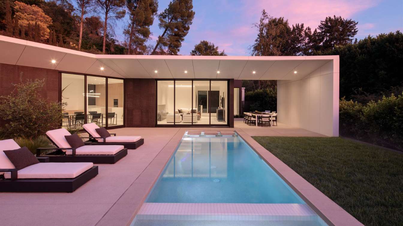
House of Design: This building is located in a property measuring, 50 by 20 Square/m between a main alley and a dead end on Nazar e Gharbi St. with access from both sides. The architectural design is done by engineer Iraj Kalantari (Bavand Architectural Office).
According to the view point of the employer and engineer Iraj Kalantari, the interior architecture, as well as the construction architecture, is a specialized job and must be accomplished professionally, away from personal taste. As a result, the interior design was entrusted to Iman Aminlari’s architectural office.
 image © Farshid Nasrabadi
Each project is designed based on the client’s special taste style and the regional and environmental peculiarities. As applied in this project based on minimal life style and the definition of the client as “a secure and normal home” The “minimal space” was inspiring as the planning. White color was adopted as the architectural and dominant symbol for most spaces to be a ground for window frames that could be compared to variable four season paintings, inviting nature to the inner space.
The idea then became a reason to create one of the most outstanding specialties of this project as the “consistency and harmony of the (exterior and interior) outer and inner parts”. Having a white color background makes it possible to define the presence of the people and even the type of their dress code. We used this idea in office room as well. White frames with glass shelves, to create the sense of suspension and there is the color of books which enlivens and defines the atmosphere.
 image © Farshid Nasrabadi
This idea can also provide an environmental diversity along with the light and color change, thus creates spaces with colorful themes. Along with this idea, the floor coverage was done as a monolithic piece made of white wood material, while being in conformity and harmony with the whole environment, it also creates a rather warm atmosphere due to the use of wood. Doors in this project, have followed the “minimal architectural” idea.
By providing a horizontal groove in the door’s lower half by designer, a beam of light was created in front of the door, proving the presence of people. Even in the service rooms, shiny and dark materials are used to separate space rather than using different colors. Another challenge in this process was natural light, the architect could provide it through creating void spaces between two main volumes. This could as well provide a means to make bigger windows, thus, enhancing more view space.
 image © Farshid Nasrabadi
The interior architecture was as well inspired by this idea to the extent that the lower sports spaces were connected to the bright and shiny courtyard walls from both sides. Mirrors were used as the third dimension, so one can find and feel himself in outer green atmosphere. The type of interior lighting system is of an indirect light and without using visible light sources. The designer has also tried to use natural light as much as possible, as an example, to provide light for the lower corridor, the ceiling edge is spaced from the main wall so that, the light penetrates in from the ceiling openings.
In lighting system, efforts have been made for the spaces to be seen as “suspended”. Also a special light technique is used for connecting walls to ceilings and floors rather than using tools or cornice. Another turning point in interior environment is the black color island in the middle of kitchen, used as, work desk as well as an element to balance and harmonize the designed spaces. And ultimately, objects like, an old chandelier or an old chair belonging to the client in the past are added to create a memorable and nostalgic feeling.


