Detailed Summary
Neil Dusheiko Architects: The project is a total internal remodelling and new rear extension to a Victorian end terrace house in the Bradmore Conservation Area. Our clients brief was to provide new, naturally lit living spaces for their young family, with a study space for them to work at home occasionally. They also wanted the house to better connect with their garden, which was completely unused and filled with hard concrete paving.
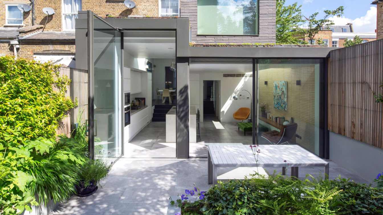
It was important, for planning reasons, to ensure that the new modern insertion was subservient to the host Victorian building. We solved this issue by positioning the new kitchen/living extension at a lower level, to sit below the existing side boundary wall. At the first floor, there is a clear definition between the old and new; a beautifully handcrafted Petersen brick with a contrasting colour and module size connecting the interior at ground level in yellow to the black textured brick of the study above.
The dark brick colour to the exterior of the first-floor study extension draws reference to the tone and richness of the existing weathered side elevation. The massing of the proposal centres around simple volumes, natural light and high quality, carefully crafted materials. These design decisions afford the new extension a different identity, allowing the Victorian terrace house to retain its original character and appearance.
The modern open kitchen/ living space is linked to the rear garden through a large stepped aluminium portal with large glazed openings bringing light in and creating a frameless threshold between inside and outside; linking house and garden together.

Use of materials / Interior Design
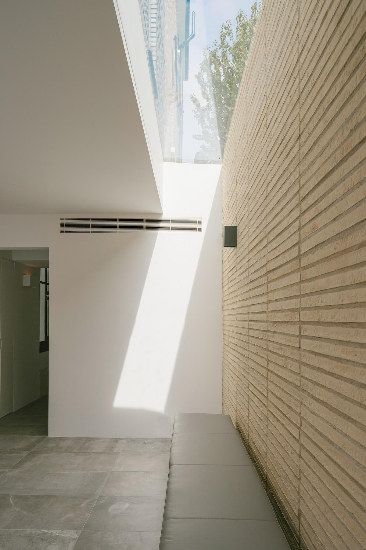
Our clients wanted their house to have a clean, modern aesthetic but also required the materials used to have a sense of craft and use handmade materials in contrast with more industrial elements. We achieved this using Petersen bricks, handmade in Denmark - each brick has the thumbprint of the person who made it and creates a warm textured surface inside. We also worked with White and Reid, who made the kitchen worktop and island insitu, pouring the liquid concrete into a mould built on site.
The handmade elongated brick is continued internally to the flank wall, in a stacked bond, drawing the eye up to a large skylight catching the morning light. We tried to bring natural light into the previously dark congested center of the plan, which was achieved through skylights and a glazed metal screen to illuminate the existing dark corridor.
Internally, we used a material palette of natural stone floor tiles, the Petersen brick, bespoke concrete worktop, richly textured black oak flooring, and sharp white walls give a contrast to the existing building. The paired back palette of materials used in the interior offers a sense of calm to the domestic space within the building. We used the same stone tiles inside and out, linking the kitchen to the new garden space.

Historic Intervention
The site’s prominent location, not only as an end-terrace house but also within a Conservation Area, meant that the composition and material treatment of the new extension would need to respond to its context and surrounding area.
Searching through old planning archives, we discovered that the site had planning permission for a garage building that was not built.
We discussed this issue with the Conservation Department, and an agreement was reached about the possible nature of the massing and materiality the next extension could have. It was We discussed this issue with the Conservation Department, and an agreement was reached about the possible nature of the massing and materiality the next extension could have. It was felt by all that a modern language would be most appropriate. Various mock-ups of materials were submitted to the Local Authority, and there was a preference to keep the facing material in brick but adjust the module and colour to have it read as a new building against the old terrace block.
The proportions of the served and servant spaces have an inherent split, which is evident within the scale of the larger entertaining and relaxing spaces compared to the bedrooms and hotel-style ensuite/utility spaces. It was important to us to retain the existing historical proportion of spaces and to ensure that the existing line of terraces maintained their integrity. Our new extension is read clearly as a new layer against the older building.
We also added a green sedum roof to the perimeter of the lower roofs to encourage bio-diversity and to give the upper rooms, particularly the study, a more pleasant outlook, linking the upper levels to the garden.




.jpg)