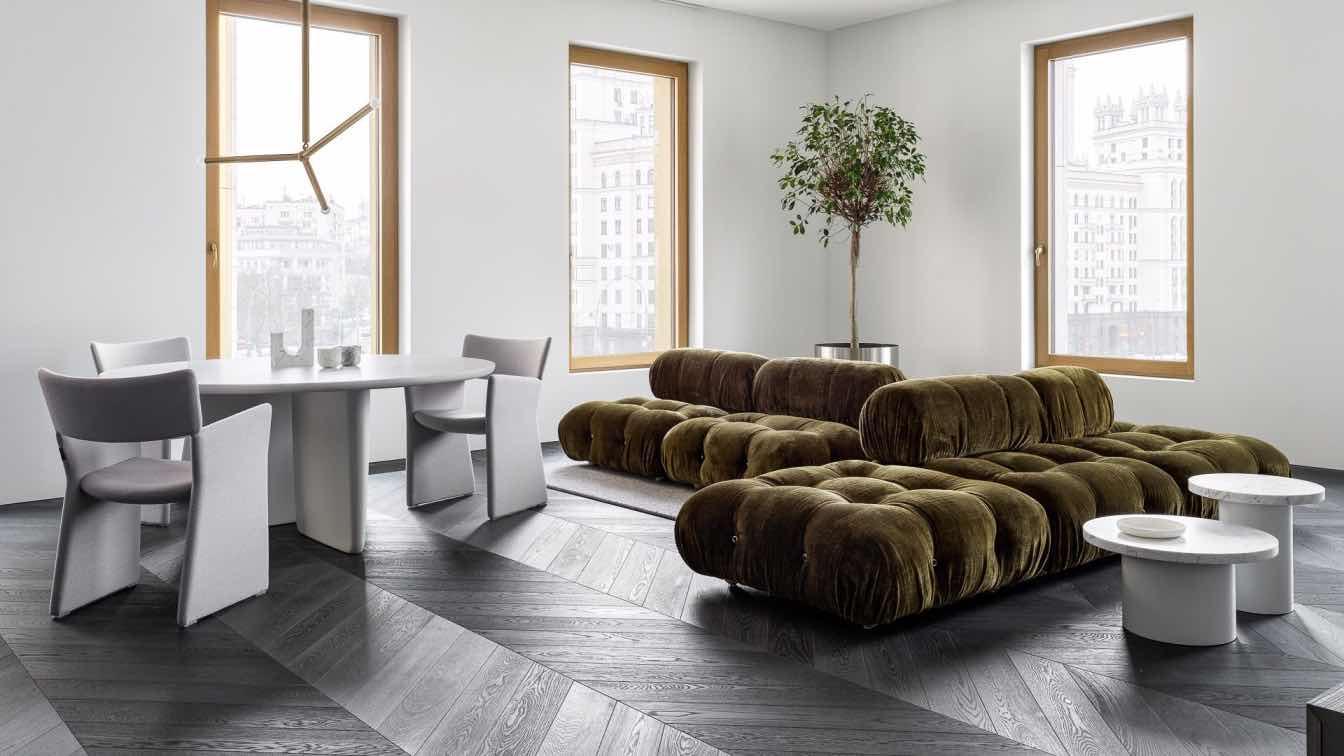
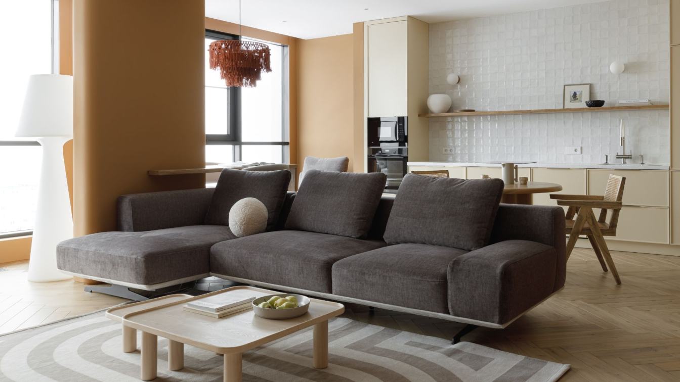
Babayants Architects: The location of the apartment is what the project’s story begins with. Here the location is especially attractive. The apartment with breathtaking views of the historical center of Moscow is in the Titul residential complex.
First of all, when starting work on a project, we pay attention to the space’s volume, light, number of windows, panoramic view, and architecture of the building itself. There were good initial data: location, correct apartment plan, and views on both sides.
Context And Project’s Features
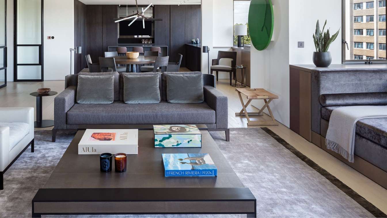
The Titul residential complex has a spectacular image. One of the main features is the unusual mixture of two façade finishings – brass and stone. We always take into account the context of the place and architecture, that’s why we as minimalists made a brave decision to incorporate quite bright brass into the interior. We used a complex mixture of cold and warm textures. This became one of the main leitmotifs of the project. Cold textures are a shade of veneer in furniture and flooring, which was customized and sought for several months, walls, and marble in bathrooms. Warm ones are brass elements in lamps and faucets, as well as the deep tone of upholstered furniture.
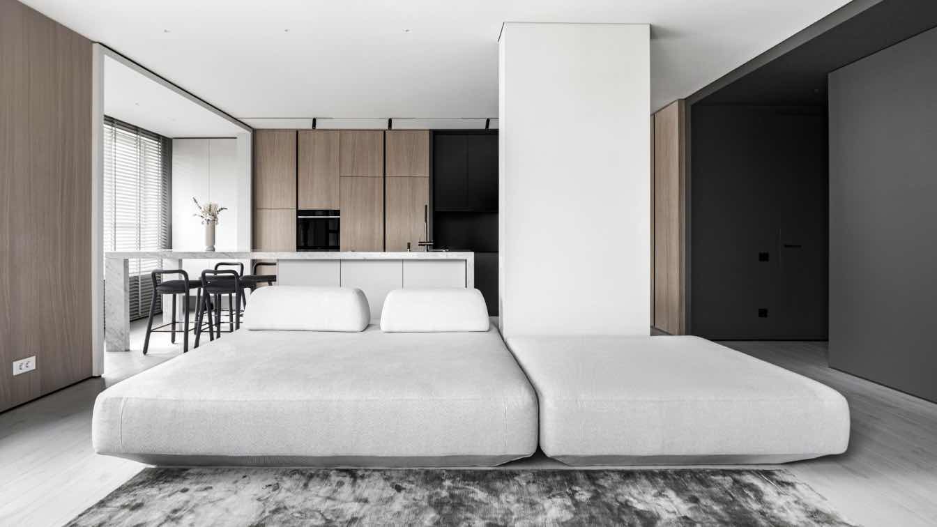
The second feature of the project is the panoramic views and natural light. There is a tinted-glassed insertion instead of the wall between the living room and the master zone. A transparent glass is in between the bathroom and the bedroom. This approach enriches the interior, making it multidimensional and complex. The living room overlooks the bedroom work desk area, adding layers to the space. It’s possible to see the dining area with a sculptural lamp and chairs from the bedroom. This gives an incredibly strong visual effect. There is also a glass insertion between the bedroom and bathroom: when one is taking the bathtub, he/she can see the downtown.
Clients’ Lifestyle And Desires
The interior is designed for a young couple who has a modern and dynamic lifestyle. They like clean functional shapes which are inherent to our projects. We tended to design a calm interior that fits the clients’ lifestyle in the center of Moscow.
One of the worth-mentioning desires of the clients is a free-standing bathtub. It’s placed on a marble podium near the window with the view overlooking the downtown.
The clients prefer nonstandard culinary forms; therefore we designed the kitchen based on their individual requirements. For example, there is an unusual teppanyaki hob, taken from traditional Japanese cuisine.
Another interesting story is linked with the kitchen: we literally fell in love with the Vola faucet, but the manufacturer does not have drinking taps, and other factories do not have exactly this type of finish. We found an unusual solution by placing two faucets side by side.
The clients wanted to see art in their home. Artist Dima Gorbunov created a work that immediately caught the eye upon entering the apartment, especially for the interior. Together with the artist, we selected the shade and size of the work, and he personally controlled its placement.
The key feature of this project is the use of only natural materials. Our clients value tactility and the pleasure of interacting with natural materials as we do. Personal sensations in space, not visual satiety, are important for them.
The protagonist of the bedroom is a desk made according to our sketches. The complex mix of wood and marble is the perfect combination of functionality and beauty. It is so expressive that we want to create a whole collection of objects based on it. The table is a wooden console fixed to the wall and a stone cabinet built into it.
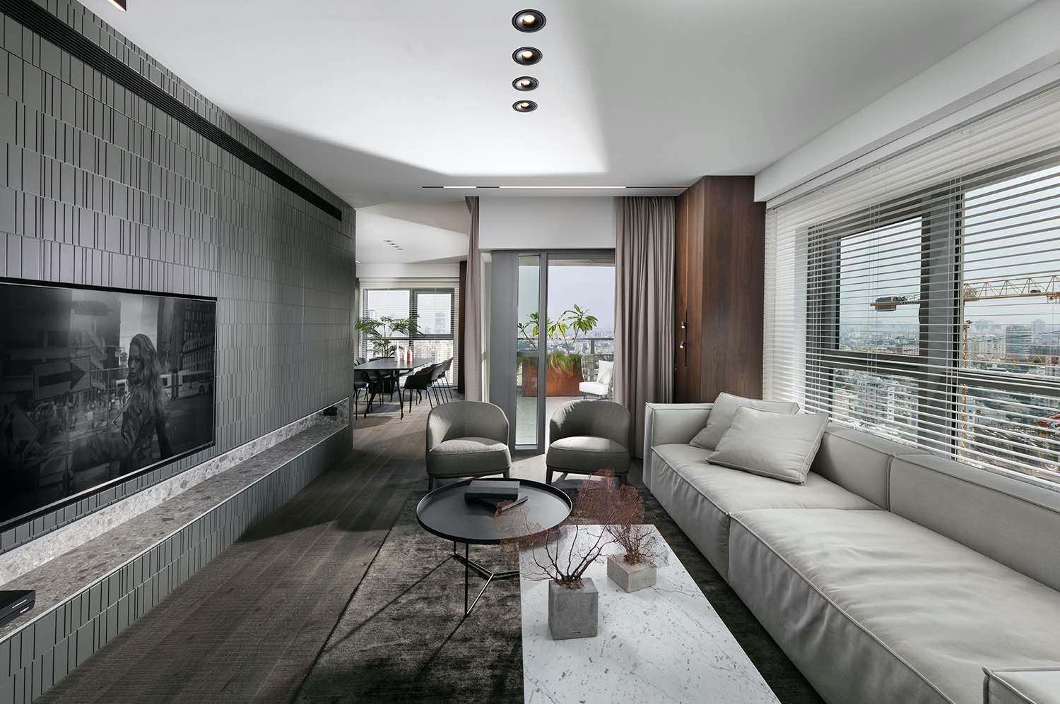
One of the secrets of a minimalist interior is to make all technical solutions invisible. For example, in this project, it is quite difficult to notice the roller blinds hidden in small niches in the living room. Another example of technical perfection is how a four-meter TV stand designed by Babayants Architects is suspended at a millimeter distance from the glass opening.
In this project, almost all solutions, and all pieces of furniture are created and designed according to made-to-measure from our team.


