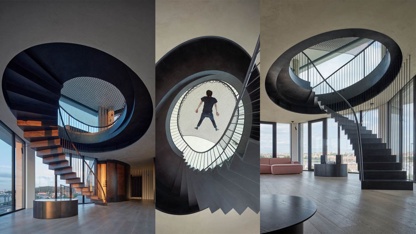
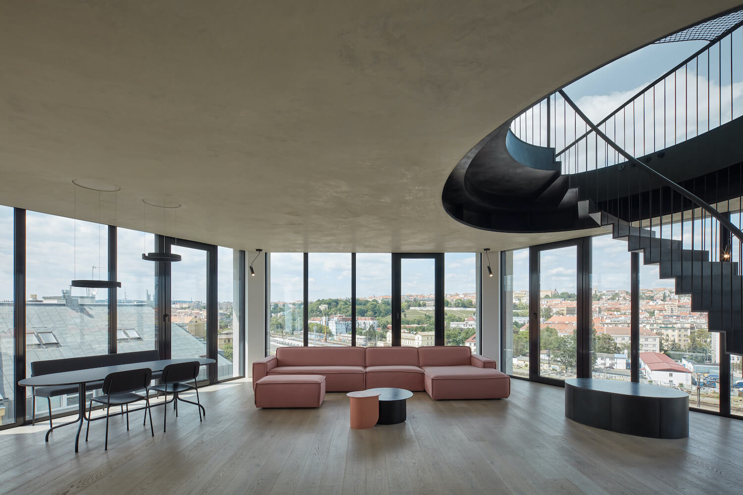
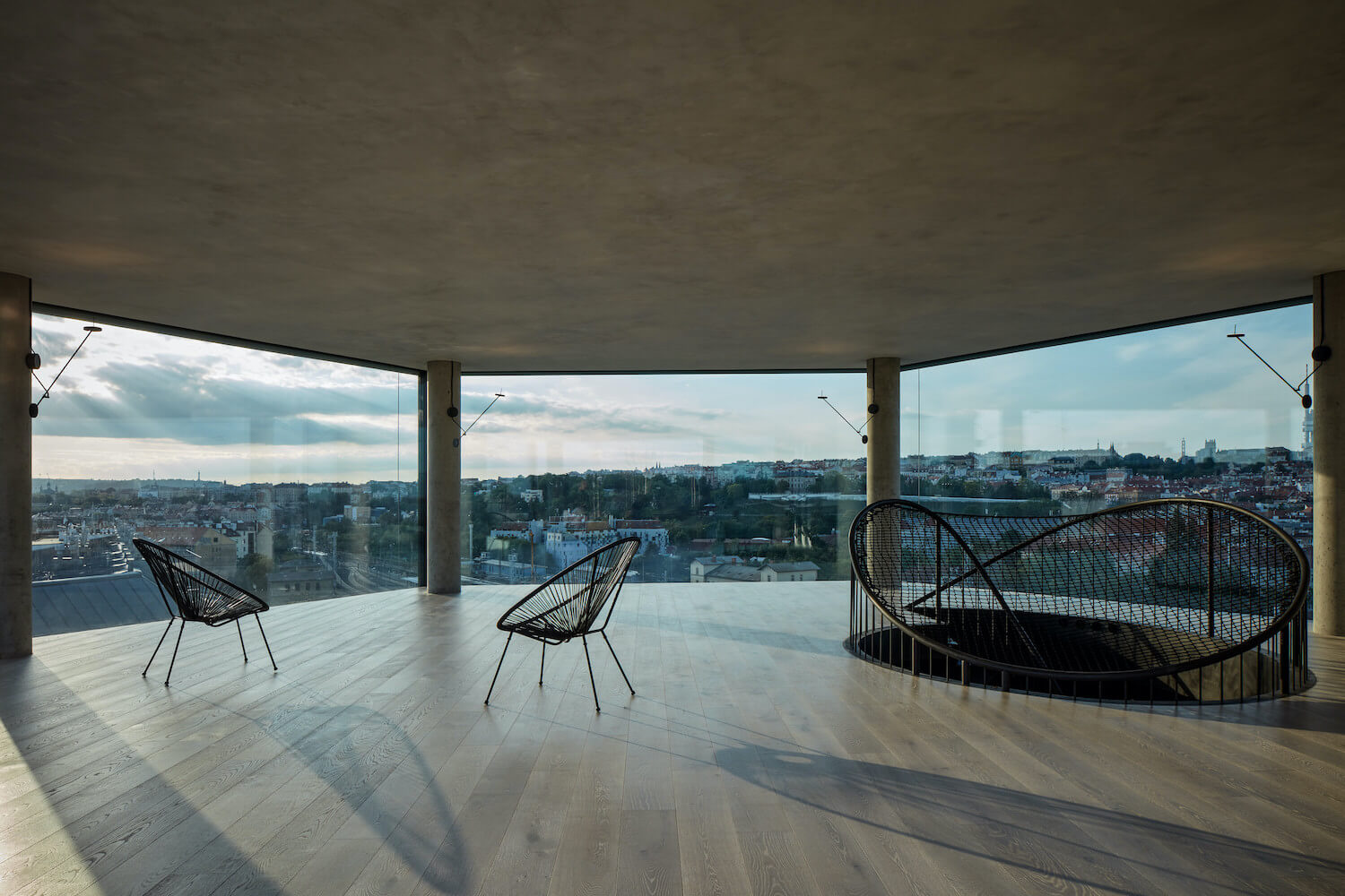
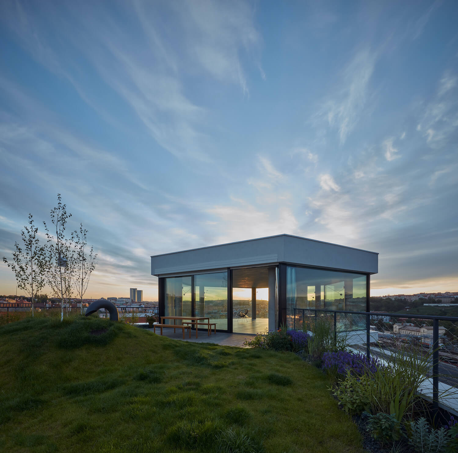
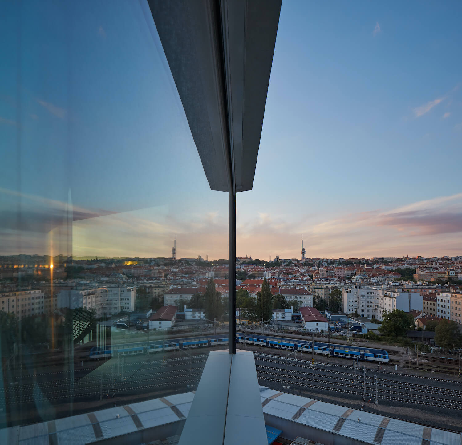
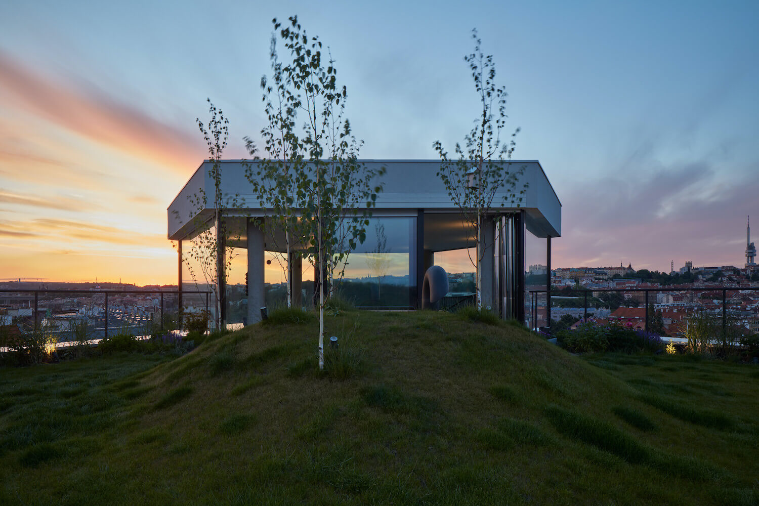
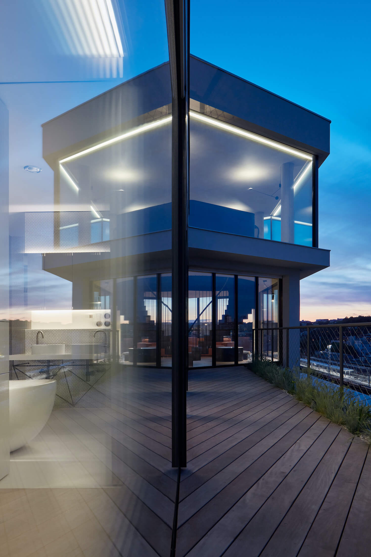
The site plan concept is based on the character and potential of the "site"; in this case, two roof-top floors in a corner house on the border of a built-up area that opens across the valley into the extensive context of distant views.
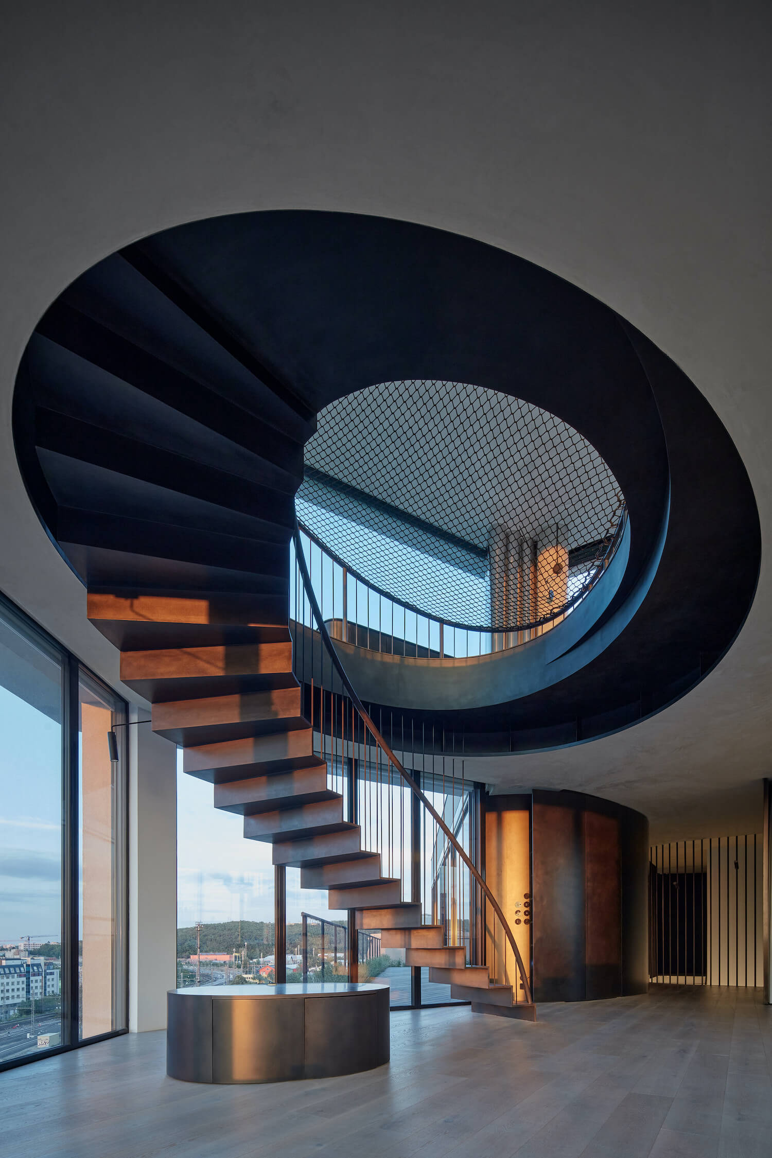
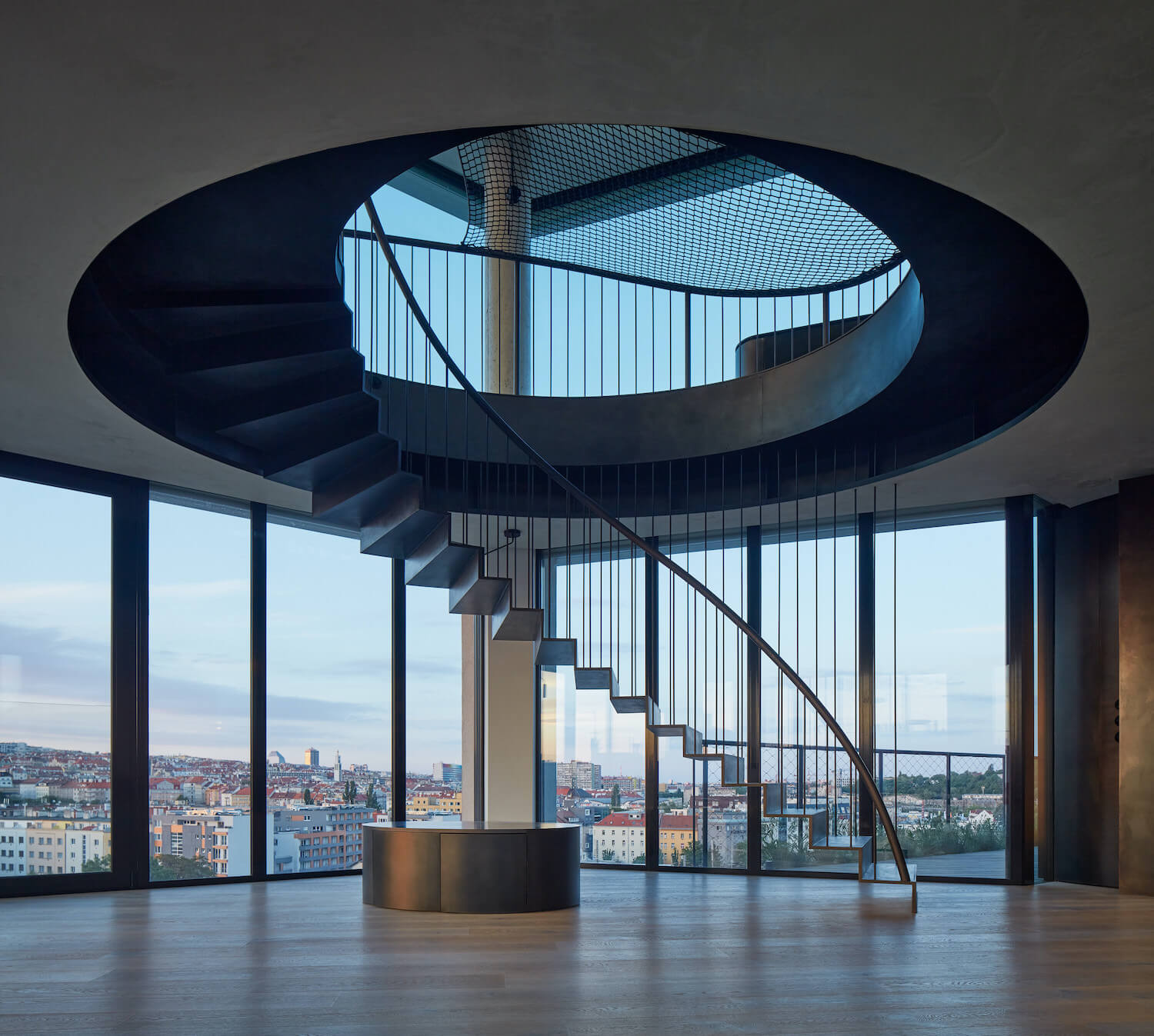
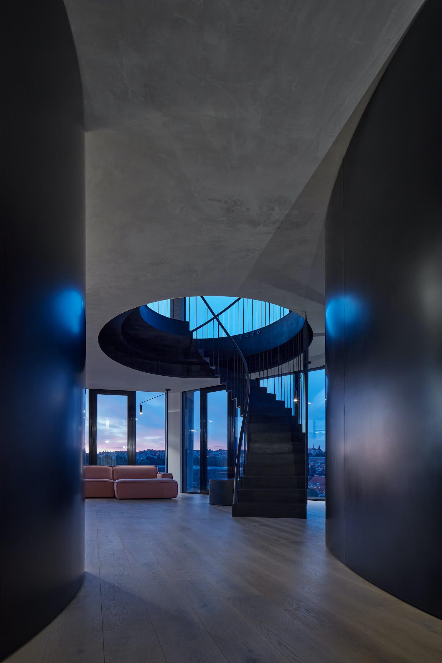
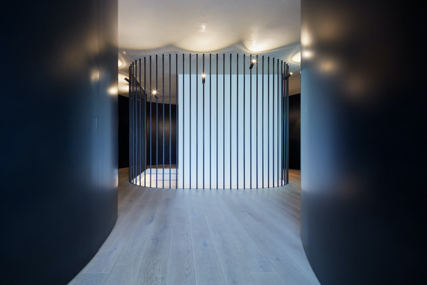
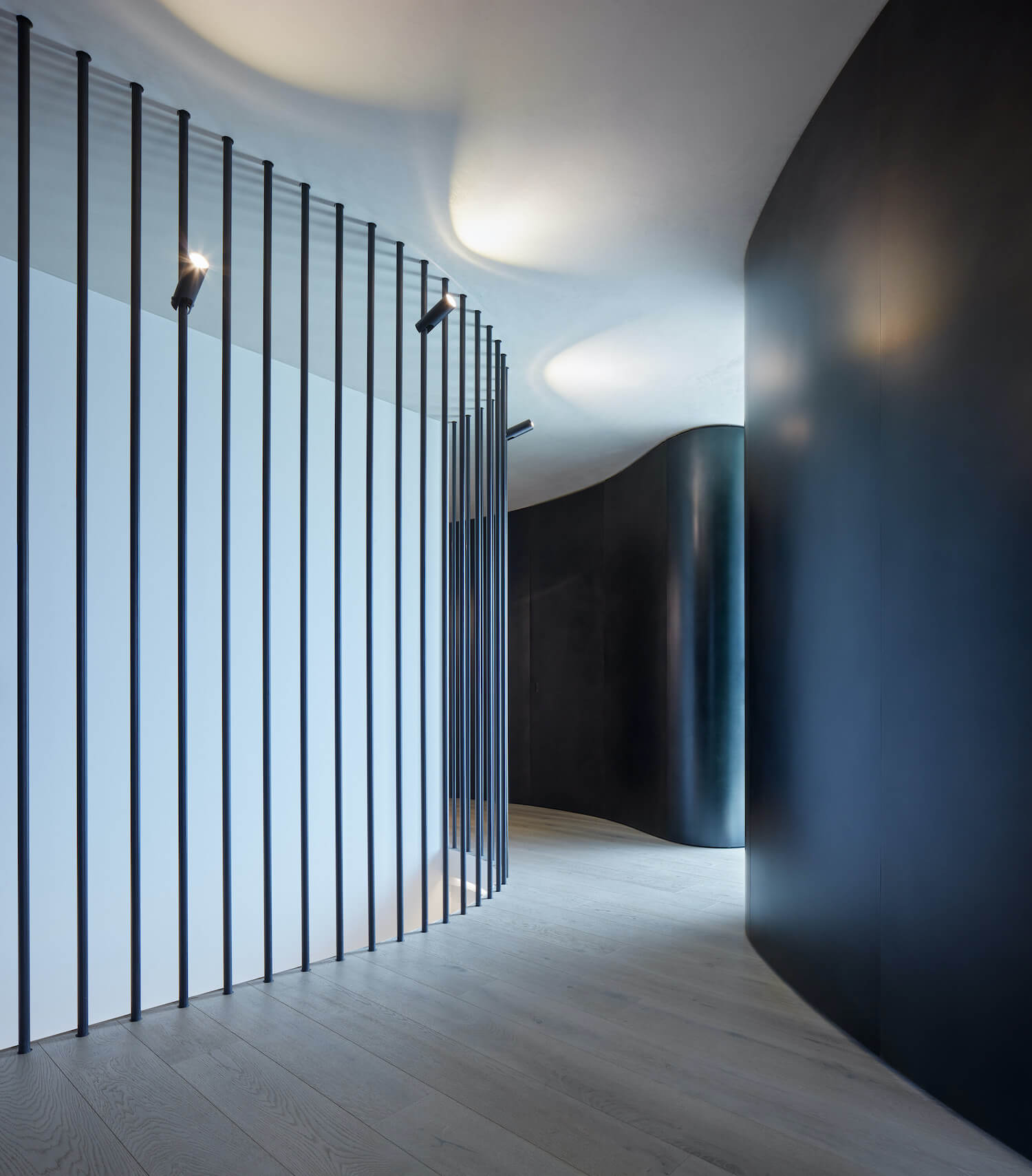
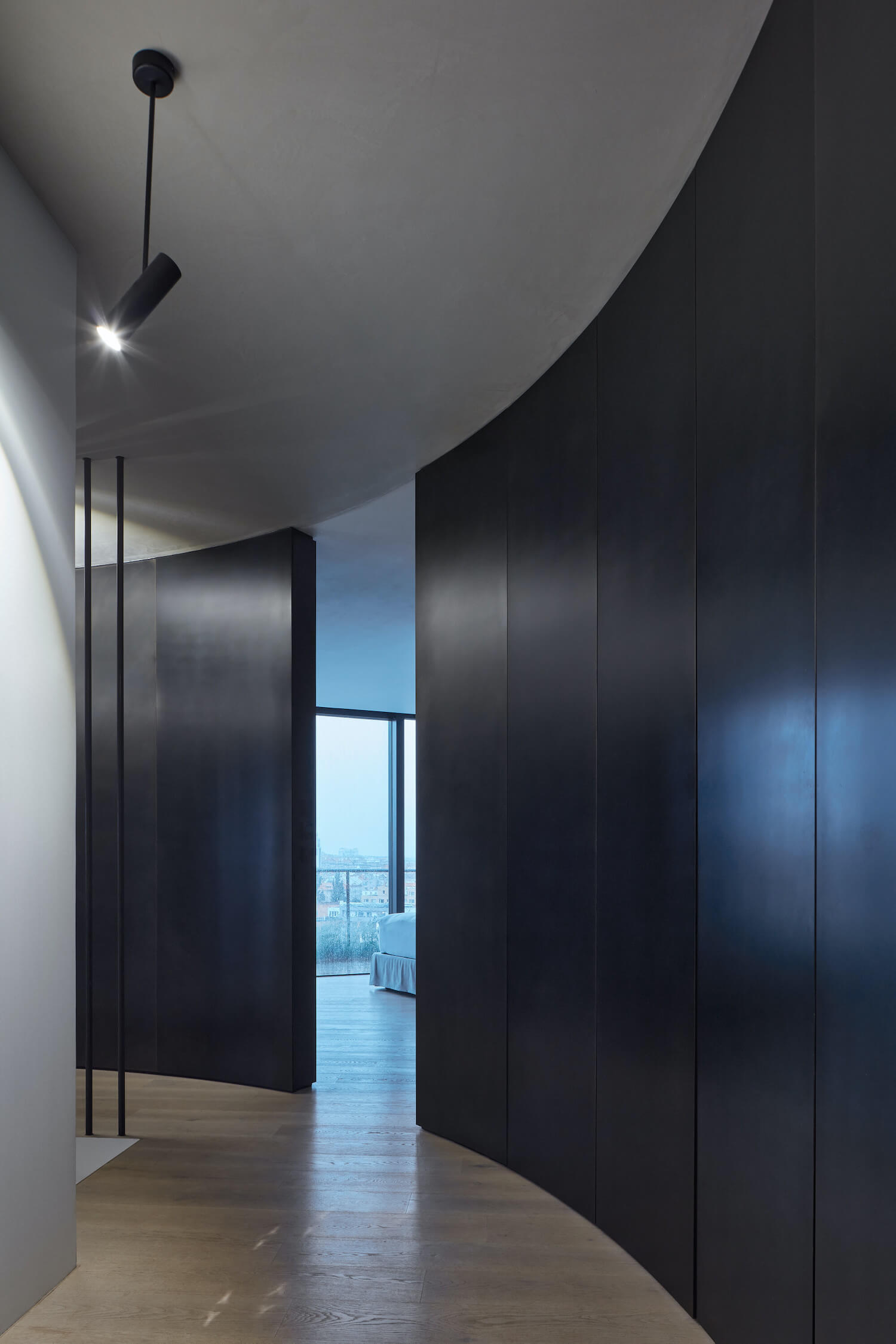
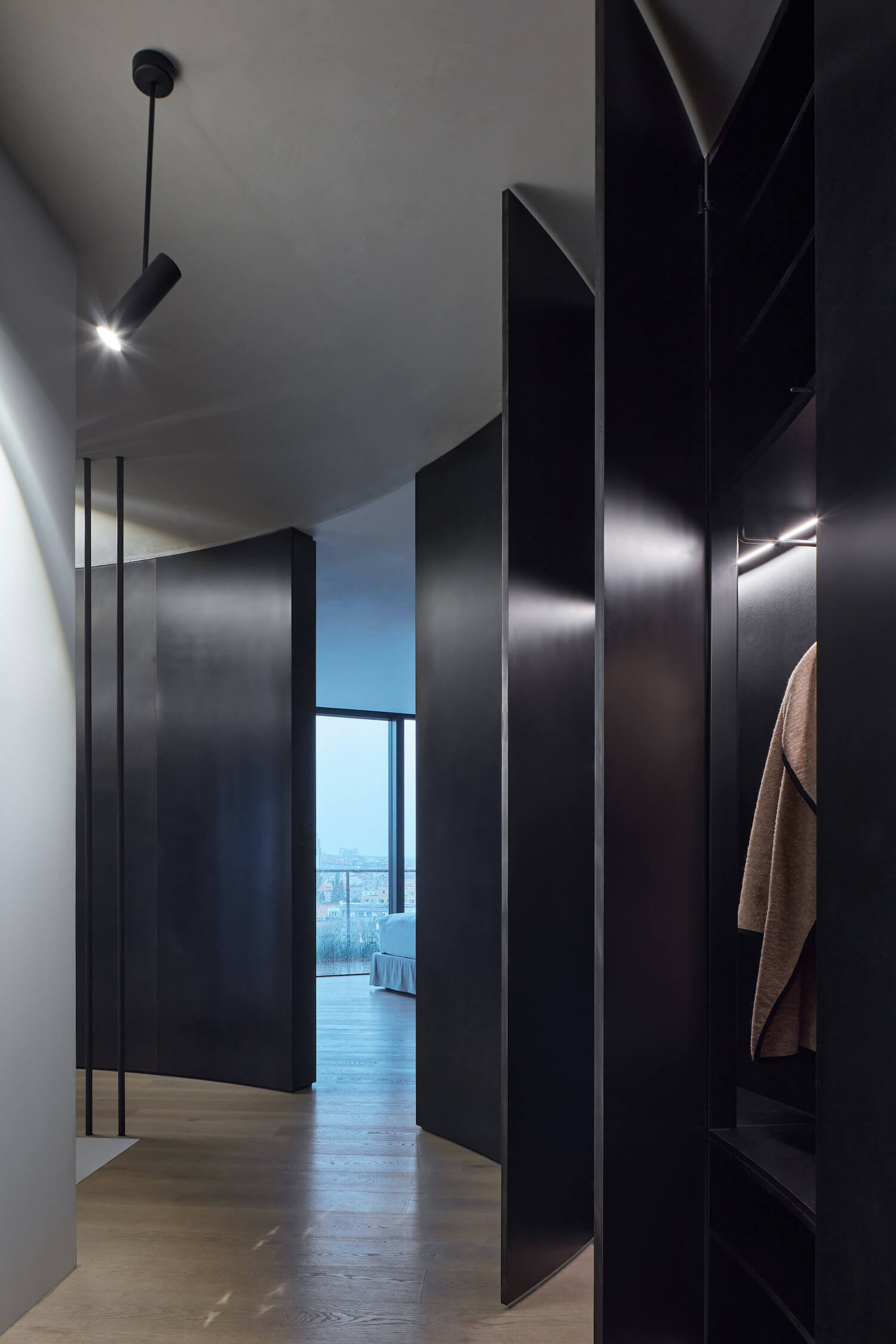
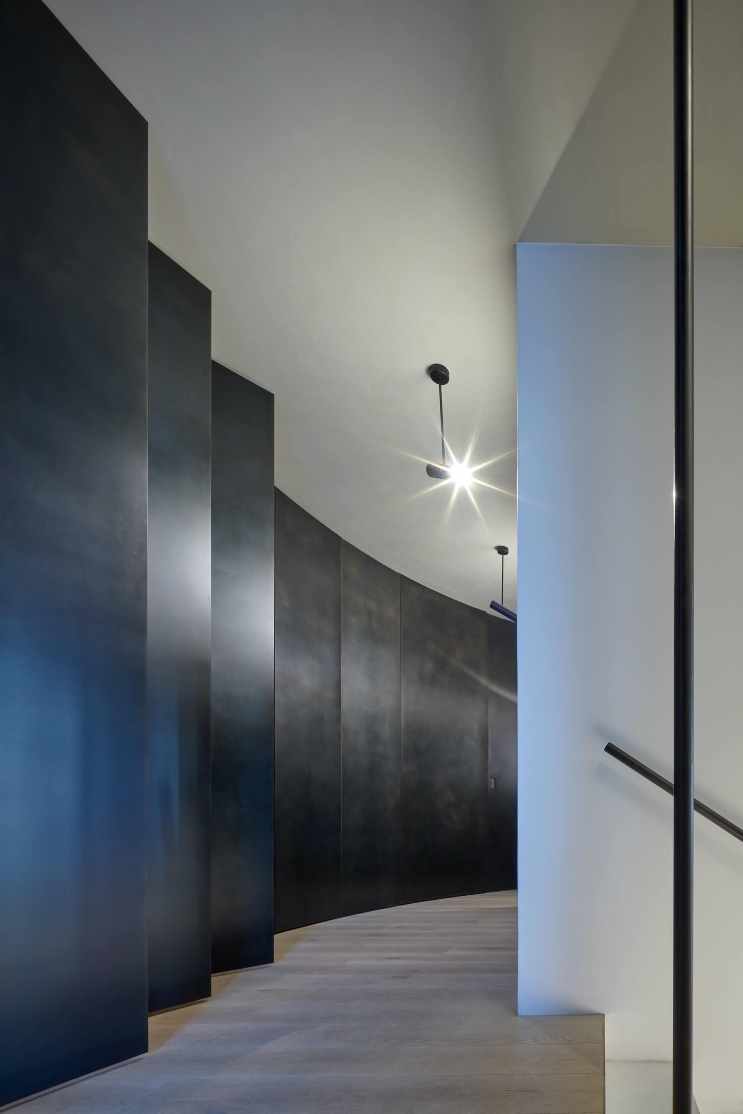
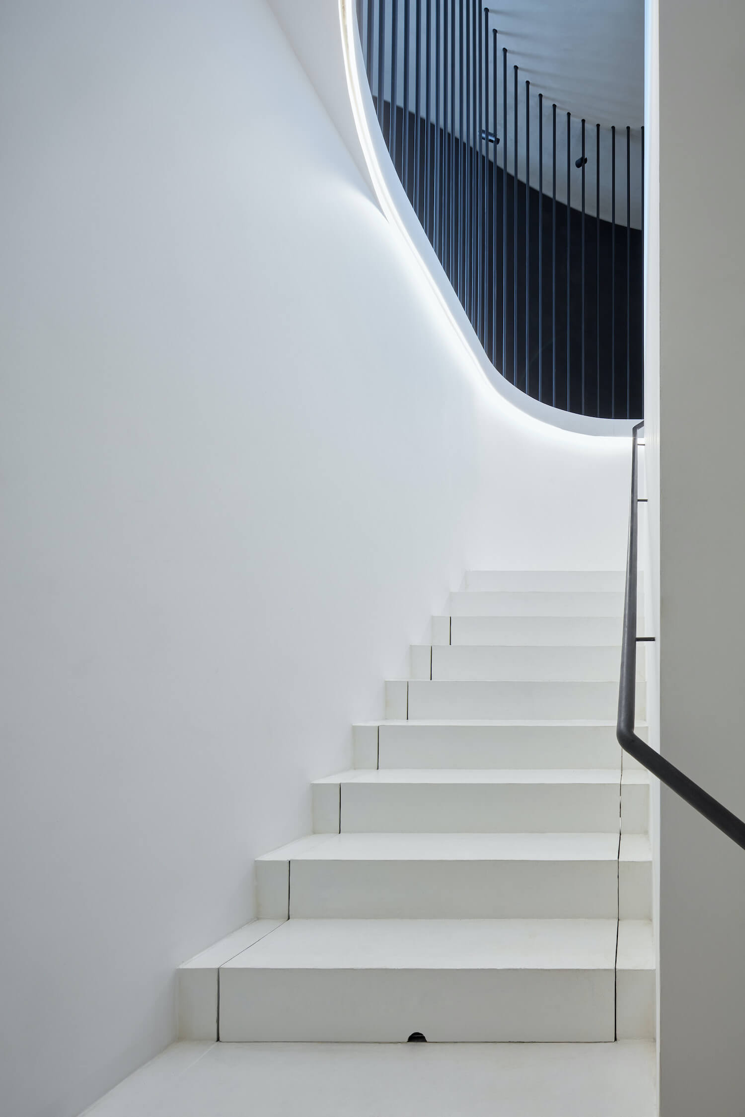
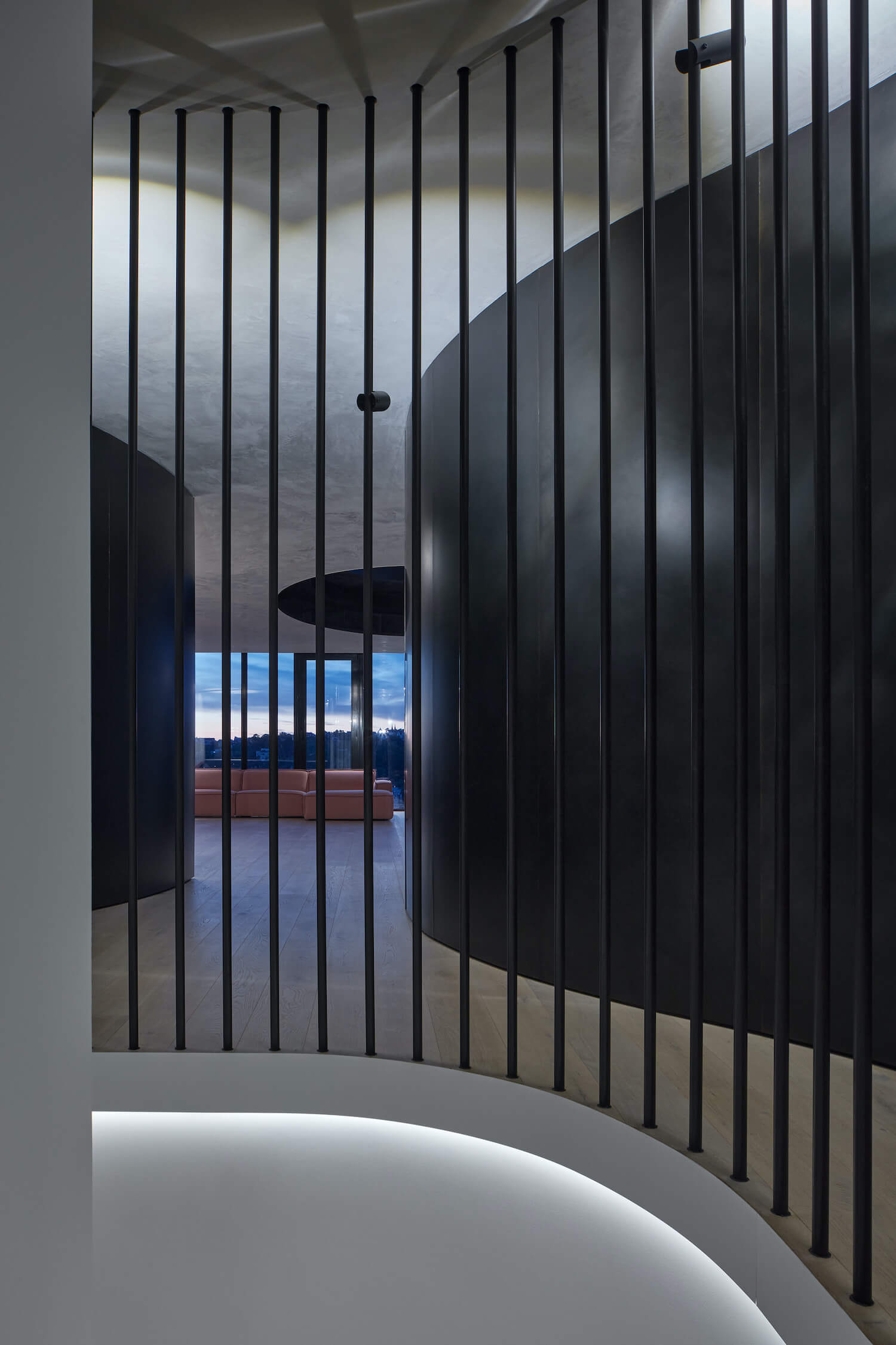
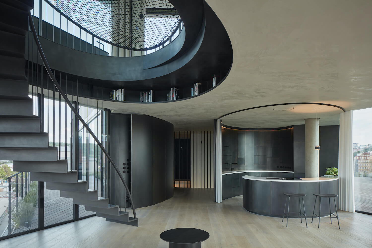
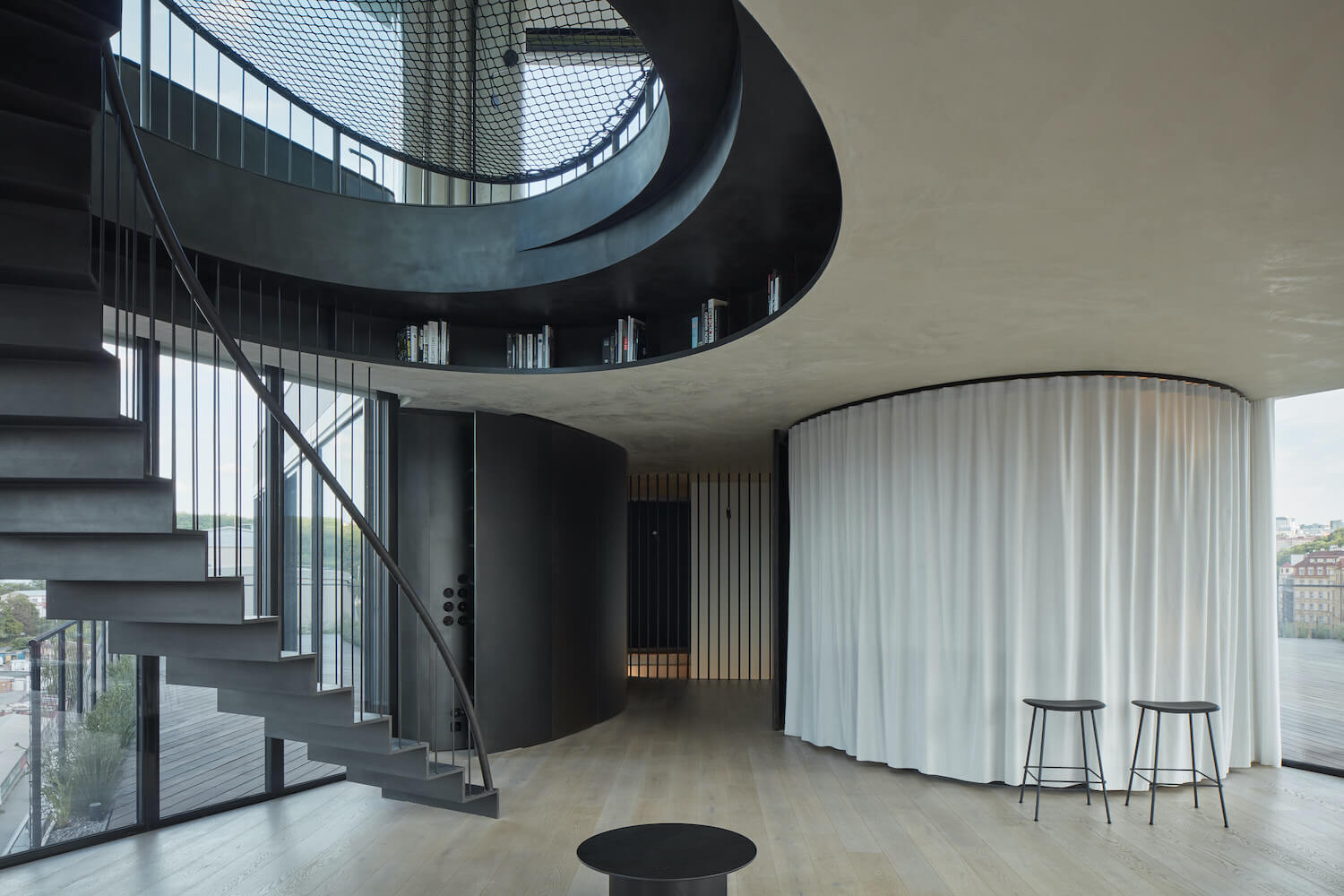
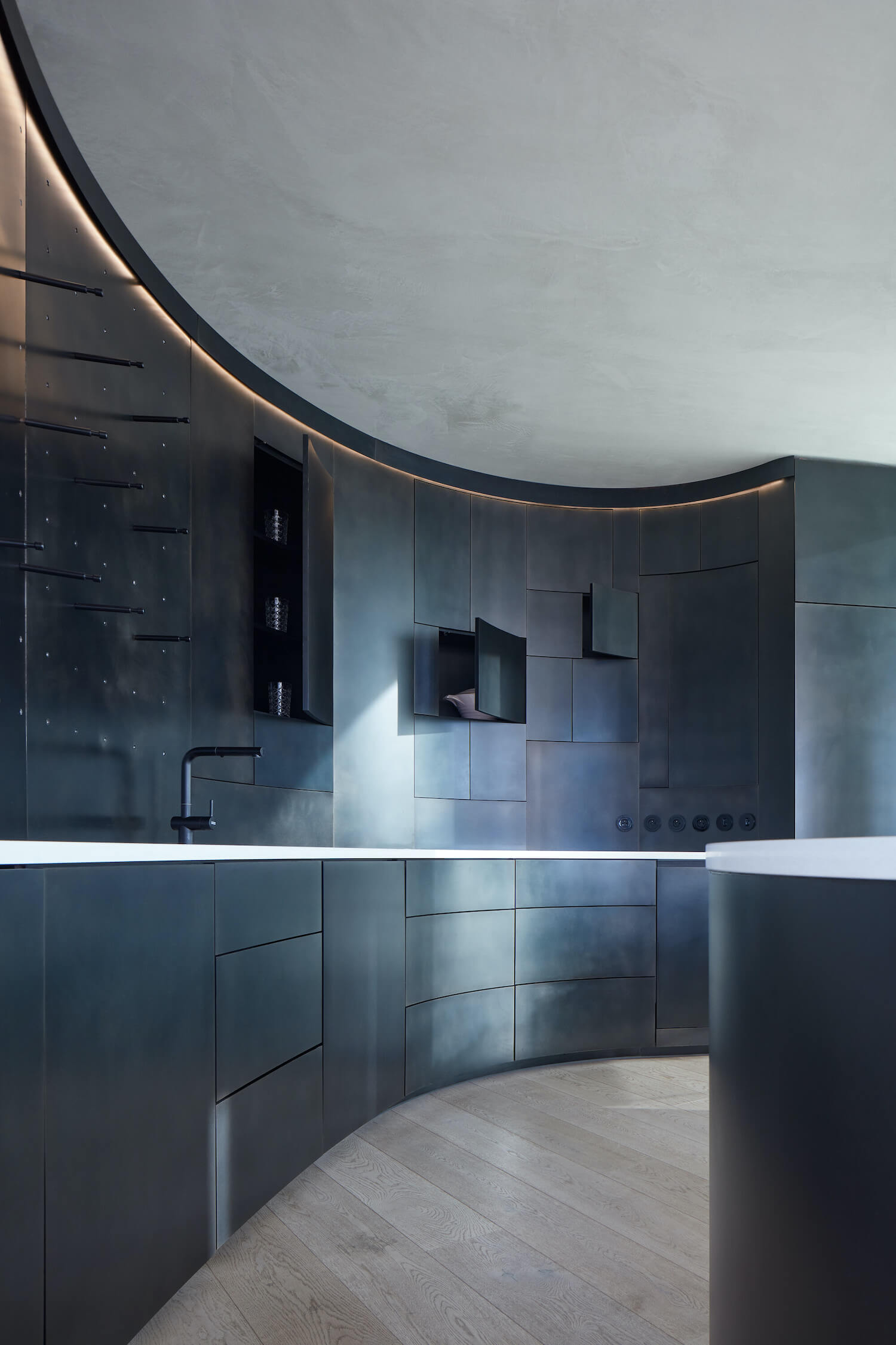
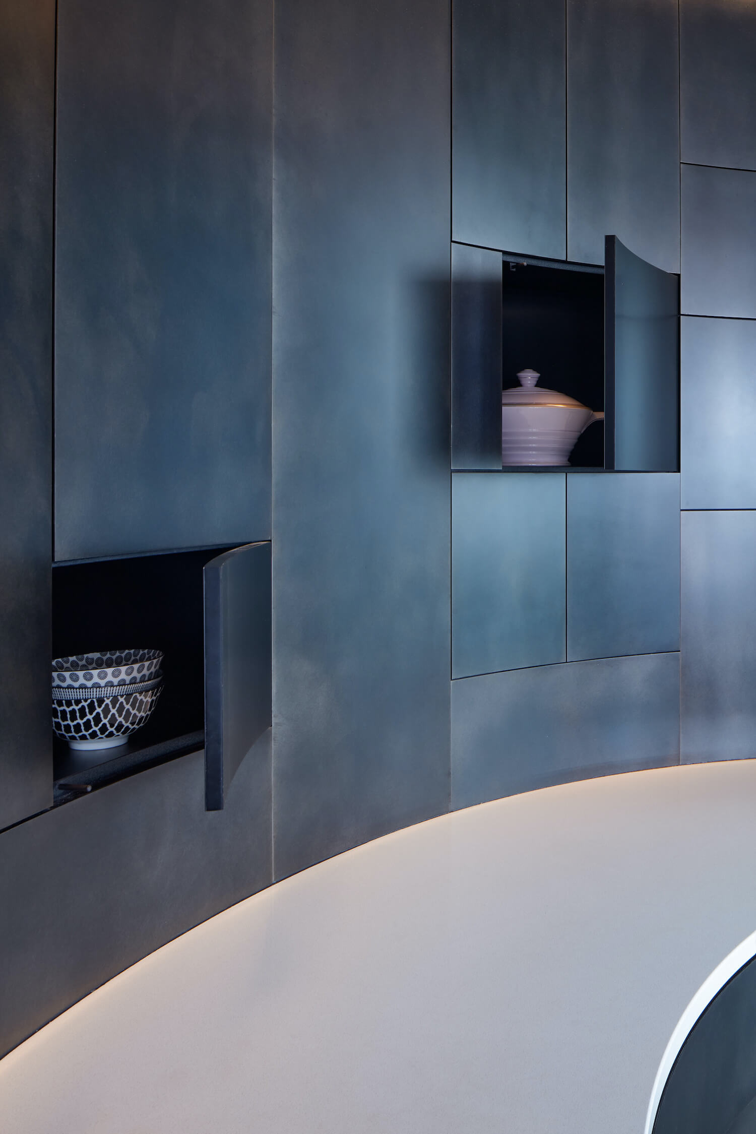
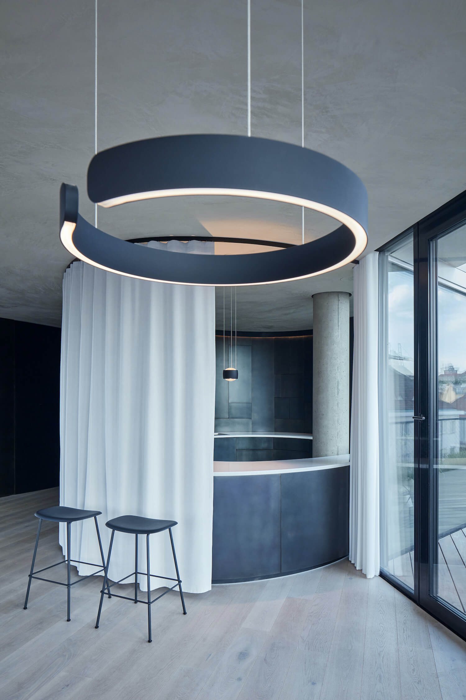
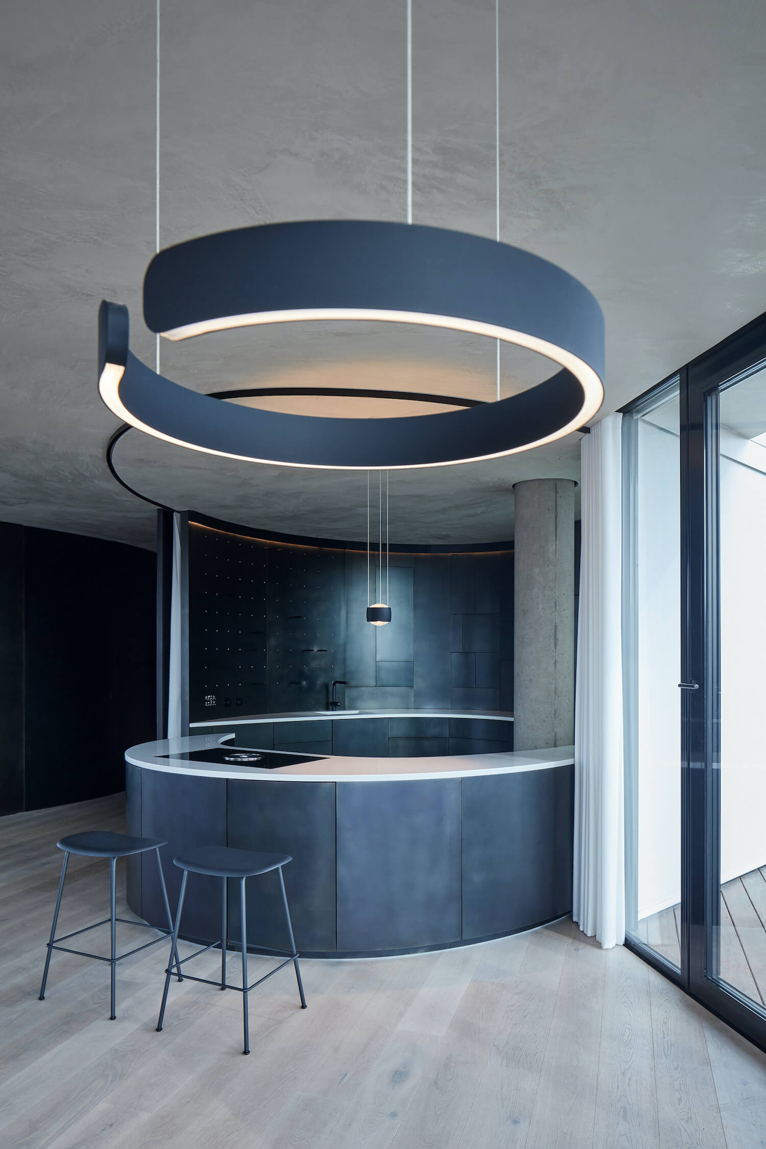
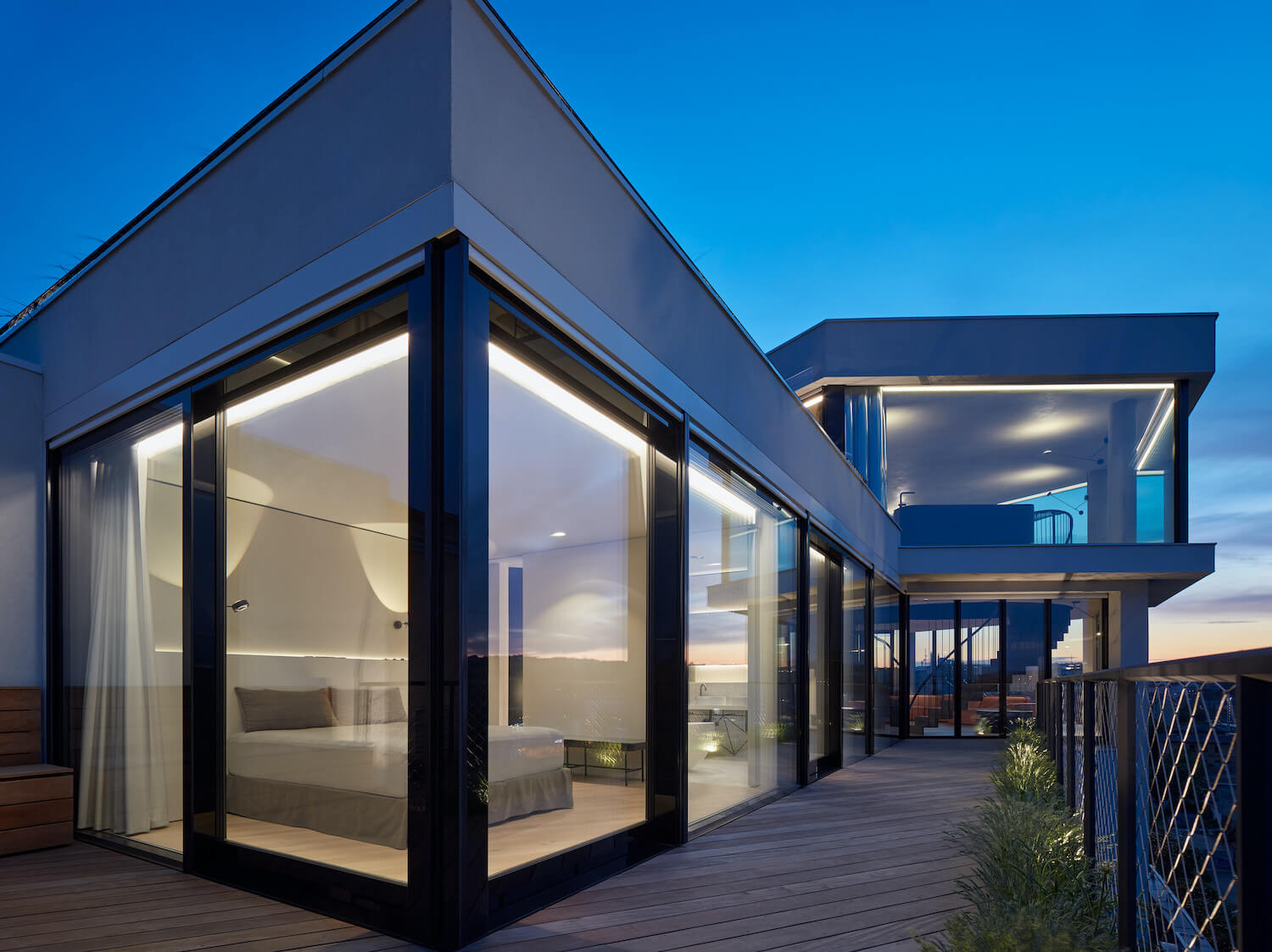
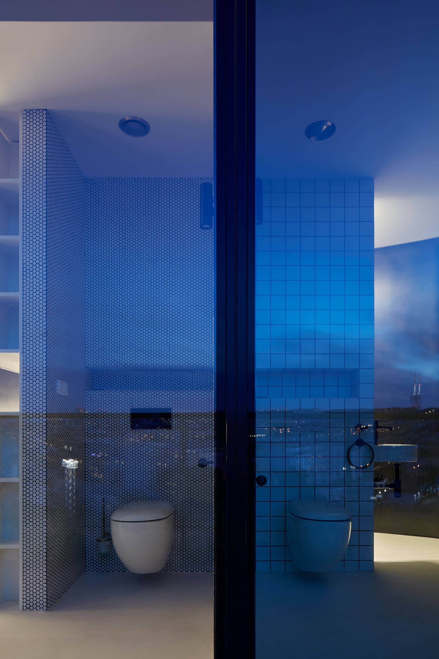
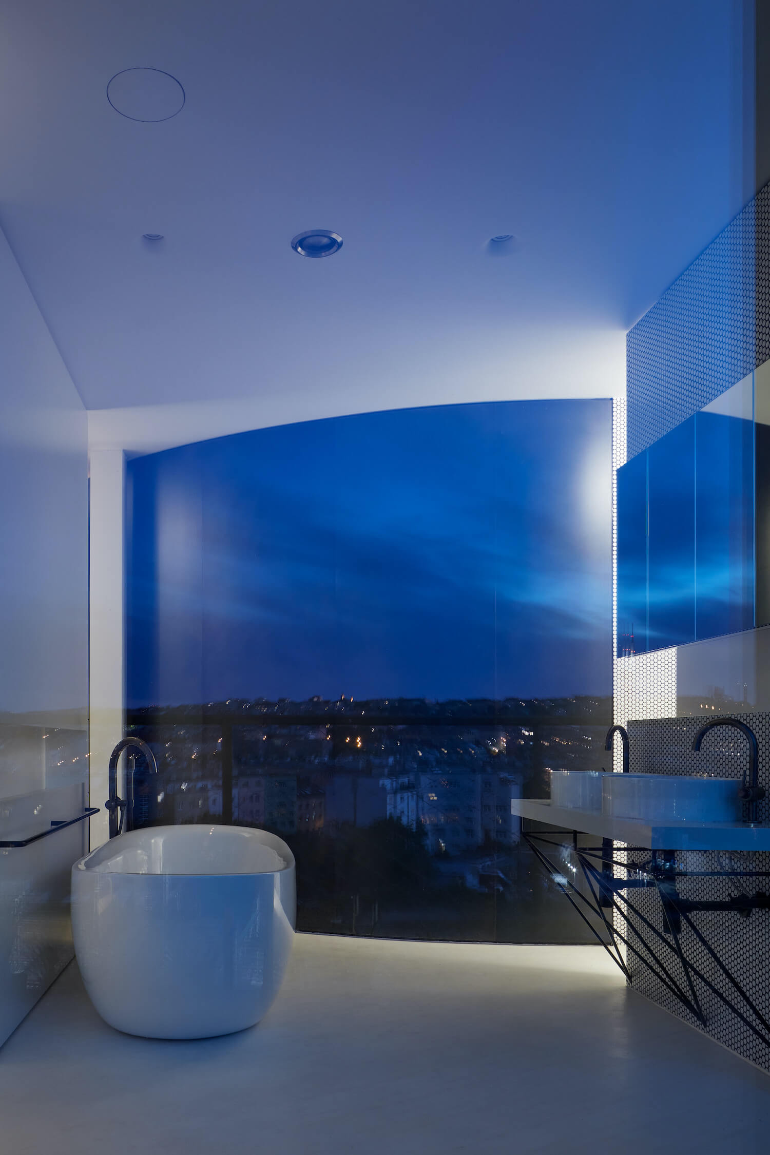
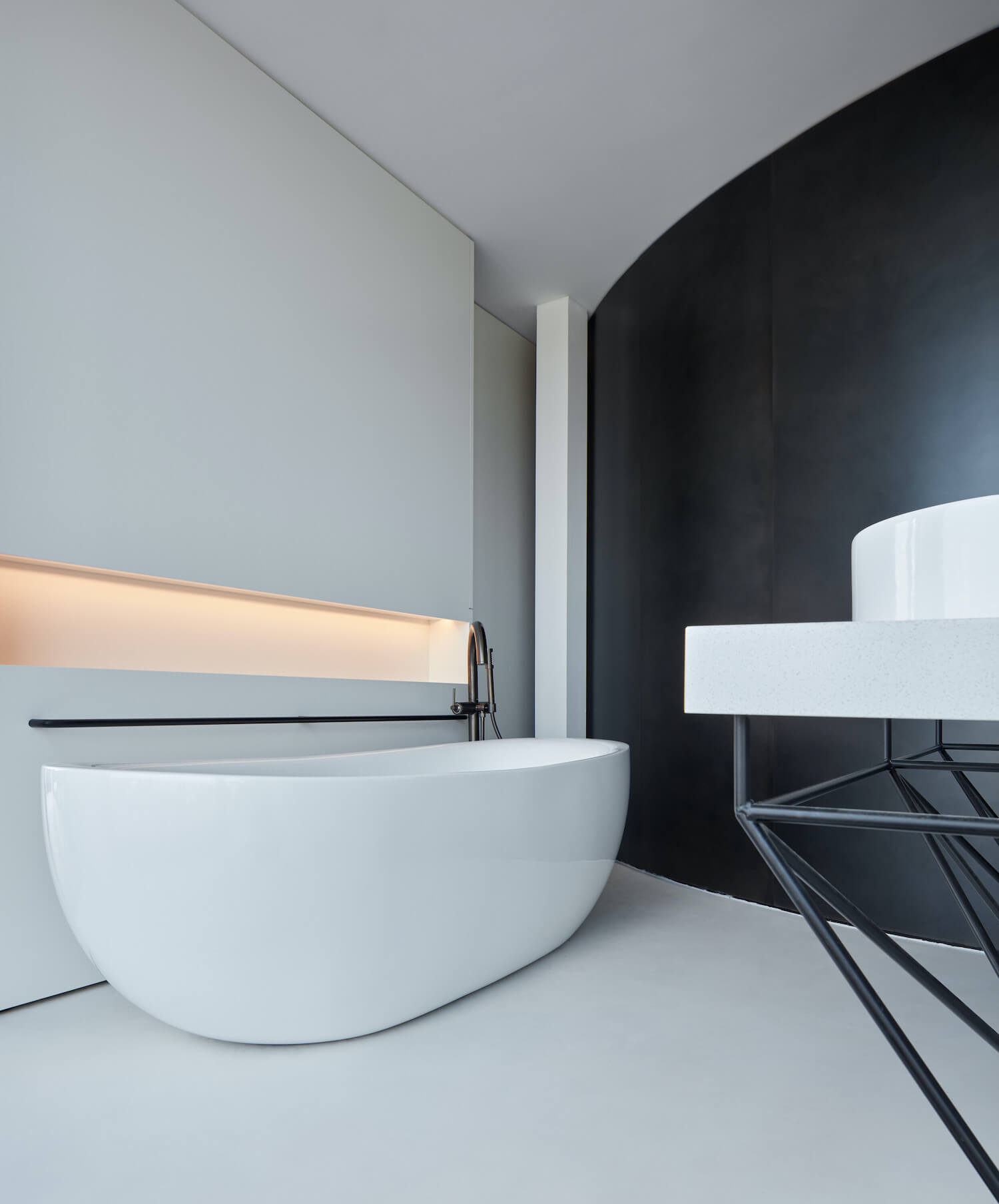
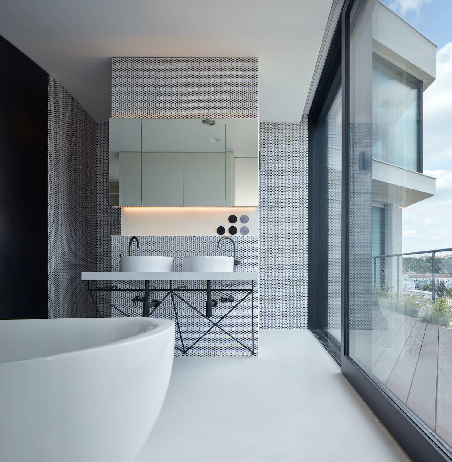
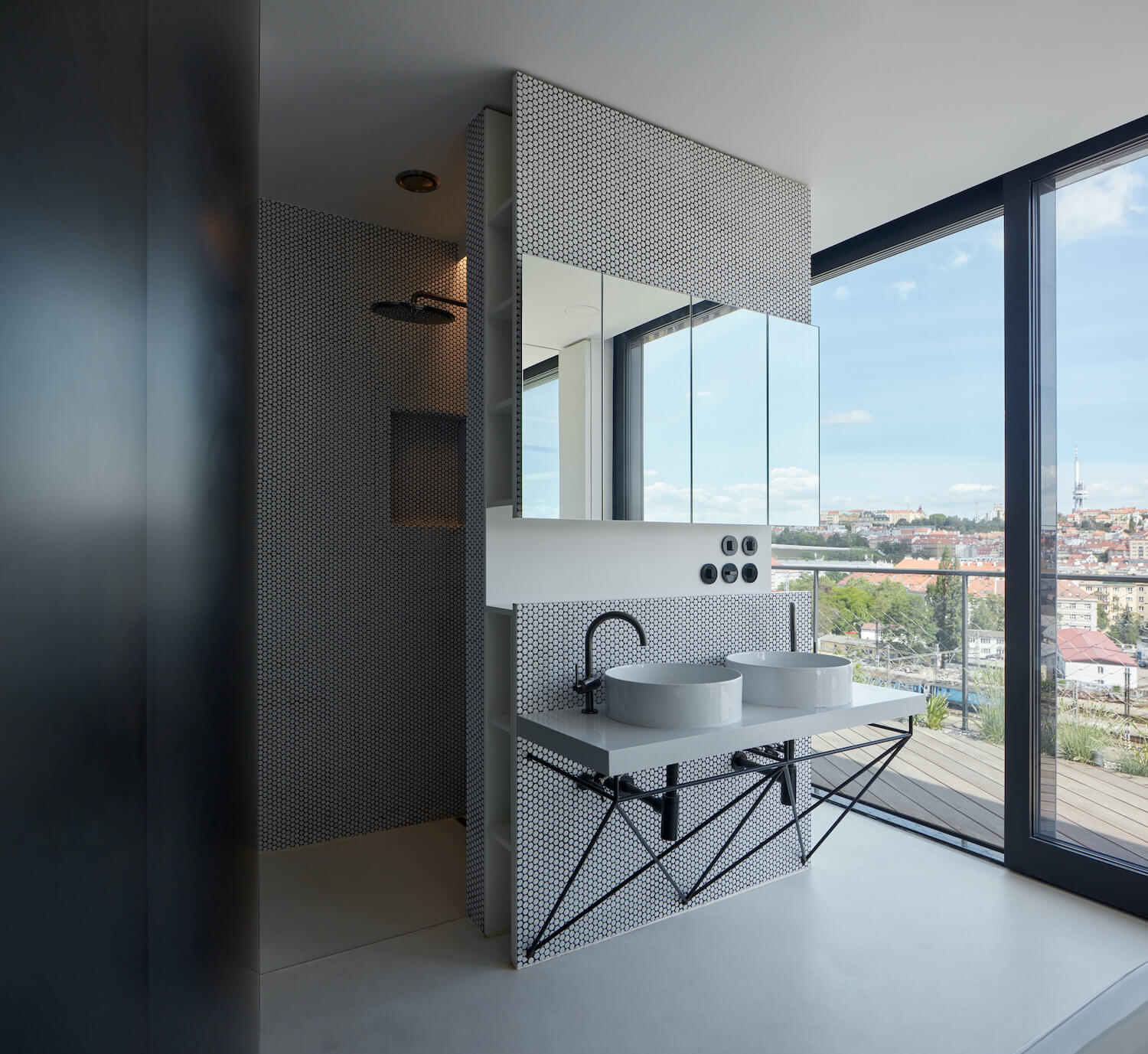
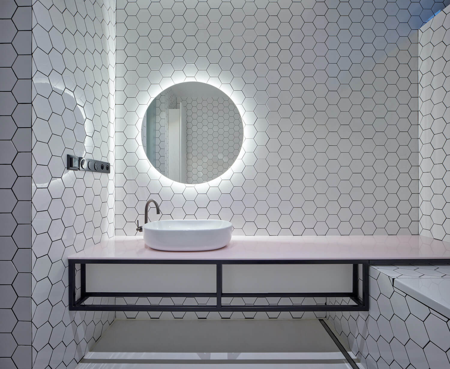
The layout articulates the division of the apartment into private and social zones, balancing the full and empty spaces separated by the steel membrane of the undulating partition orbiting the elevator and the entrance staircase. Behind this membrane, all of the private rooms, with their own perimeter terrace, are hidden. The tension between the entrance bay surrounded by a steel partition and the endless free space of the tower becomes the basis of the natural dramaturgy of movement in the apartment. Although the penthouse is primarily extroverted, its user comfort can be modulated into an intimate space by drawing the screens and curtains. The membrane of the main partition, going smoothly through the apartment, creates a private world behind it, hidden from the sight of visitors, and keeps the division intuitively readable only for the inhabitants of the apartment. The private part is divided into individual living sections (master bedroom and children's rooms), with its own “protected” world and unique view and contact with the city landscape. It maintains a "splendid isolation" section for parents, with a master bedroom, walk-in wardrobe and bathroom, and separates the children's section. The adjoining terraces follow this basic logic and are naturally divided by contacting each of the rooms in a different direction, with a different façade. The master bedroom is connected to a bathroom with solitary bath and hidden niches with toilets and showers and is accessible through the hall with a library adjoining the walk-in wardrobe. The children's section, consisting of two separate children's rooms, is accessible from the corridor bay through a hall with a bathroom. The apartment can be entered through either the staircase orbiting the elevator shaft or the barrier-free lift into the corridor bay surrounded by a steel wall containing built-in wardrobes and shoe cabinets and doors to all private parts. The doors are hidden in the steel wall and can be opened by invisible recessed no-handle mechanisms; the wardrobes, by push-to-open mechanisms.
Structure and materials
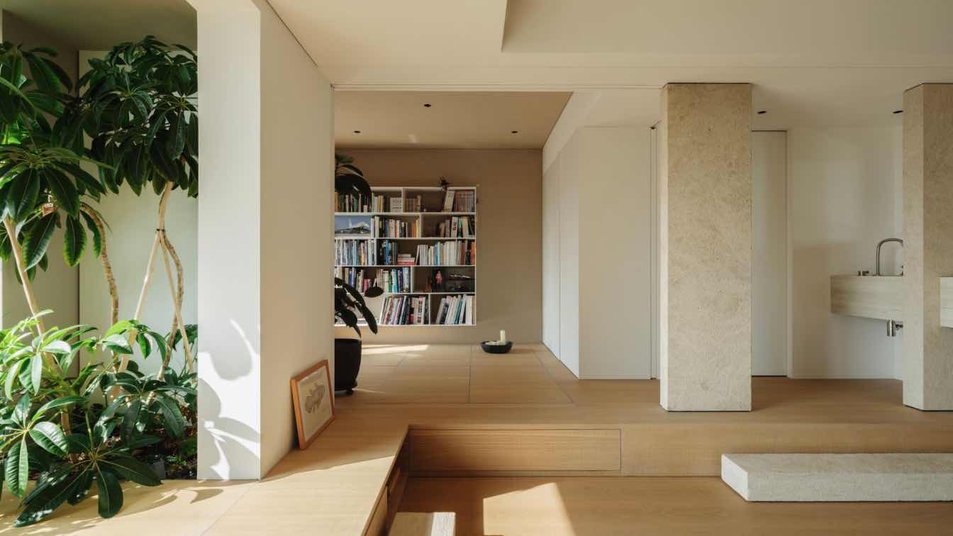
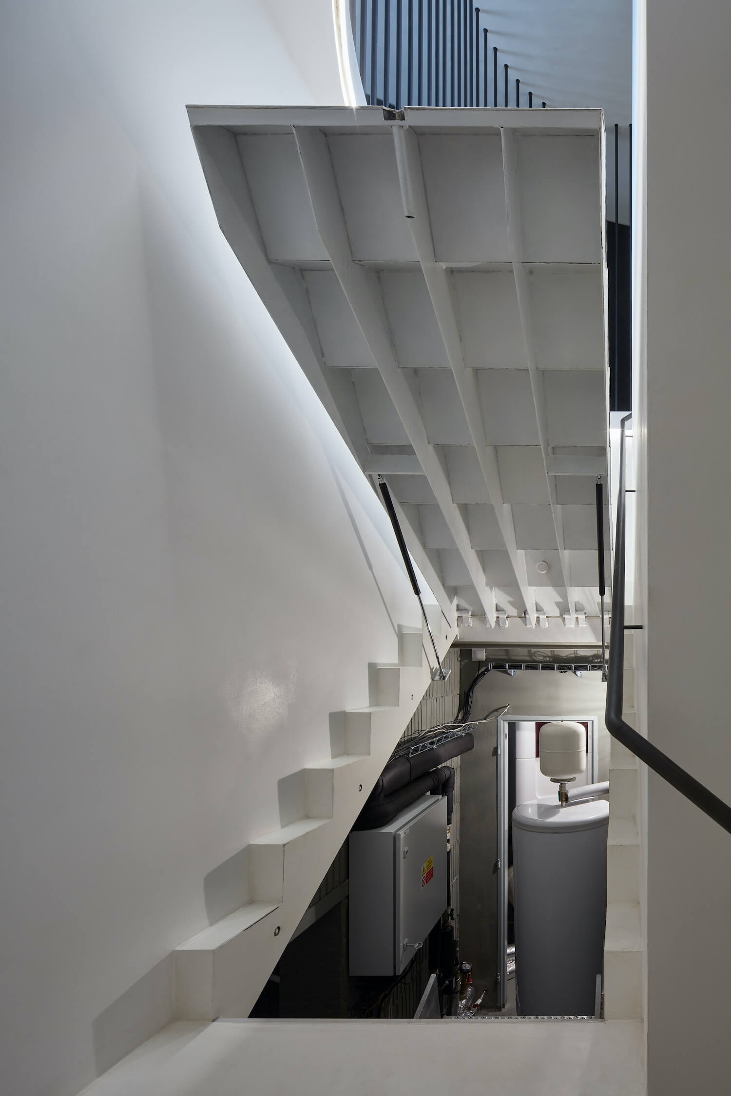
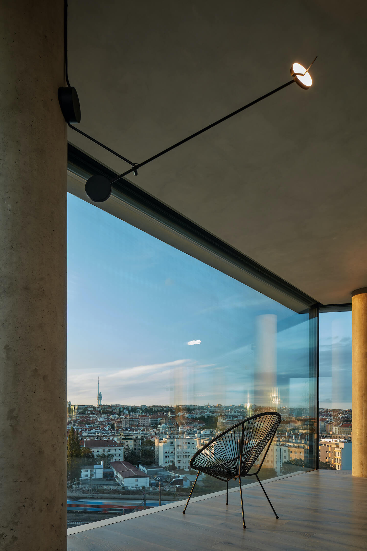
Structurally, it is a client reconstruction of the rough structure by means of major reconstruction, including significant interventions in the layers handed over in the shell-and-core state. As part of the intervention, the perimeter cladding done by the developer was completely removed and replaced with atypical large-format glazing using structural four-pane glazing with corresponding shading by large screen blinds, optimizing heat gains and losses and ensuring maximum user comfort, together with the indoor climate control system. All partitions were removed to create a continuous layout. As it was taken over during the building process, the design respects the existing load-bearing structures (with the exception of one column, which was replaced) and integrates them into the layout, simplifying the installation cores by merging and leading them in the floor and ceiling using the residual spaces (below the entrance staircase) as a technical base.
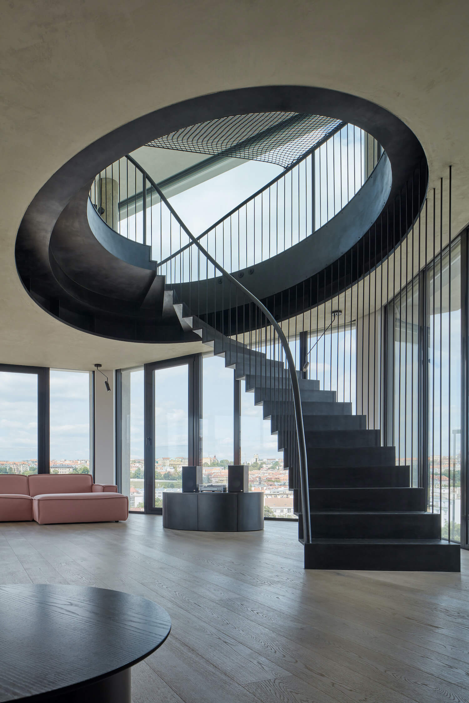
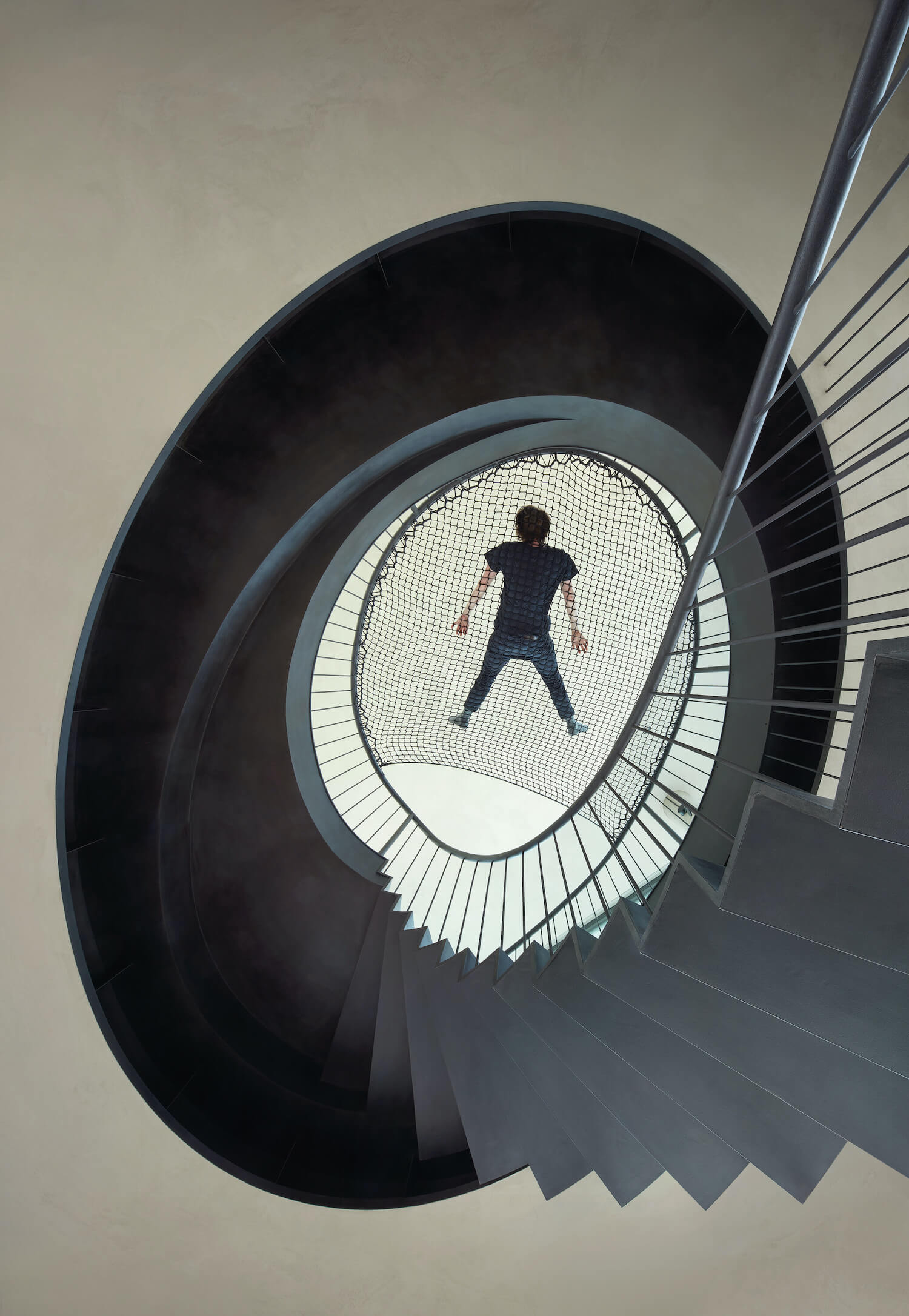
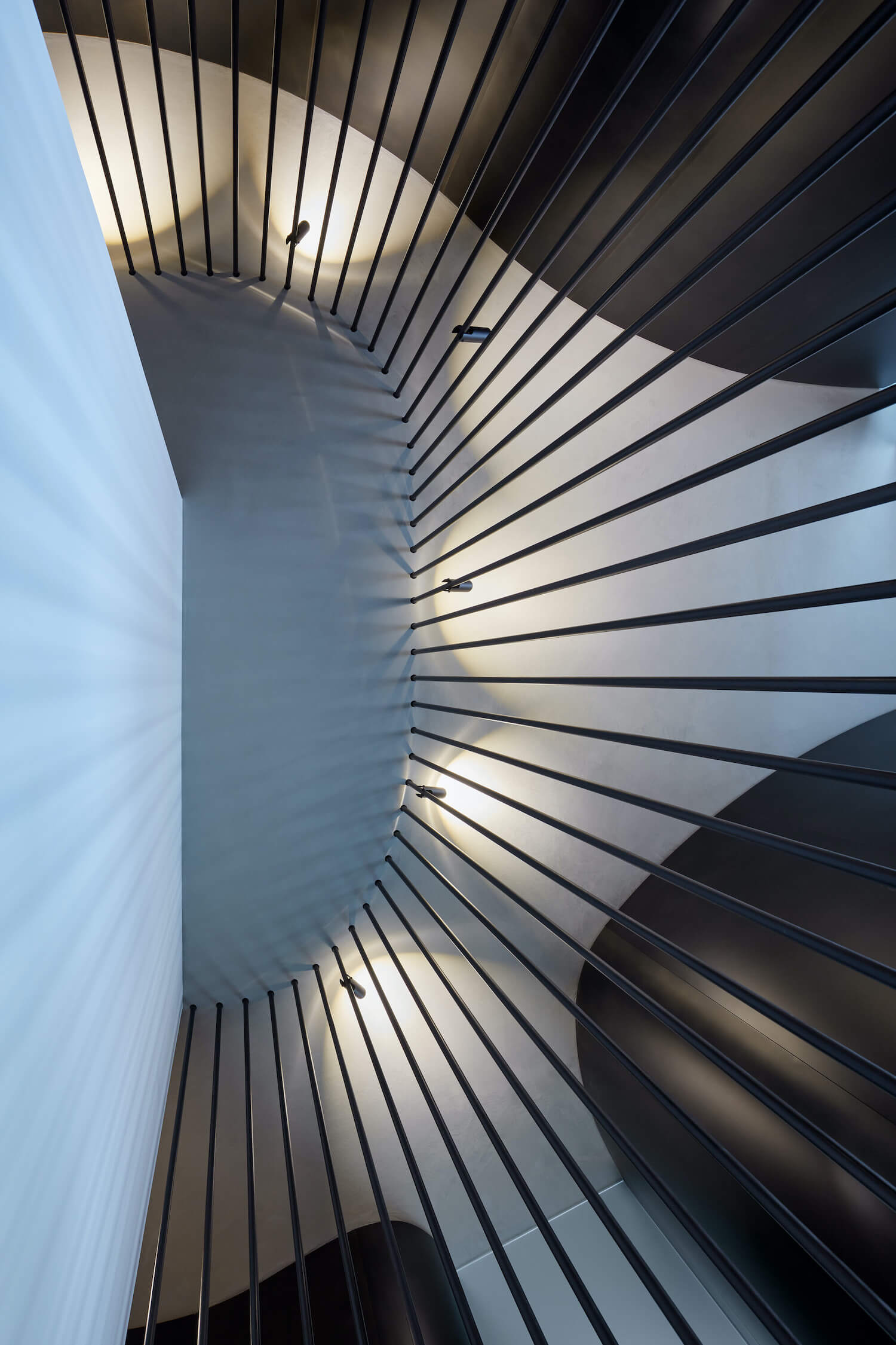
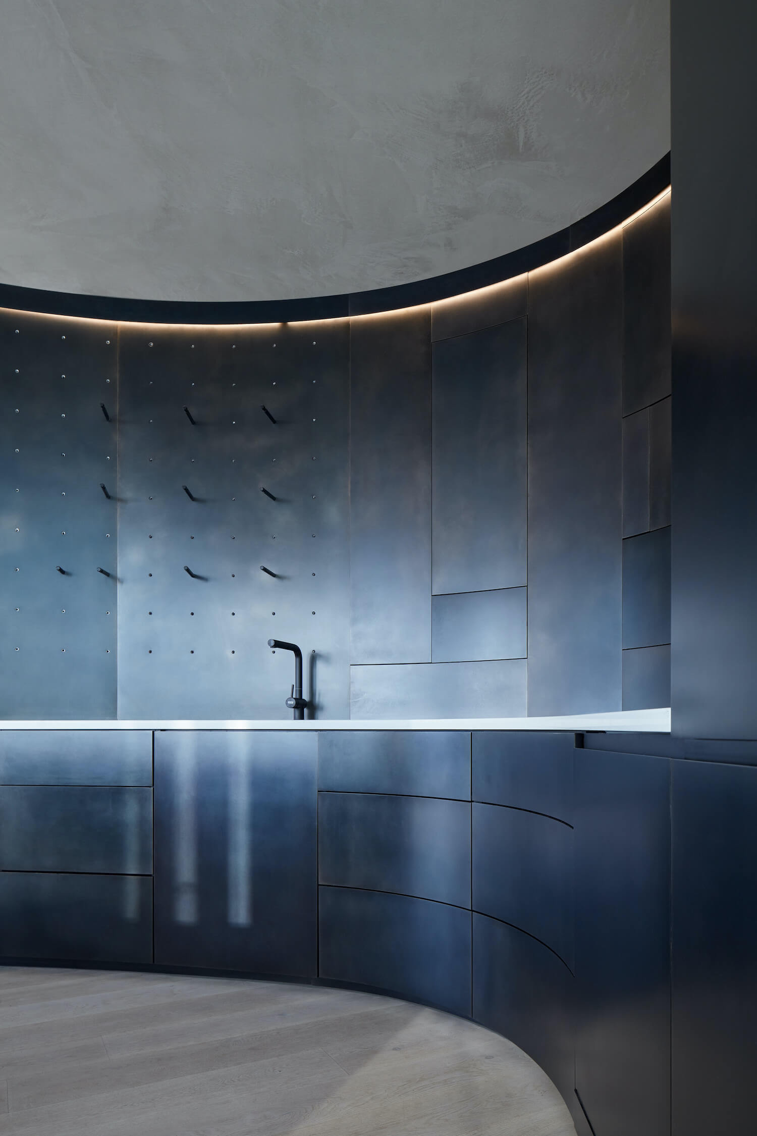
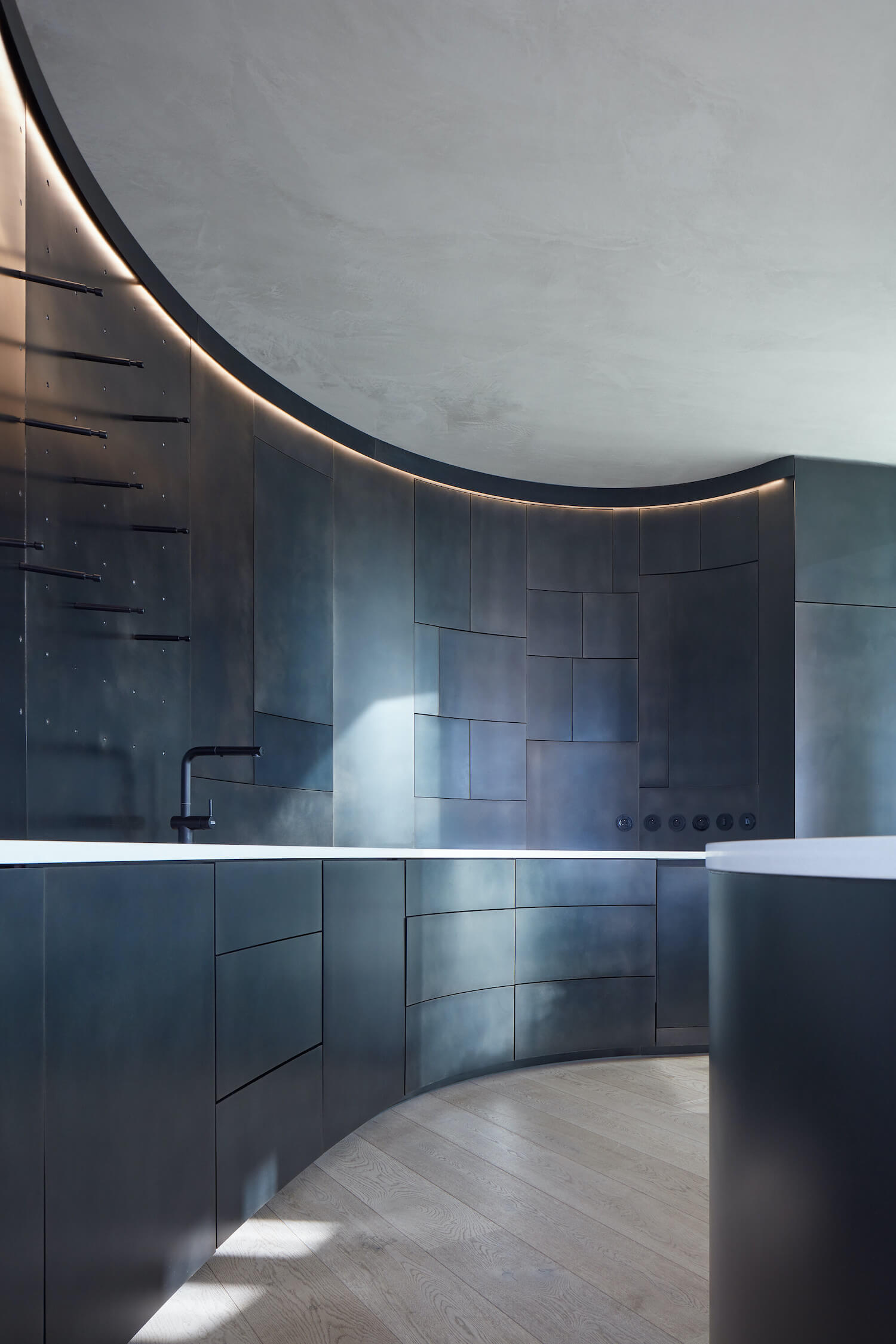
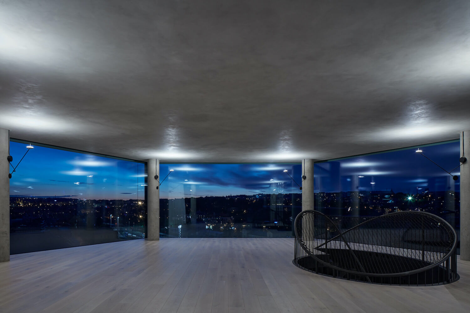
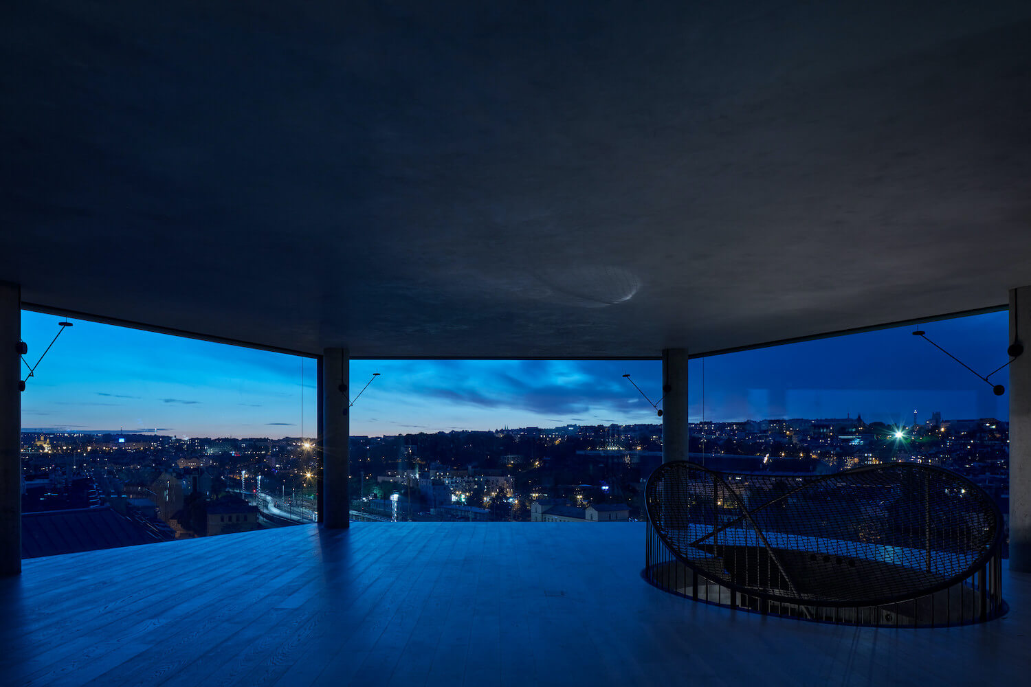
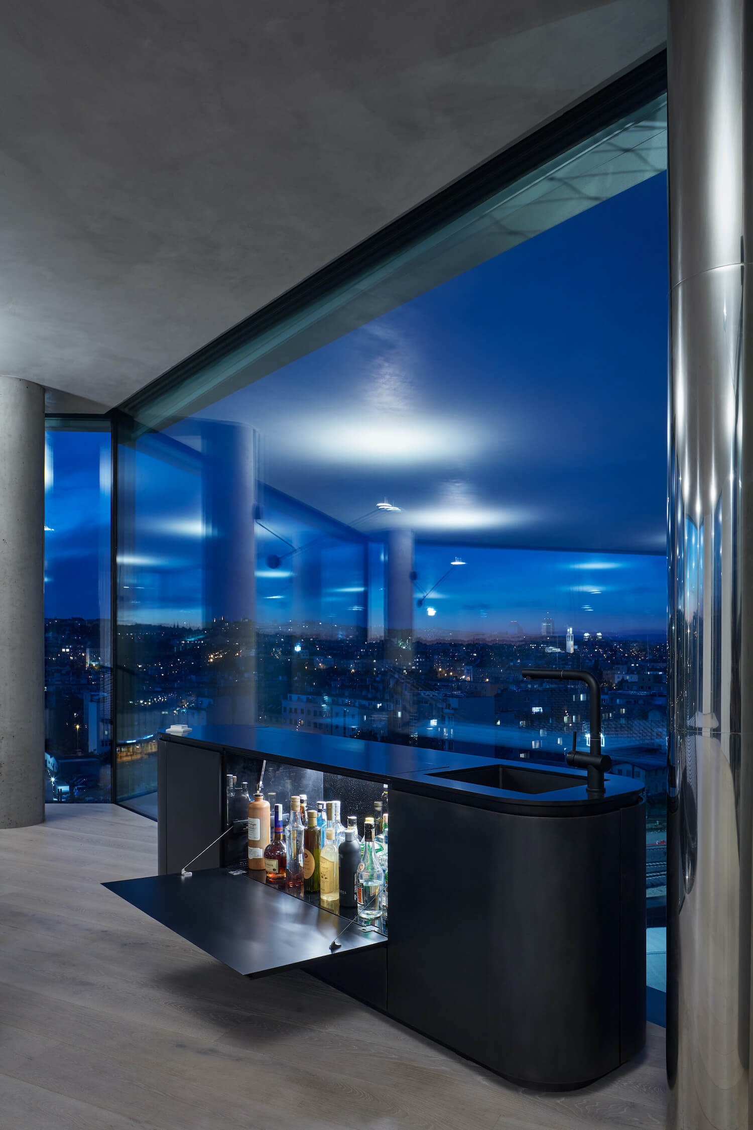
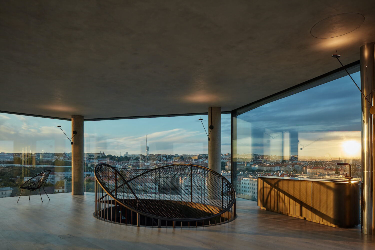
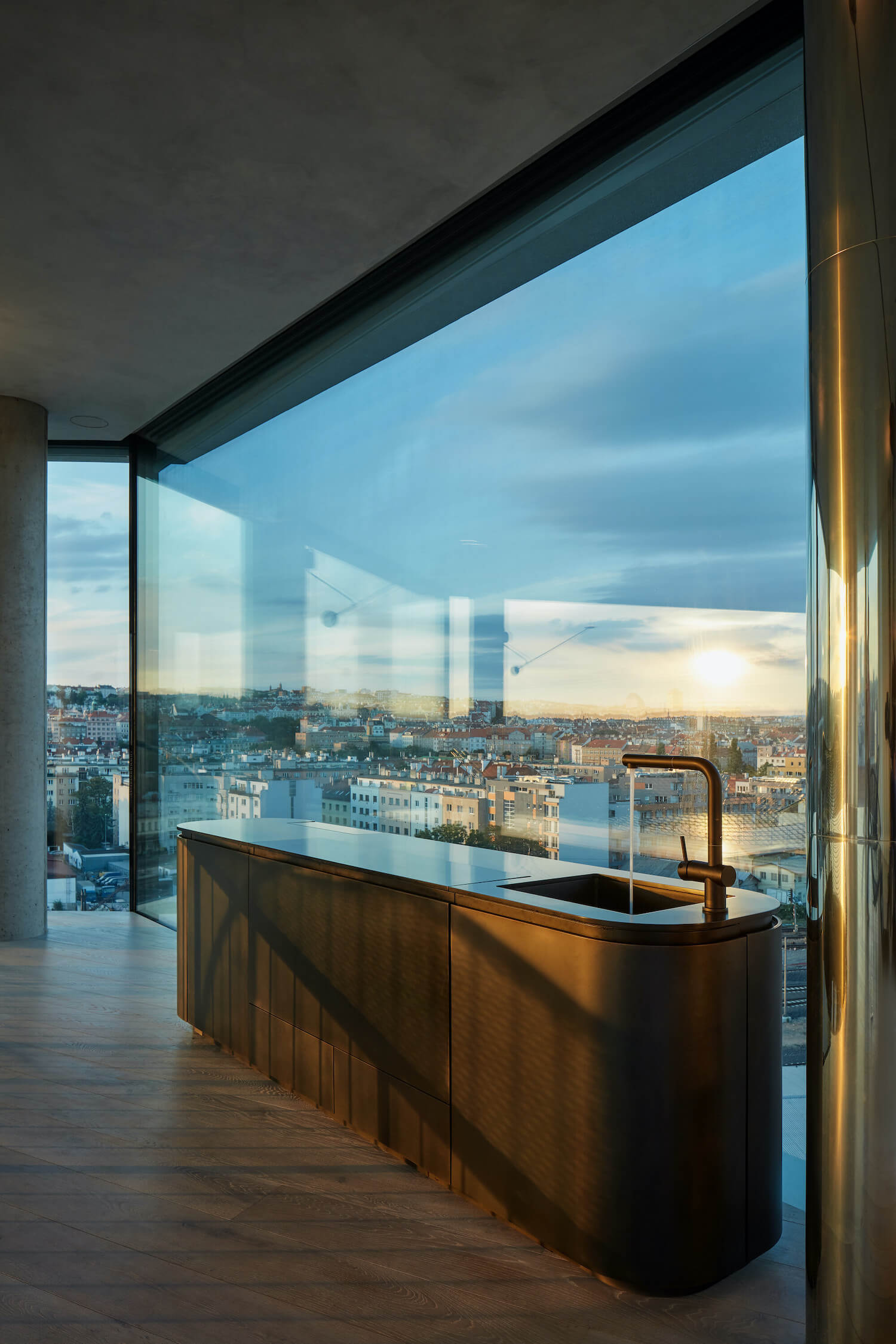
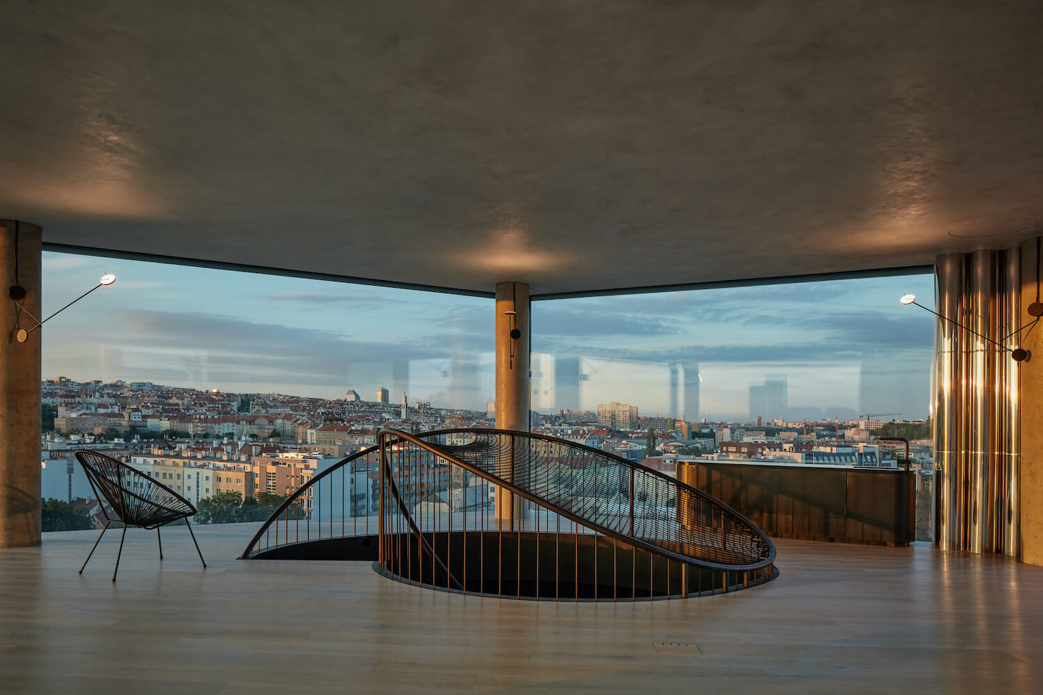
The materials used correspond to the light and mostly white space and its division into two "worlds" by a dominant dark steel partition. Its surface is treated from both sides using etching, sanding and polishing on a hot-rolled black steel sheet sandwiched on a wood-fibre board. All of the doors and openings are frameless, cut into the continuous surface of this partition. The floor is made of wide planks running perpendicular to the main facade through the entire apartment and continuing to the planks on the terraces. The ceilings are finished with a fine texture, including the recessed parts of the lights and air conditioning and integrated covers for hanging swings and other elements on the upper floor. The railing of the interior staircase creates a rising and descending curve so as to interrupt the panoramic view as little as possible and equipped with a hammock with access to the place where the handrail touches the floor. The space is lit using diffused reflected light and hidden lines lining the curves of the partitions.
Technological design
The project works with a high-end technological solution corresponding to the most progressive standard currently achievable. The technologies are intentionally concealed, and therefore, practically invisible, and remain a hidden force in the apartment’s background. The indoor temperature control is based on low-temperature transmission; the temperature changes are not perceivable. The system creates an ambient climate and maintains a comfortable temperature without the obvious flow of air during its exchange. The hidden heating and cooling distribution is integrated into the floors and ceilings, and the air-conditioning distributed through the slits lining the windows is also almost invisible and does not distract from the visual design of the apartment. The primary energy source is an air-to-air heat pump hidden in an acoustically separated shaft on the terrace. The maximally open façade is complemented with large exterior screens in white that shade sunlight and remain transparent from the inside, even when closed, to maintain contact with the city.
About studio
We look for authenticity hidden in every task. We always start from scratch, trying to avoid usual architectural cliché and reinvent the core basics in slightly different shades and moods. Our approach is based on interconnecting physical and metaphysical layers of the project, resonating of form and content and engaging sculptural methods with the conceptual tendencies. We consider initiation of projects to be part of our work, reflecting not only architectural, but also programme, content and social aspects. We do not work with usual inspiration or archetypes. For a long time, we have been using the subliminal method of nomadic thinking, which G. Deleuze and F. Guattari defined with this impressive metaphor: The nomad “sets out to the desert. He leaves the camp and starts a journey through the lands, watching the movements on sky. In the morning he leaves the territory towards a new land and in the evening, he re-settles each time he unfolds his carpet on it… These movements and processes are expressed by the rhythm of walking, which imprints the landscape in the pilgrim and vice versa. The nomad and the philosopher (and the architect), like all people, keep inside the lands in which they grew up, wandered and dreamed of.” Our projects are the result of such work; and our interpretations as authors stays mostly hidden giving space to every visitor for their own reading.
We have a wide range of projects, from art (memorials) to a non-traditional exhibition in the National Museum in Prague, underwater observatory in Norway and individual housing projects. We have just finished a significant project of Prague riverfront revitalisation.
Petr Janda is an architect and an artist. He graduated from the Faculty of architecture at Czech Technical University in Prague (School of prof. Jan Bočan) and the Academy of Fine Arts in Prague (School of Monumental Art of prof. Aleš Veselý). In 2008 he founded his own studio petrjanda/brainwork. He frequently participates in architectural competitions and exhibitions (also as a jury member), he has won several awards (Grand Prix of Architects 2007, BigMat 13‘– Memorial to victims of communism in Liberec etc.). Between 2011 and 2014 he was a member of the board of Czech Chamber of Architects and a chairman of the Promotion of architecture working group. He has been engaged in revitalization of the Prague riverfront since 2009 and in 2017 he became the main architect of this area.

