Go Up Arquitetura: The project was developed for a couple with two children, one aged nine and the other aged 12. With a hybrid work routine, they have more than one home office environment at home. This way, they can choose where to work, whether both or just one of them are in the property. They like to have leisure time, talk, drink, receive friends and watch streaming.
The couple had already been clients of the office when building their first apartment, and when they acquired this one, which attracted attention due to its size and location close to work, they decided to call the professionals again, as the spatial organization and style of the property did not match their style. your needs or personal tastes.
Their greatest desire was to resolve the layout of the spaces spread across the 147m², especially the social and access areas, to provide a home with a real life feel, with functional decor that was part of everyday life, in a light environment. , organized, integrated, but without luxuries or extravagance.
All rooms received renovations, except the service area and the guest bathroom, which only received functional solutions, such as the installation of new towel rails. The solutions presented treated the products and elements that already existed there with great respect, without the need to "break everything and throw it away" to achieve a beautiful project suitable for the residents. The transformation allowed a property with a completely industrial and dark style to be transformed into a space with relatively simple, yet creative solutions.
Following a boho, contemporary style, with modern and rustic touches, architects Juliana Silva and Amanda Mori, from the Go Up Arquitetura office, used neutral tones with a grayish background and applied touches of color in blue, green and pink in this project, as well as materials natural elements, such as the reclaimed wood bench, brick walls and furniture with cane doors.

They completely whitened the existing wooden floor, reducing two tones of the original wood and replaced the glossy varnish with a matte/natural varnish. They chose to create the social hall that did not exist in the layout with a curved wall and painting with a whitewashed effect, moldings in the elevator in MDF color cumaru root, from Duratex, and an access door in the slat made with Mint green Duratex joinery. This transformation sectorized access and enhanced the most important area of the house.
The living room also received technical lighting through electrified rails, and the fireplace wall had the same whitewashed paint effect as the entrance hall, which highlighted its pre-existing graphite frame. The layout with a blue island sofa in the center and a Costella armchair in caramel leather makes up the set. The dining room has an oval Saarinen table with a Carrara marble top. Walls with white battem board and paintings and lighting that surround the decoration.
In the integrated kitchen with peninsula and organic wood countertop, all finishes were changed, such as the furniture in Mint green MDF - Duratex, MDF Cumaru root, Guararapes screen and MDF Corten finishing the hood. Only the gray quartz countertop was maintained.
The couple's bedroom had its balcony expanded to incorporate a home office with a wooden table that also serves as a bedside table. It was painted in chic rippie and Venetian red by Suvinil in the carpentry shop. The architects worked with an upper shelf in pure freijó color, from Duratex. Other loose furniture, such as the chest of drawers, bedside tables and the floor mirror, were inserted into the project to complete the space, giving an even more "spontaneous" touch to the apartment.

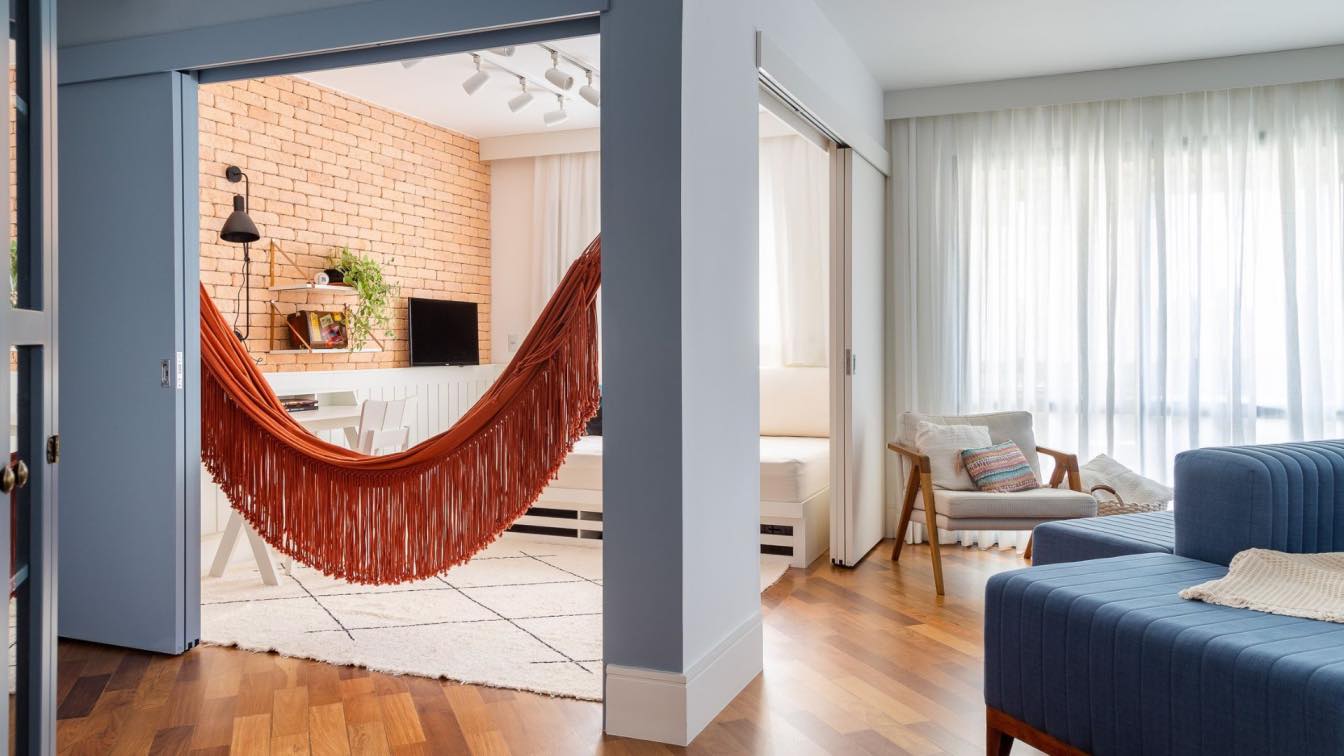
The reversible room, received a white panel with a reversible bed/sofa, just below the earthy bricks, a work or study table was placed loosely in the room and a swing hammock to relax.
The professionals faced two major challenges in the project. The first was the creation of the curved wall of the entrance and the fireplace, with the painting called a "whitewashed effect". This type of painting and effect is not one that is sold ready-made in stores and had never been produced by any of the office's suppliers. To incorporate this painting, they had a working process with different materials and application tests, until they arrived at the best recipe and then produced it by hand on all the walls that carried the effect.
The second challenge was construction time. As it was a move from an old apartment to a new apartment, with a pre-established move-in date, many of the solutions adopted were also carried out depending on the deadline, such as the choice to preserve part of the furniture box. existing ones, changing all the doors, finishes and track lighting, so that it would not be necessary to lower a plaster ceiling to receive spotlights, the brick walls of the reversible bedroom were preserved in this space, but received a new look with the entire environment transformed, among others proposed solutions.


