HOW CAN A HOUSE BE A TRIANGLE?
IF SPACE TURNS CORNERS.
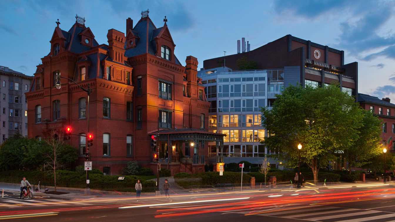
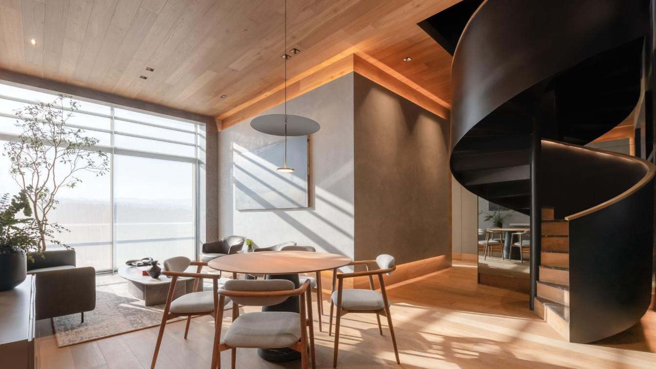
EL Studio PLLC: A renovation of a 3,900 SF, two-level apartment on Dupont Circle, the existing space was a lesson in the challenges of converting DC’s Commercial office inventory for residential use: low ceilings, imposing structure, insufficient building systems, and a footprint resultant from its position on the triangle between Massachusetts Avenue and P Street NW. The project was an exercise in “shrink-wrapping”: simplifying geometry with a curtain of elevated finishes. The unit shape is resolved by the communicating stair, which connects a double-height living space to the upper level.
The stair user begins oriented parallel to P Street. At an intermediate landing, the user turns to face Massachusetts Avenue and ascends a series of cantilevered parallelogram treads. The treads are steel plate wrapped on five sides in mitered white oak. A stainless-steel rod guardrail emphasizes height. The stair, which occupies an acute corner of the triangle footprint, connects living space to upper-floor bedrooms via a double-height gallery, maximizing the client’s daily interaction with art, light, and the urban context beyond. The handrail is a leather-wrapped block set on a recessed angle.
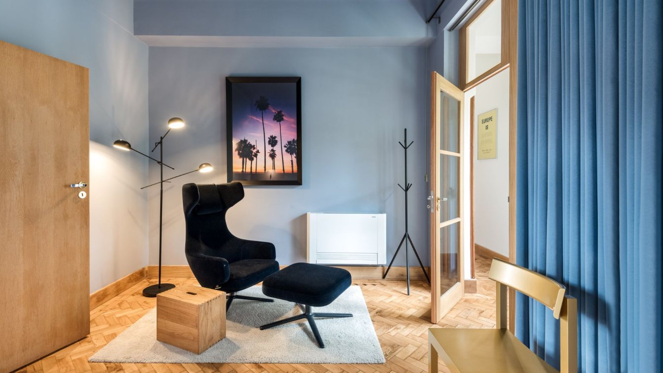
The primary suit is accessed from a bridge that spans the double-height living space. The stair and the suit both negotiate the challenge of the polygonal unit shape. The bed is tucked in a niche with metallic wall covering, framed with white oak wood paneling. A bedroom-safe fireplace anchors a seating area in the outer point of the suite’s triangular shape. The television is recessed into wood paneling which suggests the form of the dressing area further along the window wall. The dressing area is polygonal in plan, following the angle of the window wall. Double hanging closets with floor-to-ceiling white oak doors line the space. A central dresser is topped with black-painted glass. The panels that face the windows open for extra storage. Full heigh Nero Anrico stone panels line the vanity wall beyond (and contrasting penoy wall covering in the toilet room). The Vanity also has a polygonal top. The top opens to reveal a mirror, recessed lights, power outlets, and storage. Raised ceilings in both the dressing area and bedroom, painted blue, echo the suit’s geometry while counteracting the lower ceiling heights necessitated to deliver conditioned air to the expansive window wall. The primary bath arrays around the back of the dressing area millwork, with marble-lined vanity and walk-in shower spaced by a toilet room and utility closet.
The project engages the incidental geometries produced by the overlay of grid and radial avenues of the L’Enfant plan, providing subliminal orientation to the surrounding city.


