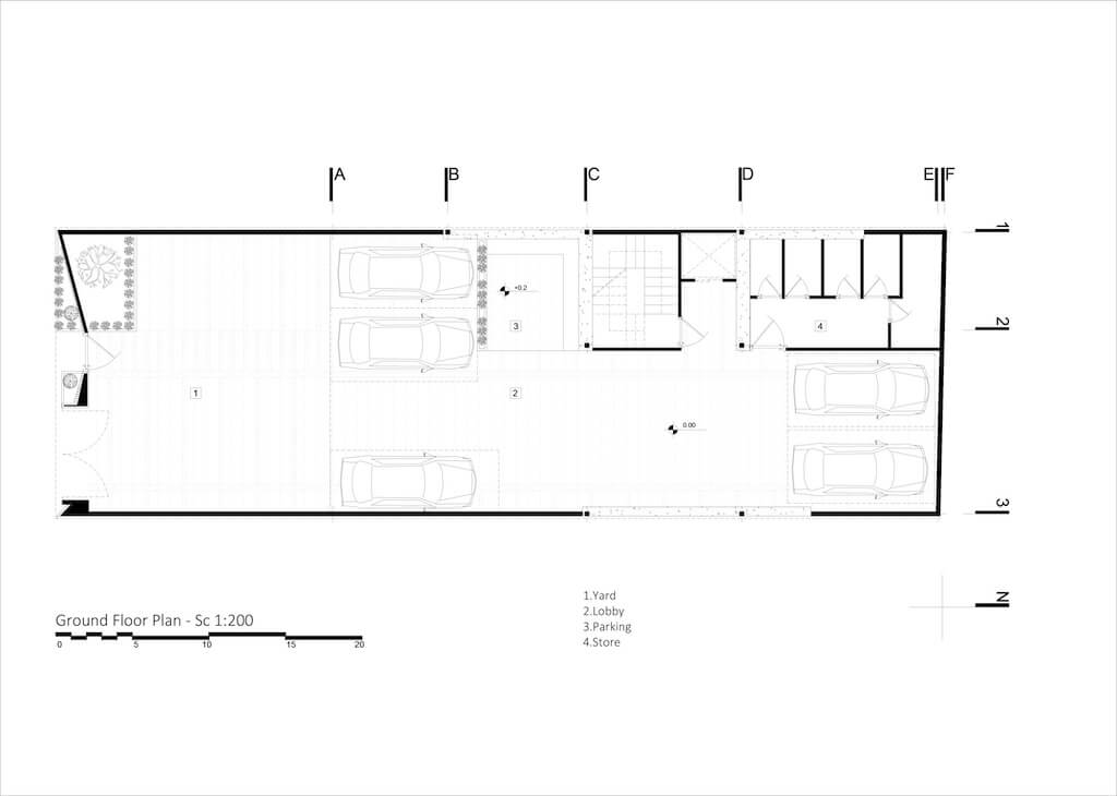
Barsav Office: The primary challenge of the project was to establish a connection between the client's preferences for their living area and the neighborhood's historical, cultural, and economic features. As architects, we saw our task as developing a model that could both blend in with the neighborhood's historical context and serve as a viable substitute for the varied and haphazard structures that have been the long-term homes of the local population. The first strategy to accomplish this is to deal with the creation of memories, which is a junction between the history of the fabric, old dwellings, and the sensation of being in the space, rather than going back to the previous architectural form and image and instead following merely a cursory impression. It caters to the project's customers and clients.
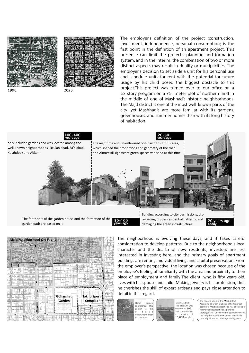
The employer's definition of the project (construction, investment, independence, personal consumption) is the first point in the definition of an apartment project. This presence can limit the project's planning and formation system, and in the interim, the combination of two or more distinct aspects may result in duality or multiplicities. The employer's decision to set aside a unit for his personal use and schedule units for rent with the potential for future usage by his child posed the biggest obstacle to this project. This project was turned over to our office on a six-story program on a 250-meter plot of northern land in the middle of one of Mashhad's historic neighborhoods. The Majd district is one of the most well-known parts of the city, yet Mashhadis are more familiar with its gardens, greenhouses, and summer homes than with its long history of habitation.
The neighborhood is evolving these days, and it takes careful consideration to develop patterns. Due to the neighborhood's local character and the dearth of new residents, investors are less interested in investing here, and the primary goals of apartment buildings are renting, individual living, and capital preservation. From the employer's perspective, the location was chosen because of the employee's feeling of familiarity with the area and proximity to their place of employment and family. The client, who is fifty years old, lives with his spouse and child. Making jewelry is his profession, thus he cherishes the skill of expert artisans and pays close attention to detail in this regard. The employer creates a paradox by pursuing opulent design and summarizing in an opulent manner while simultaneously emphasizing the delightful and unforgettable experience of living in homes with courtyards.
Our objective was to rethink employer expectations and pursue luxury in the form of excellence, usefulness, and tangible, personal, and unforgettable experiences.
Grapevine
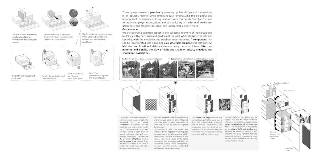
We discovered a common aspect in the collective memory of individuals and buildings with courtyards and gardens of the past while studying the site and speaking with the employer and neighborhood residents. A component that can be incorporated into a building as a structural element and that conveys historical and functional history while also being translated into architectural patterns and details, the play of light and shadow, privacy creation, and ventilation possibilities.
Ideogram
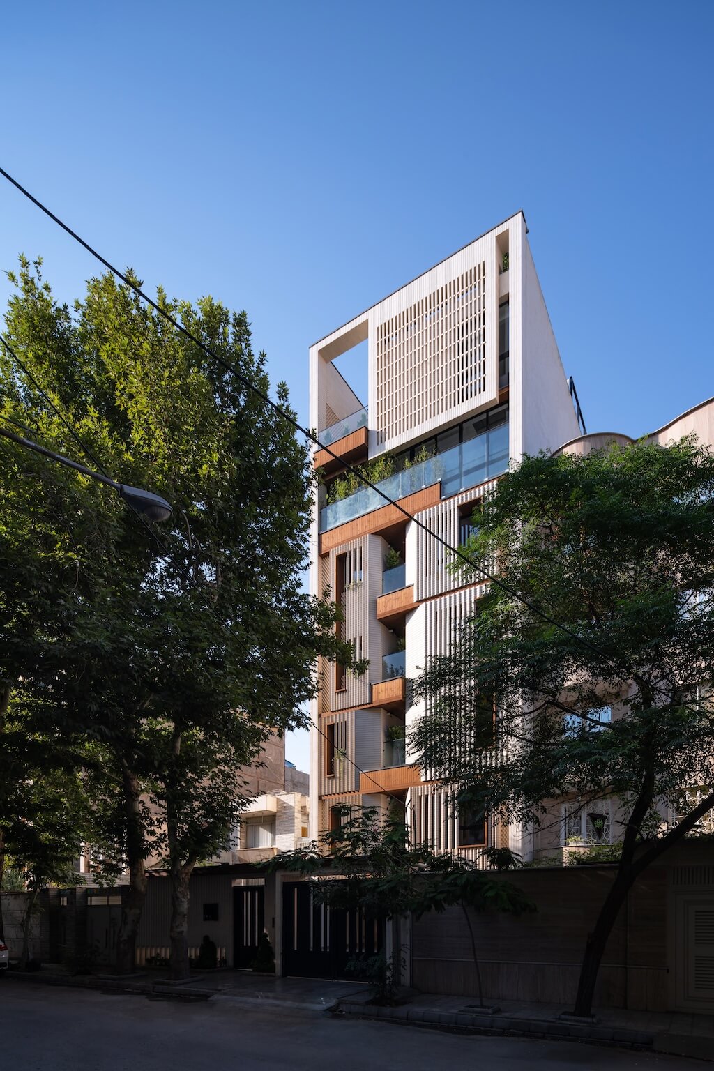
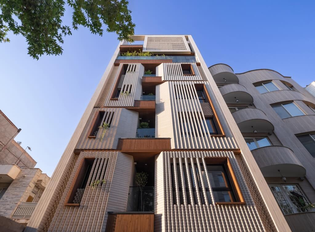
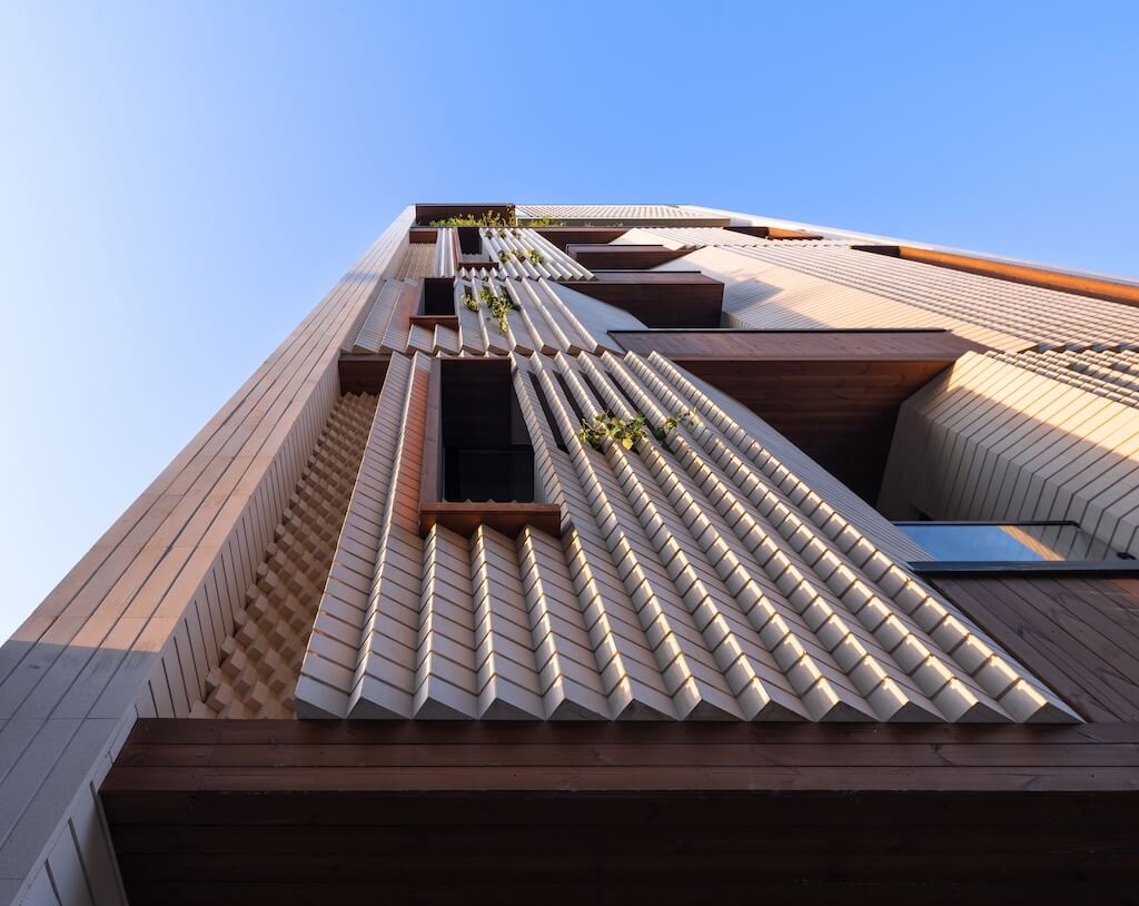
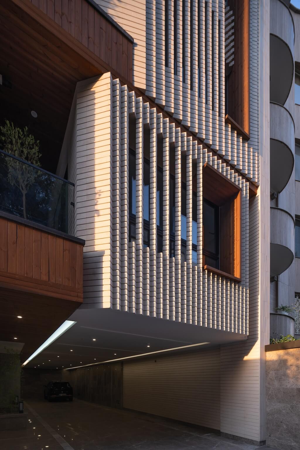
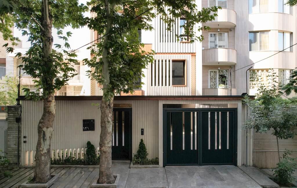
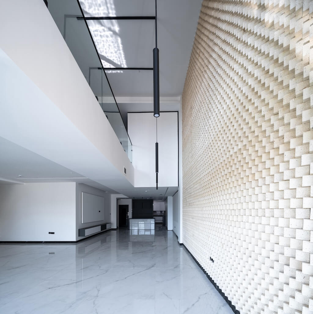
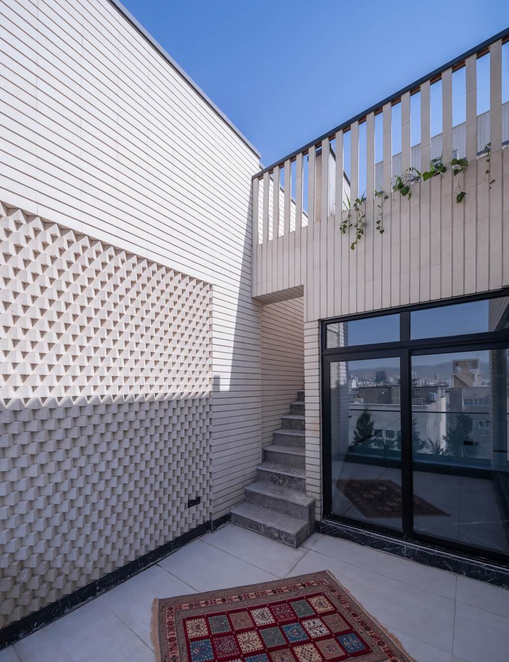
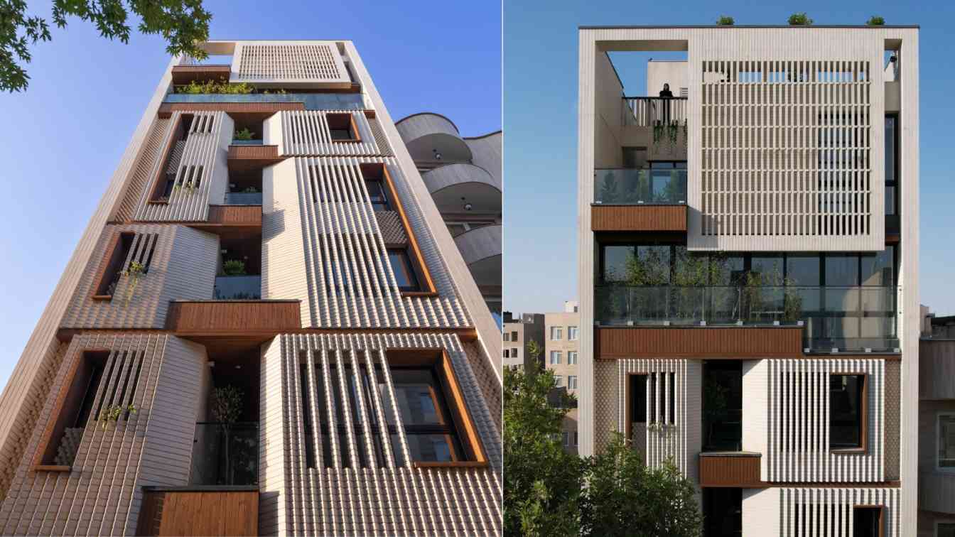
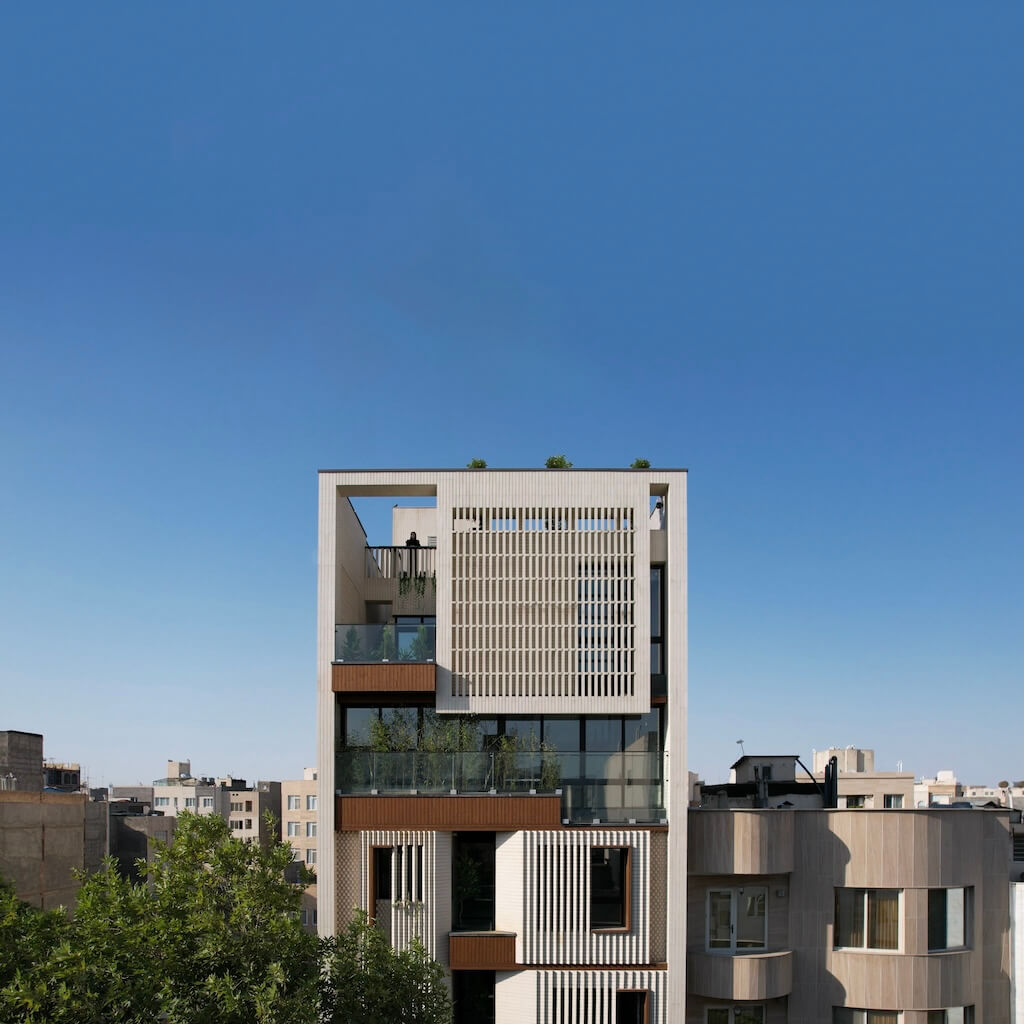
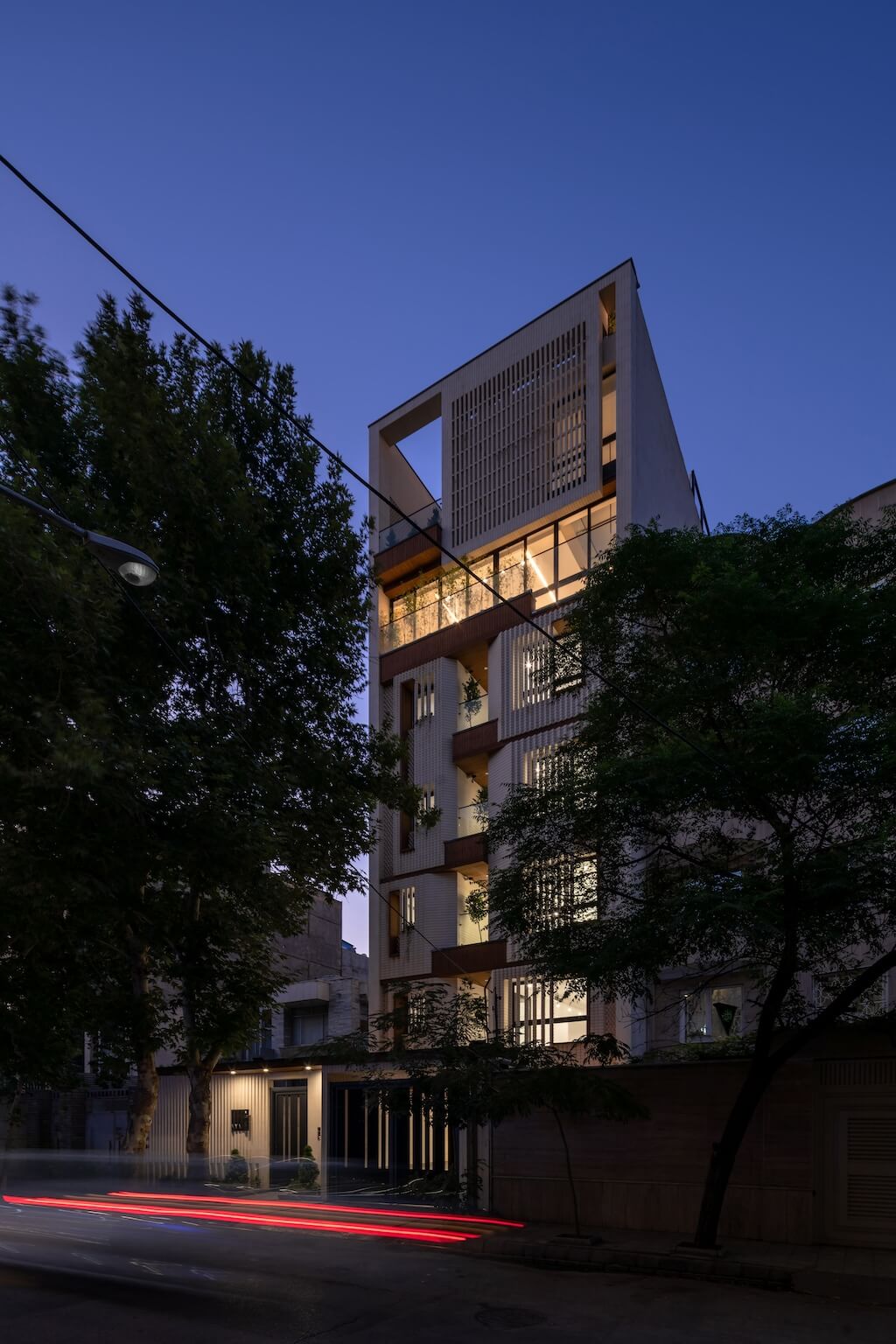
The project's fundamental concept is a frame, which serves as both the framework for the spatial component arrangement in the building's core and an index model for it. Simultaneously, it is well adorned, setting it apart from its weired neighbors that will soon undergo renovations. The story of the movement of light and shadow on the sloped brick surfaces, from the front to the depth of the room, is centered around a frame with a few old plane trees in front of it. Based on a climate study of the materials and prototype used in older Mashhad structures, white brick was selected for its color and capacity to dampen neighbor disturbances.
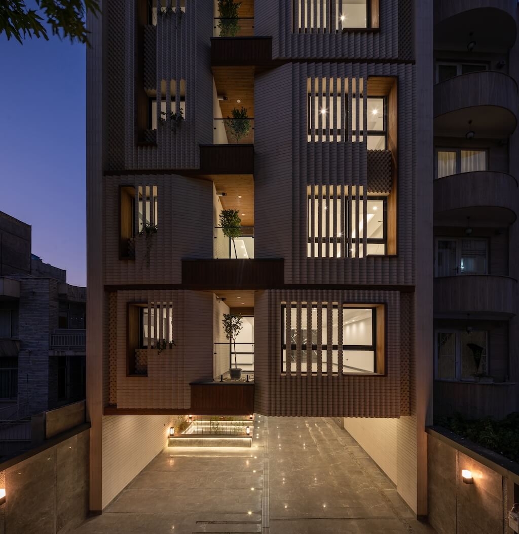
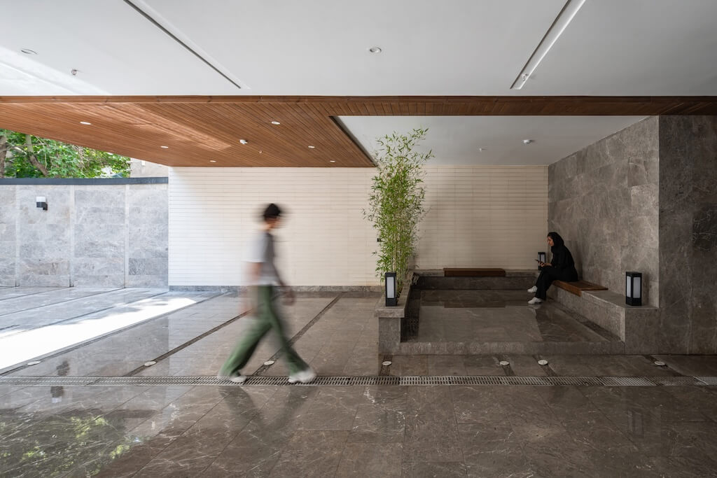
The interaction with the street was restricted to the negative volume spaces (terraces) due to the alley's narrow width, heavy traffic, and the aristocracy of the houses. However, because of the light's penetration into the space and ability to see outside the day spaces (living room), we were able to consider unattended windows and natural ventilation. The corners are angled toward the surroundings, giving the space user a larger field of vision down to several tens of meters. Nevertheless, the perspective from the depth of the room ends just at the plane trees that border the terraces' outside, enabling interaction with the environment.
The leaf shells on the volume can be angled and slid to create different exterior permeabilities and apertures to control the view from the outside to the inside. This also provides a background for the play of light and shadow and regulates the amount of sunlight. It also turns the view away from the front and faces east and west to provide a more detailed visual experience of the alley and sunrise and sunset.
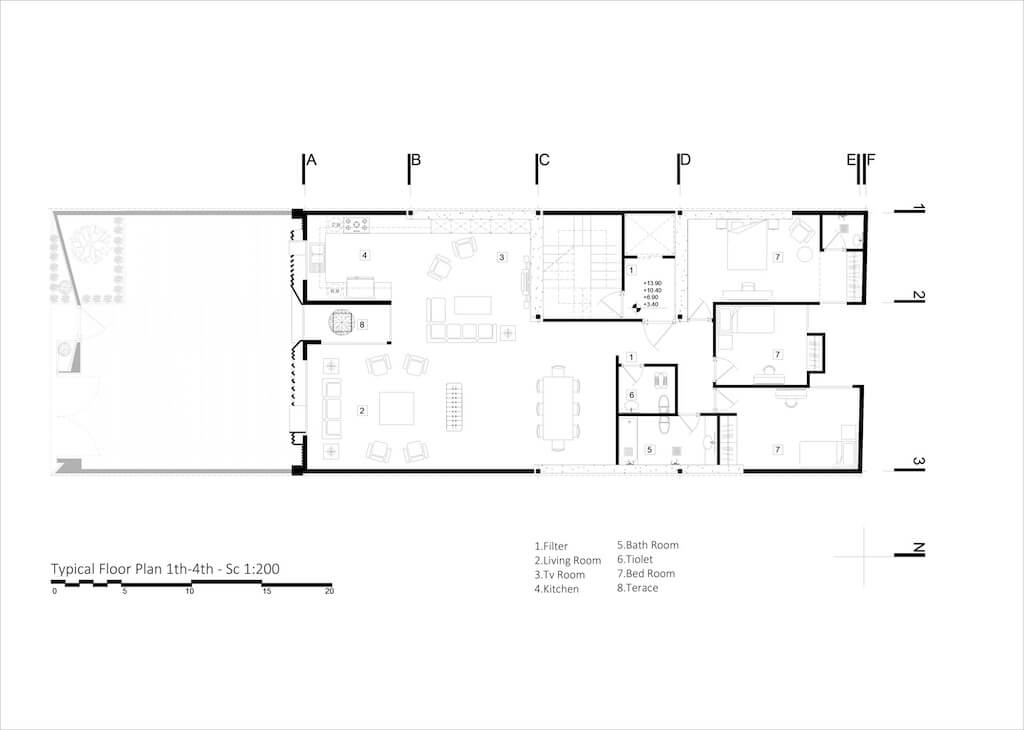
Typical floor (1th-4th)
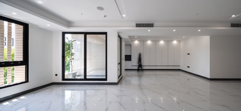
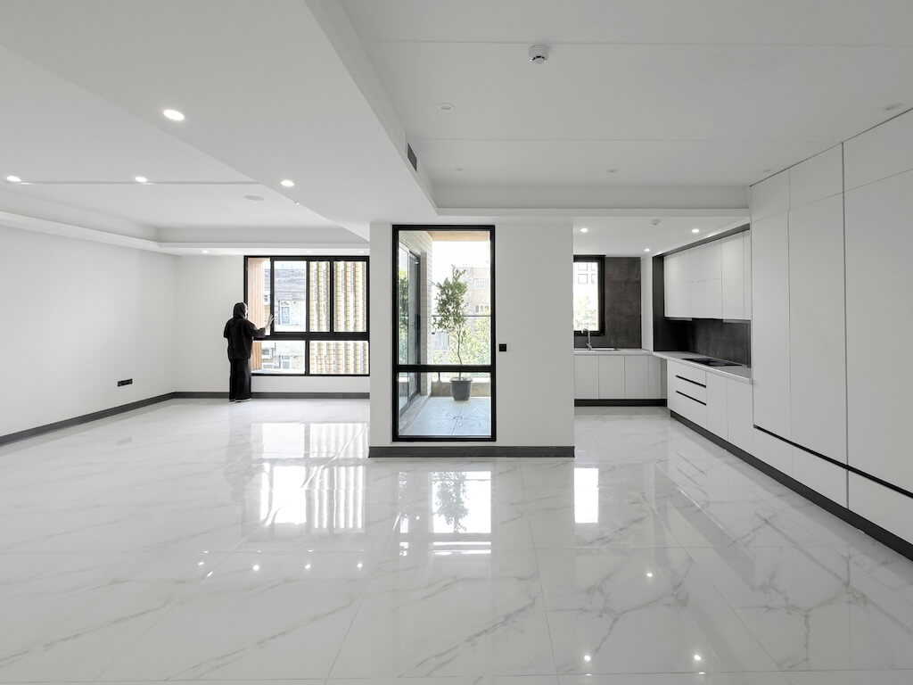
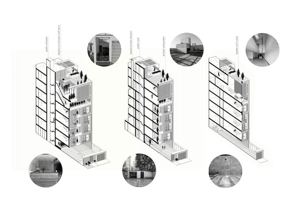
The employer's concerns regarding the definition of rental units in the first to fourth floors (160 meters) were the kind of layout, the maintenance issue, materials that could be renewed, and the openness and smoothness of the space. The primary goal was to enable the adaptability and versatility of the area situated between the kitchen and the main hall. Space approaches: First, the space (living room, library, TV room, leisure area, etc.) can function independently. Two: The option to expand the main hall or the kitchen (preparation-dining area) The terrace, which extends from the facade's edge to the depth of the layout, offers the visual appeal, ventilation potential, and natural light benefits for this area. Despite being green, it is seen to be an appropriate partition between the kitchen and dining area.
House
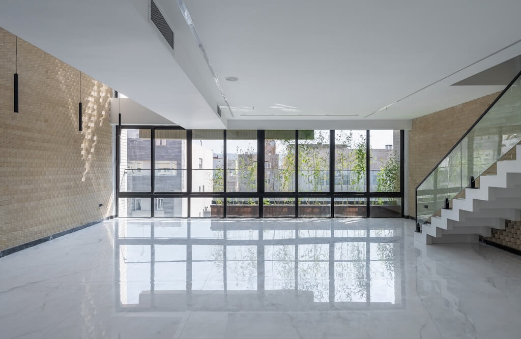
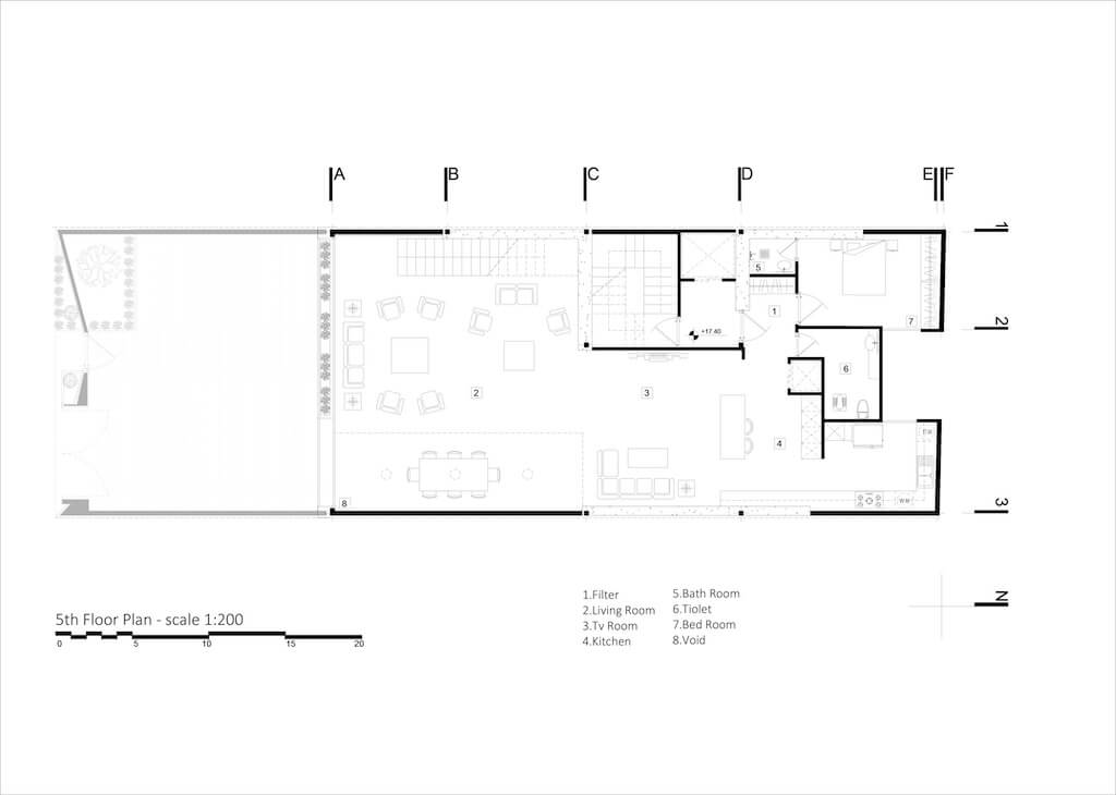
When this house was designed, the client was the main user of the space. The white-black duality, which was based on past architectural experience on the one hand and a lack of spatial predecessors on the other, needed to be proportionately redefined to reach the middle ground. The living area and guest reception took up the entire first floor of the house. due to The southb ody's garden allowing for the creation of a green curtain in front of the neighbor block's roof, and the absence of aristocrats (opposite blocks) maximized transparency.
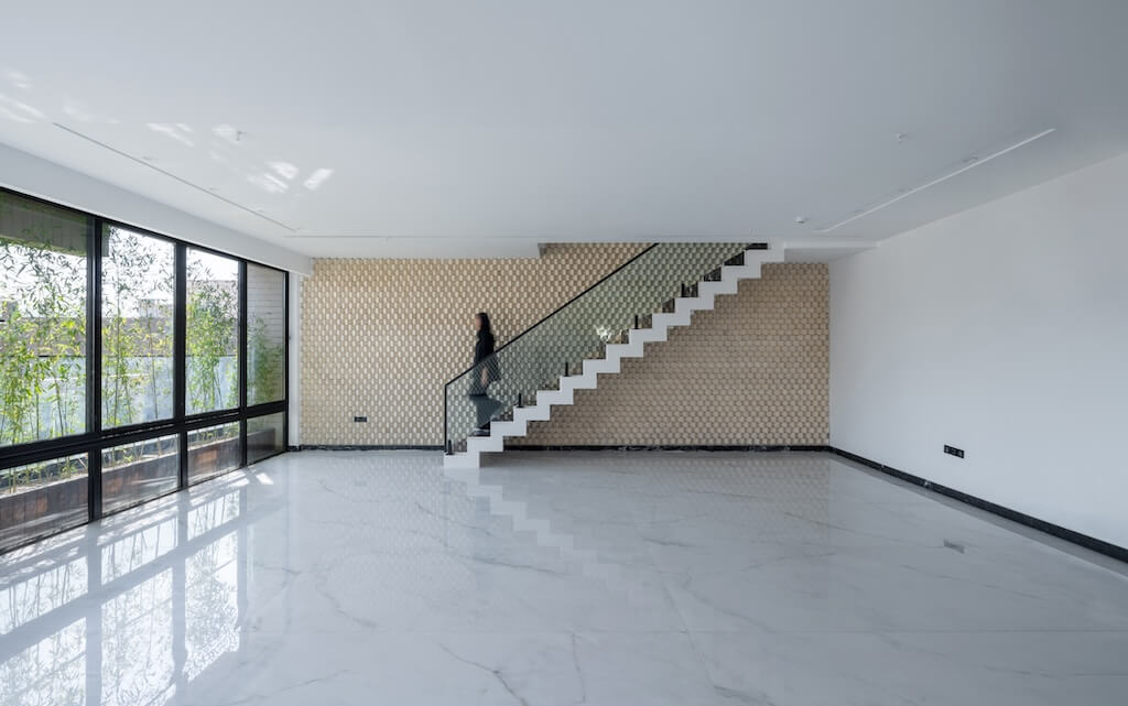
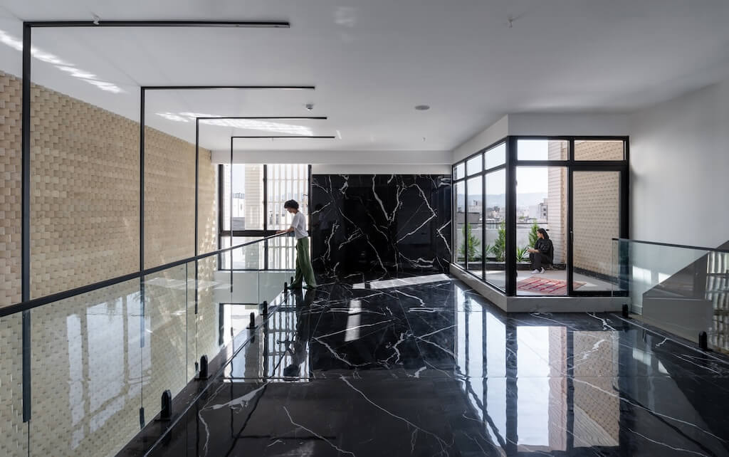
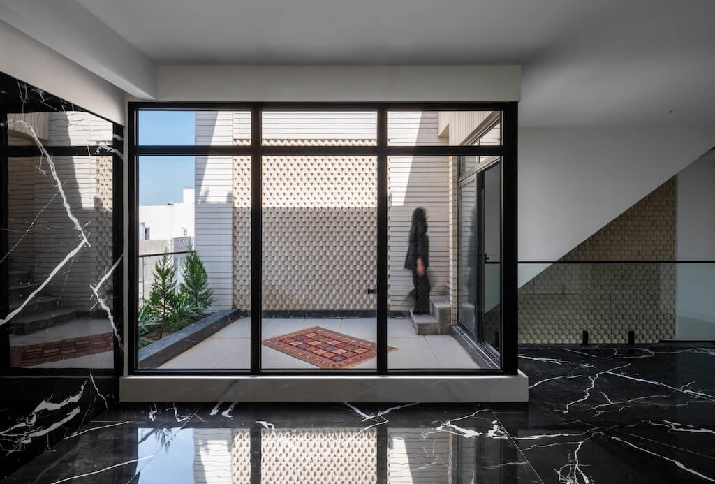
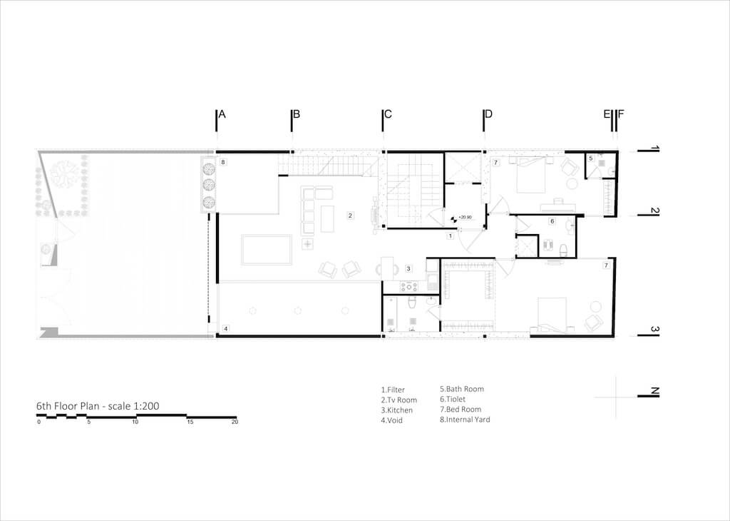
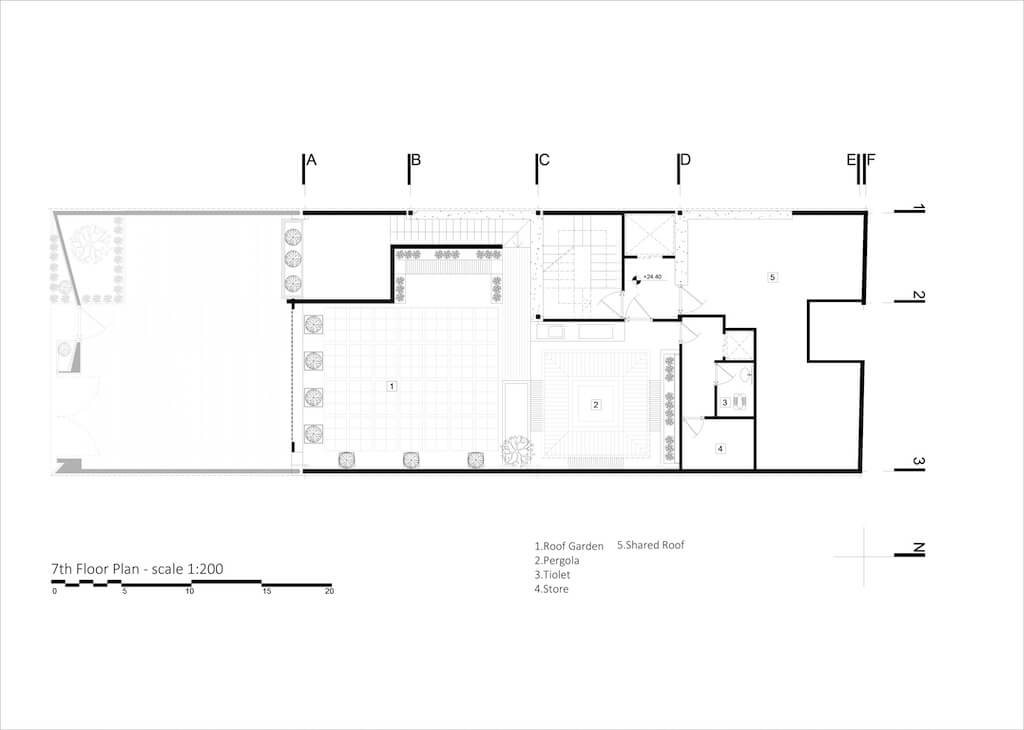
The rooms, living room, and open courtyard with a view of the plane trees are all on the second floor. The living room faces not only the courtyard but also the main room and the reception area through it. The living area may open up to the public courtyard, much like the porches of old houses did. Connected to the roof's third tier, the open staircase can provide a space to child's play, and spend an hour of the night with family members. We aimed to uncover the intuitions that transpired in the space and to inspire a feeling of questioning by introducing ambiguity into the elements of architecture.
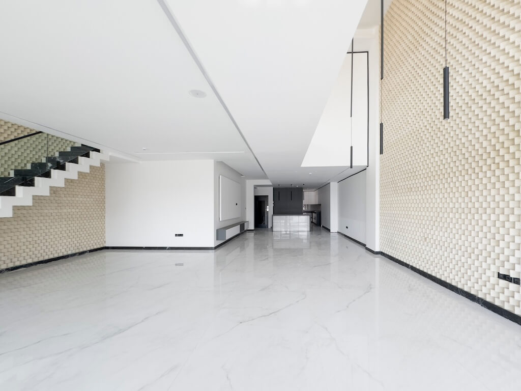
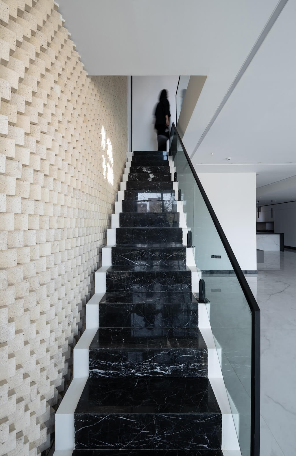
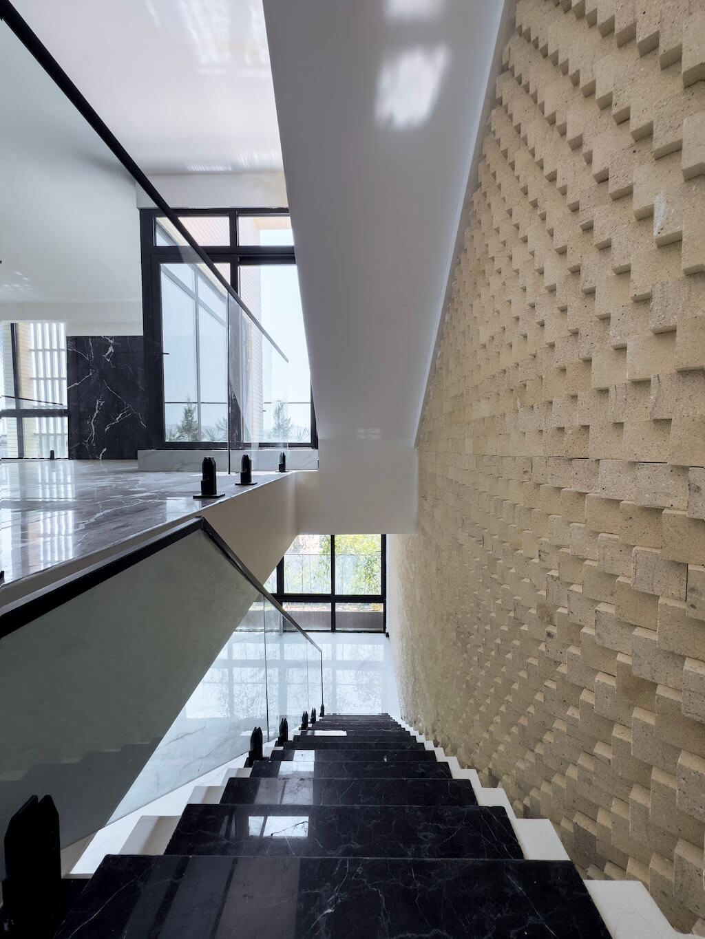
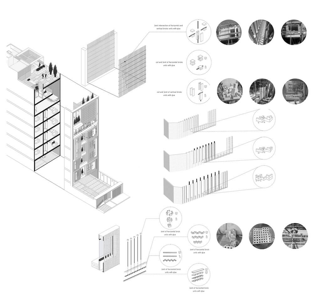
A frame created by angling the placement of cut brick pieces. By rotating and moving through the two-dimensional image, it conveys a story of memories through the play of light and shadow on the various brick faces—rather than merely being a brick wall with several dimensional dimensions. There are distinct experiences within and outside the space when there is sunshine since it is partially bright, partially dark, and partially illuminated in some areas of the shadow. The brick frame enhances readability, extension, and the relationship between the floor levels in the initial step. However, after going through the staircase and into the second tier, we see that the body extends to the third layer and that there are stairs from the courtyard that lead to the next layer. Reaching the main objective becomes much easier when one pays attention to the space's zeros and ones in terms of color and texture.
