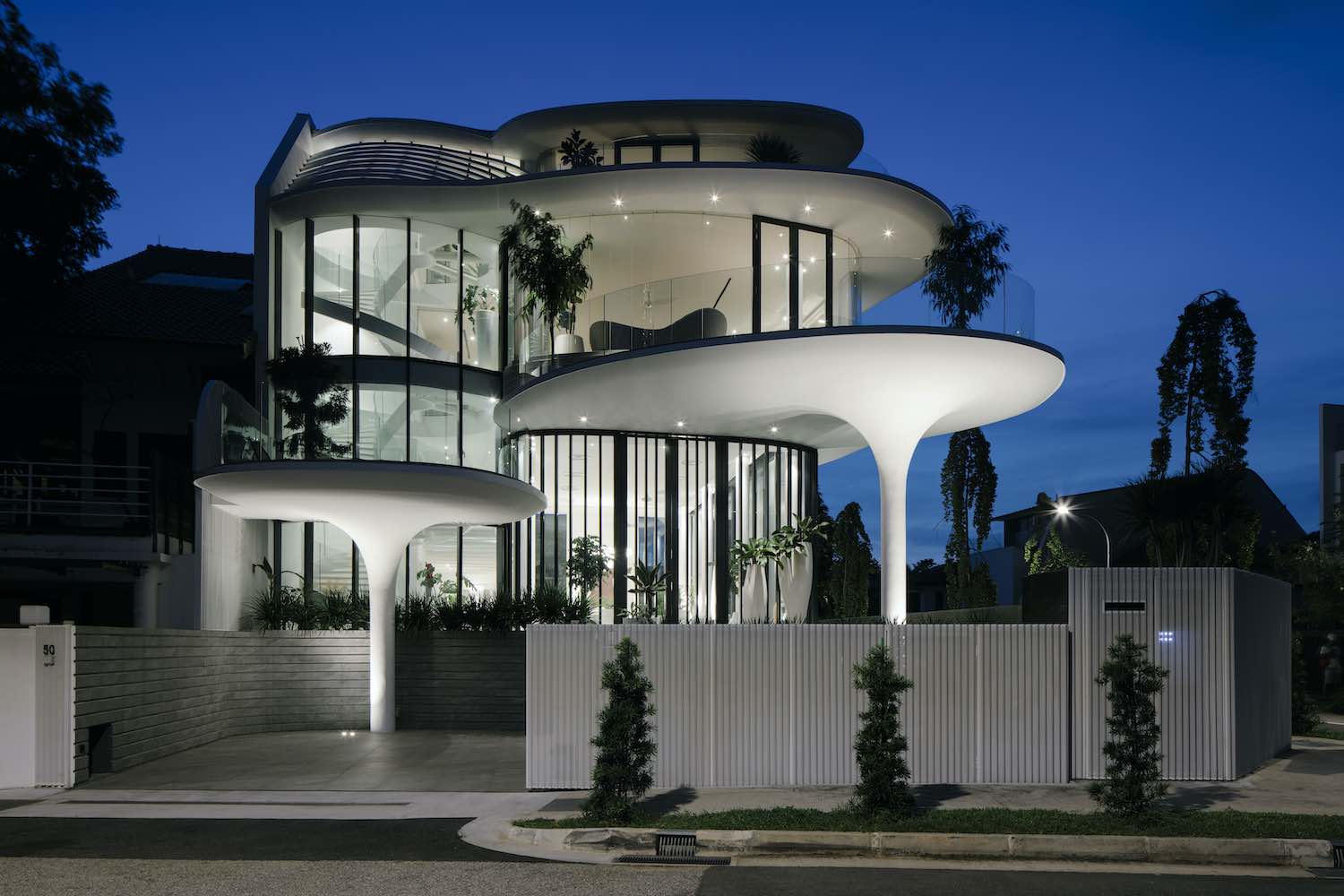
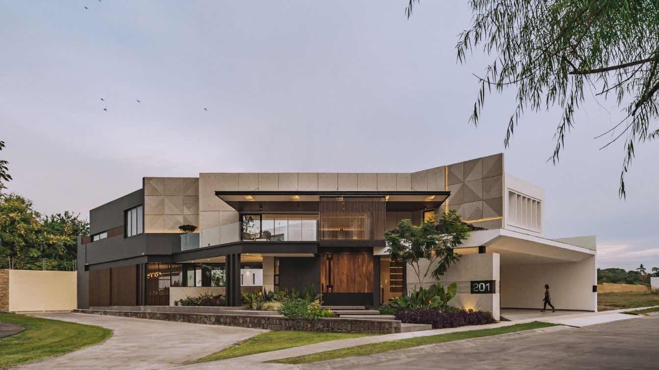
The Singapore-based architecture firm EHKA Studio led by husband and wife team Hsu Hsia Pin & Eunice Khoo has recently completed ''Stiletto House'' in Singapore, that is inspired by the beauty of free-flowing curves.
Architect's statement: Inspired by the beauty of free-flowing curves, Stiletto House is a fusion of sculpture and building, a blending of form and function to create living spaces that inspire. It embraces traditional concepts of tropical architecture while reinterpreting them in contemporary forms. It explores what a house could be like for an avid collector of antiques and ultra-modern furniture, a house that displays and becomes a display itself. The house strives to strike a delicate balance between the traditional masculinity of dramatic grand spaces and the sensuous, fluid nature of free flowing curves. An otherwise rigid double volume space is blanketed with the softness of the curved overhangs and columns. The curves seek to question the possibility of breaking the mould of typical rectilinear forms while responding to local planning guidelines and maximizing plot efficiency.
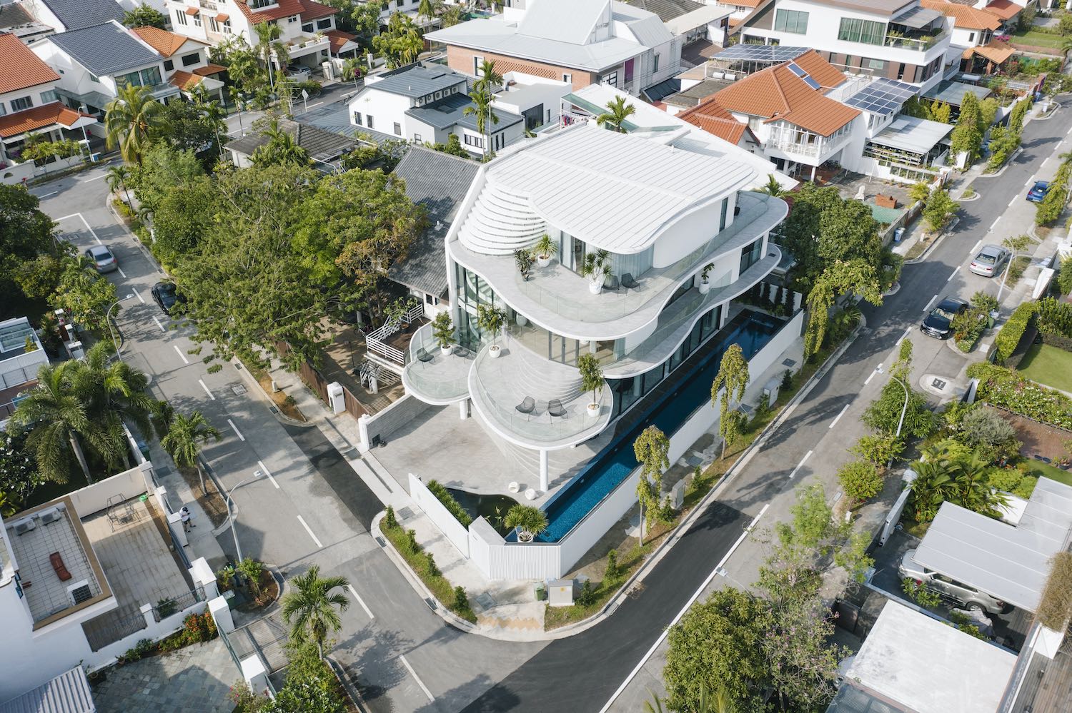 image © Studio Periphery
SETTING OUT CLIENT’S BRIEF
Our client is an avid collector of antiques and furniture and he envisaged a house to showcase his amassed collections. His brief was to create a "curvy" house, with maximum internal space, large open spaces to display his antiques and furniture pieces. 1st floor should be voluminous, bright and airy. The house was to have a sense of drama, a “wow” factor. He wanted large double volume living space with a colonnade of round columns. The facade is to be full of glass.
We interpreted the desire for a very unique and dramatic looking house by creating very sensual sculptural forms. "Floating" overlapping curvaceous planes shield the spaces, enclosed by curved glass and walls.
The columns become a curvaceous stiletto, supporting the entry porches, illuminated dramatically by night. Glass is used generously for the facade and balustrades to create a sense of lightness. Even though some spaces are deep, none feel dark or claustrophobic. Double-height glass in the living room allows the living spaces, with all its furniture and antiques to be on “display” to the public, even the curvaceous spiral stairs is visibly positioned in front of the house and fronted with curtain wall glazing. Double-height sliding doors open fully at the living hall for the hot air to escape while large fans ventilate the hall.
Sensual curves are deployed throughout the house, from the building to the landscaping and groundscape, to the staircases and curved glass railings, to the edging soffit details and corrugated perforated metal sheets, and even to the interior cabinetries, furniture and fitting out accessories. At each scale of the project, from the building form to the details, there is a pursuit of sensuality of form. These curvaceous forms create a sense of drama, plays well off the sunlight and adds a touch of "softness". Yet each curve is defined logically by the spaces it contains - bedrooms, family room etc, and is not employed in a whimsical manner.

image © Studio Periphery
PLANNING CONSTRAINTS
Our client’s goal was to maximise the site with as much internal floor areas as possible, and with each room being as large as it possibly can.
The planning constraints we faced were mainly the URA and PUB planning guidelines. Being located at low lying area, the ground floor is required to be elevated by around 1.5m from the road level. To negotiate the level changes, we created fluidly shaped steps that blend into the landscape. The entry approach from the carpark lot is sheltered by floating “pods” the follow the level changes. These pods are seemingly supported by only one stiletto column (but in reality, is also supported at other points for stability).
Although this house is located in a 2 storey residential zone, by working within the envelope control requirements of URA, we managed to squeeze in an additional mezzanine floor. This gives the owner additional floor space, which he used to house some of his antiques and designer furniture. To prevent the spaces below the mezzanine from feeling too “squashed up”, the entire mezzanine floor is constructed with glass, so the kitchen and bar area below the mezzanine still feels lofty.
The total built in area is 9300 ft² which is remarkable for a plot of this size. All the rooms are pushed to the edge of the allowable setbacks. The sculpted roofs and floor slabs work within the allowable eave setbacks, while the internal spaces and balconies are pushed to the maximum building setback. The combination maximises space while creating a "playful" facade.
 image © Studio Periphery
MATERIALS AND METHOD OF CONSTRUCTION
Even with its seemingly complex shapes, the geometries can be reduced to simple concepts so that the construction methodology is reasonably basic and does not require any special building technology. The materials employed are common in the local house construction: concrete and glass. These make the building buildable and keeps construction cost affordable. The sculpted columns are in reinforced concrete, using with laser-cut formwork and flexible plywood to form the shape, then plastered and smoothened out by hand to achieve the smooth curves. The curved and corrugated exterior walls are fabricated off-site in fibre reinforced concrete panels and assembled and finished onsite to achieve a smooth finish.
The extensive use of glass in a home is the client’s requirement, and while seemingly counter-intuitive in the tropics, it actually worked to create comfortable and beautiful spaces when combined with passive design strategies which are adopted from traditional tropical architecture. The western façade is mostly solid walls, and the double- height sliding glass doors at the dining area have an exterior sliding aluminium screen to block the western sun. On the north and eastern facades we have large double-height glass, with sliding doors that can fully open, allowing the space to be cross ventilated. Coupled with the ceiling fans, large overhanging eaves to provide shade, and pool and water overflow wall along the entire boundary to cool the surroundings, these design strategies help create a comfortable living space that can be used even without air-conditioning. The use of low-emissive glass also helps to minimise the thermal impact. We believe this project can redefine what tropical architecture can look like.
ANY OTHER NOTEWORTHY DESIGN CHALLENGES AND FEATURES
This design challenges the notion that homes need to be rigidly shaped for efficiency, by exploring how a sculptural building can be efficient, logical, tropical, practical and liveable at the same time. While highly sculptural in form, the building also addresses the occupants needs for shelter and shade, light and ventilation - creating comfortable spaces even without mechanical cooling. The use of sensual curves is unusual for houses that are commonly defined by its setback boundaries and by the desire for maximum efficiency.
 image © Studio Periphery
 image © Studio Periphery
 image © Studio Periphery
 image © Studio Periphery
 image © Studio Periphery
 image © Studio Periphery
 image © Studio Periphery
 image © Studio Periphery
 image © Studio Periphery
 image © Studio Periphery
 image © Studio Periphery
 image © Studio Periphery
 image © Studio Periphery

image © Studio Periphery

image © Studio Periphery
 image © Studio Periphery
 image © Studio Periphery
 image © Studio Periphery
 image © Studio Periphery
 image © Studio Periphery
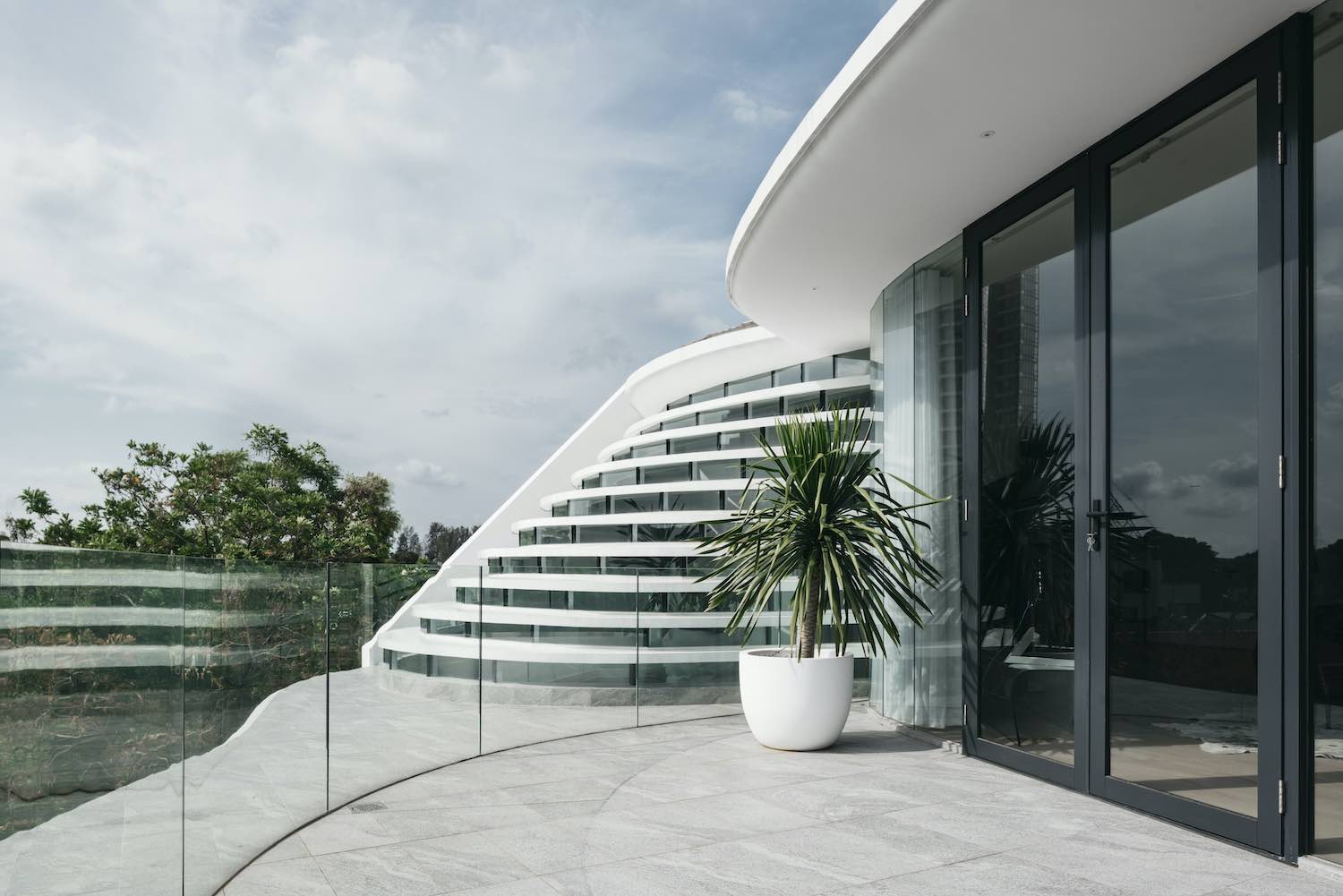 image © Studio Periphery
 image © Studio Periphery
 image © Studio Periphery
 image © Studio Periphery

image © Studio Periphery

image © Studio Periphery

image © Studio Periphery
 image © Studio Periphery
 image © Studio Periphery
 image © Studio Periphery
 image © Studio Periphery
 image © Studio Periphery


