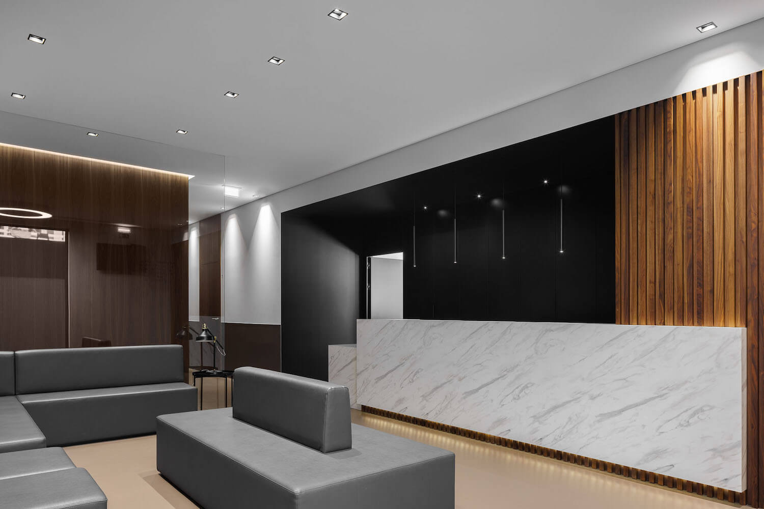
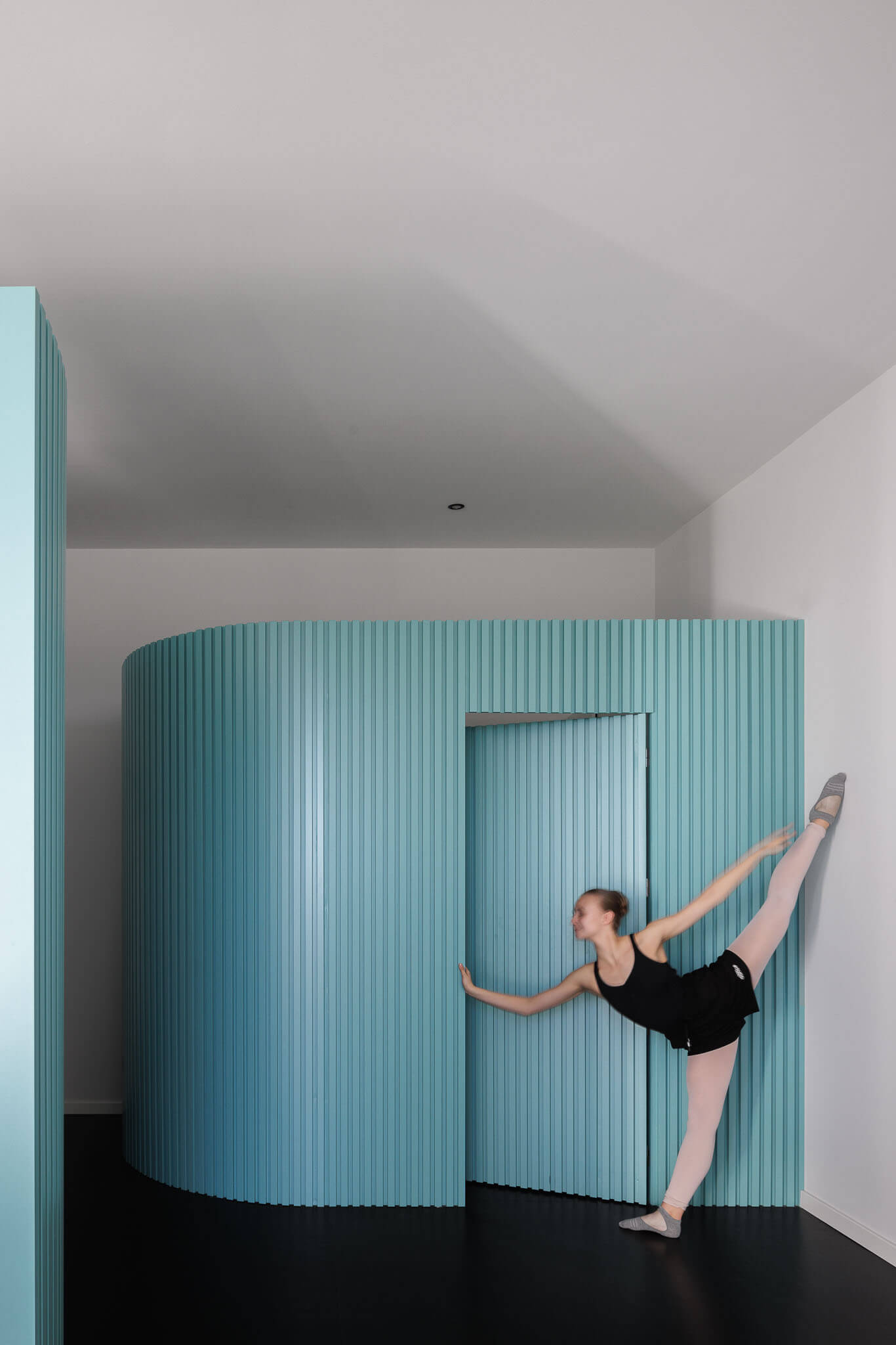
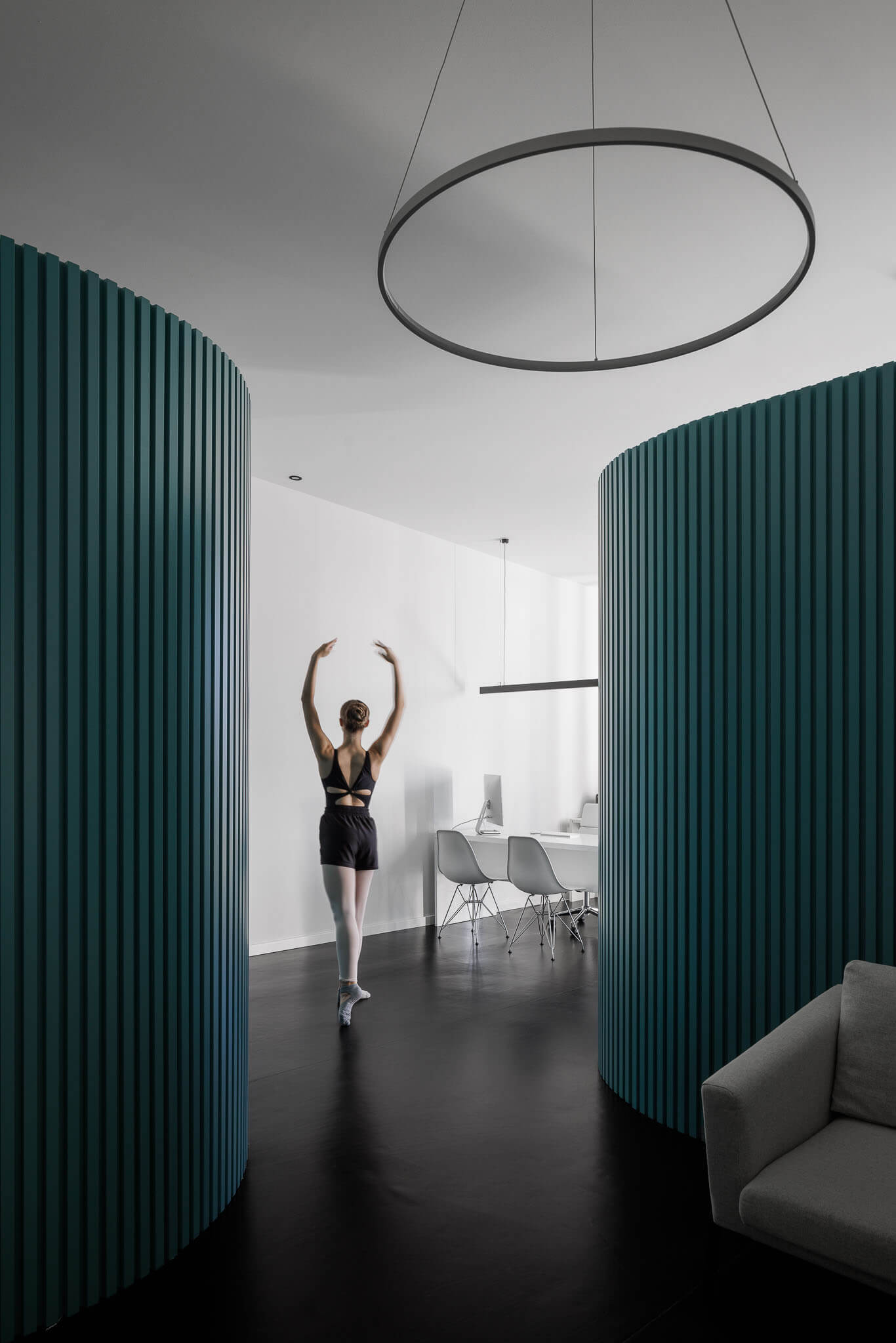
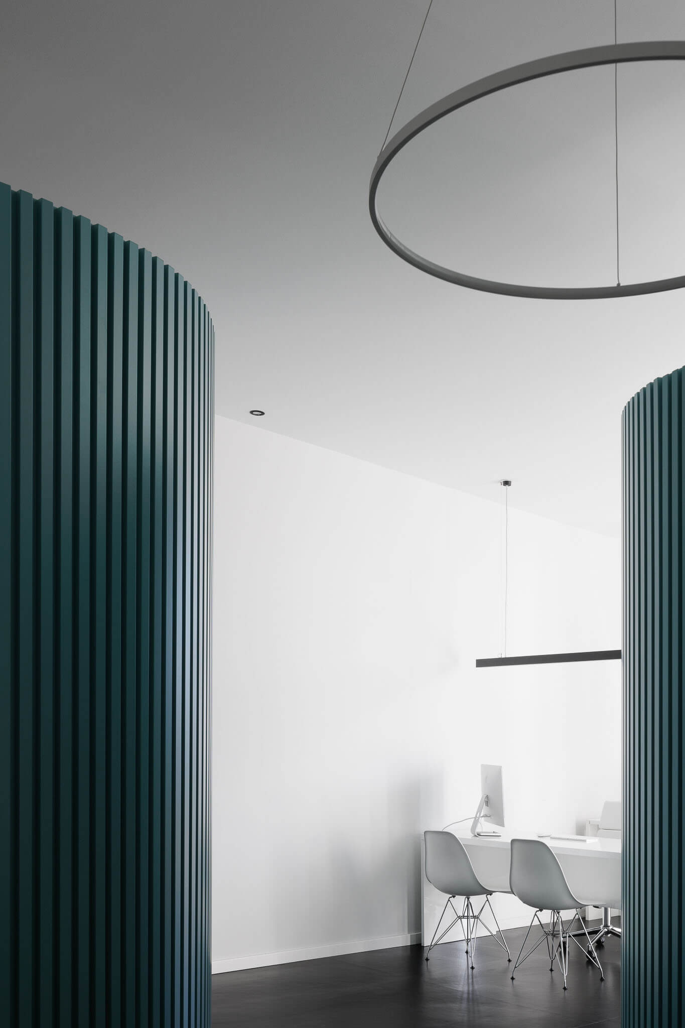
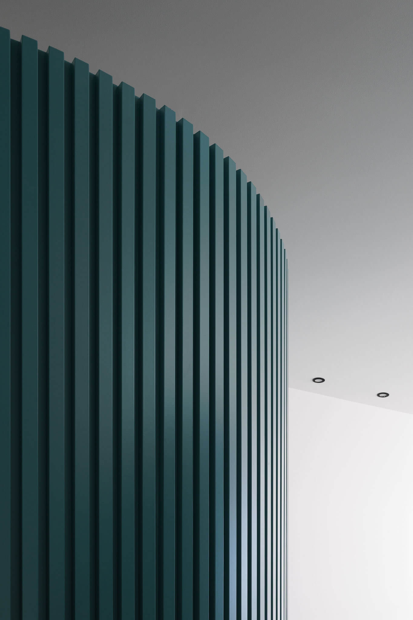
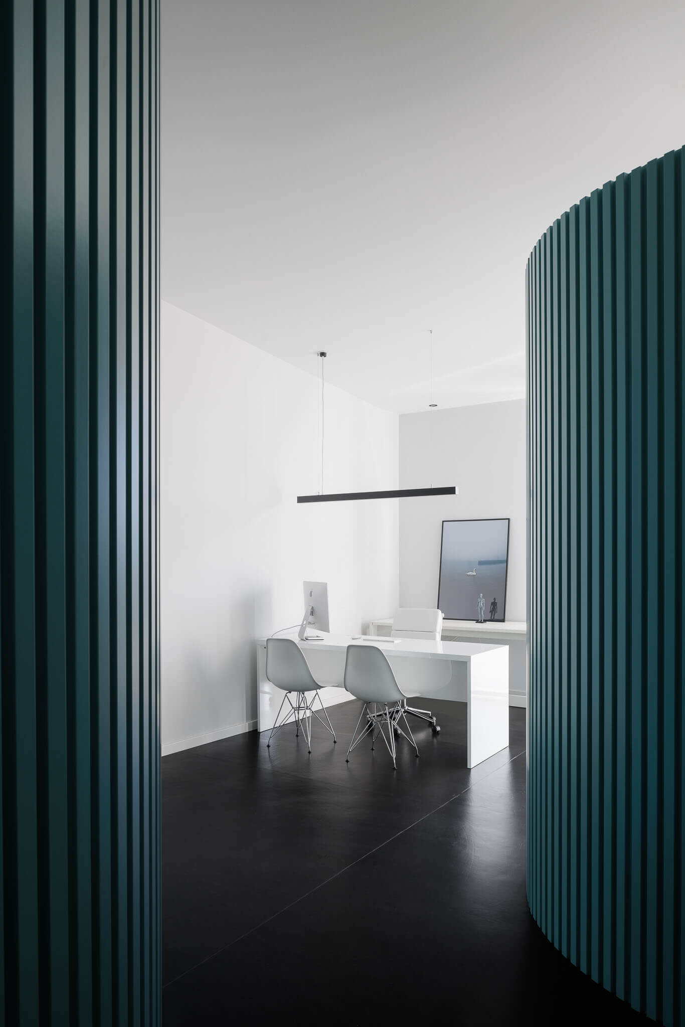
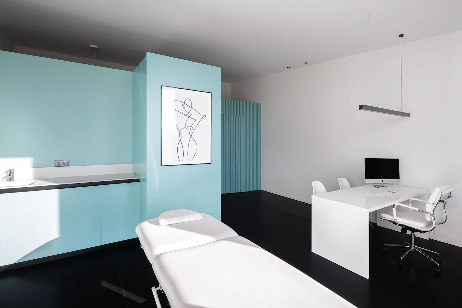
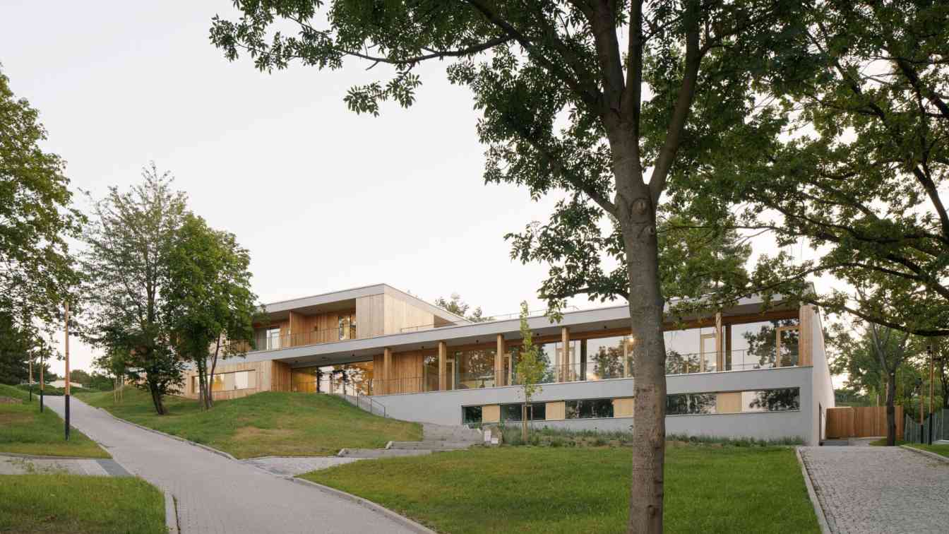
Industrial on the outside but delicate on the inside.
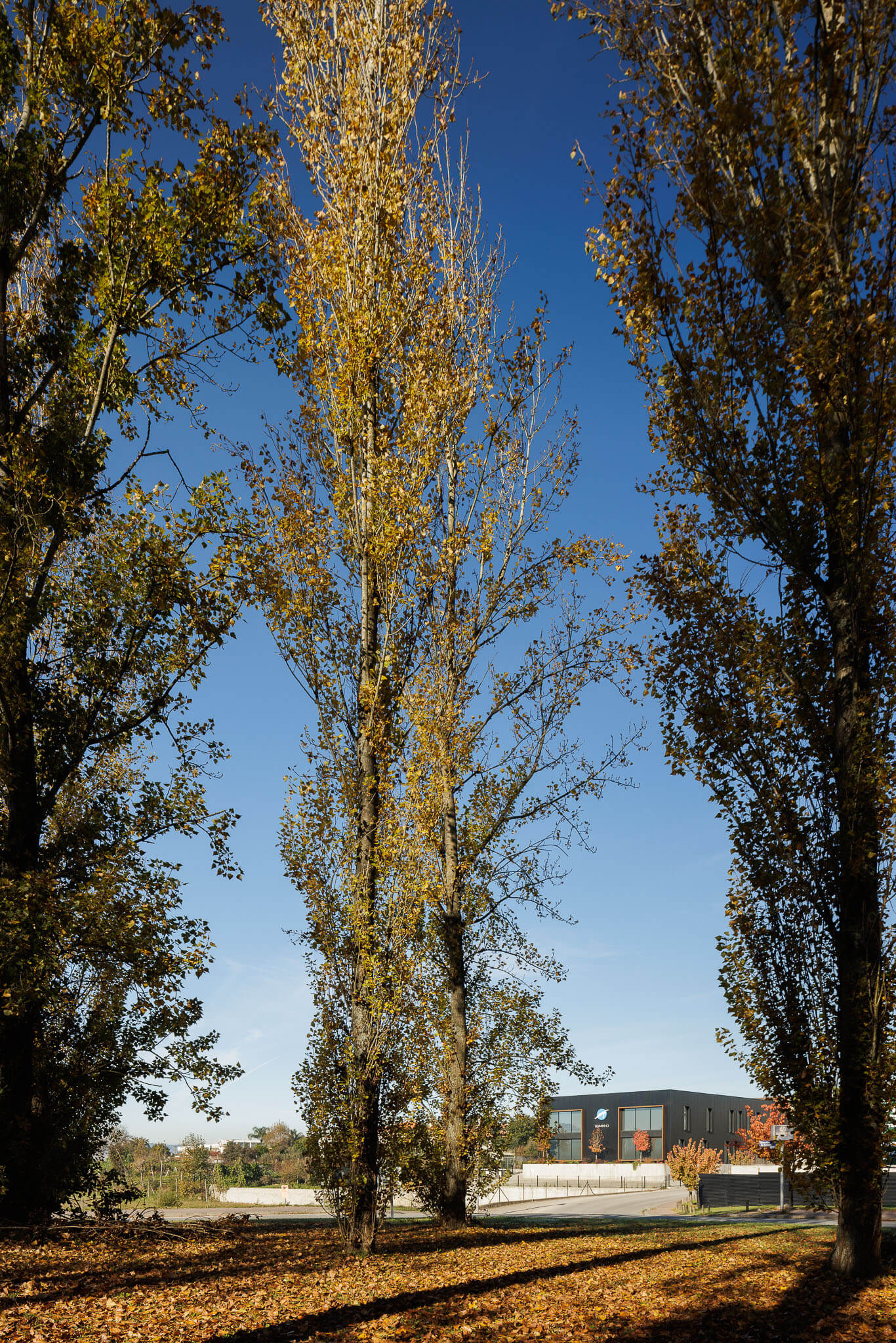
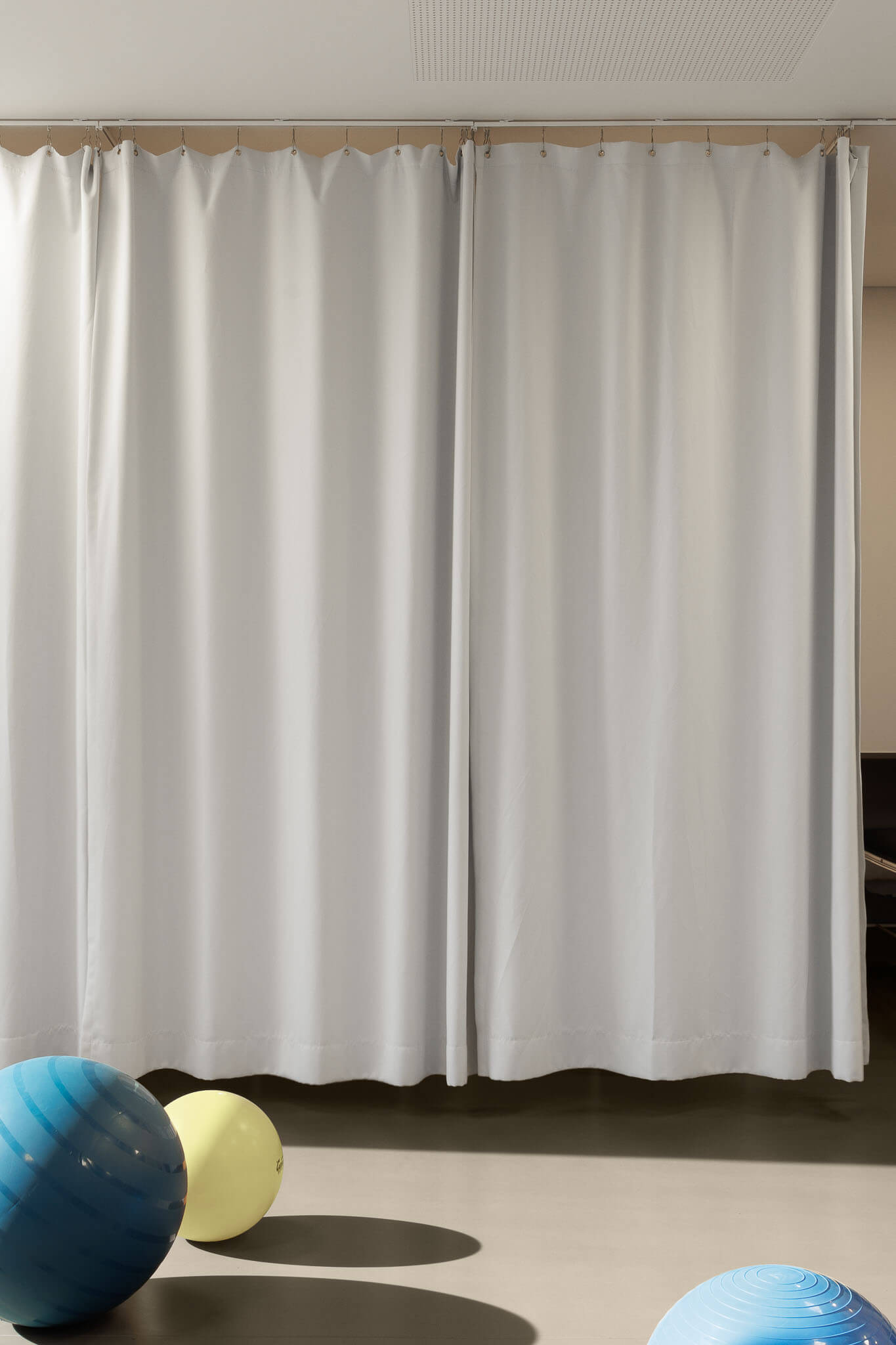
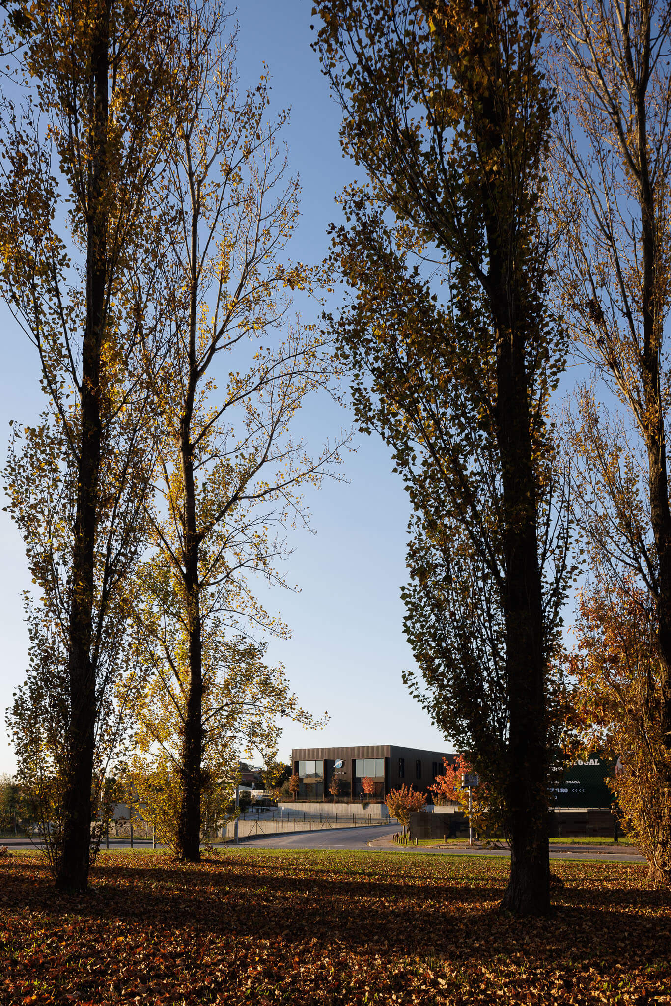
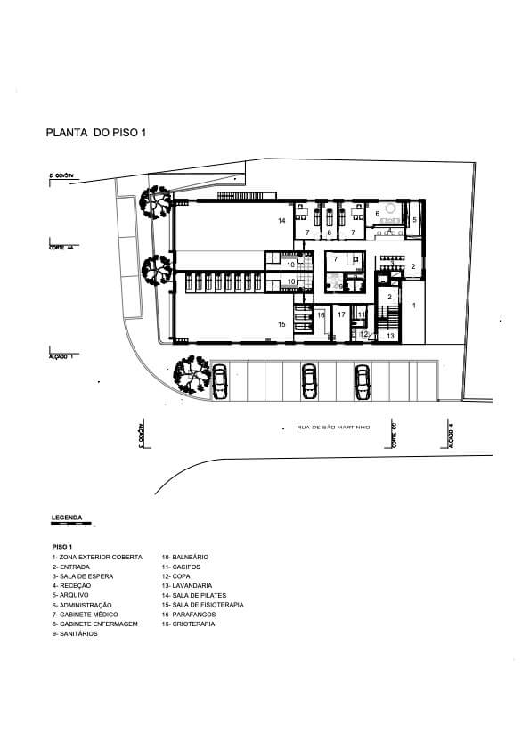
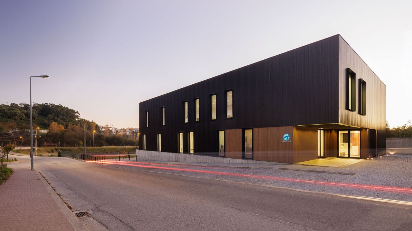
L2C Arquitetura: The land is in Braga, Portugal, close to is municipal stadium. This place, marked by some scattered construction, needed a building that faced the street and that somehow organized future constructions. The opportunity arose when we were contacted by Fisiminho, which intended to build a physiotherapy and rehabilitation clinic with a high-performance centre for sports.
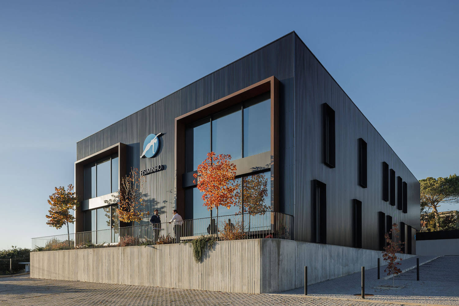
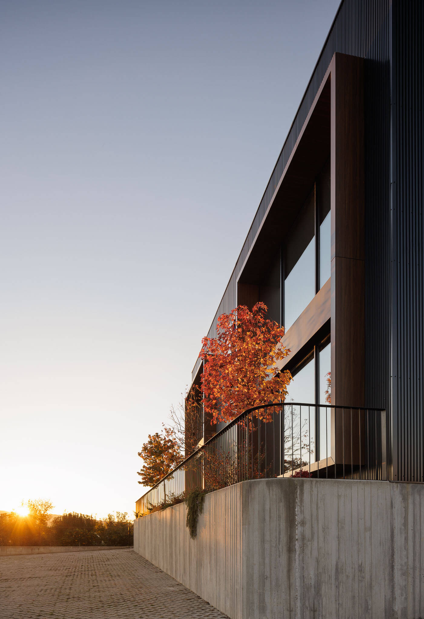
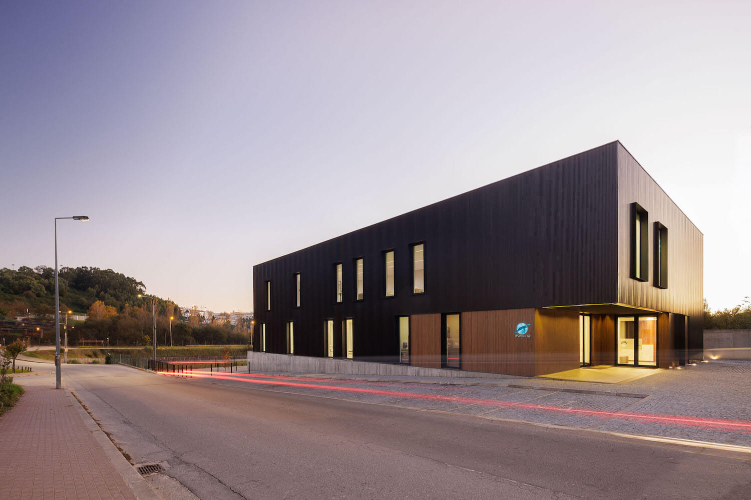
The difference in elevations of about 1.80m along Rua de São Martinho and a proposed street in the master plan, that crossed the lot played an important role in the formulation of the proposal. At the highest level, we find the point of agreement between the street and the base where the building should land. With these assumptions, the idea was implemented through the proposal in a relatively simple way.
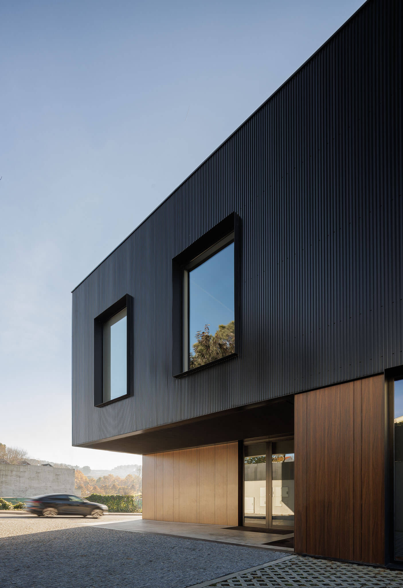
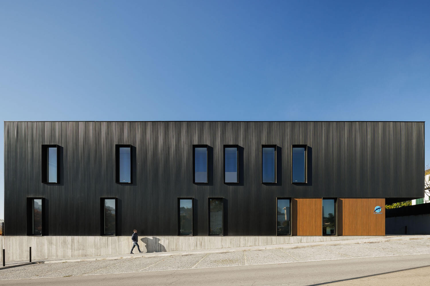
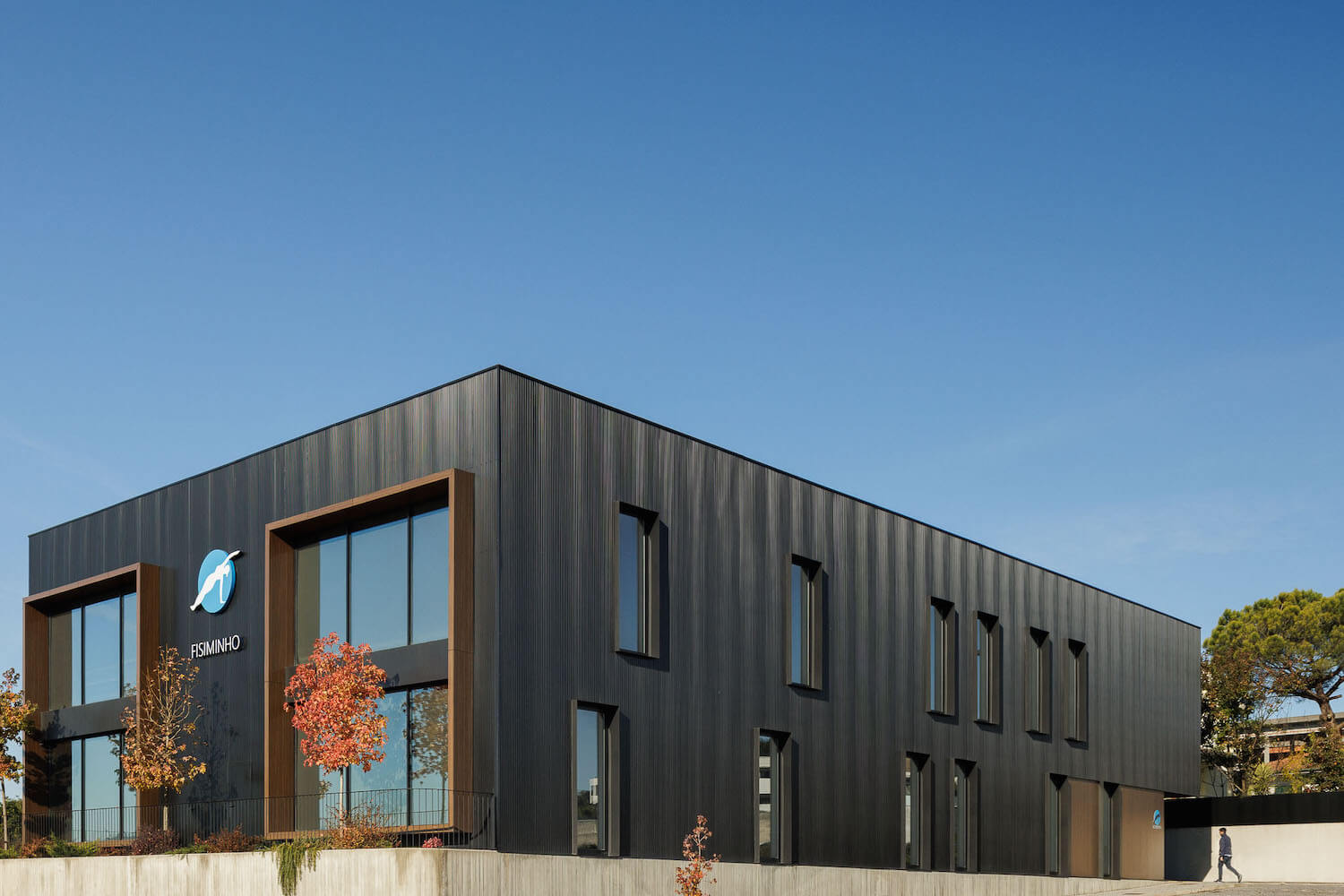
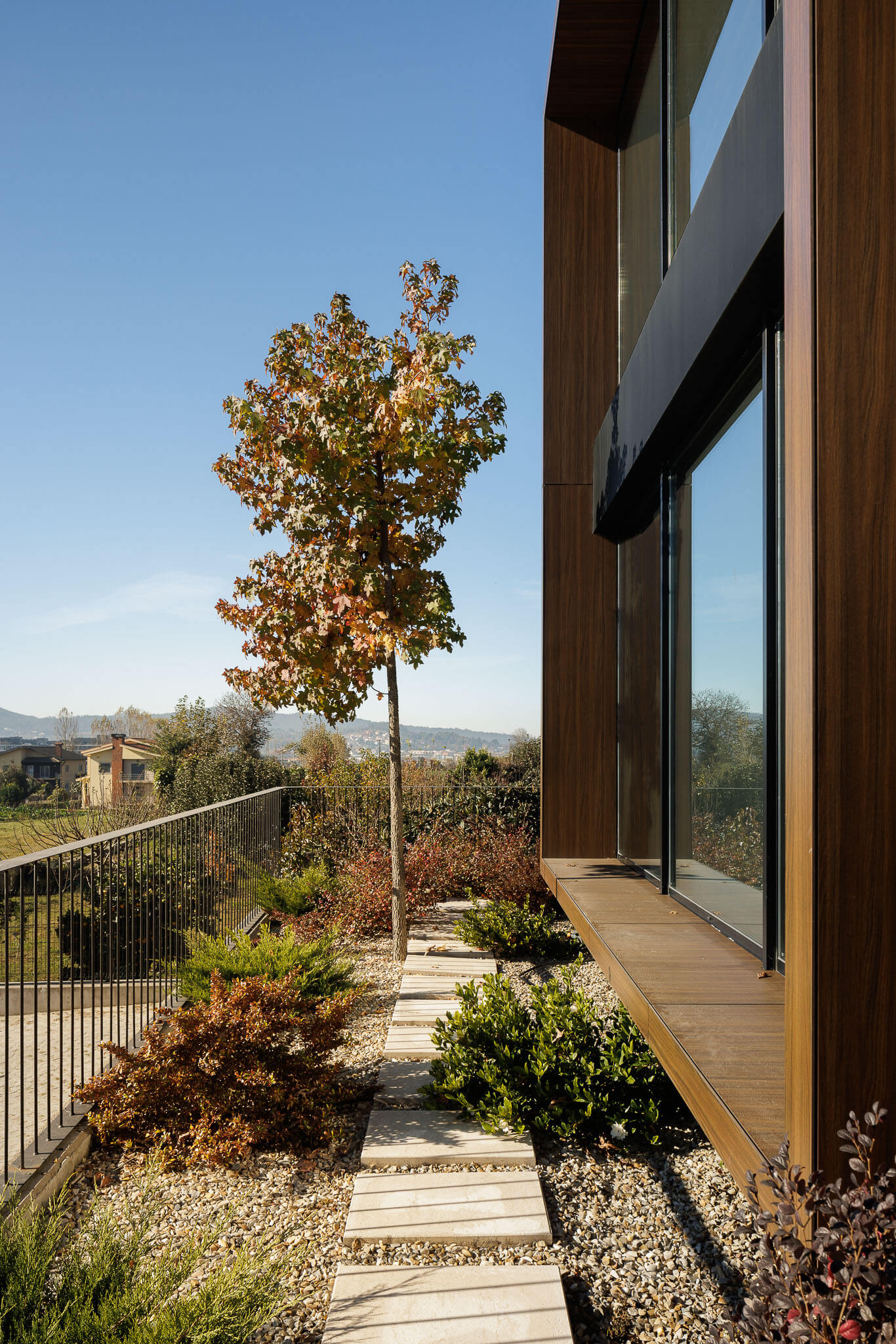
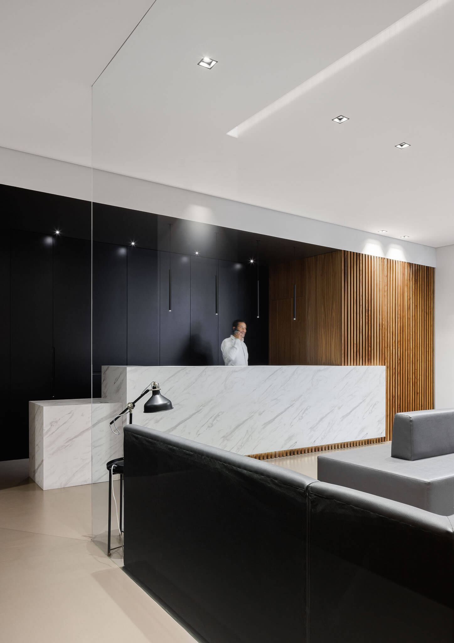
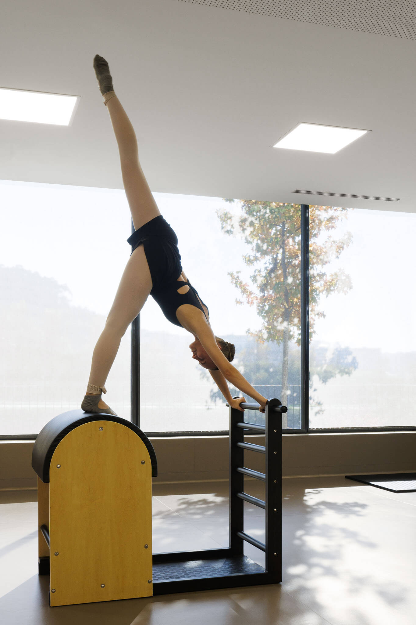
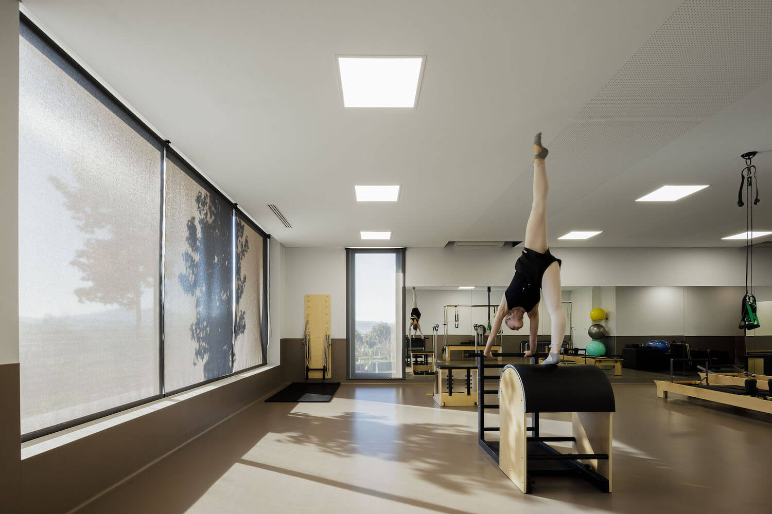
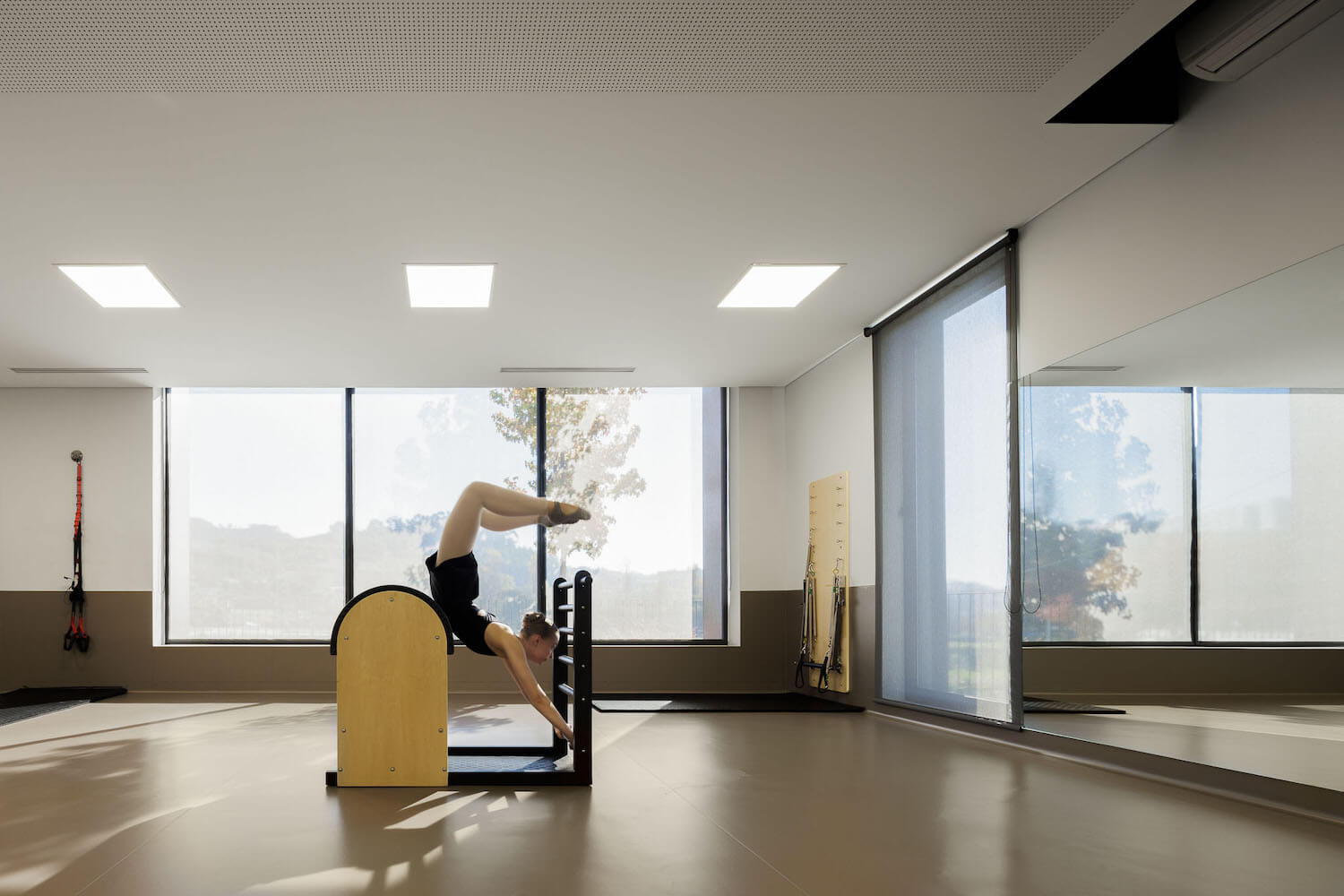
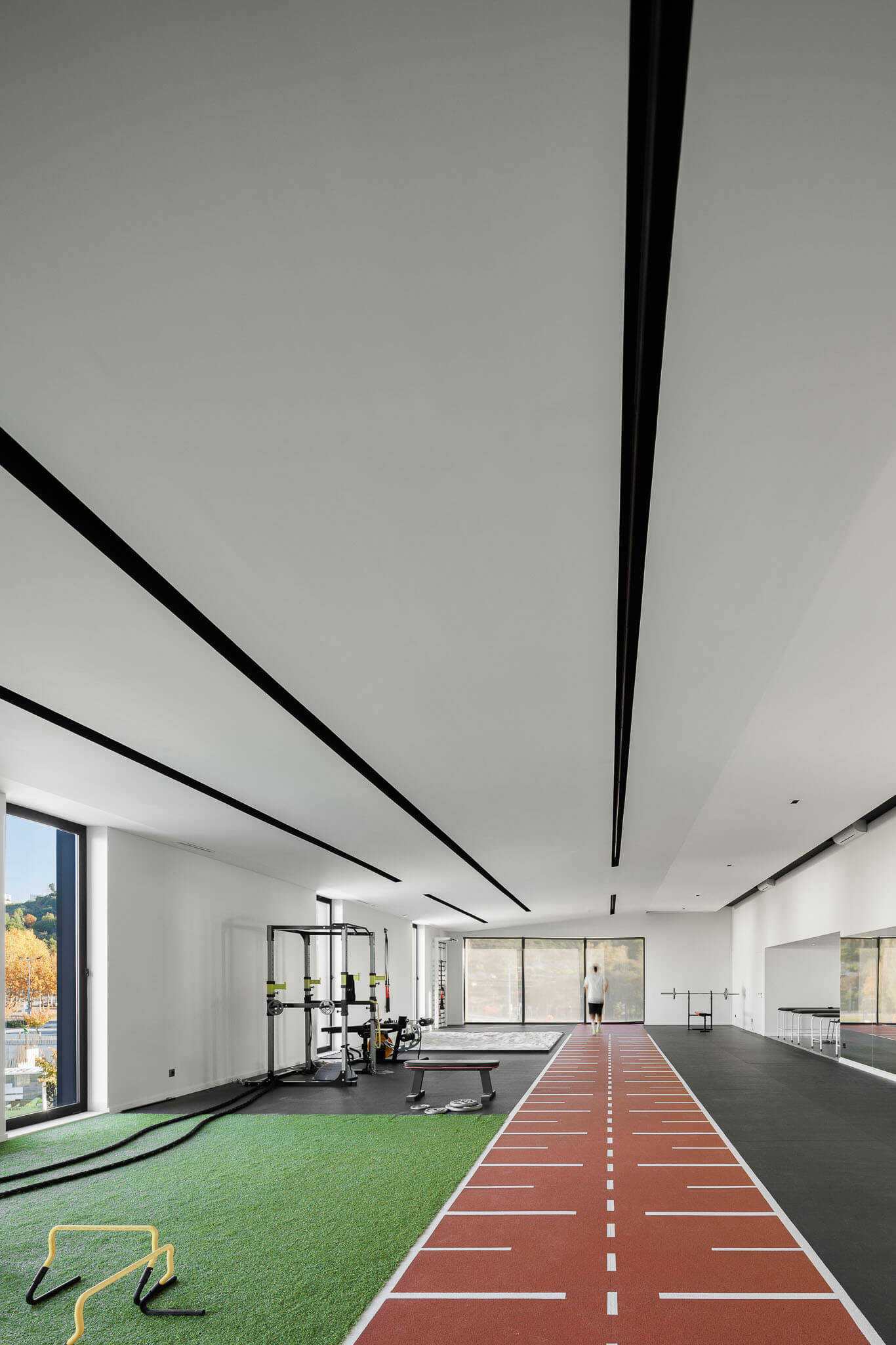
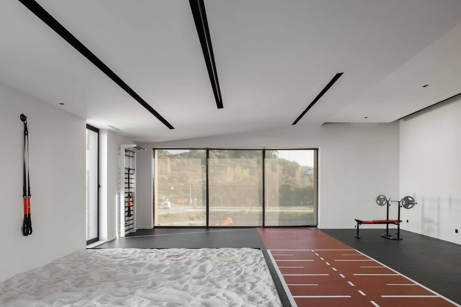
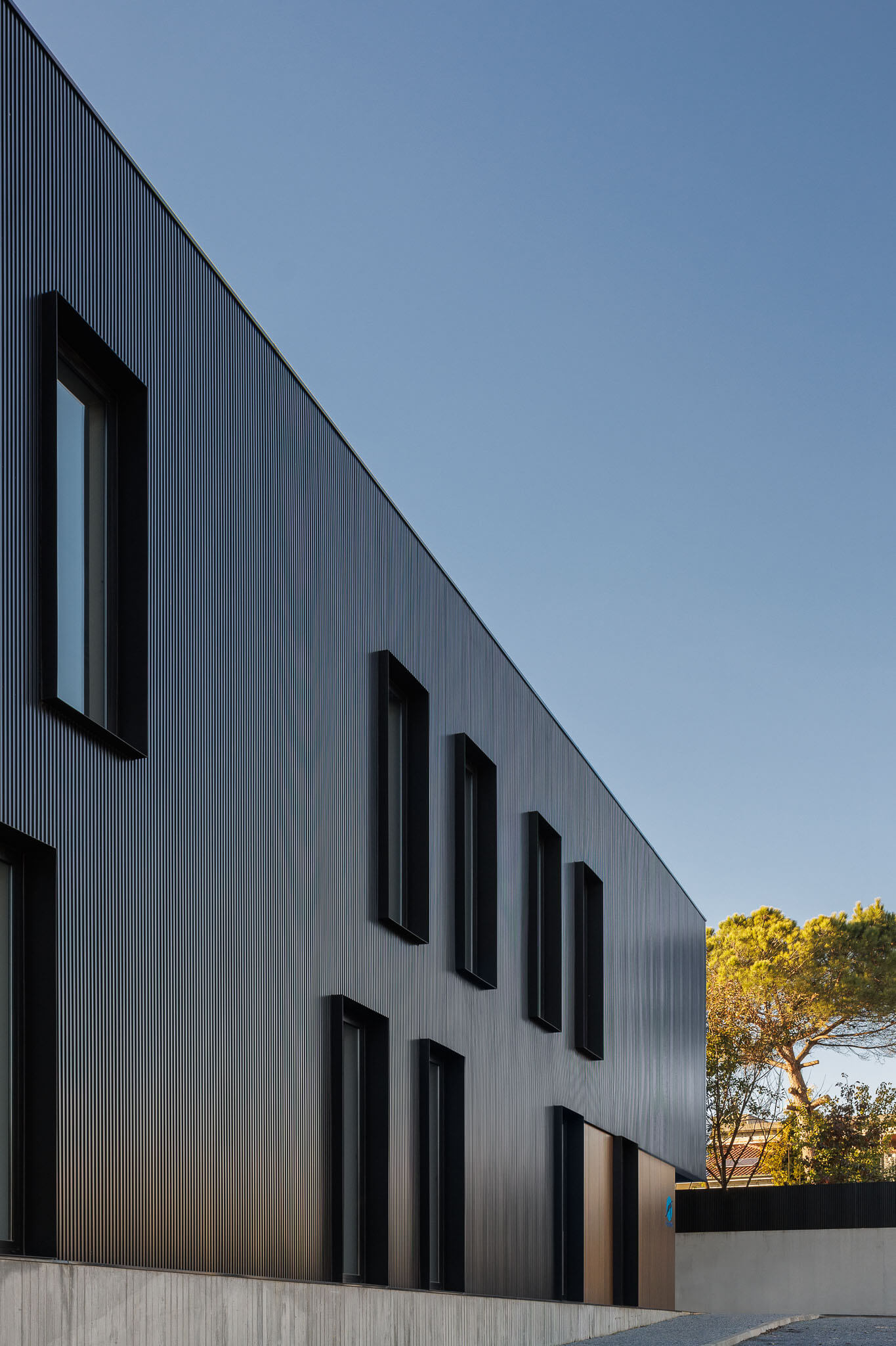
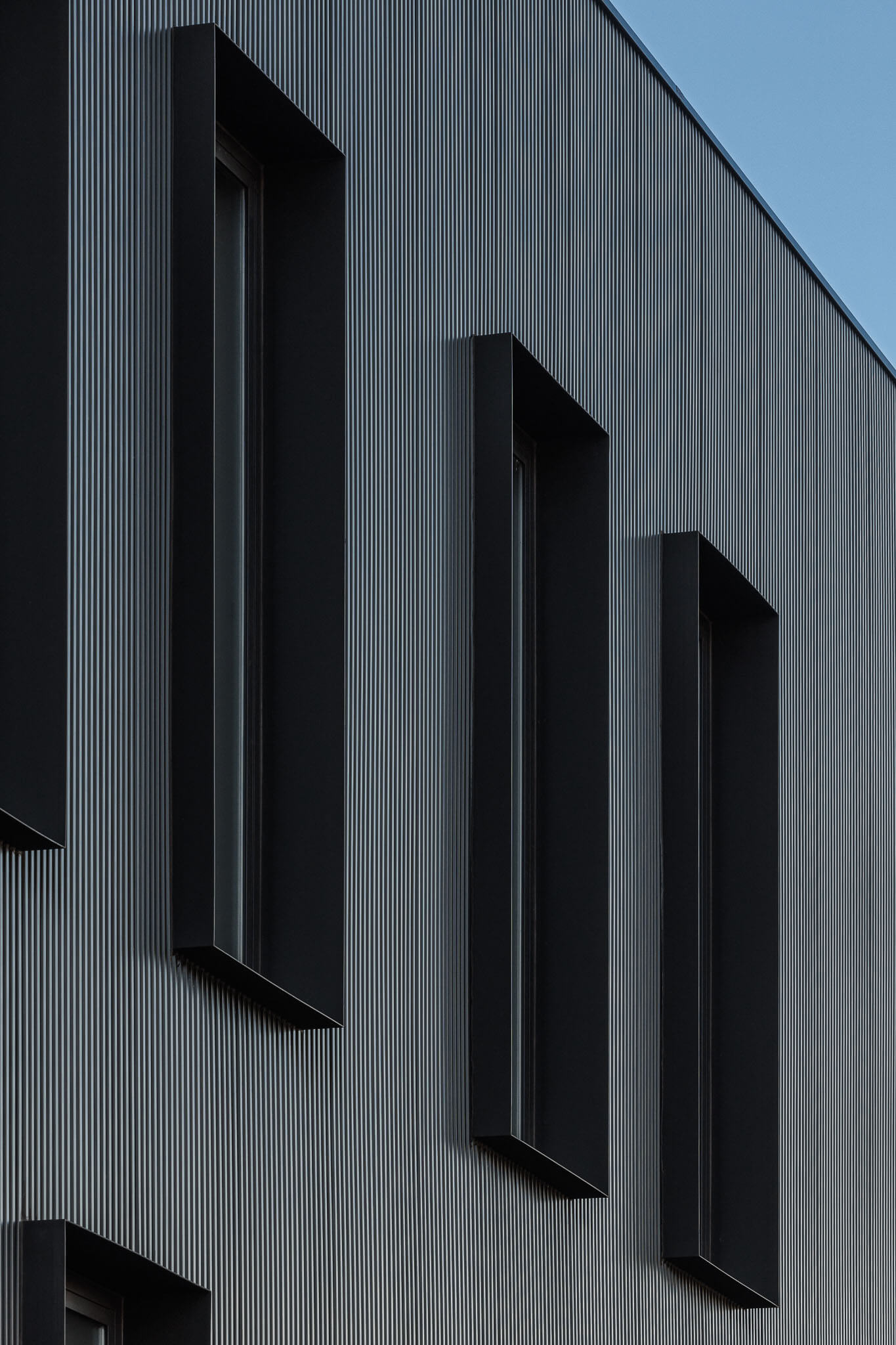
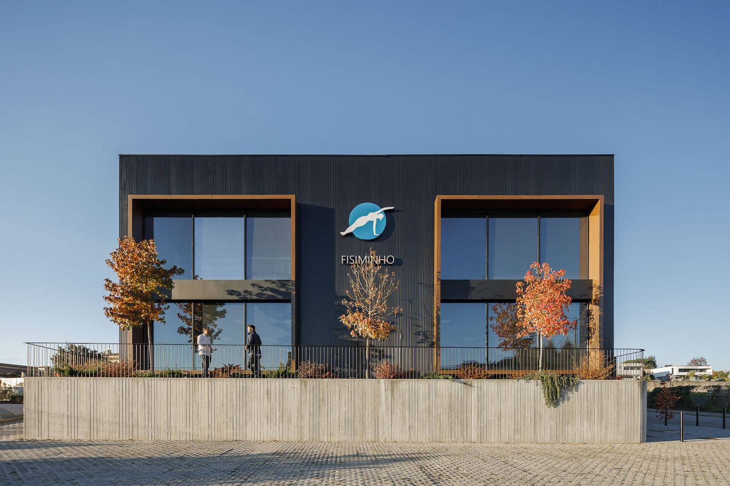
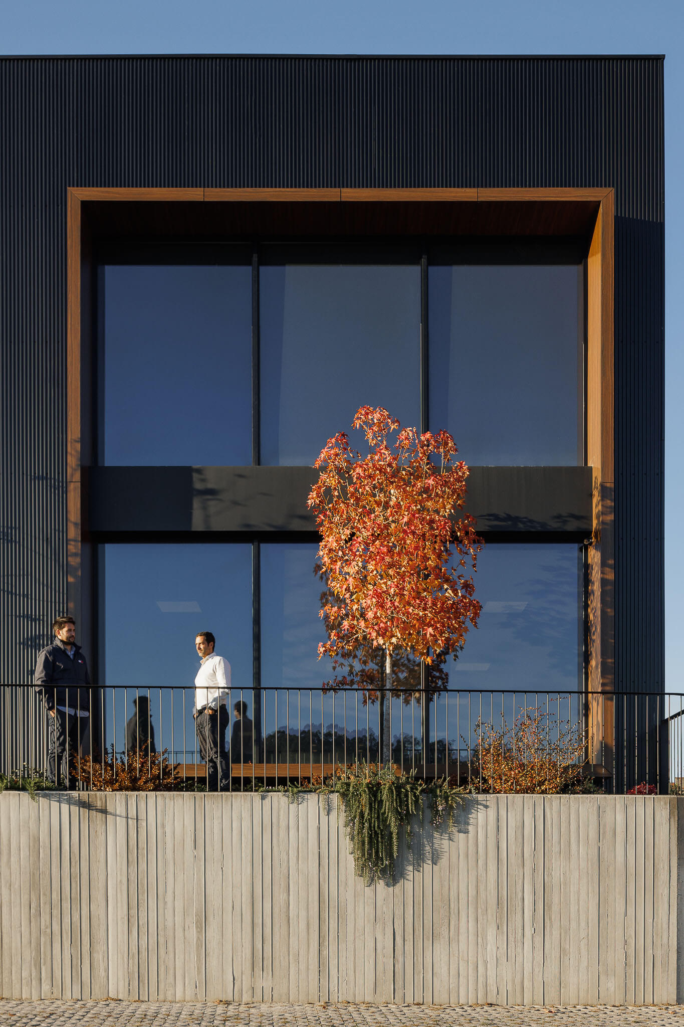
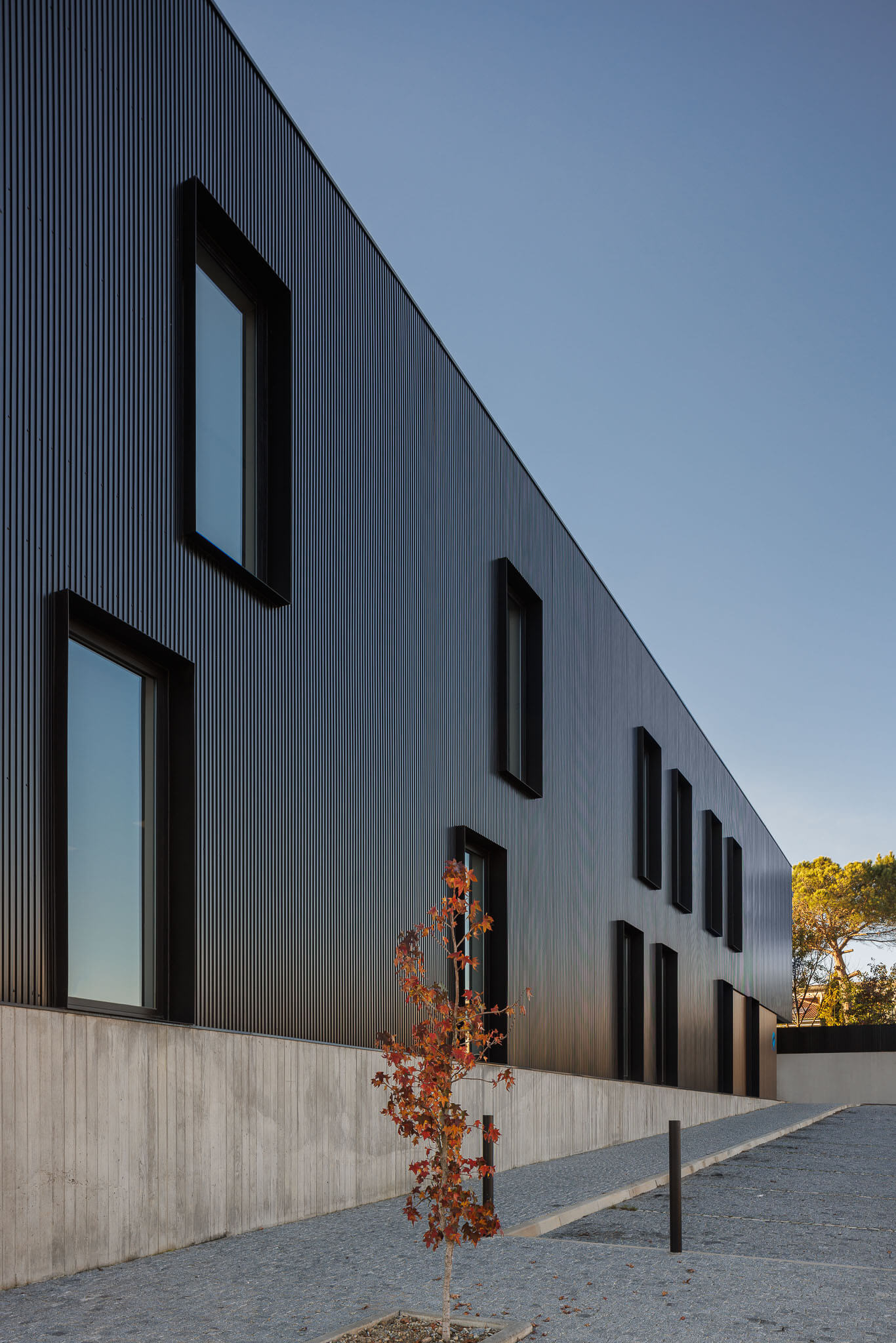
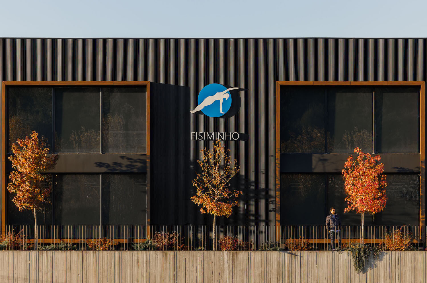
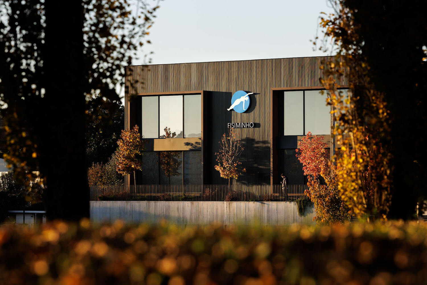
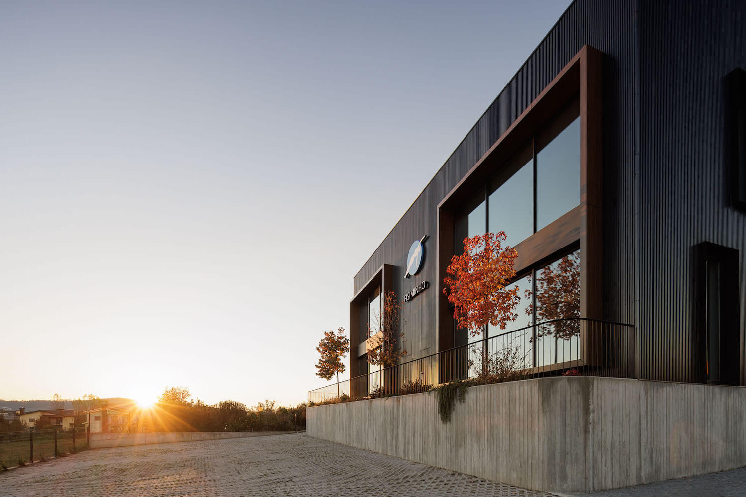
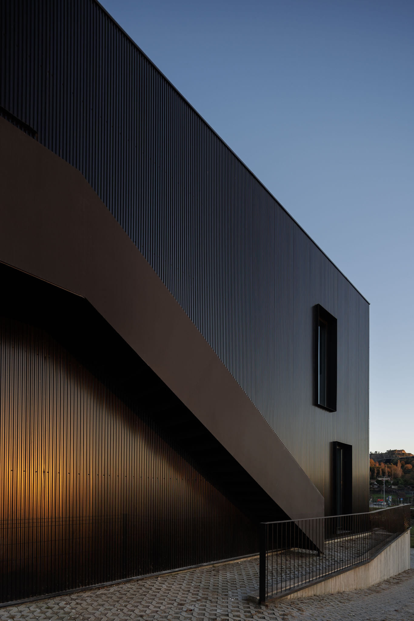
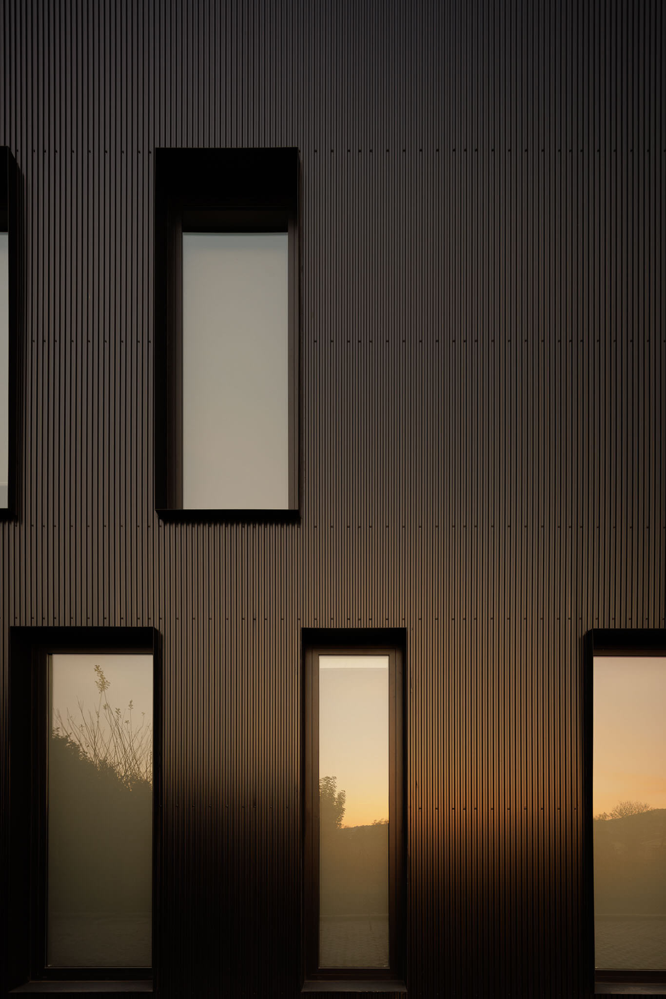
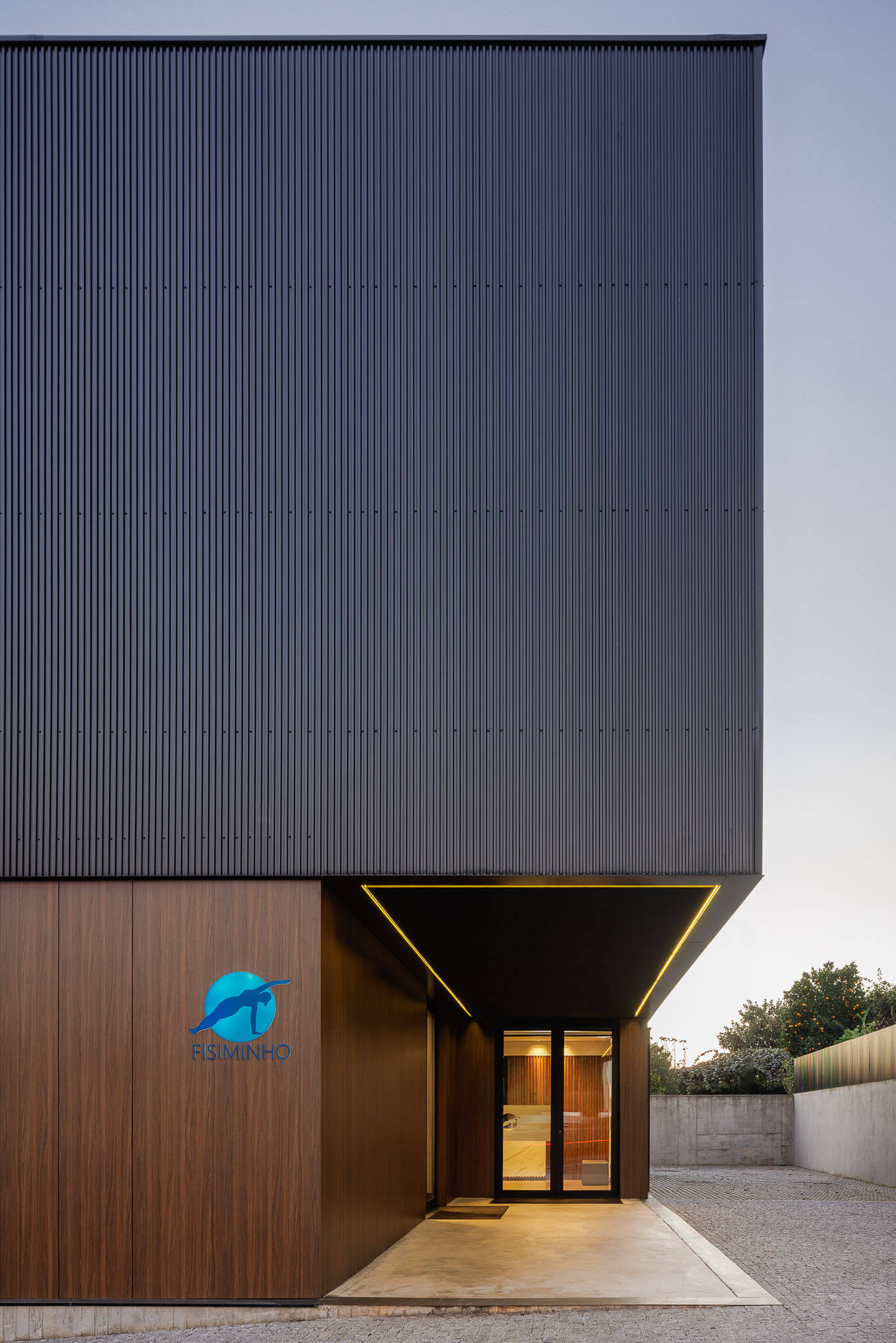
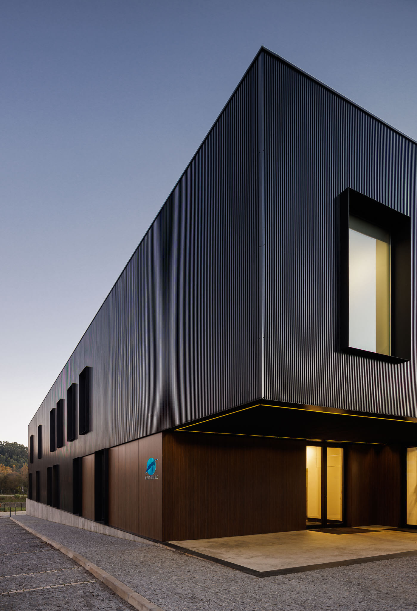
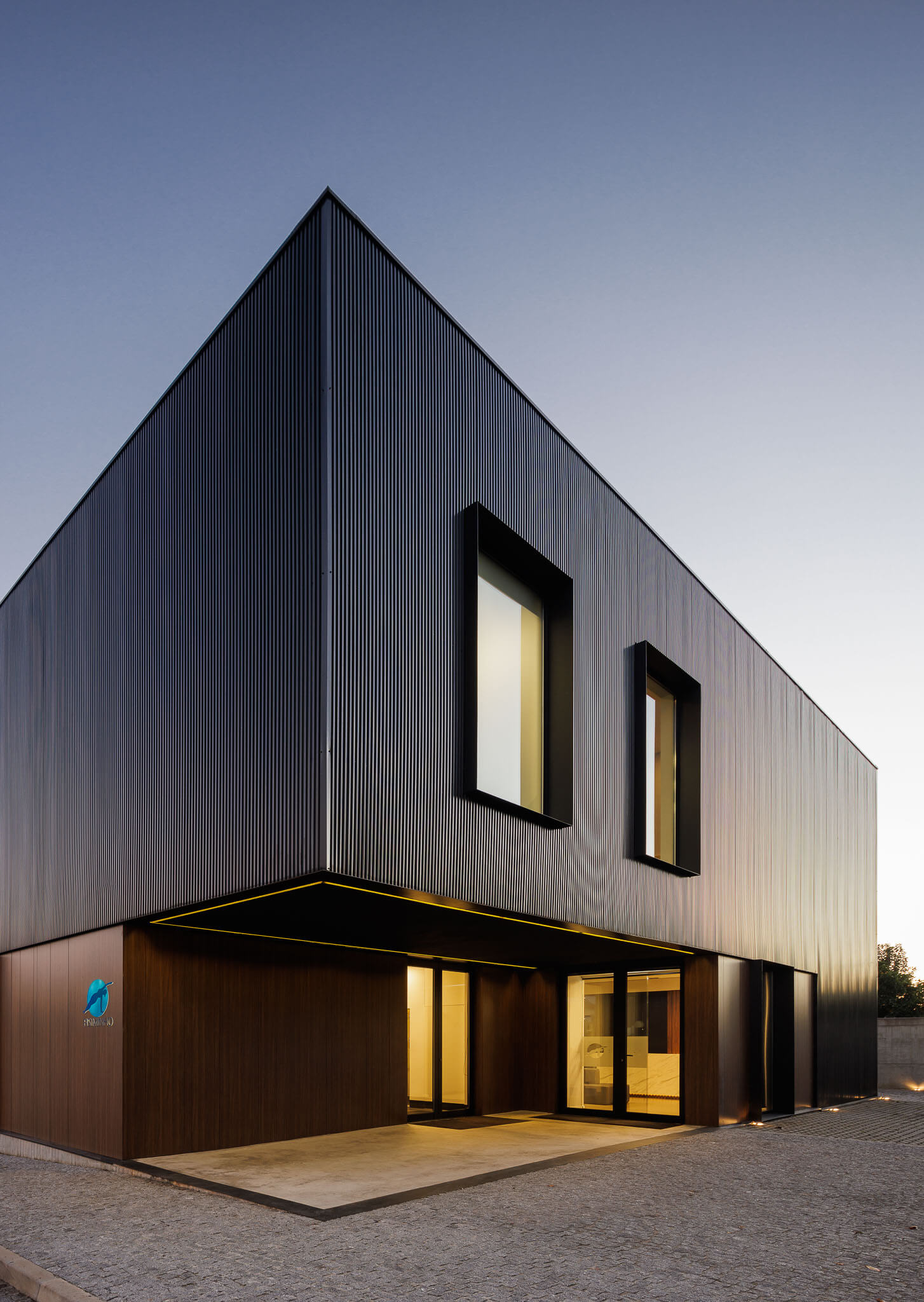
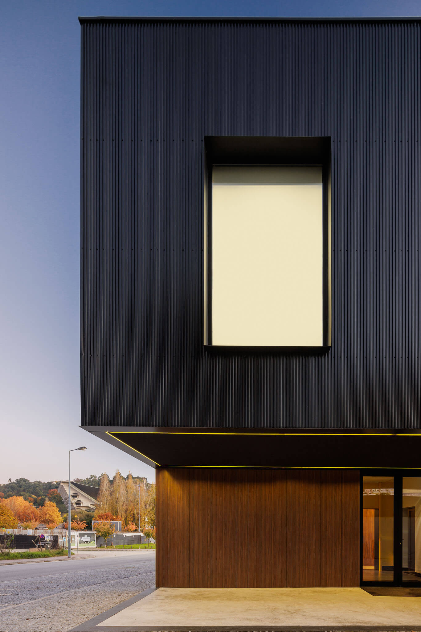
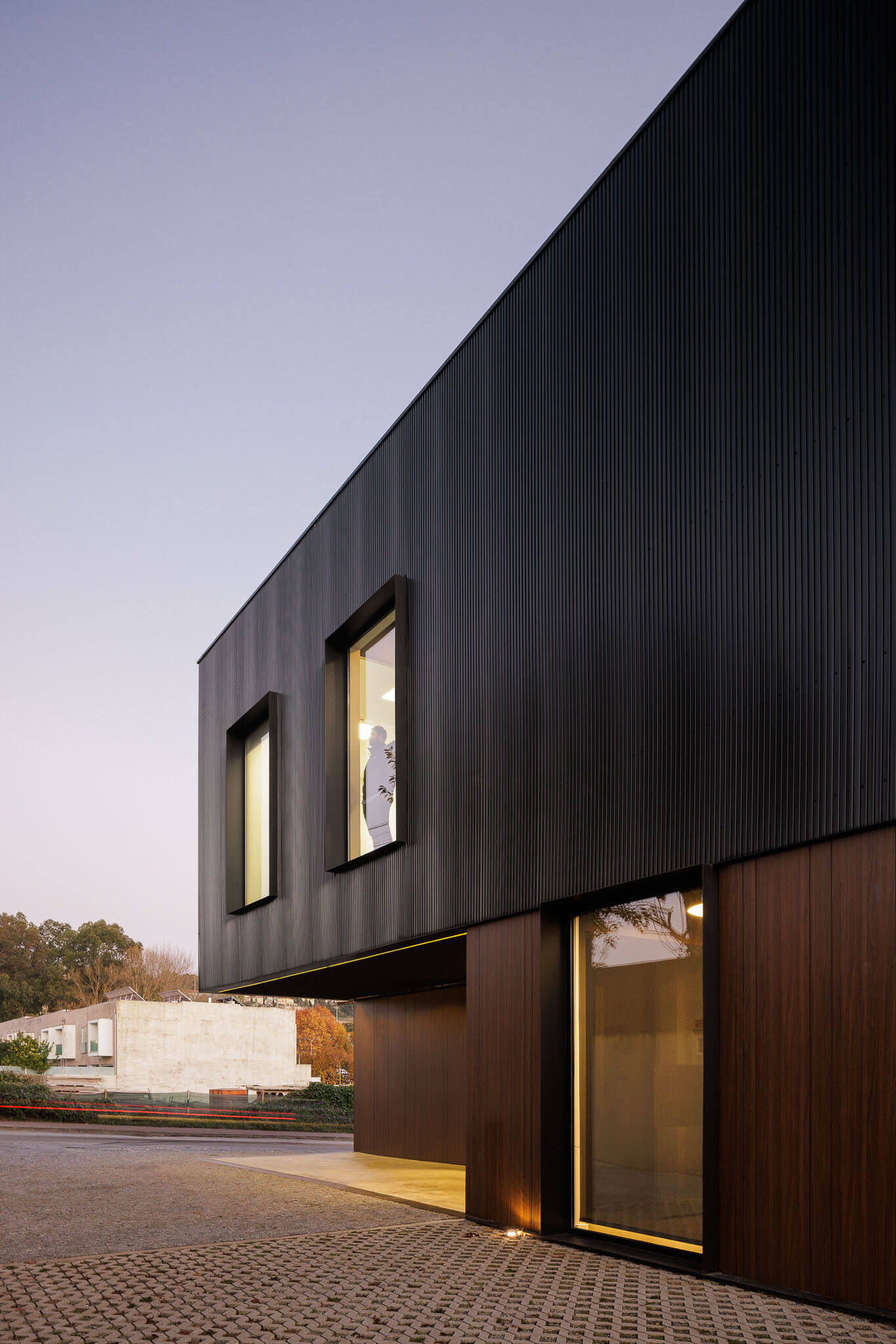
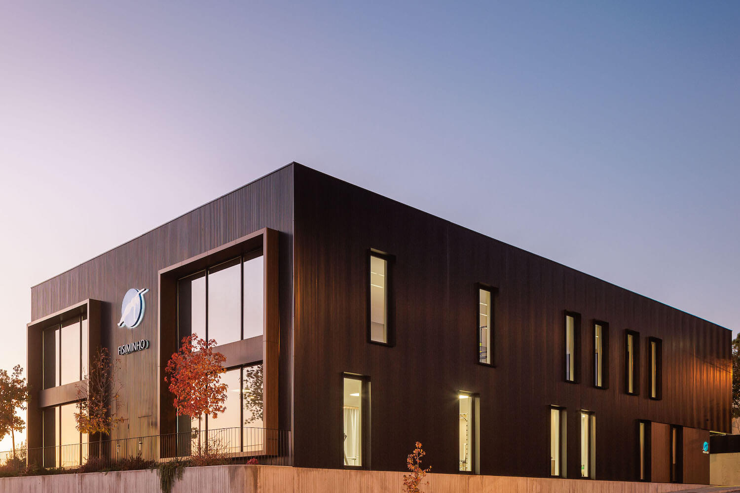
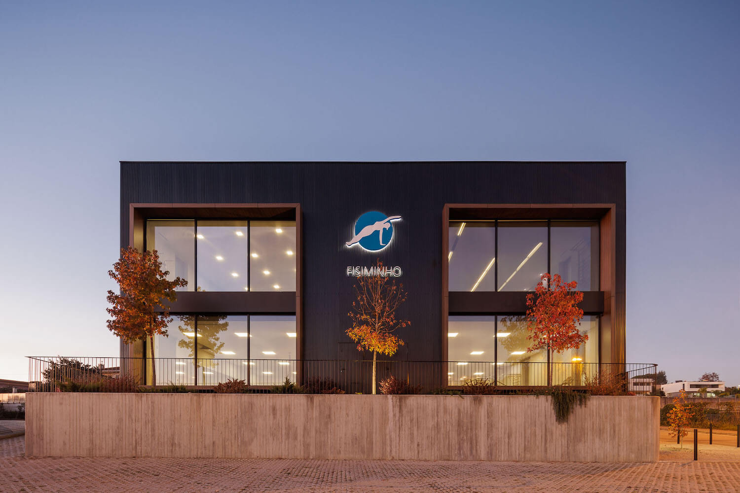
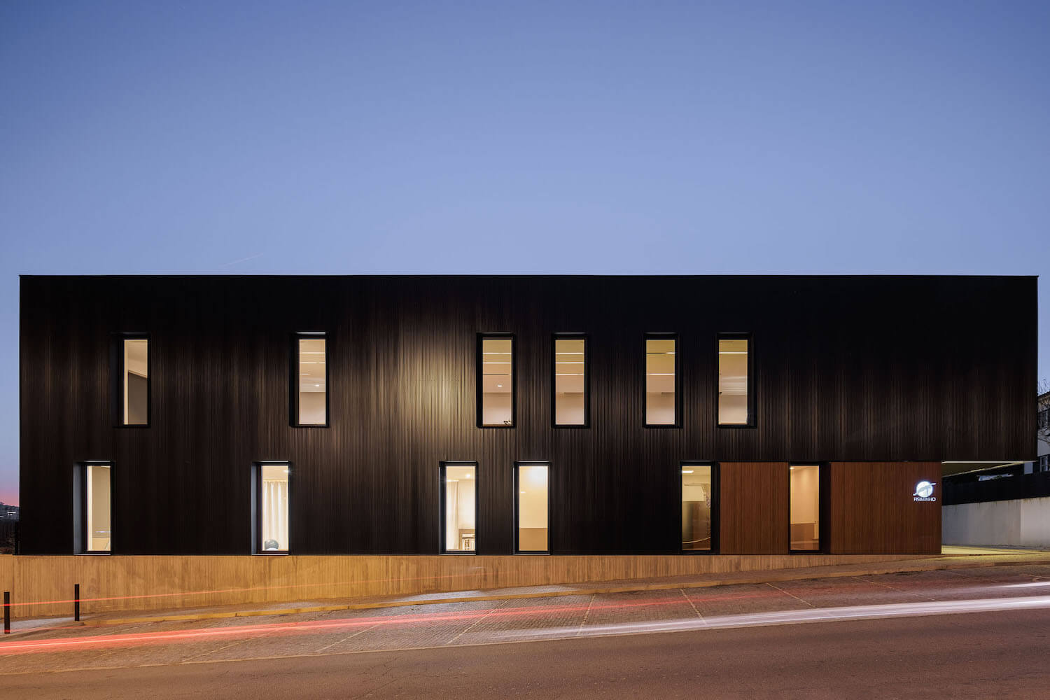
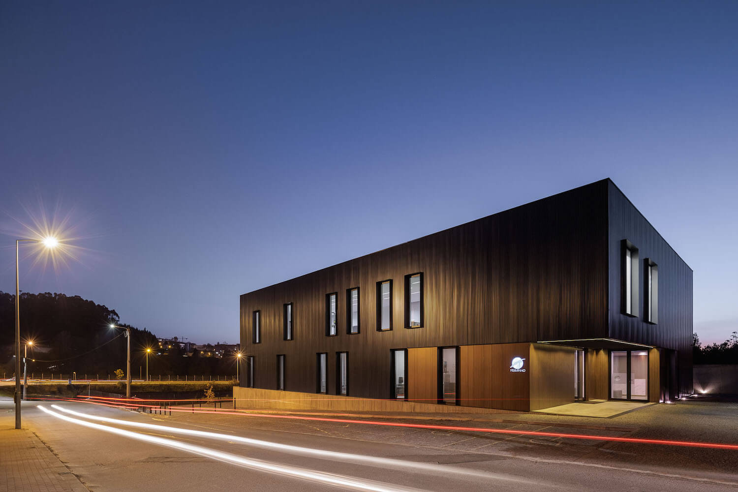
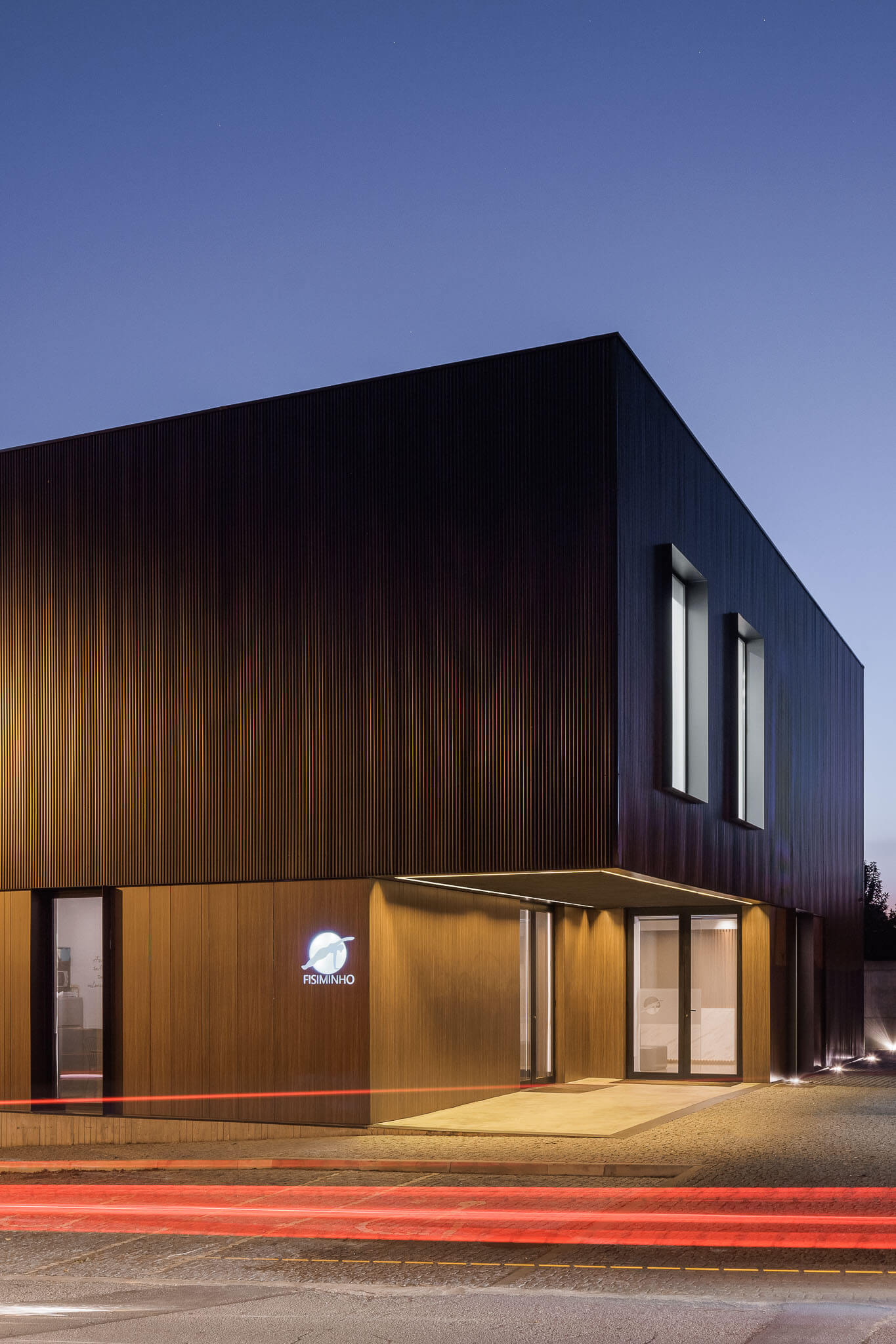
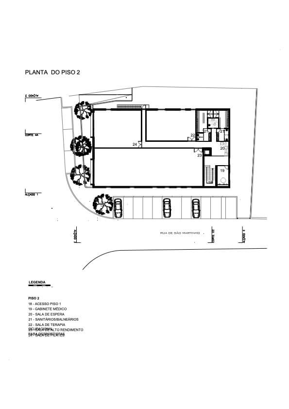
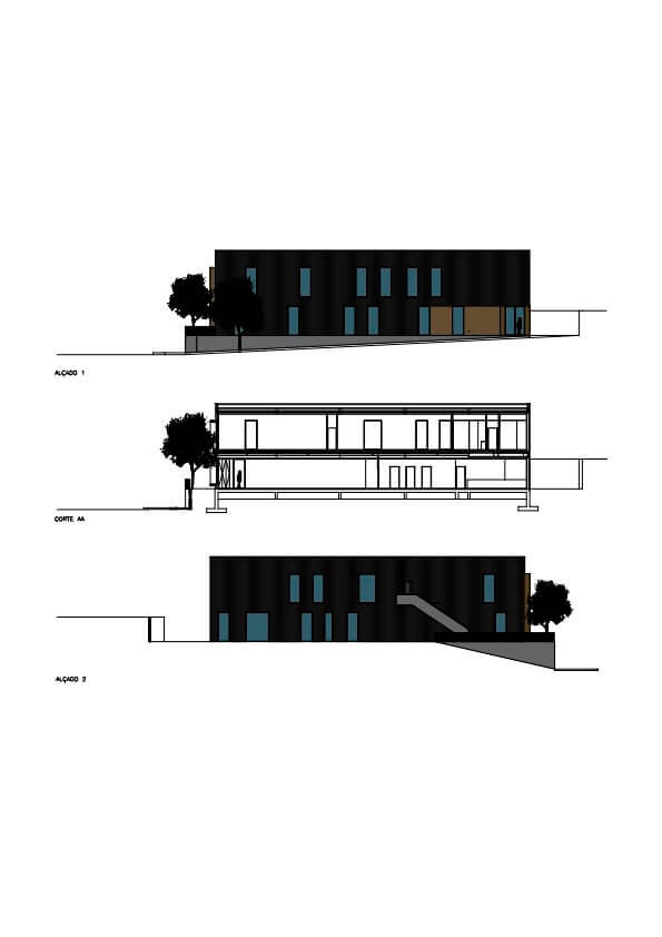
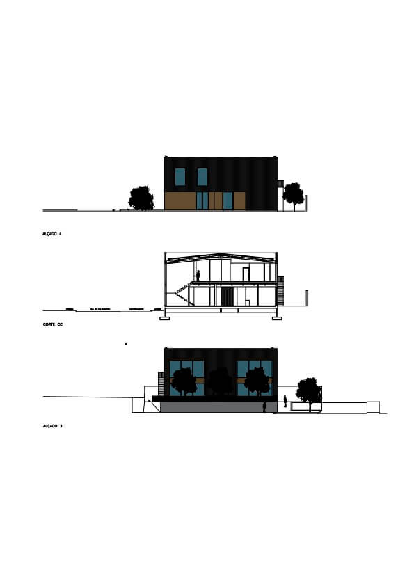
Organized along an axis parallel to Rua de São Martinho and developed on two levels, its volumetric shape resembles a parallelepiped resting on the highest level of the land. The openings, placed in an apparently random way, give more dynamism to the elevations, contrasting with the predominant volumetric simplicity. The volumetric subtraction in the main body provides a covered outdoor space and marks the entrances. The building is divided into two separate and independent entrances. One gives access to the physiotherapy clinic, located on the ground floor and the other gives access to the high-performance centre located on the top floor.
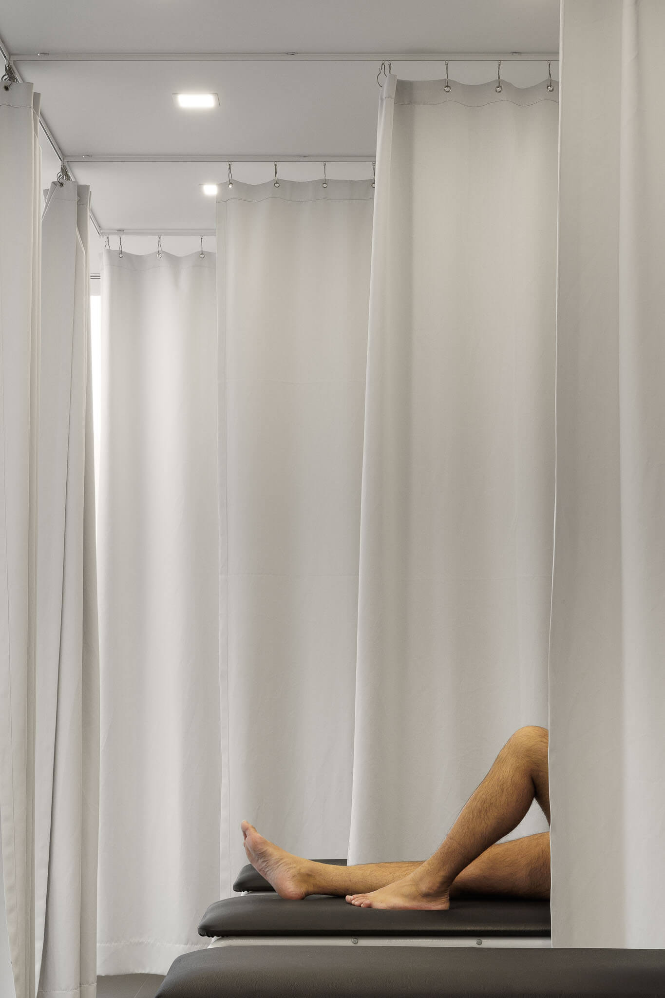
with this procedure, the entire building can contribute in a positive way to the entire surroundings, making it susceptible to greater/better use/function, contributing to an improvement of the public space. Essentially, we sought to obtain an image of the facade and volume of great simplicity and geometric rigor that reflects on the one hand, the different values of use of interior spaces and, on the other, a relationship between the typological solution adopted and the terrain.
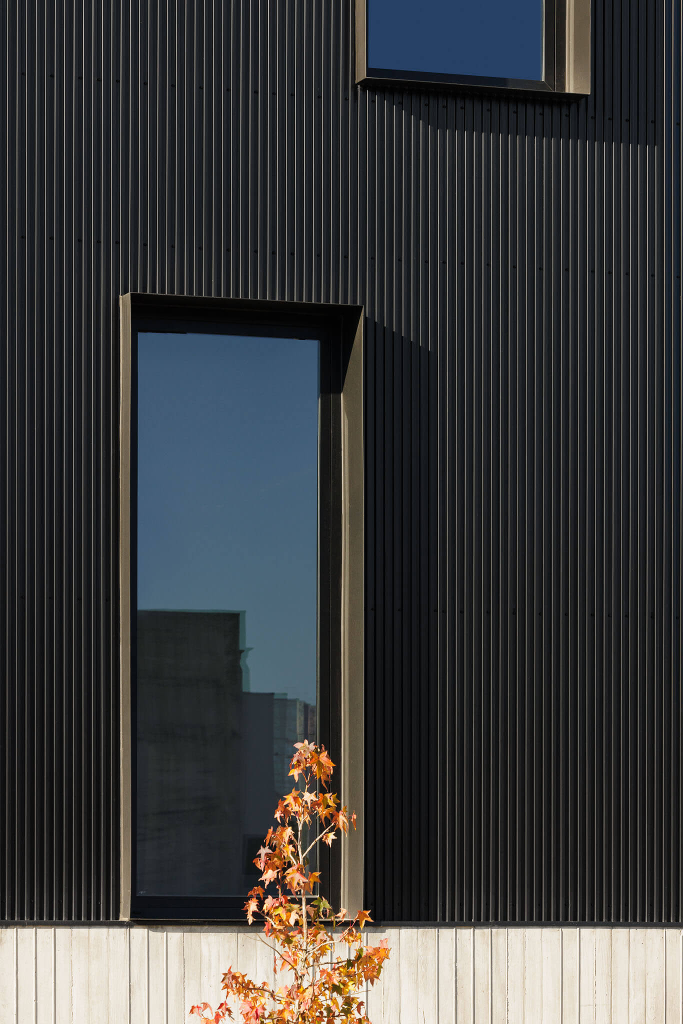
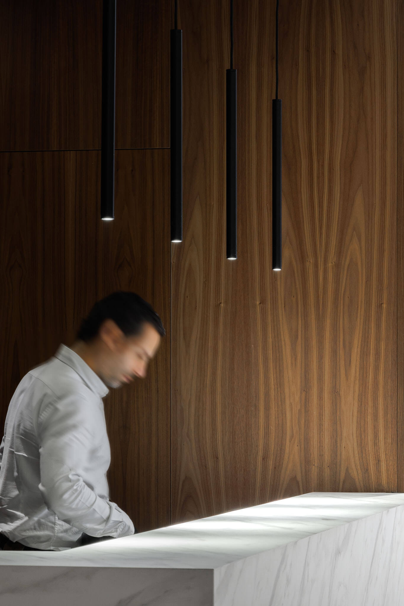
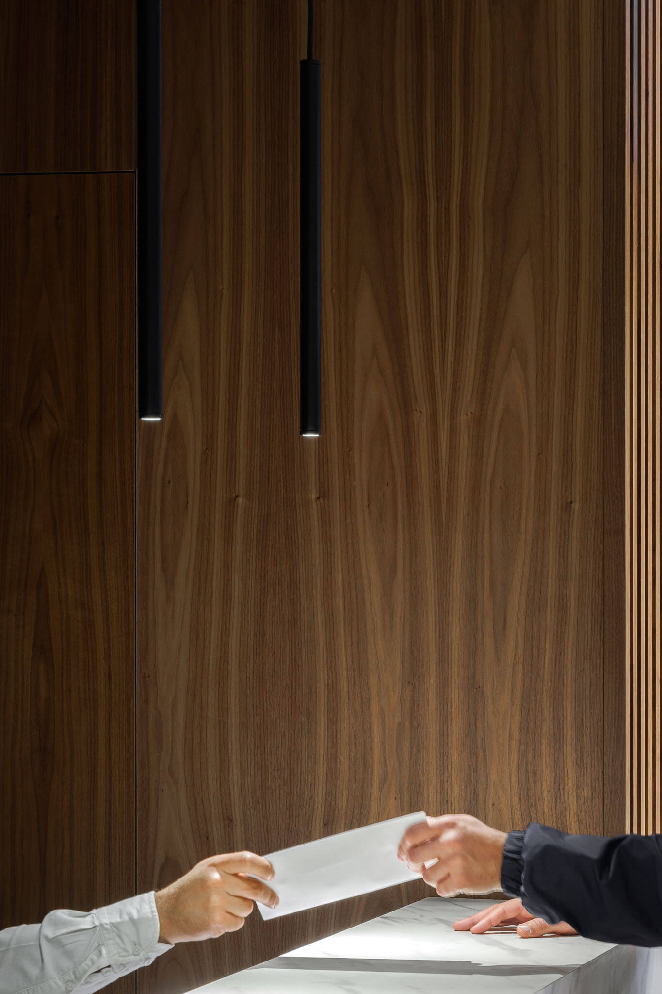
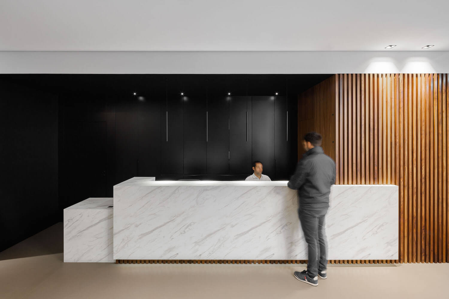
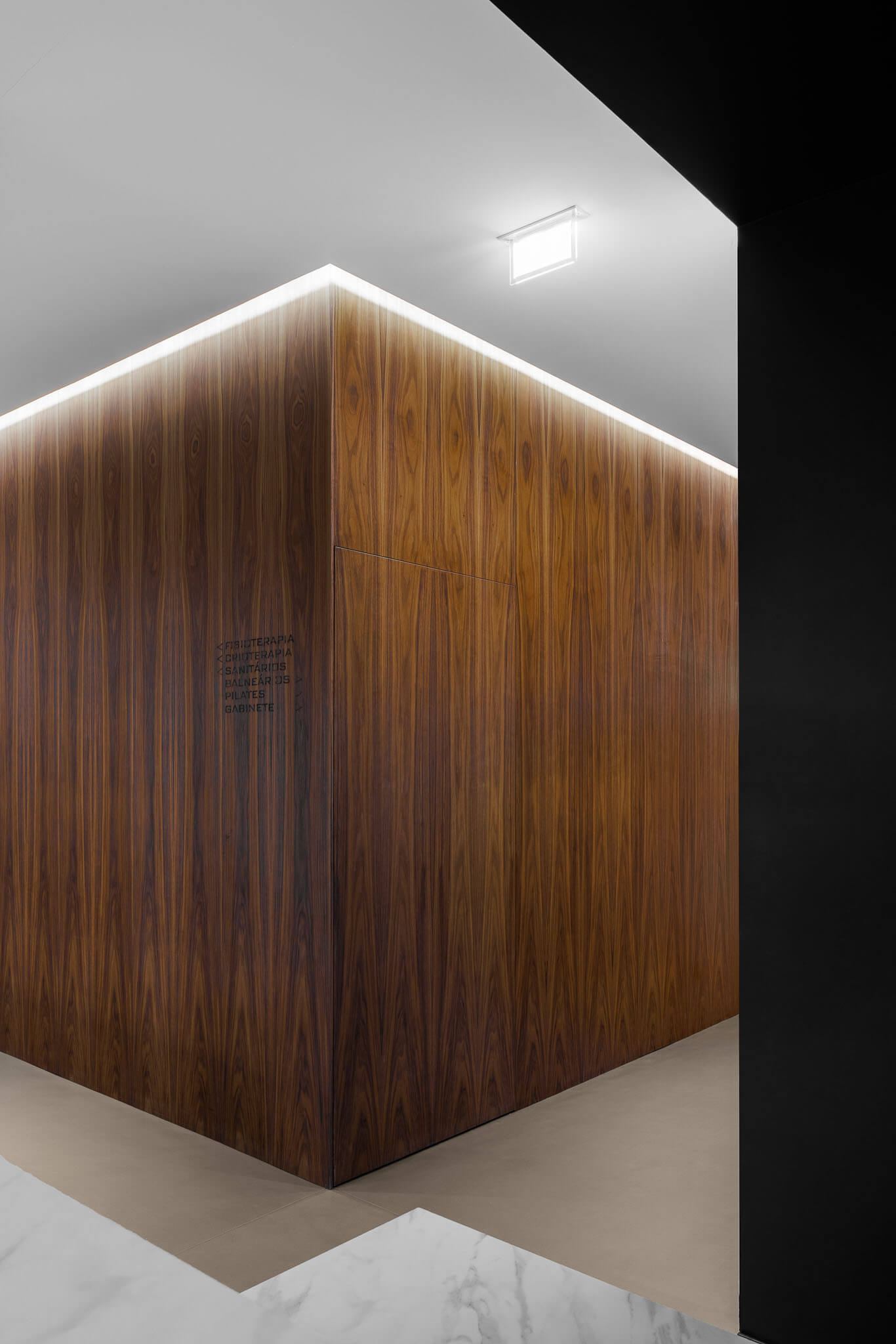
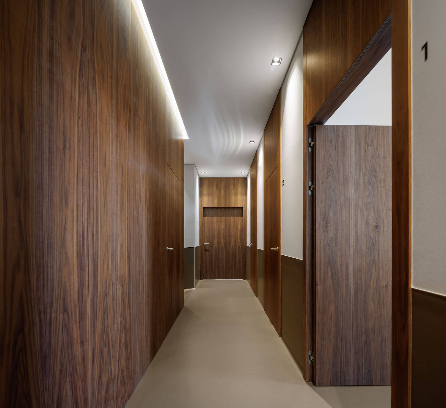
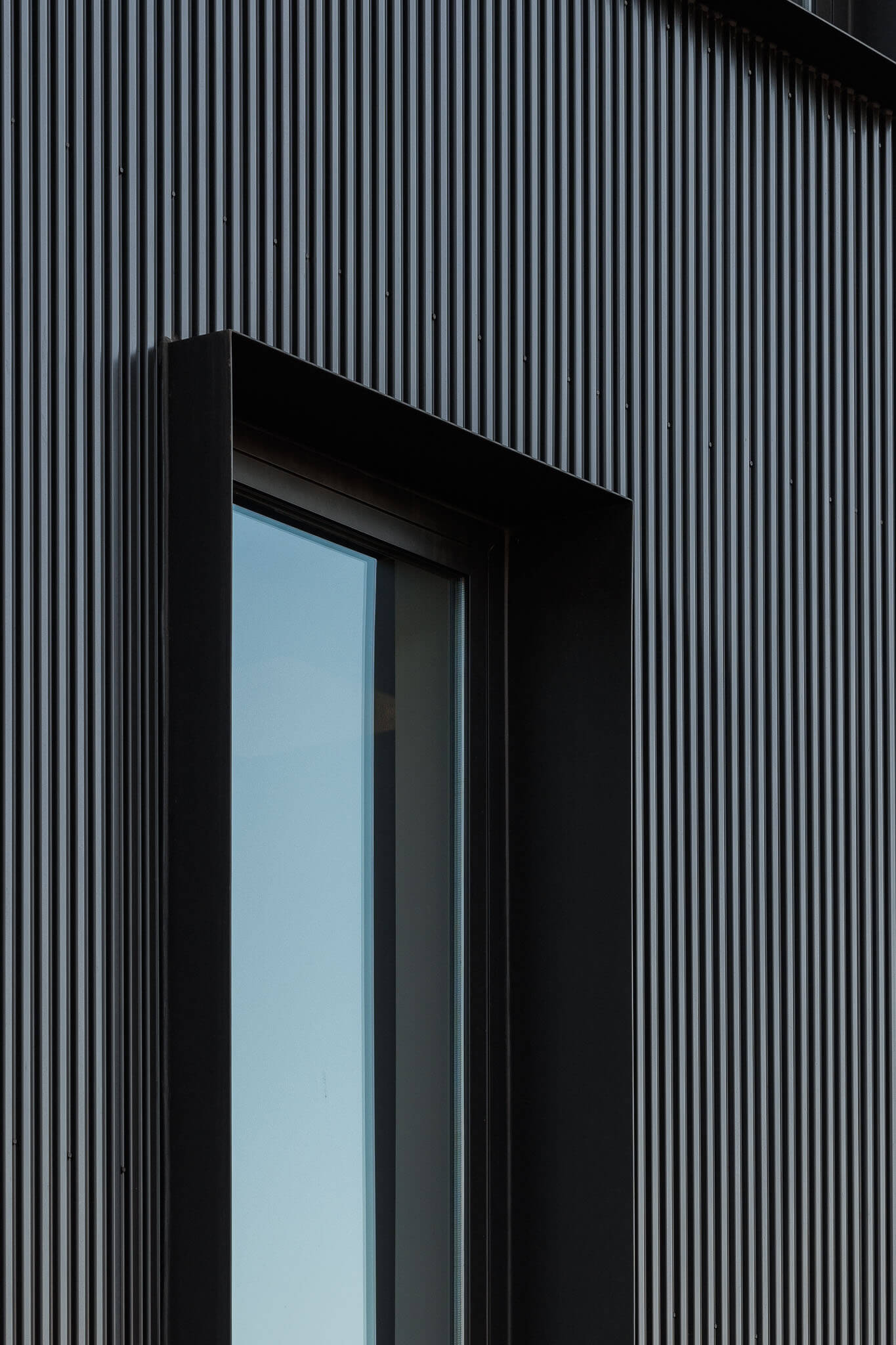
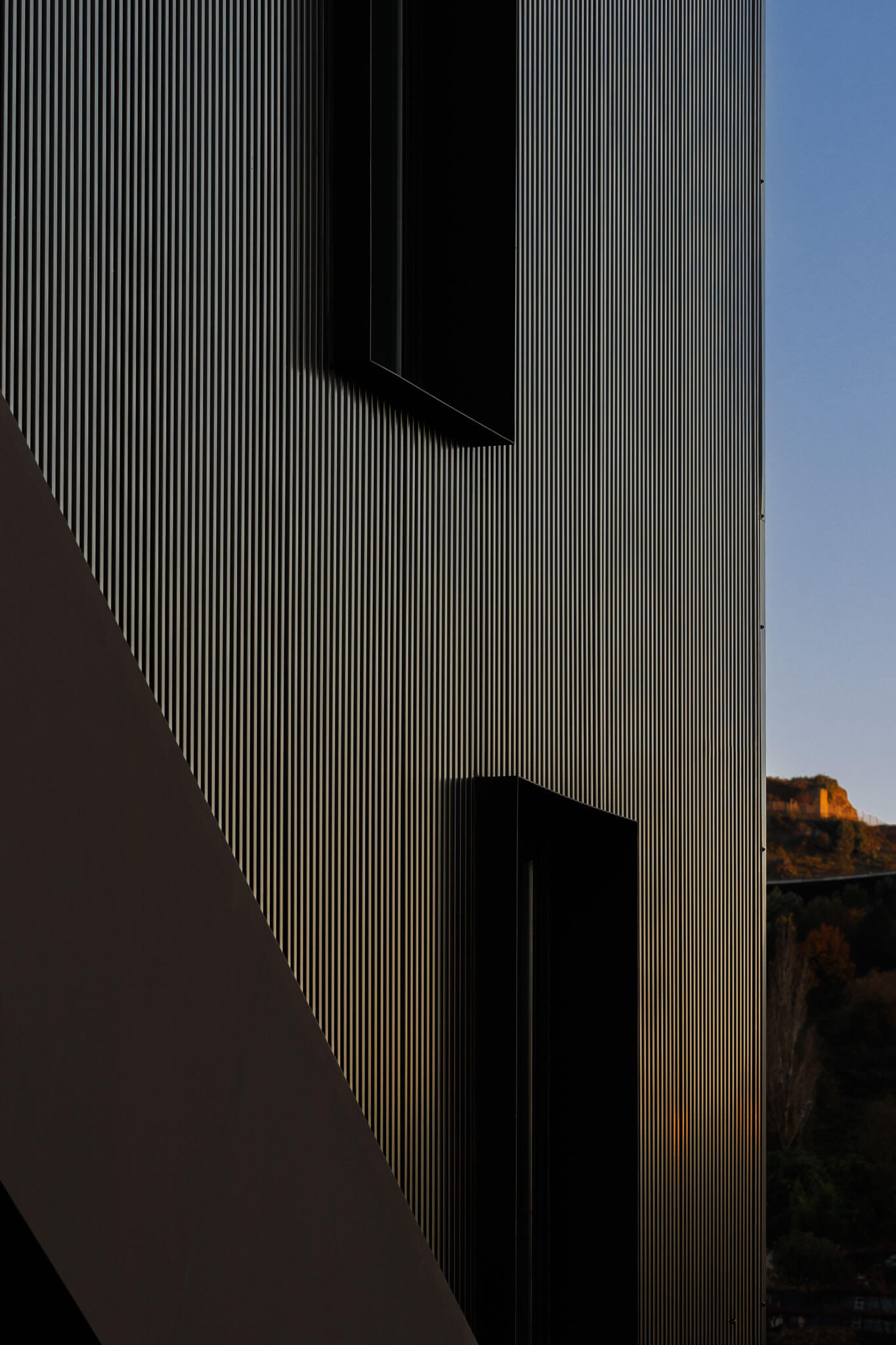
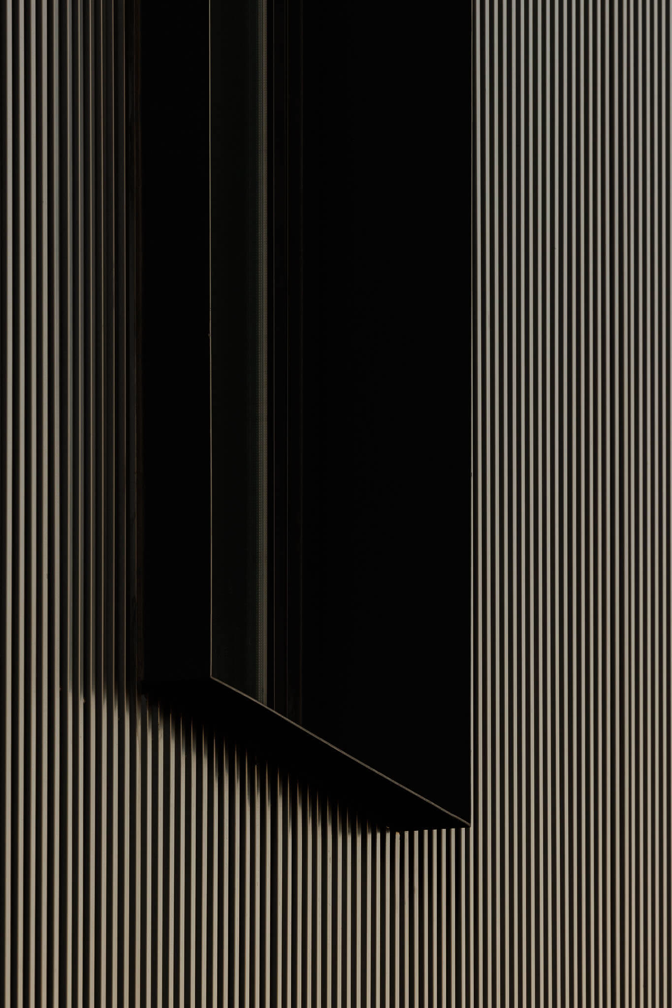
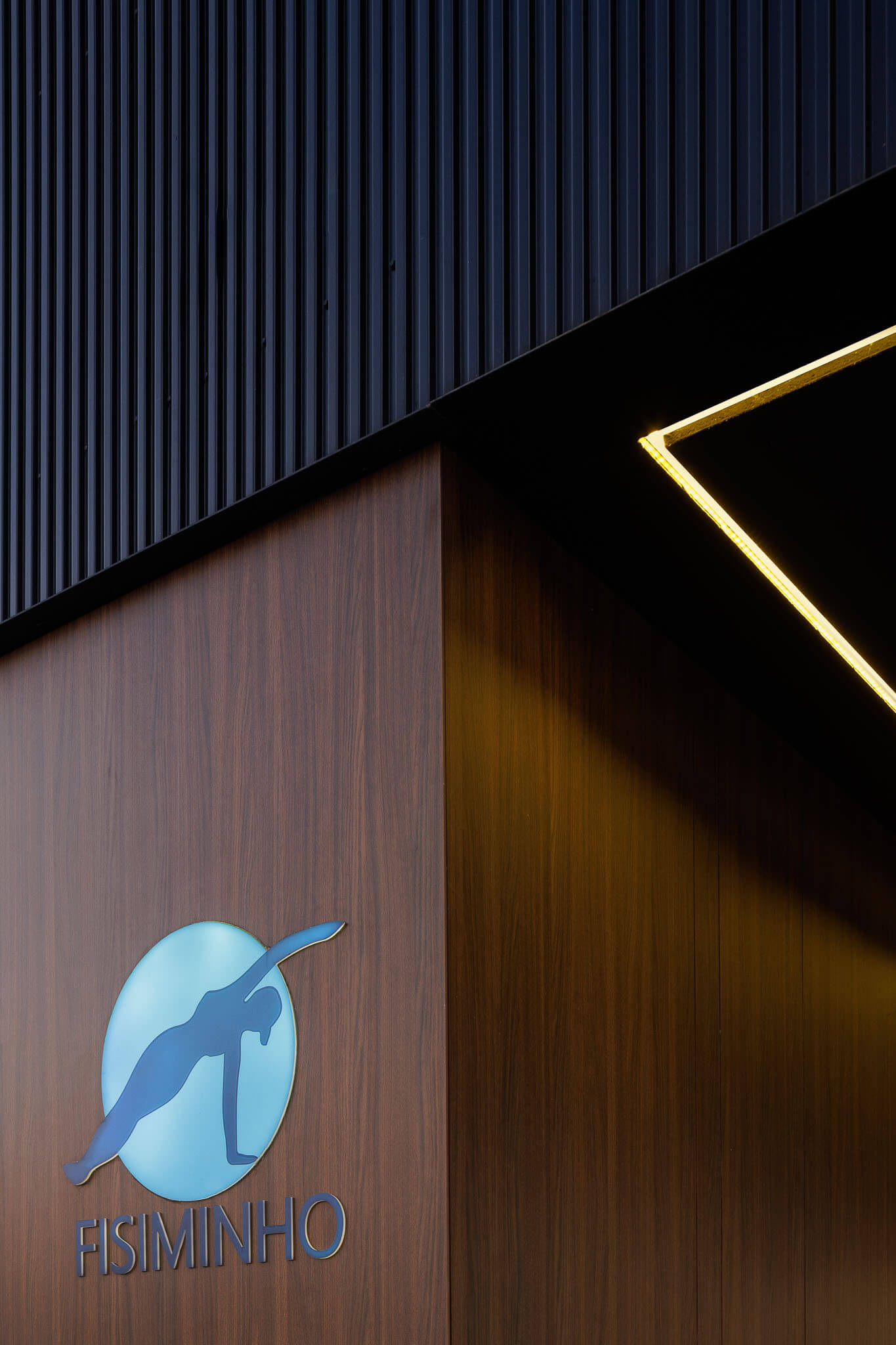
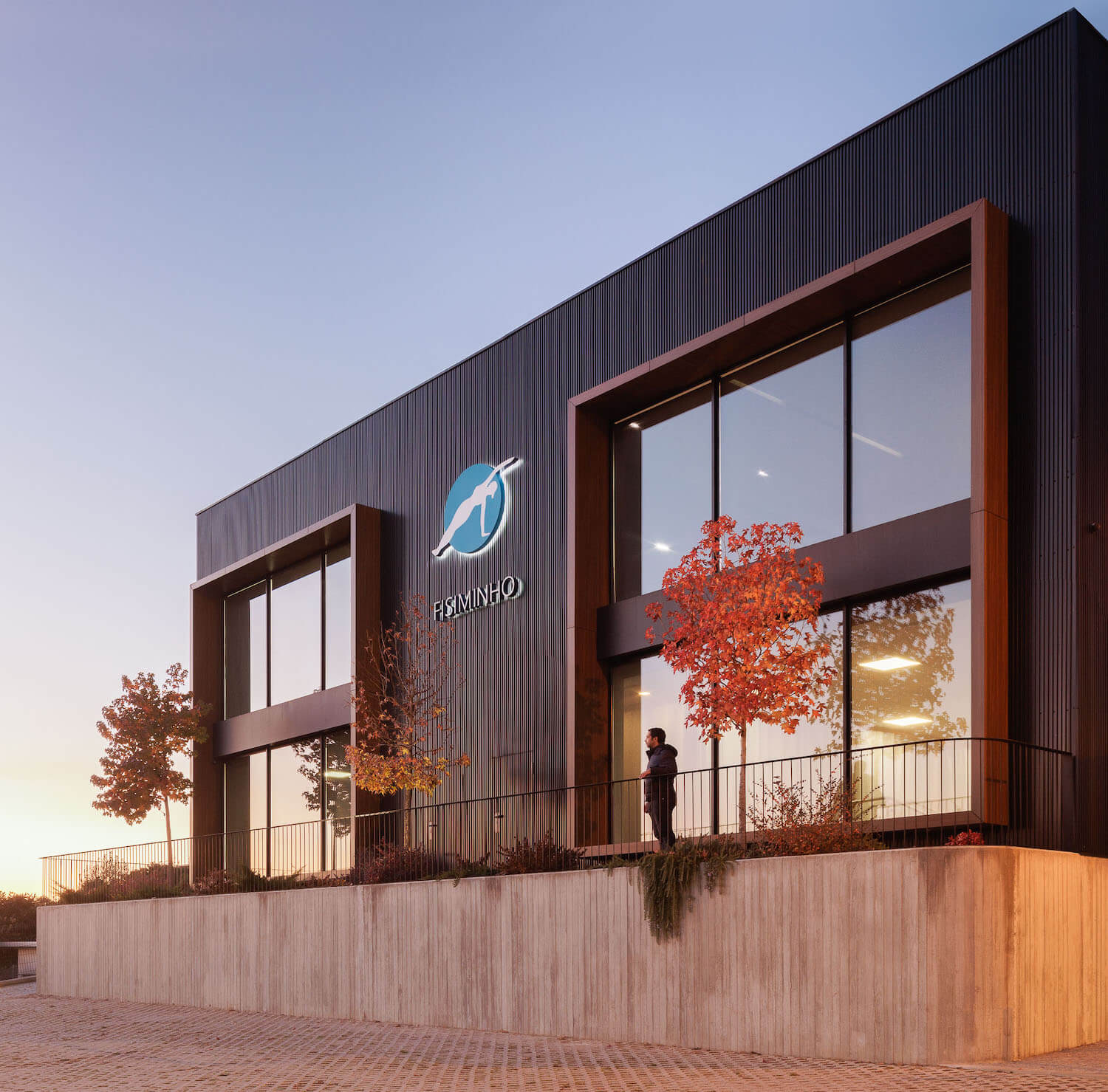
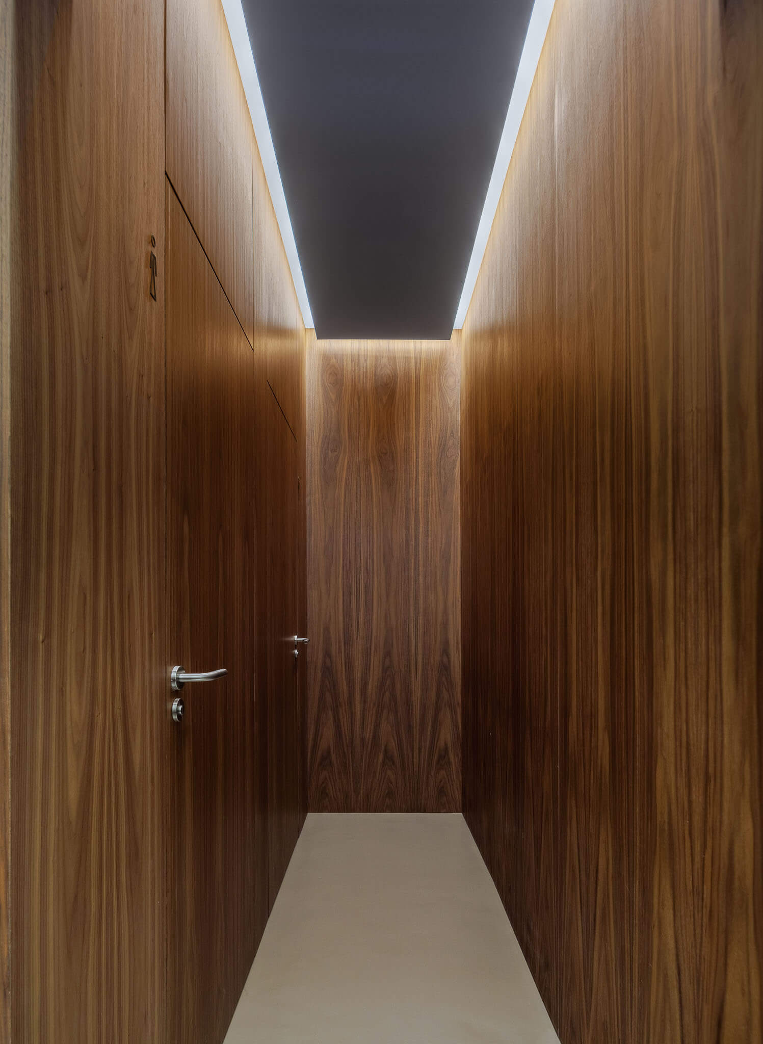
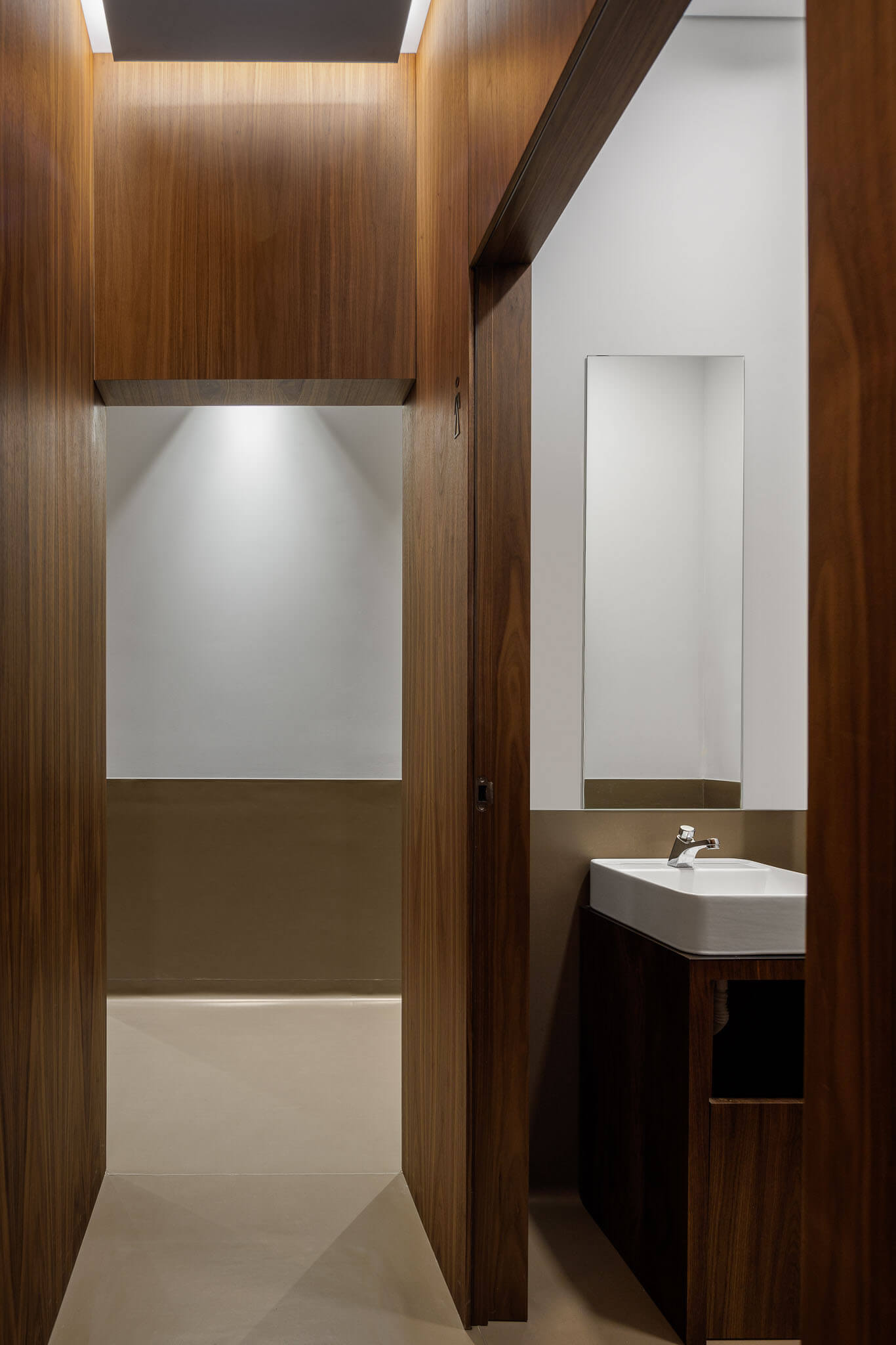
All these concerns are reflected, in the rhythm, arrangement and transparency of the openings, in the materials (black profiled panels), walls in exposed concrete, exterior floors in granite cubes, aluminium window frames, wood panel coatings in the entrance areas and steel/iron painted on the gates, in the plans created, in the spatial hierarchy associated with them, as well as, in the characterization and definition of outdoor spaces and their relationship with the inside.
A contemporary architectural design solution was intended that, due to the extreme simplicity of the language adopted, could assume a strong formal and volumetric clarity, privileging, as mentioned, the relationship of the building with the land and the surroundings where it is inserted.
