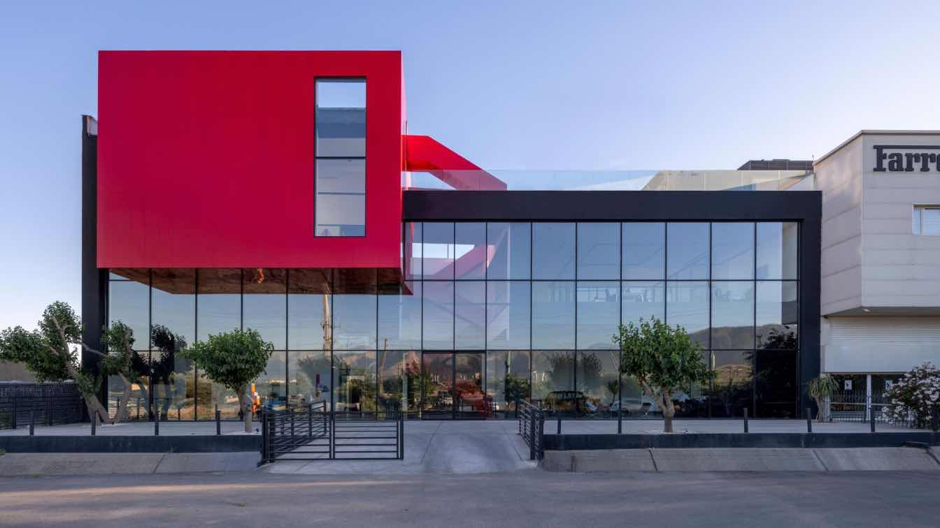
South African-based architecture firm SAOTA, completes Kirsch Pharma HealthCare’s new factory and headquarters in Wedemark, Germany.
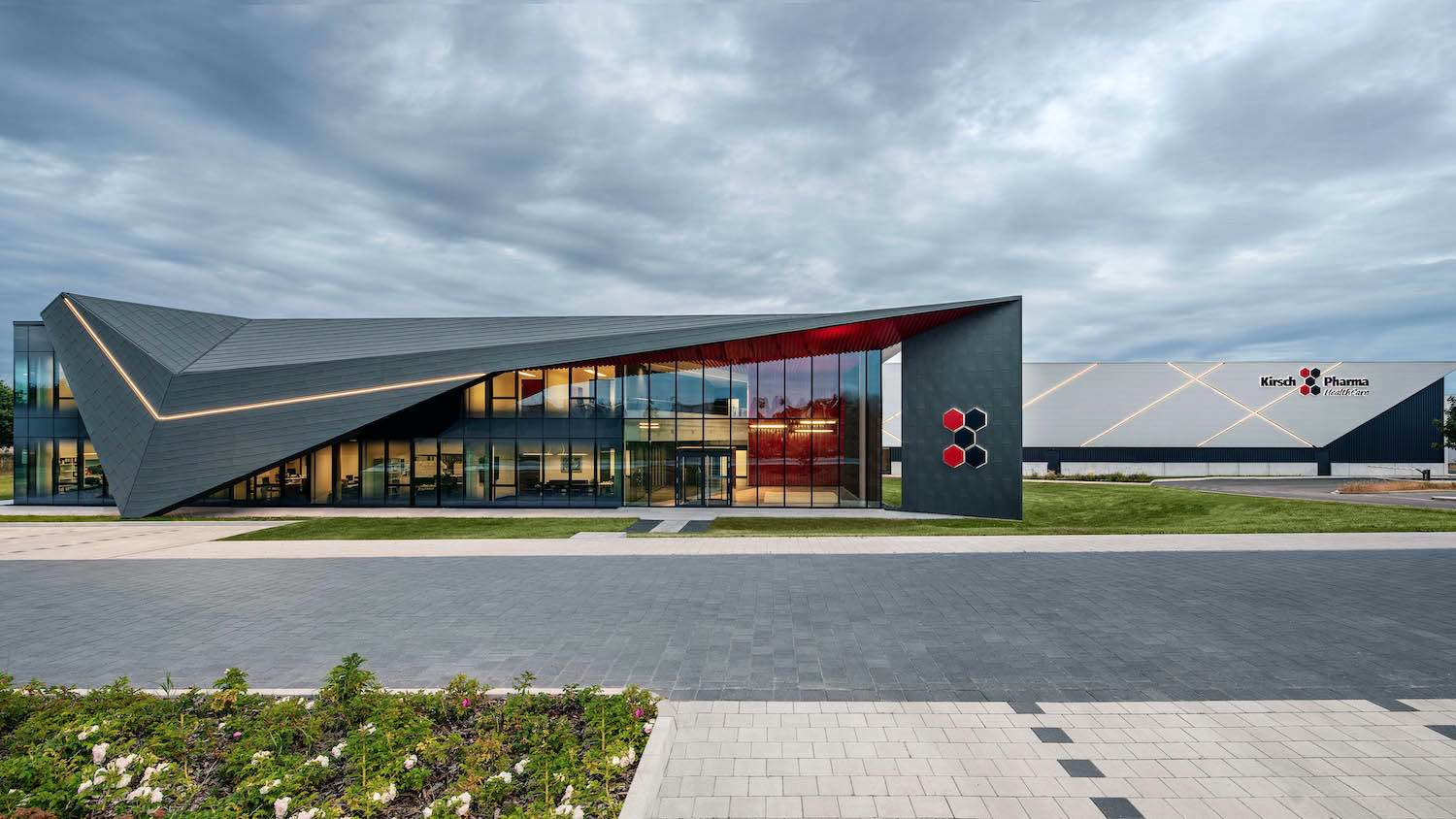
Kirsch Pharma HealthCare specialises in the production of finished pharmaceuticals and dietary supplements and SAOTA approached the project by creating a strong architectural statement and designed a building that stands as a sculptural object in the landscape.
Architect's statement: In their design for the new head office and production site for Kirsch Pharma HealthCare GmbH in Wedemark, Germany, SAOTA rethinks the often underwhelming and generic industrial prototype.
The site of German‐based Kirsch Pharma HealthCare’s new factory and headquarters in Wedemark, Germany, is a somewhat anonymous industrial zone without distinctive contextual cues. South African‐based architectural firm SAOTA approached the project with the understanding that a meaningful architectural response to this environment would require a building that stood as a sculptural object in the landscape, making a strong architectural statement that imparted a sense of presence and identity in its ownright.
 image © Adam Letch
Kirsch Pharma HealthCare specialises in the production of finished pharmaceuticals and dietary supplements (oral dosage forms) for the pharmaceutical, nutritional, biotechnology, veterinary and cosmetic industries. In addition to an efficient state‐of‐the‐art factory, the company also required a reception and office area that would articulate its ethos and identity while tying together the office and production facility. It also aimed to create an uplifting work environment for its employees while instilling in them a sense of institutional pride and wellbeing.
The design of the factory building was dictated largely by functional requirements and consists of a simple rectangular structure clad with light grey steel cassette walls forming a skirt or slightly projecting section of façade under which slips a layer of graphite grey-coloured trapezoidal sheeting. This façade treatment creates a sense of lightness to what would otherwise appear monolithic, while dramatically incised lines across the façade’s surface further break up its mass. The factory’s positioning was carefully considered to allow room for future growth and expansion.
The adjacent office and reception building, on the other hand, required a departure from generic industrial forms – a welcoming and uplifting environment that would complement and express the nature of Kirsch Pharma HealthCare’s activities while intelligently humanising its aims and advancing its purposes.
 image © Adam Letch
While the office area maintains an essentially rectangular form, and consists of a reception area, boardrooms rooms a conference room and offices, SAOTA contrasts the office building and the factory building with a striking sculptural canopy over its main face and entrance. This bold, futuristic form helps orientate visitors and guide them towards the arrival point while mediating the transition from exterior to interior.
The angular, faceted shape of the canopy, which wraps around the translucent triple-glazed glass curtain walling, translates elements of the company’s brand identity and logo while borrowing from its colour palette, complementing and advancing its corporate identity with its landmark quality. Its swooping angular lines echo the incised lines of the factory building, which serves to unify the two buildings.
The dynamic, technologically inspired, futuristic form of the canopy conveys a sense of speed, confidence and innovation while the transparent curtain walling allows the building to glow invitingly like a jewel in the landscape in the dull grey environment and weather. The canopy articulates the advanced, progressive technological component of Kirsch Pharma HealthCare’s activities, while the interior conveys the humanity and nurturing aspect of its mission.
 image © Adam Letch
The canopy’s overhang not only provides shelter, but also brings human scale to the industrial setting and facilitates a welcoming transition into the building. The soffit’s red ribbing is surprisingly expressive, with a highly textural quality that brings additional humanising detail on approach, while contrasting playfully with the monochromatic skies and architectural surroundings.
The contrast between the canopy’s outer shell, in graphite grey-coloured zinc cladding and the red powder-coated custom-made aluminium soffit (which extends indoors and runs through the foyer to form a feature backdrop wall for the reception counter towards the rear of room) emphasises the warm and inviting quality of the interiors, imparting a conscious experience in visitors of being invited into Kirsch Pharma HealthCare’s world. The interior spaces of the office building are flexible, allowing the foyer and boardrooms to function as an event space when the company holds client receptions or other events.
The way in which the reception areas relate to the adjacent factory building draws together its image and activities, merging the industrial and client‐facing elements of the business while creating a useful distinction with its contrasting light and dark facades.
The fact that Kirsch Pharma HealthCare’s office building is outward looking, as opposed to the generally inward‐looking factory buildings, also sets it apart, allowing natural light into the interior while providing views that facilitate a sense of connection to its park‐like landscaped setting. The shifting natural light serves as a natural marker of the day’s progress, which brings a natural dimension to the generally artificial context.
Through its graphic quality and bold use of colour, the signature feature of Kirsch Pharma HealthCare’s canopy and office building creates a narrative that translates the company ethos into aesthetic expression – the landscaping, architecture and interior design tell a story while stretching the possibilities of industrial architecture.
 image © Adam Letch
 image © Adam Letch
 image © Adam Letch
 image © Adam Letch
 image © Adam Letch
 image © Adam Letch
 image © Adam Letch
 image © Adam Letch
 image © Adam Letch
 image © Adam Letch
 image © Adam Letch
 image © Adam Letch
 image © Adam Letch
 image © Adam Letch
 image © Adam Letch
 image © Adam Letch


