TAOA: This project involves the renovation of an old building into a vacation destination. The original building, featuring a concrete frame, is nestled within a dense coastal forest in northern China, surrounded by a serene and secluded natural landscape. Just a few hundred meters beyond the forest lies the vast sea.
Originally, the building stretched 100 meters along the edge of an acacia forest, with beautiful waterscapes on both the south and east sides. However, its interior design included a single-sided corridor, resulting in long and somewhat redundant hallway spaces. The facade was overly closed off, fragmented by narrow Tuscan-style vertical strip windows that obscured the scenic rolling landscape around it, ultimately isolating the building from its natural surroundings.
The renovation aimed to break down the isolated and enclosed facade, fostering a close relationship between interior spaces and the picturesque surrounding environment. By reorganizing the interior layout, the design introduces a refreshed vacation lifestyle that brings nature indoors as much as possible.
To enhance spatial flexibility, the existing column grid was treated as an orderly framework. Within this grid, structural columns are either concealed within partition walls or deliberately exposed, creating a new balance of openness and structural coherence.
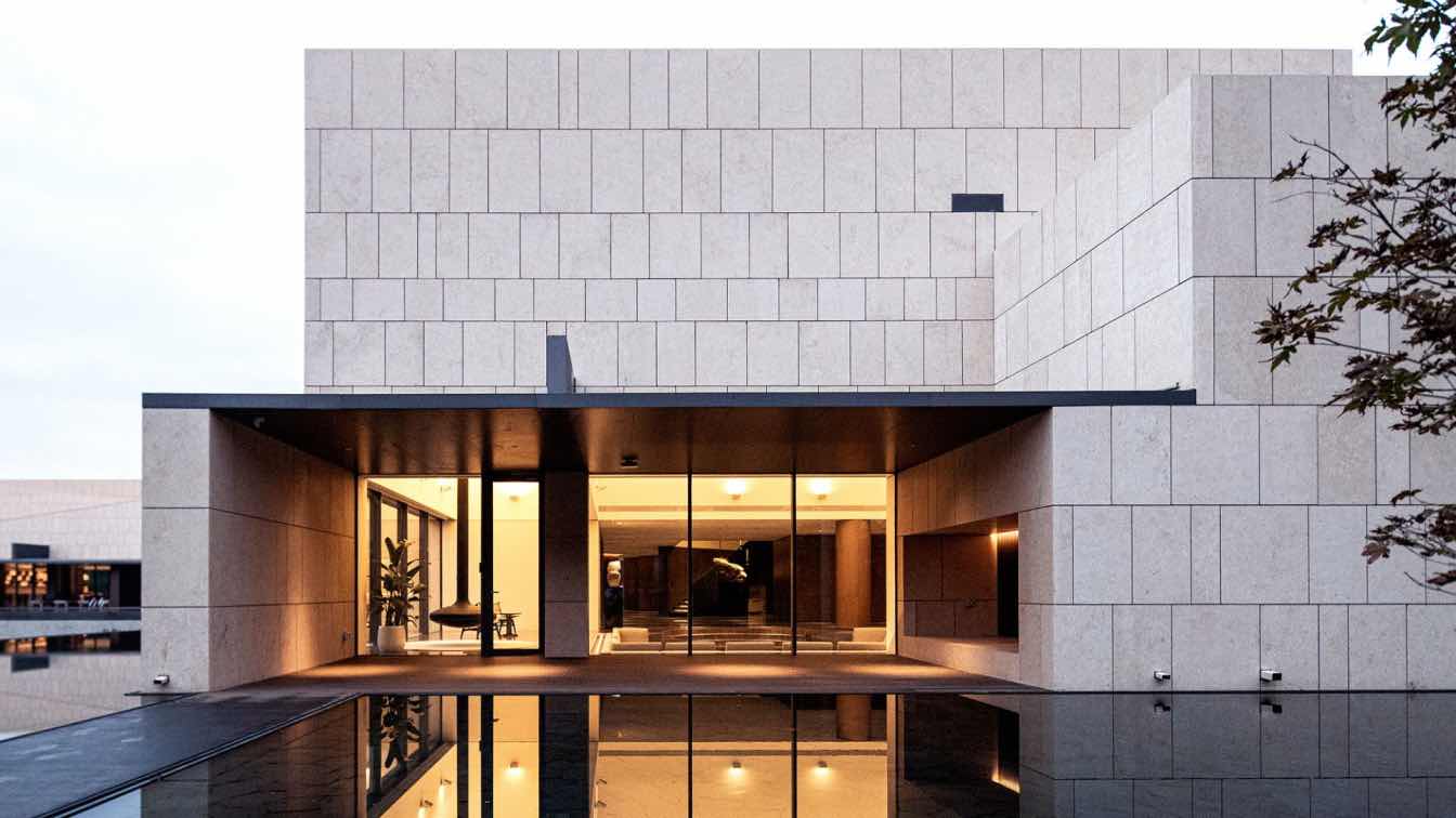
To strengthen the building's connection with the surroundings, three main strategies were employed in the renovation. First, based on the existing concrete frame structure, the design team removed the first floor's outer infill walls, unified the interior ceiling height, and extended the ceiling outward to create a cantilevered canopy.
The canopy establishes a horizontal line across the entire building, contrasting the solid stone walls above with the airy, transparent lower section. Above this line, a solid stone facade emphasizes the structure's volume, while the space below opens to the landscape with enhanced transparency. The transparent glazing facade beneath the protruding eaves becomes an abstracted landscape belt, which captures the surrounding environment. Viewed from under the extended overhanging eaves, the distant, scattered natural landscape takes on an ordered abstraction, forming a cohesive view of the surrounding wilderness.

The second strategy involved creating an inner courtyard by selectively reducing interior floor area, to enhance engagement with nature. Lastly, the third strategy introduced new courtyard walls, linking previously scattered sections of the building and wrapping external nature into the interior. In this way, the building’s boundary is deliberately blurred, allowing for a seamless integration with the surroundings.
The upper portion of the building follows the original layout, divided into two distinct areas: a communal area, and a more private guestroom area, with an open-air badminton court positioned in between. The rooftop adds significant value, offering diverse vantage points and spatial experiences.
A striking outdoor staircase and ramp in the middle section serve not only for fire evacuation but also connects the upper floors directly to the ground, allowing for varying views as one moves up and down, encouraging immersion in nature.
The exterior is finished with beige stone, conveying warmth during cold northern winters and aligning with the owner's vision. The solid walls also resonate with the region's character.
By retained the building's original contours, the design team transformed it into a stone sculpture that exudes tranquility and strength amidst the wild forest.
The design process was a balance between idealistic vision and practical constraints, avoiding simplistic determinism or superficial formalism. Through nature’s intervention, the design team sought to liberate the building from its previous rigid functionalism.
Renovating this old building signifies a transformation of an outdated environment. By preserving and reorganizing its internal structure, the design team enhanced its inherent logic. This layering of new logic fosters a rich and distinct architectural character, opening the building to nature while retaining the solidity and strength characteristic of northern architecture. Ultimately, the building harmonizes with its regional context, blending into the natural landscape and becoming one with it.


