In 2017, St Hilda’s Anglican Church in Island Bay approached First Light Studio with a brief describing the need for a beautiful, quality, and timeless design for the existing church. This request followed a one-year ultimatum from the council to address the building's earthquake-prone status.
Recognizing the importance of a larger congregation space and revitalizing the street-front connection with the community, the parish chose to remove the earthquake-prone elements of the brick façade. Additionally, they desired an extension to the nave that would provide more space for the baptismal font, increased seating, and a new façade facing the street.
The new extension respects the sacredness of the Christian church, emphasizing beauty, quality, and a welcoming atmosphere both inside and out. It aligns with the symbolic journey experienced within the church.
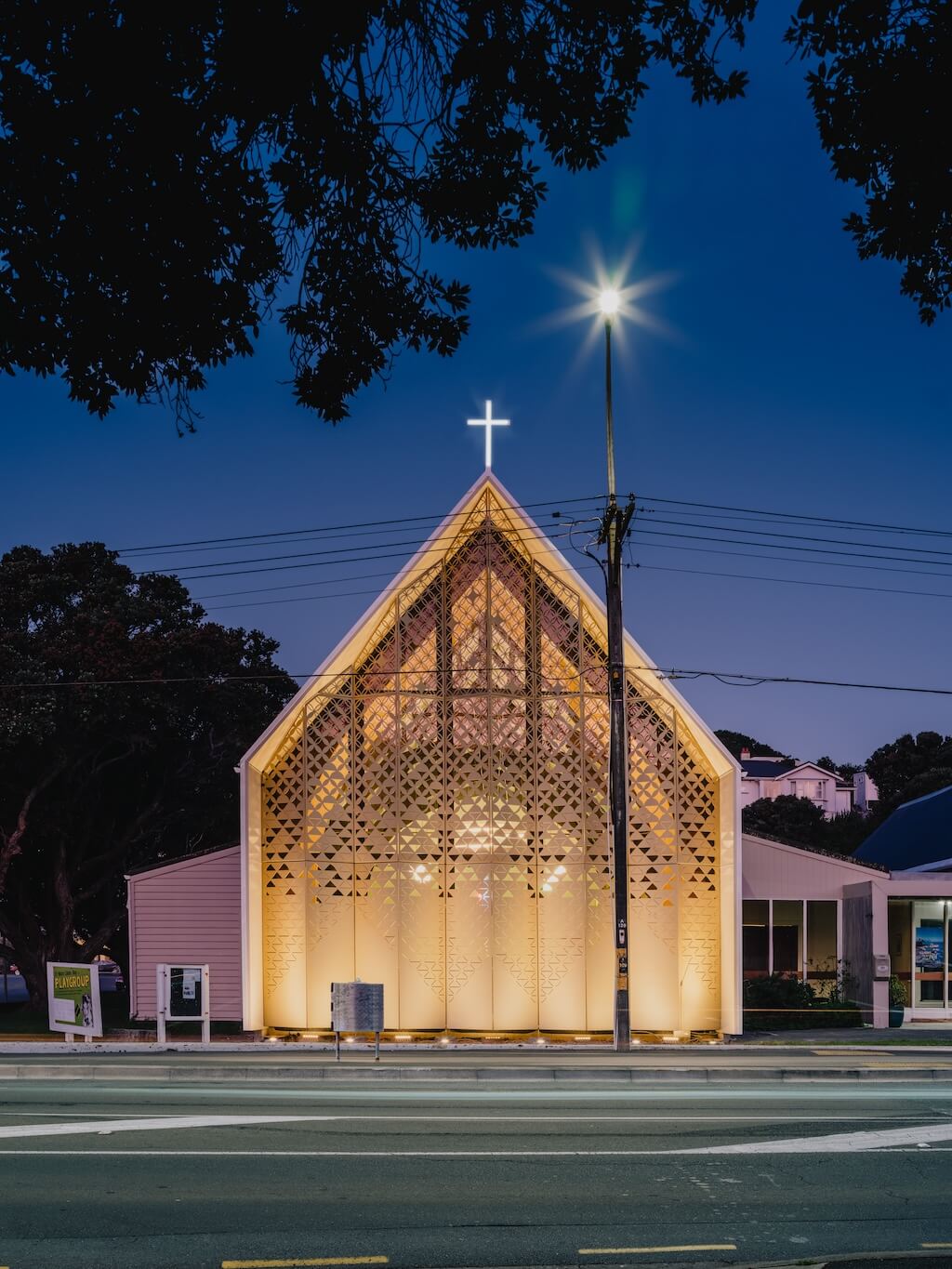
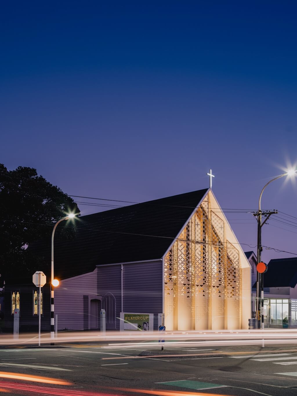
By extending the existing weatherboard sides of the church towards the footpath, two nib walls are created, offering shelter for full-height glazing. In front of this glazing stands a golden tessellating veil, adorned with a pattern that represents the history, future, people, and essence of the place and the church.
St Hilda’s Anglican Church's design by First Light Studio integrates architectural elements that honor the church's sacred nature. The design embraces beauty, quality, and a sense of warmth to create an inviting environment for both the congregation and the surrounding community.

St Hilda’s Church holds significant heritage status, having been completed in 1912 and designed by renowned church architect Frederick de Jersey Clere, known for his work on St Mary of the Angels and numerous other churches in the lower North Island.
In 2012, an assessment revealed the church's severe earthquake-prone condition. Ironically, only the brick front, intended by de Jersey Clere, was constructed to his original plans due to budget constraints. The remaining portions were built with timber weatherboard, with the intention to rebuild in brick when funds allowed. However, this plan never came to fruition.
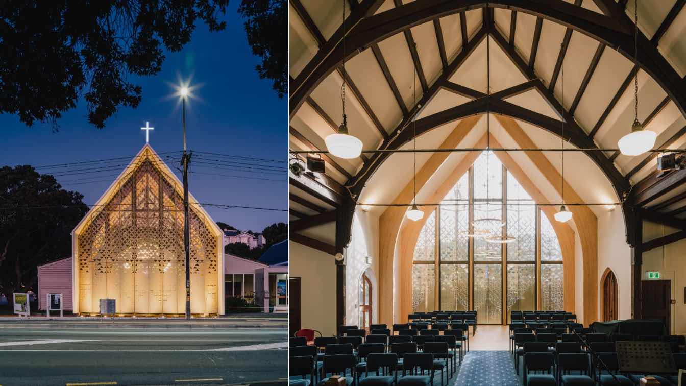
After years of contemplation within the congregation, in 2017, the decision was made to remove the earthquake-prone brick façade and design an extension to the nave. This extension aimed to provide more space for the baptismal font, increased seating, and a new street-facing façade.
The new façade pays homage to the Māori history of the area, incorporating the Niho motif—a symbolic upward triangle representing mythology, hospitality, and the family houses within a tribe. The Niho motif is ingeniously used to create a pattern that narrates the story of the land (whenua), ocean (moana), sky (rangi), and stars (whetū) used for navigation.
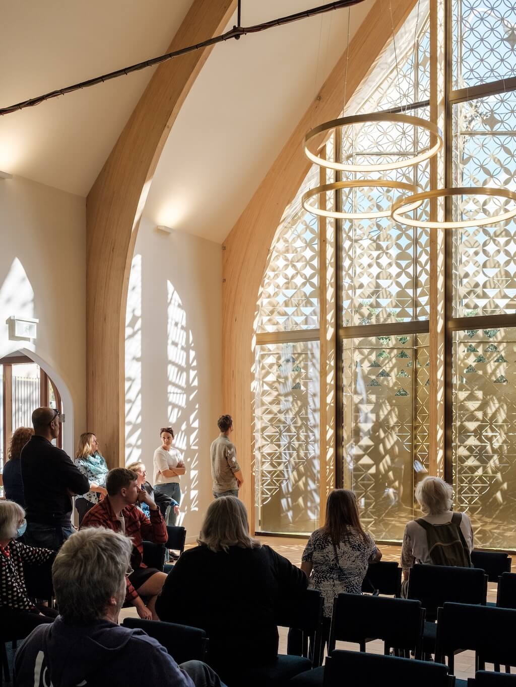
The screen, adorned with these tessellations, is positioned close to the footpath, providing spaces for play and engagement. Delicate perforations at eye level offer detail while ensuring privacy for those inside. As the screen ascends towards the sky, the perforations grow larger, culminating in a nearly transparent top, evoking a sense of lightness and drawing one's gaze towards the heavens.
A strong connection between the interior and exterior is fostered, as sunlight filters through the screen during the day, casting patterns and stories as captivating shadows on the floor. At night, the church radiates as an illuminated beacon, with the screen glowing and the transparent upper sections revealing the beauty of the new and existing interior structure.
