HO arquitectura de interiors: Euphoria is a beauty salon designed to spend a great time in a warm and relaxed atmosphere where manicure and pedicure services are offered.
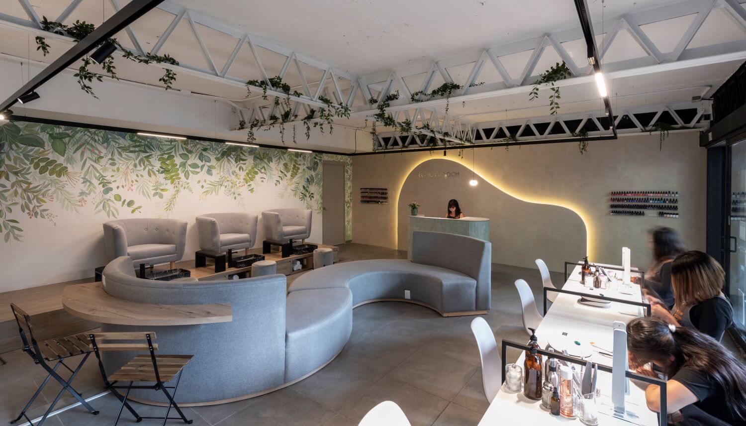
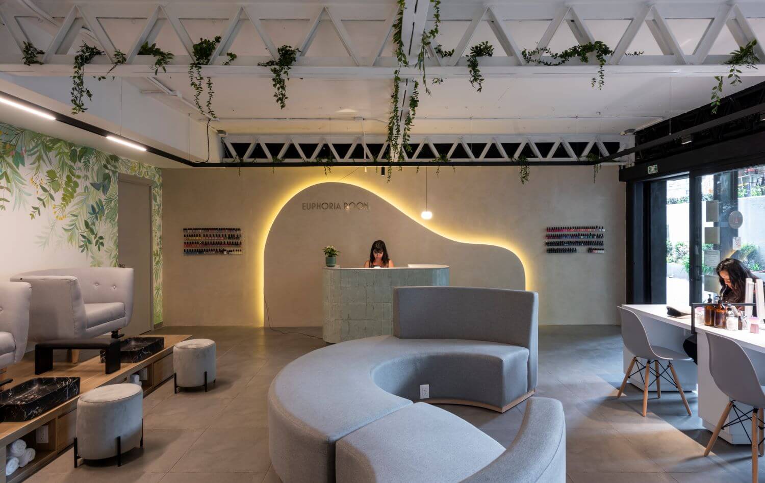
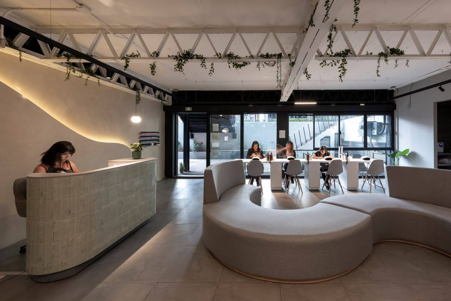
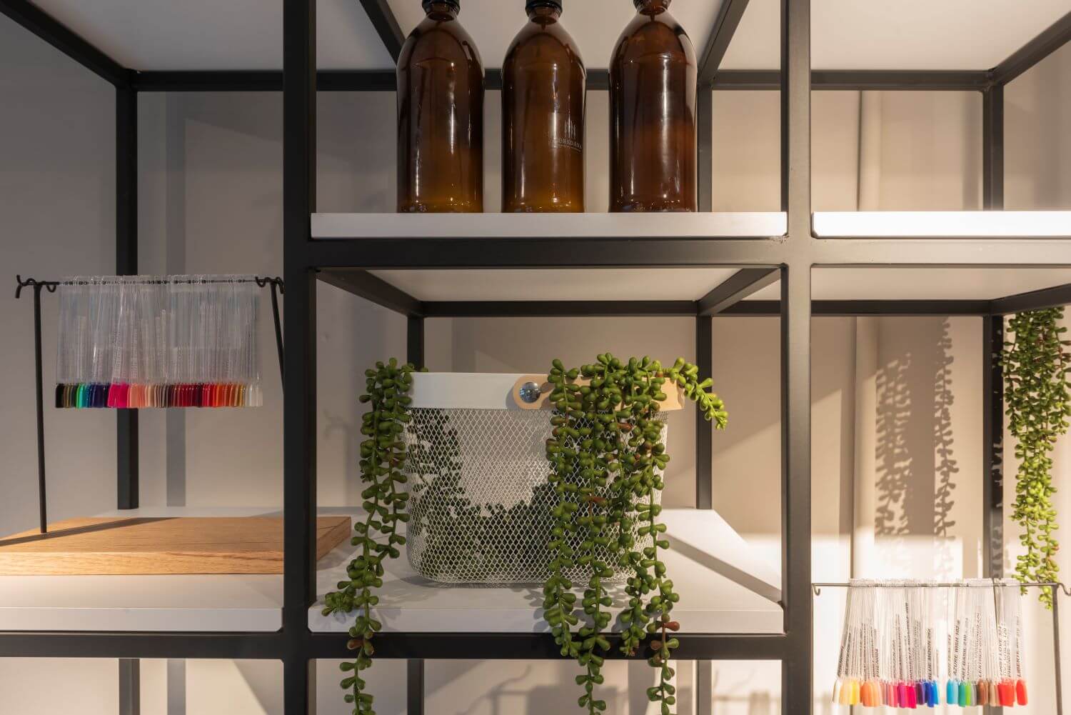
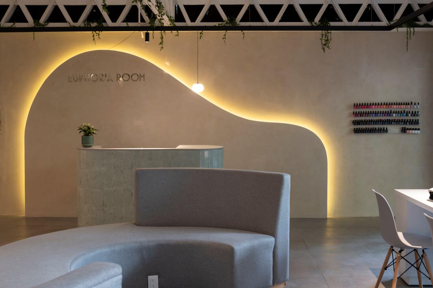
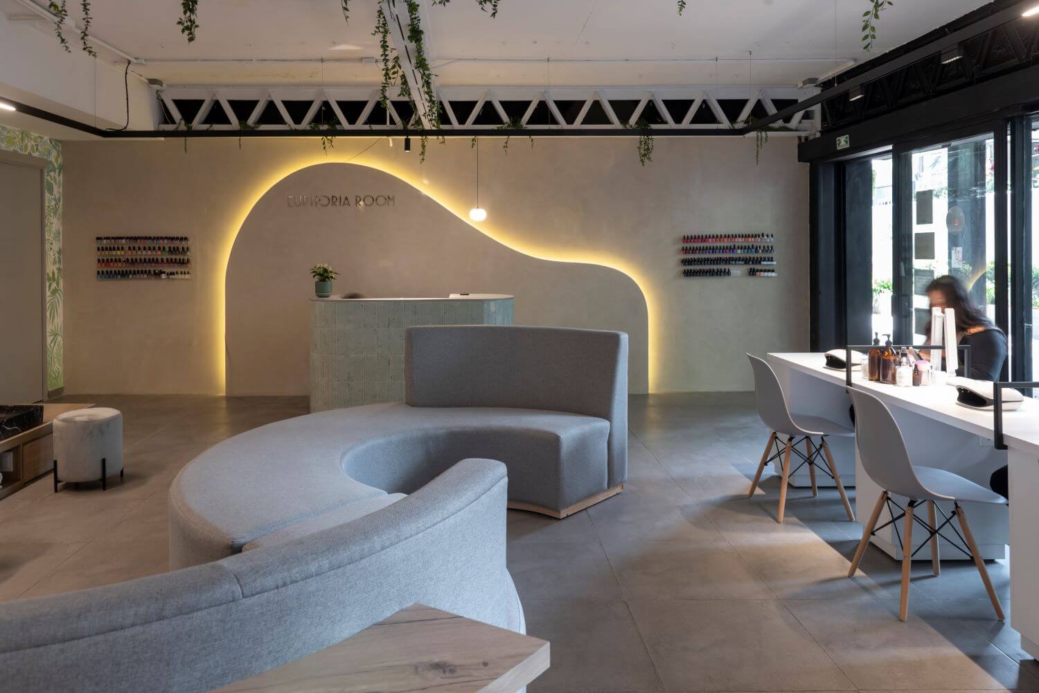
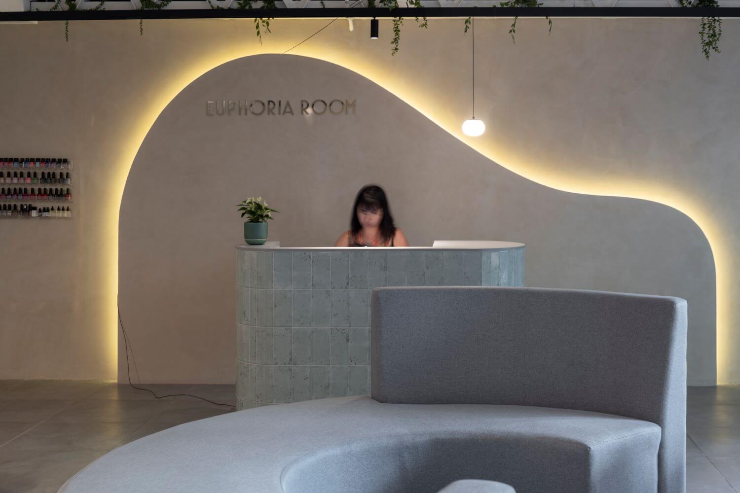
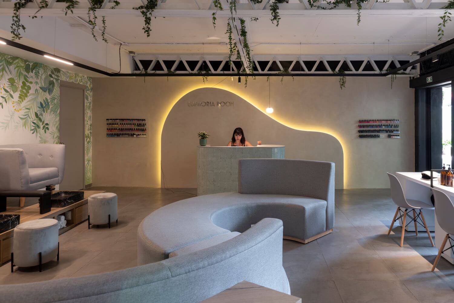
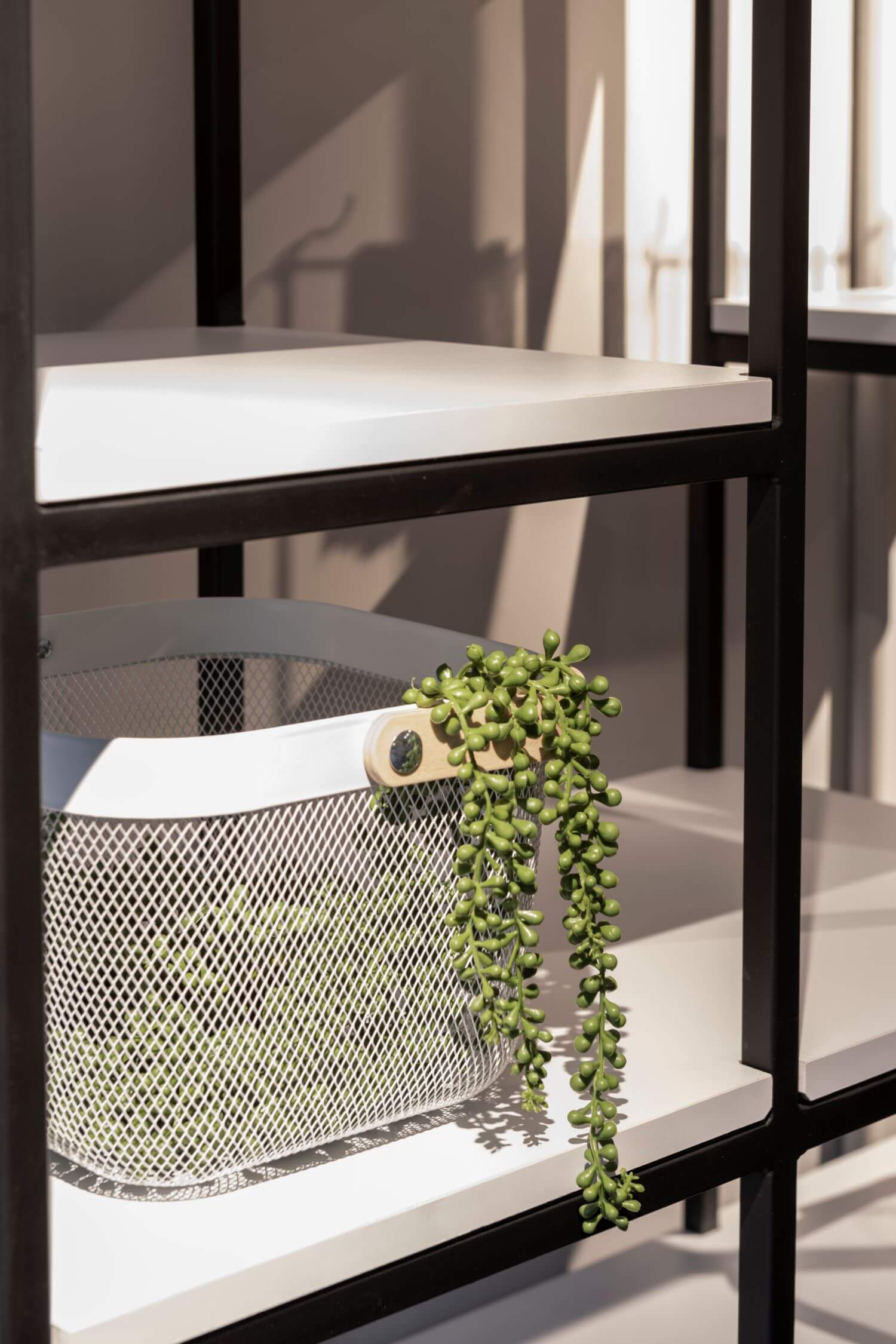
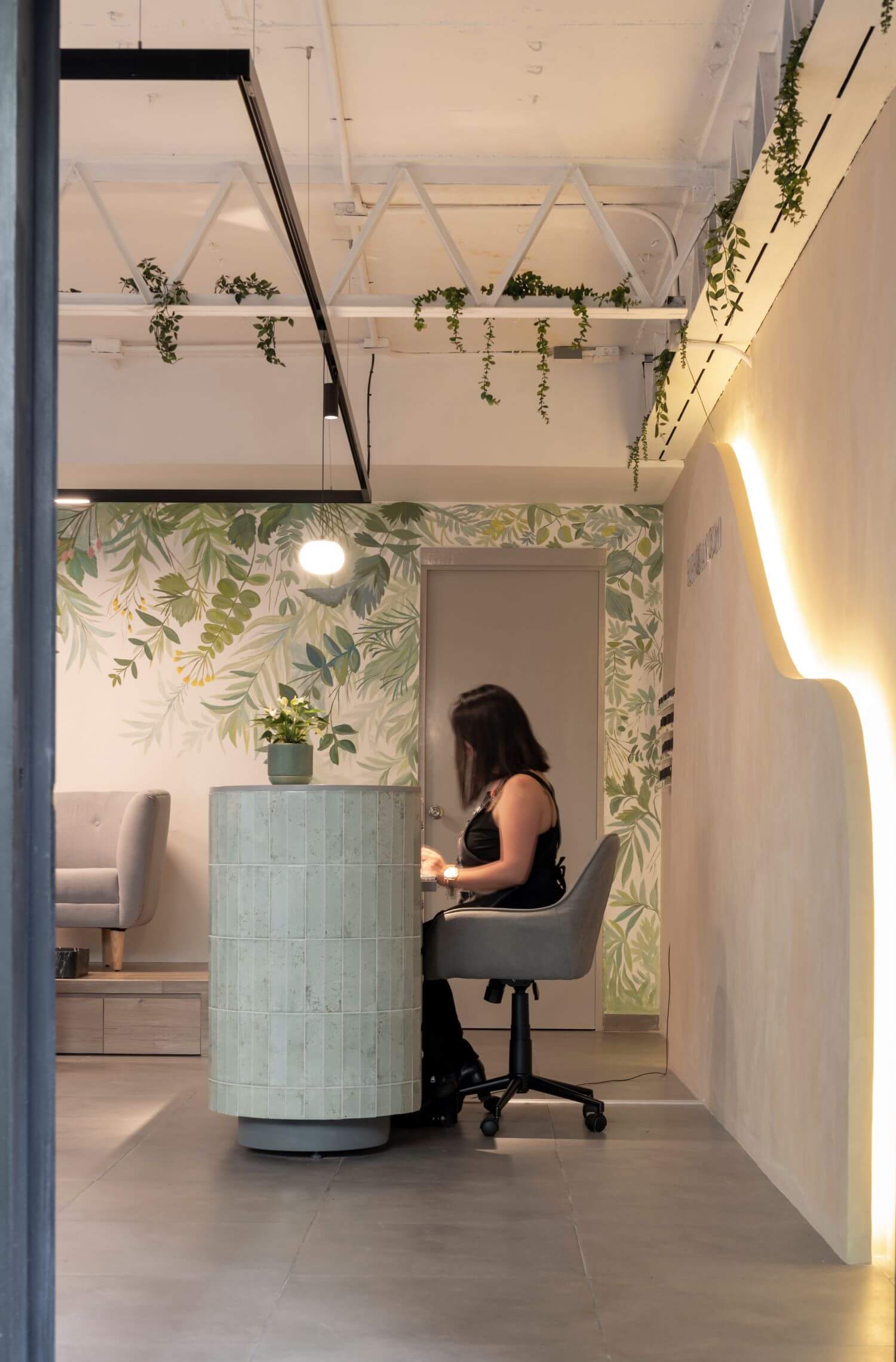
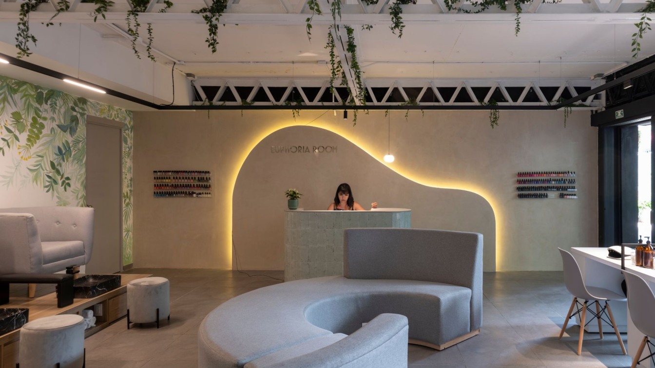
The concept of this space was inspired by an industrial design with the intention of respecting the original structure of the building, the color white was used in certain points to create a brighter space, in the main wall was installed a chukum type paste with a natural Mexican finish, with a degraded touch that gave a rustic effect, a lambrin of rock board was placed in front that forms a curve of indirect light in warm color to highlight the branding of the premises. On the sides of the store, suspended acrylic shelves were placed to display the different shades of nail polish.
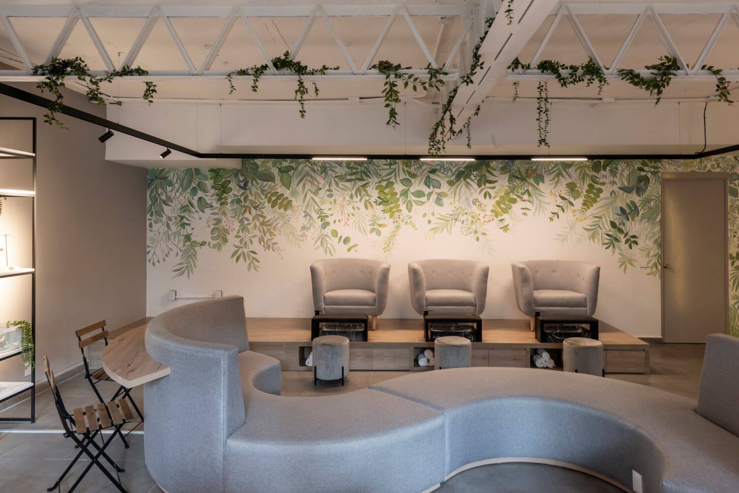
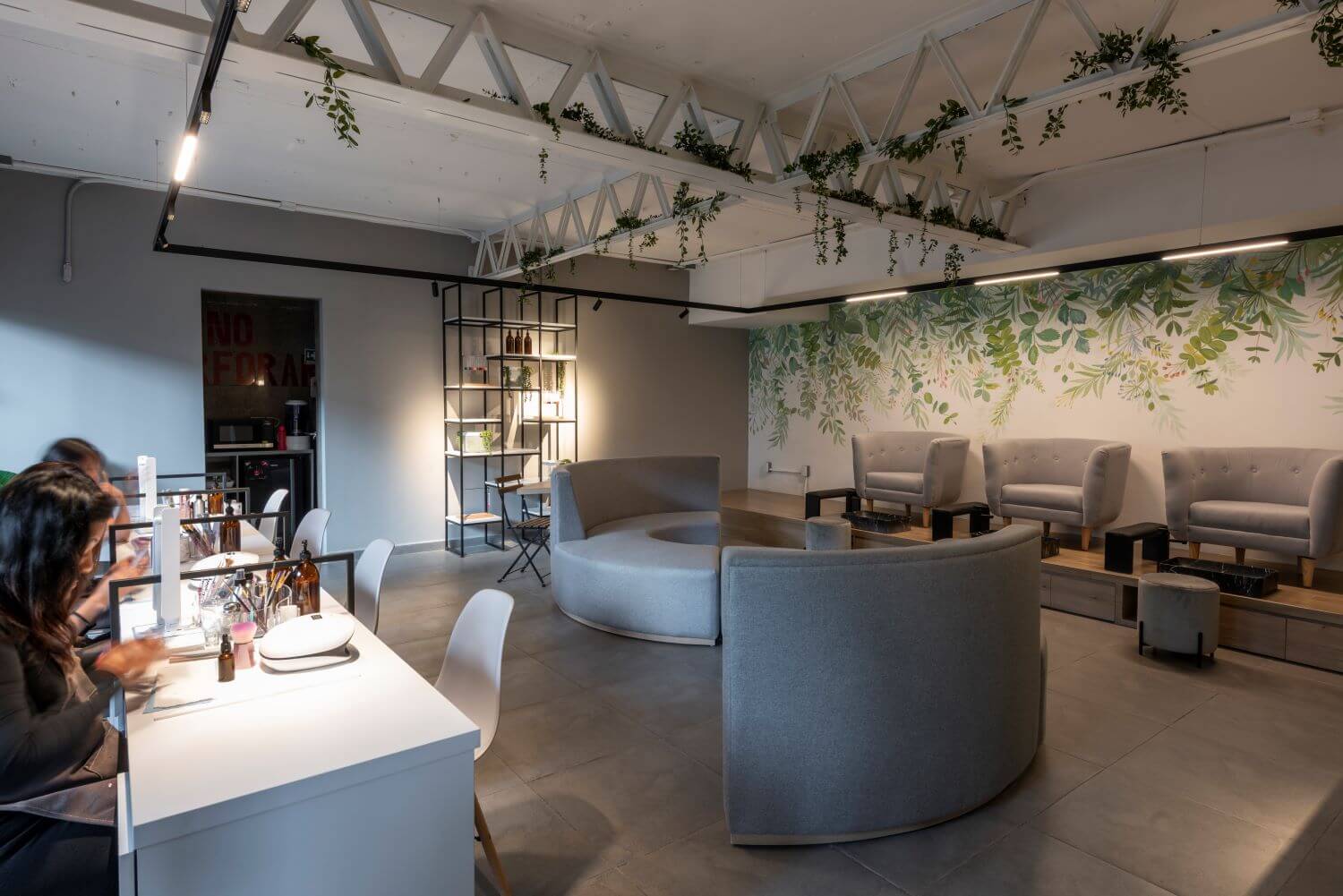
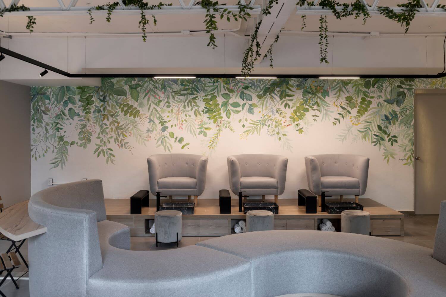
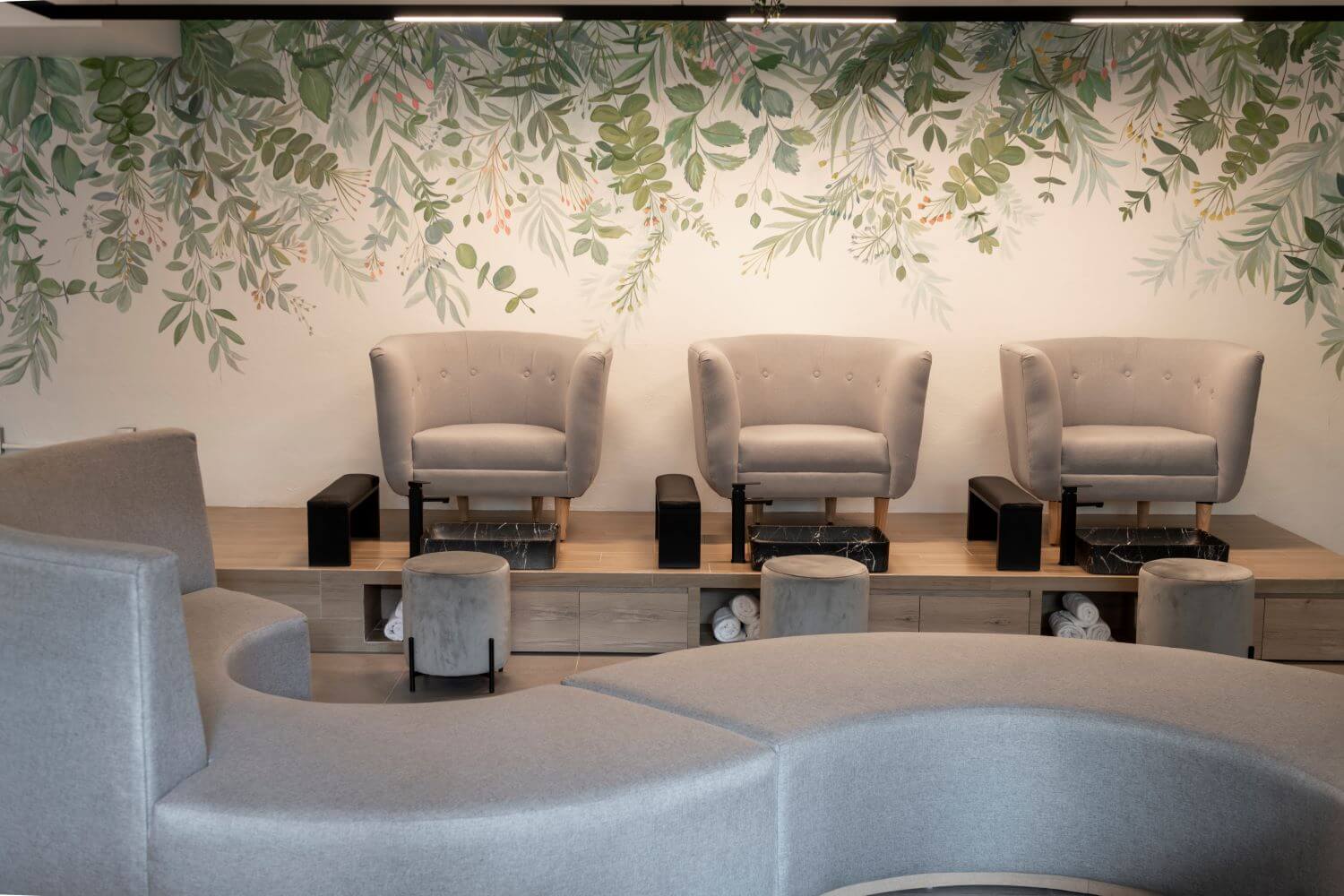
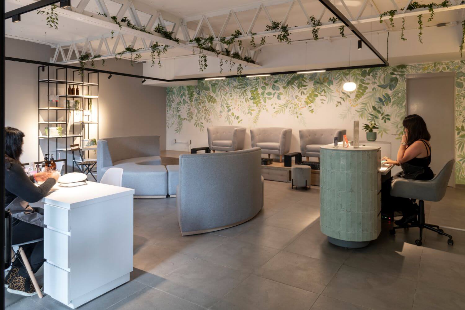
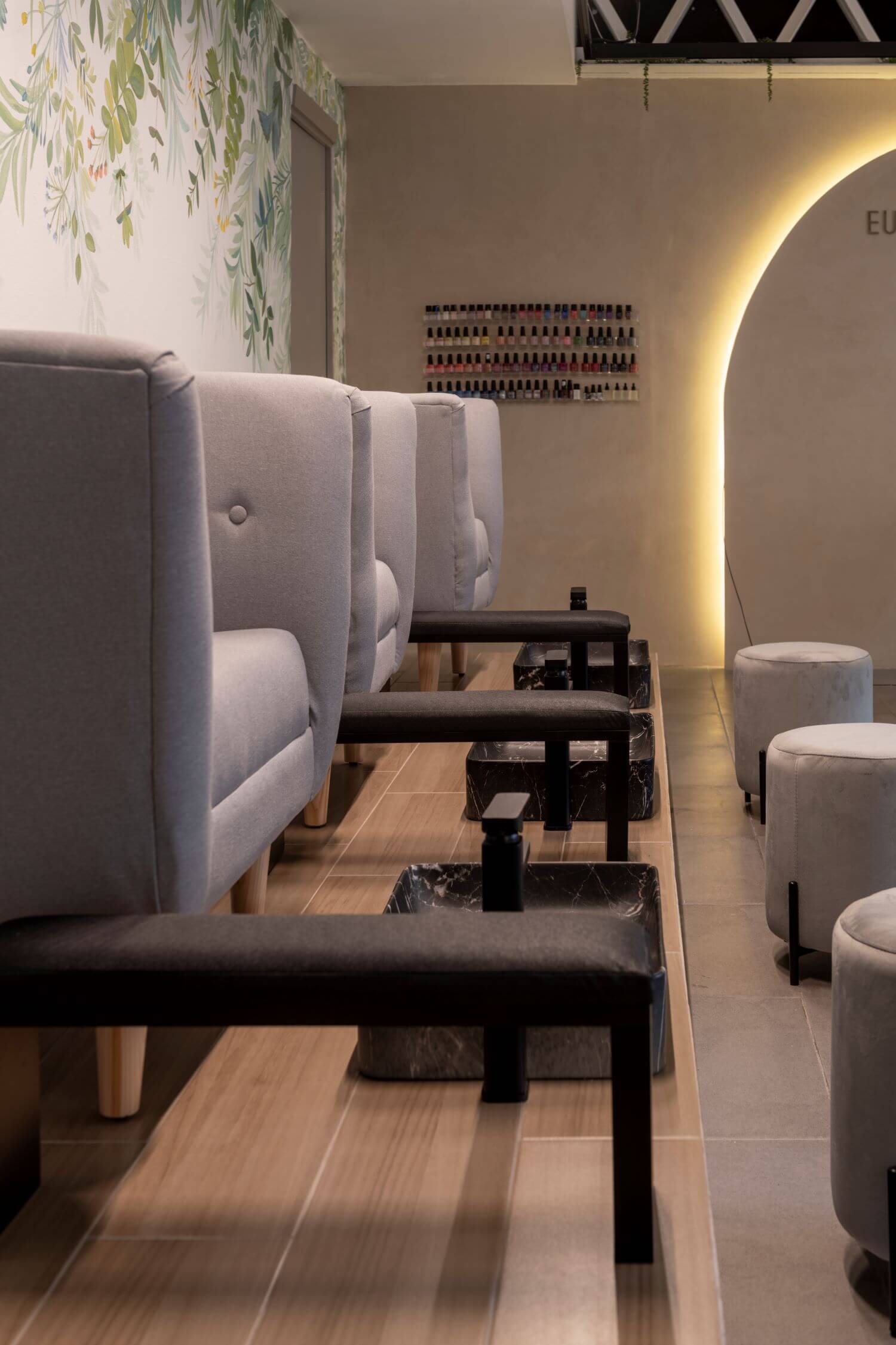
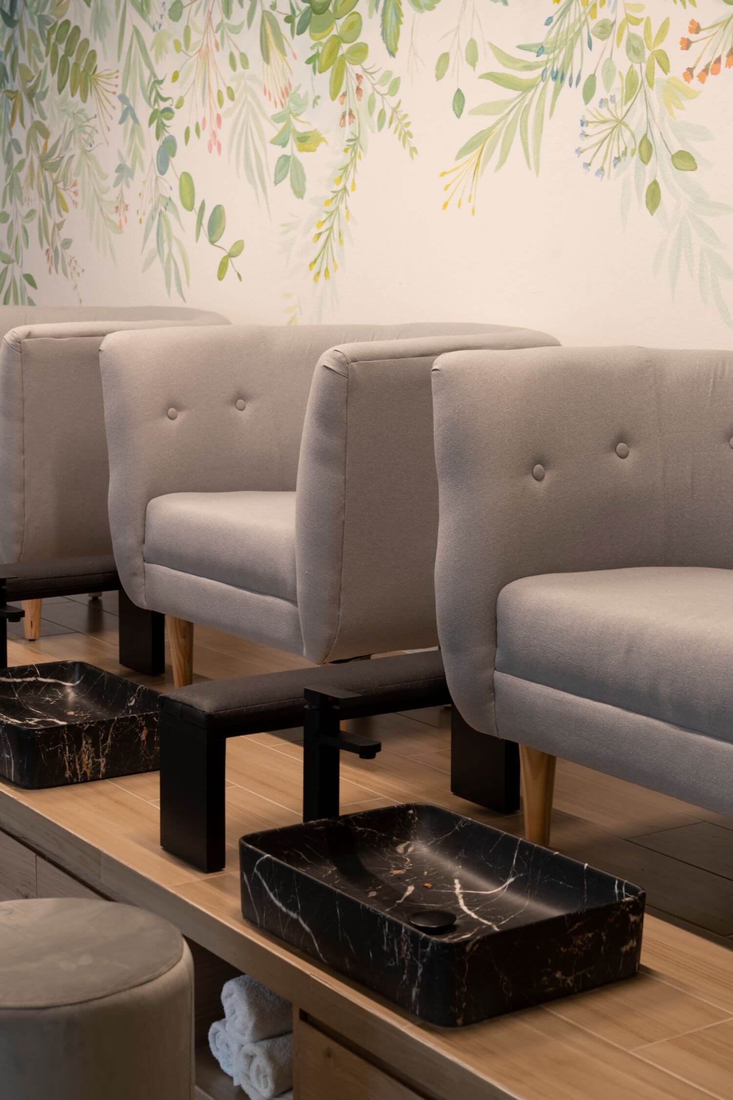
In the pedicure area 3 individual chairs in neutral tones were placed on a step type base, which was finished with wood type porcelain in light tones, also ceramic sinks with a black marble appearance were installed, with the combination of these colors and materials, a harmony was achieved respecting the industrial design of the place. Taking advantage of every space that could be had, drawers were placed under the base to store the material necessary to provide the service, thus making the space and the service offered efficient.
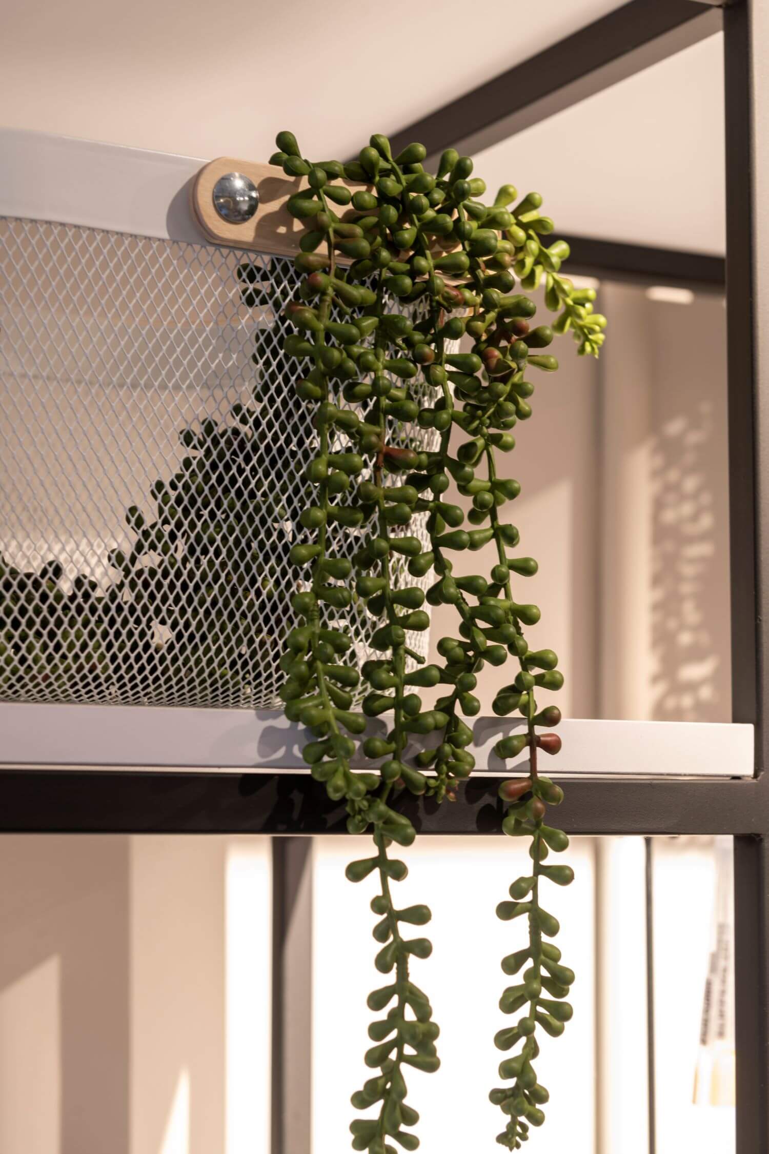
On the wall behind the armchairs a mural was drawn with motifs of vegetation, in green tones which gives it a lot of life, also helping to give a sense of peace and serenity within the space. To complement the green tones, artificial foliage was placed on the steel beams, but with a very natural appearance and easy maintenance, creating a space with three-dimensionality, which gives a feeling of being in an outdoor space.
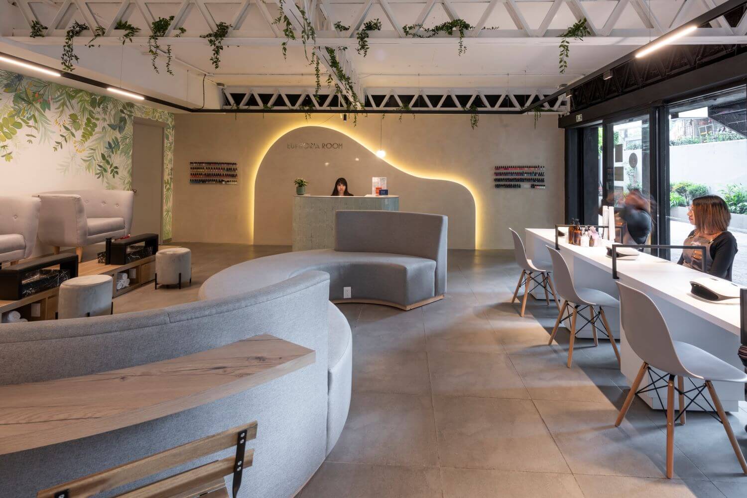
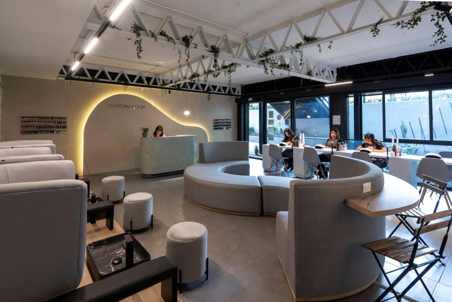
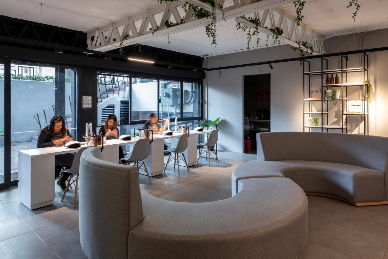
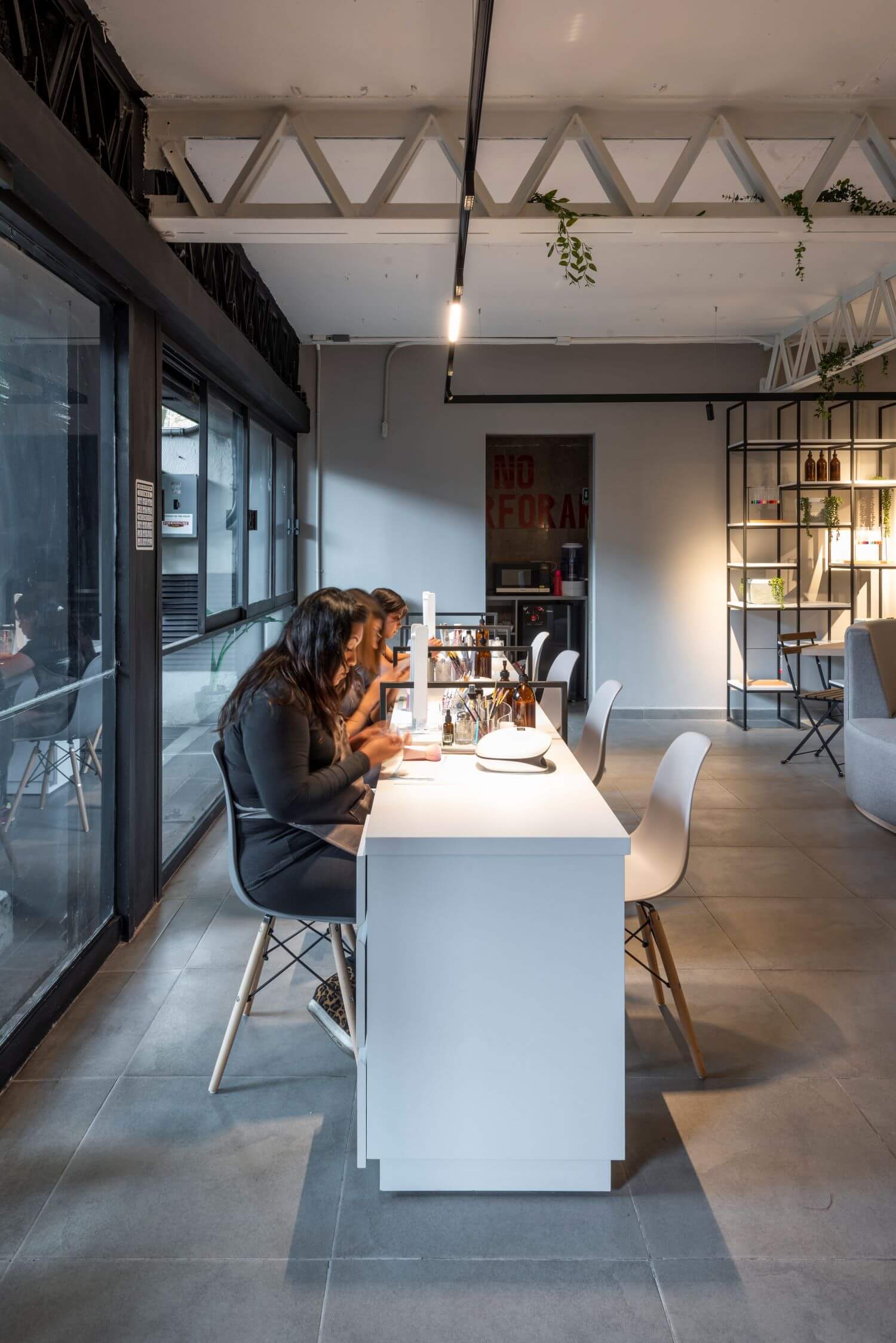
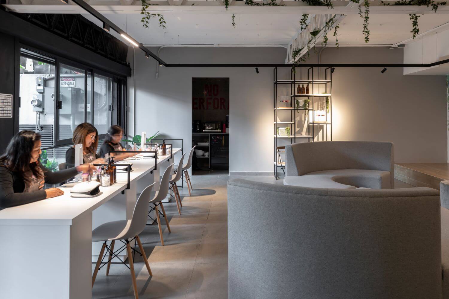
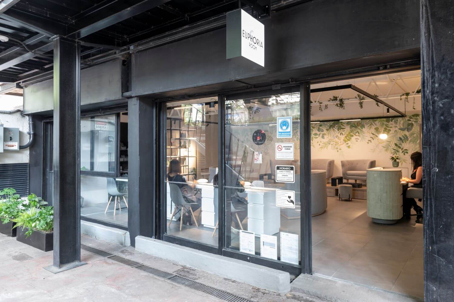
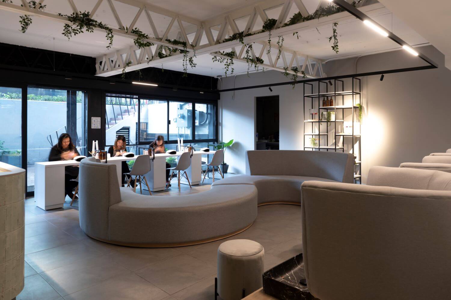
Working in a small space with little light, it was very important to open some windows towards the street, that combined with the painting and the elements of nature gave a feeling of spaciousness and light, artificial lighting also played a very important role in the project, we placed suspended magnetic rails which form a perfect picture, with some lights embedded in the blimps to have a good lighting in each space, which at the same time helped us to complement the concept.
The manicure workstations are white with a black metal structure, following the industrial style of the place, these were placed together to create a sense of bench, so that the user could be more comfortable in their own space but without feeling isolated. One of the most important elements was the multifunctional waiting room, that is to say, it is a curved room that gives us service for the 360° of the place, it can give us service for the pedicure and manicure area, waiting, work, socializing, and many other activities.
