The city Herzliya in Israel may be far removed from the pastoral island that we all know and love from the reality show "Survivor". However, this is precisely where this reality TV star from 'Survivor' chose to settle after a period of not being in the limelight, residing under the radar. As you'll soon see, her new apartment, meticulously planned and designed by Dorit Sela and Nitzan Horowitz, is the epitome of refined chic and great taste.
A thoughtful and precise combination of seemingly contrasting styles, bright and warm colors, curved corners, and abundant softness are just some of the characteristics of their new apartment. After years of living in rented apartments in Tel Aviv, the couple decided not to compromise and purchased a new contractor-built apartment in one of Herzliya's pastoral neighborhoods. They approached designers Dorit Sela and Nitzan Horowitz with a clear goal: to transform the generic apartment into a true home—a pleasant and embracing living environment that exudes a boutique hotel's holiday atmosphere 365 days a year. The experienced design duo embarked on the task and created a real home for the loving couple, rich in patterns, soft and bright tones, textures, and an abundance of textiles—a sort of private fortress enveloping the loving couple, ideal even for moments when they host family and friends.
The apartment, originally planned as a 5-room unit plus a small closet room, has now transformed into a spacious, luminous, and practical 4-room apartment, including a large, specially equipped wardrobe room tailored to the needs of the influencer in the design and fashion field.

"We designed the apartment in a style we refer to as 'metro style,' composed of an ensemble of styles," Sela shares. "We merged the eclectic with the modern and worked with special elements like curved walls and disconnects in the walls that create a harmonious, refined, and clean look."
"We had our first meeting after the star sent us pictures of spaces that inspired her, and in practice, we did combine our style and lines with things she loved. That's how we created a genuine home, to the extent that one can momentarily forget that it's an apartment in a building," Horowitz adds. "We chose to deviate from the building's inherent linearity and created an abundance of rounded and curved elements, granting the apartment a soft and inviting appearance. We combined coverings and sculptural motifs throughout, all in the soft sandy hues, which form an ideal envelope for luxurious furnishings. Despite investing a lot in every detail, the final result doesn't seem forced—the apartment feels organic, natural, and emits very pleasant vibes."
One of the elements that contributed to the desired aesthetic is the walls, which (along with the ceiling) Sela and Horowitz decided to cover with a mineral plaster in a sandy shade, providing a sense of softness and depth. Moreover, the designers chose to design a disconnect between the walls and the ceiling, creating rounded corners throughout the apartment.
"The floor is laid with smoked oak parquet, and as an extraordinary step, we decided to forgo standard panels and instead raise the floor by about 20 cm. This created an illusion of a larger floor space than it actually is," Horowitz explains. "In tandem, the fact that the rounded corners do not collide with each other creates interesting encounters between the different elements, thus strengthening the feeling of depth and space."
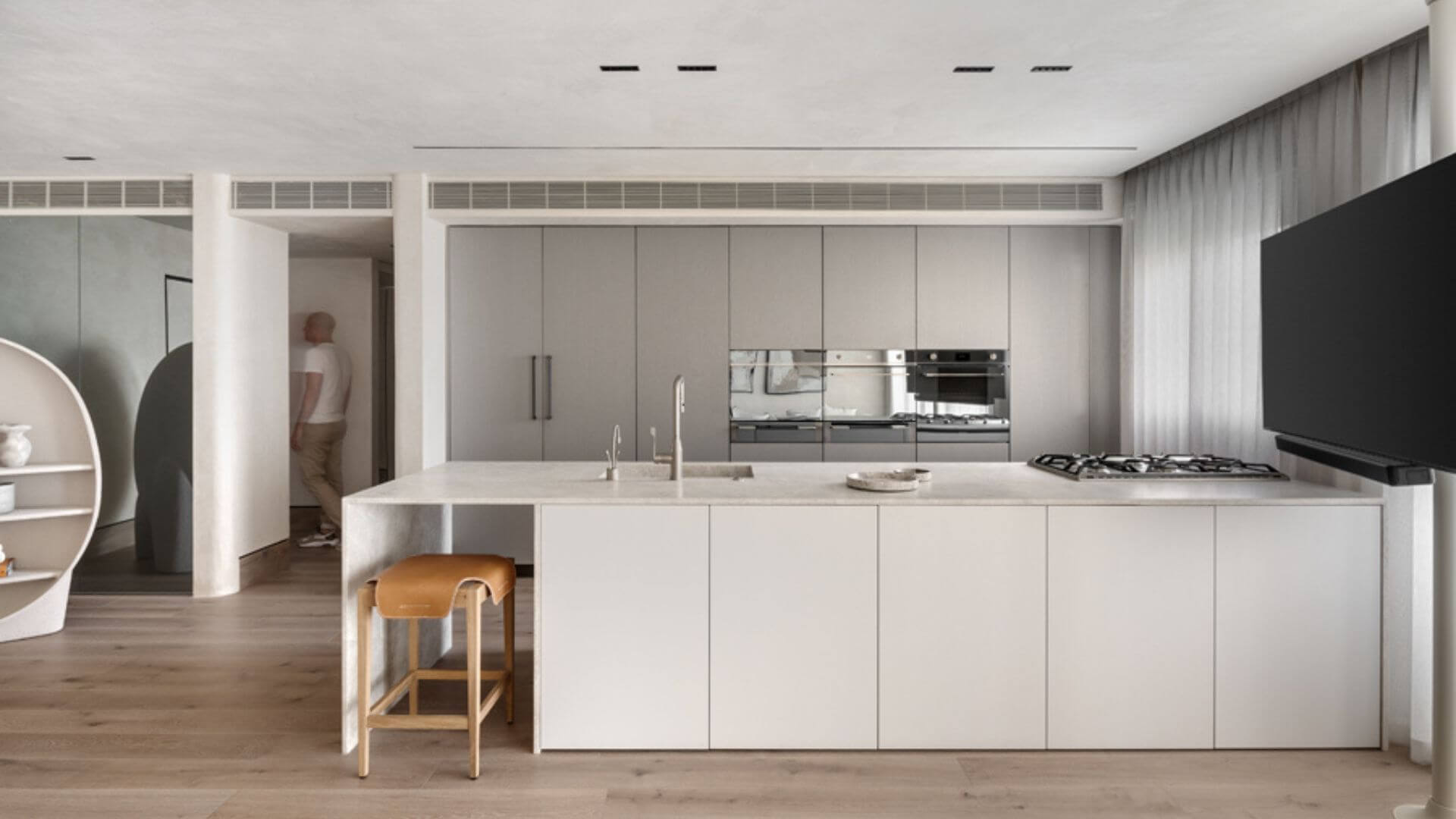
The parallel kitchen, open to the living room, appears quite spacious, though it perfectly matches the apartment's dimensions. The spaciousness of the area is a result of a floor-to-ceiling wardrobe wall that spans an entire wall, which they chose to cover with an innovative finish in a color imitating concrete texture.

"The large island in parallel to the dominant furniture was designed with tones of natural stone. It serves as a practical and spacious work surface and, alongside that, as an intimate seating area for the couple. At one end stands an iconic concrete sideboard, designed by Raphael Navot for the French brand Roche Bobois, serving as a library, albeit with a slightly different interpretation. One of the reasons we chose it lies in the fact that it excellently emphasizes the asymmetry and rounded shapes that dominate the space," says Sela. "Moreover, its appearance seems draped in concrete and, as such, integrates seamlessly into the overall concept."
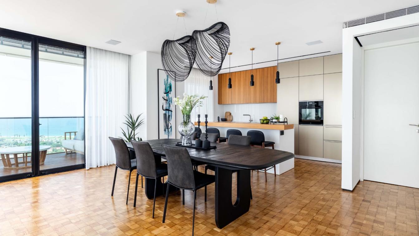
"For the adjoining dining area, we designed a table from scratch, crafted from three different materials: Corian, porcelain, and natural stone. The three lighting fixtures suspended above blend well with the refined and clean appearance this area emits," she further explains.
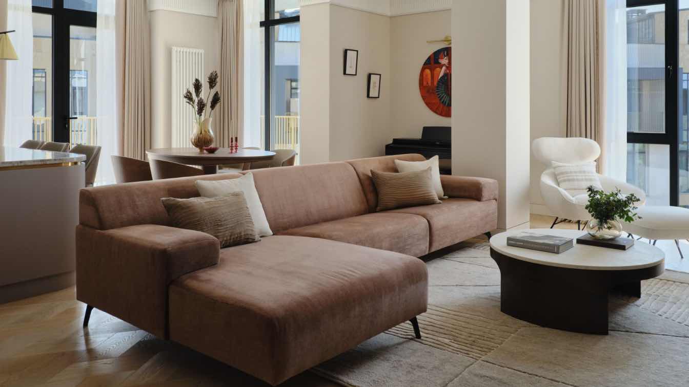
The living room features a long, comfortable sofa upholstered in white fabric adorned with decorative cushions. Adjacent to it is a light-colored armchair surrounded by a wide camel-toned leather strip. Placed at the center of the room is an oval-shaped coffee table in a stone-gray shade. The textured rug, large dimensional plant, and the artworks hung on the walls complete the look. The communal area is sealed with the expansive hosting terrace, which includes an equipped outdoor kitchen. Sela and Horowitz chose a large, luxurious sofa for it, alongside a table incorporating a fireplace, perfect for cozying up to on cool nights.
The bedroom, notably expansive and indulgent, was expanded by absorbing part of the original space, further enhanced by a mirrored wall from floor to ceiling. Atop it stands a rounded vanity table crafted from fruitwood, a creation by Arik Ben Simhon, beneath which a camel-toned leather pouf is placed. The couple's bed is adorned with a velvet coverlet, and above the two bedside tables of different sizes, symmetrically hang lighting fixtures.
True to their design and fashion taste, the suite's walk-in closet is undoubtedly one of the highlights of the apartment. Sela and Horowitz designed it as a highly functional walk-in wardrobe, and between it and the sleeping area stands a frosted glass partition enclosed in a thin black aluminum frame: "Dorin is a fashionista, so we fully collaborated with her in planning the custom-made closet, crafted in Italy," says Horowitz. "She knows better than anyone what she wants and needs, which items she has, and which ones need priority."
A zero-line door leads to the couple's bathroom, designed with clean lines and including a particularly large shower and a suspended vanity unit with a marble surface and sinks for him and her. Above it hangs an elliptical mirror surrounded by a soft light ring.


