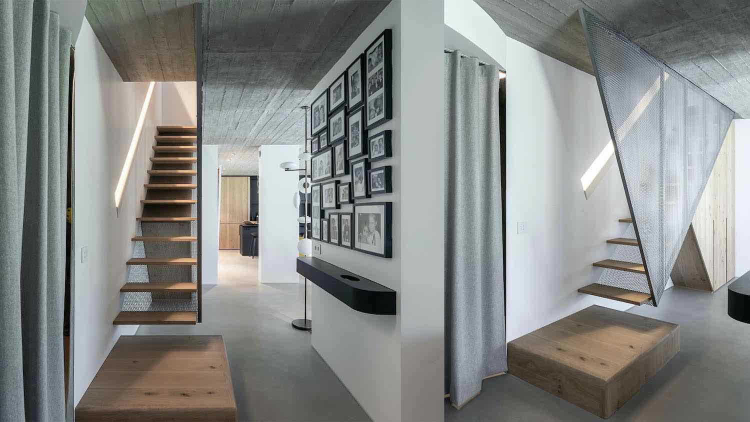
In a relatively new building at the heart of Holon, an impressive apartment is nestled, meticulously designed by Florina Popovski and Tali Eliashov for a young couple. Both couples appreciate quality, and it’s evident they have great taste. A glimpse into the apartment reveals meticulous attention to every detail. Welcome to the new home of a young couple located in a building completed a few years ago. Prior to moving in, the couple sought the expertise of Florina Popovski and Tali Eliashov, owners of FT Architecture & Design studio, to craft for them a sophisticated, elegant, and refined living space tailored precisely to their desires, needs, and preferences.
"The couple recently got married, and this is their first home. Before the renovation, it was a standard contractor's apartment, and beyond just designing, we made several structural changes," recalls Popovski. "For instance, we relocated the kitchen to create a much more spacious area with a large island. We combined two bedrooms into a luxurious master bedroom, and by altering the walls and openings in this area, we managed to create, in the hallway leading from the public area to the bedrooms, a large storage closet for general use."
Overall, it's evident that both the couple and designers emphasized storage and wardrobes, creating aesthetic and meticulous spaces that honor the furniture details and artwork placed thoughtfully throughout various sections. "One of the guiding principles throughout the design process was to create spacious, flowing areas, free from visual clutter," explains the designer. "The couple is very laid-back, and one of their requests was to use a calm, monochromatic color palette, with touches of balanced colors. The result achieved is a cohesive living environment; relaxed and serene on one hand, yet very warm and inviting on the other."

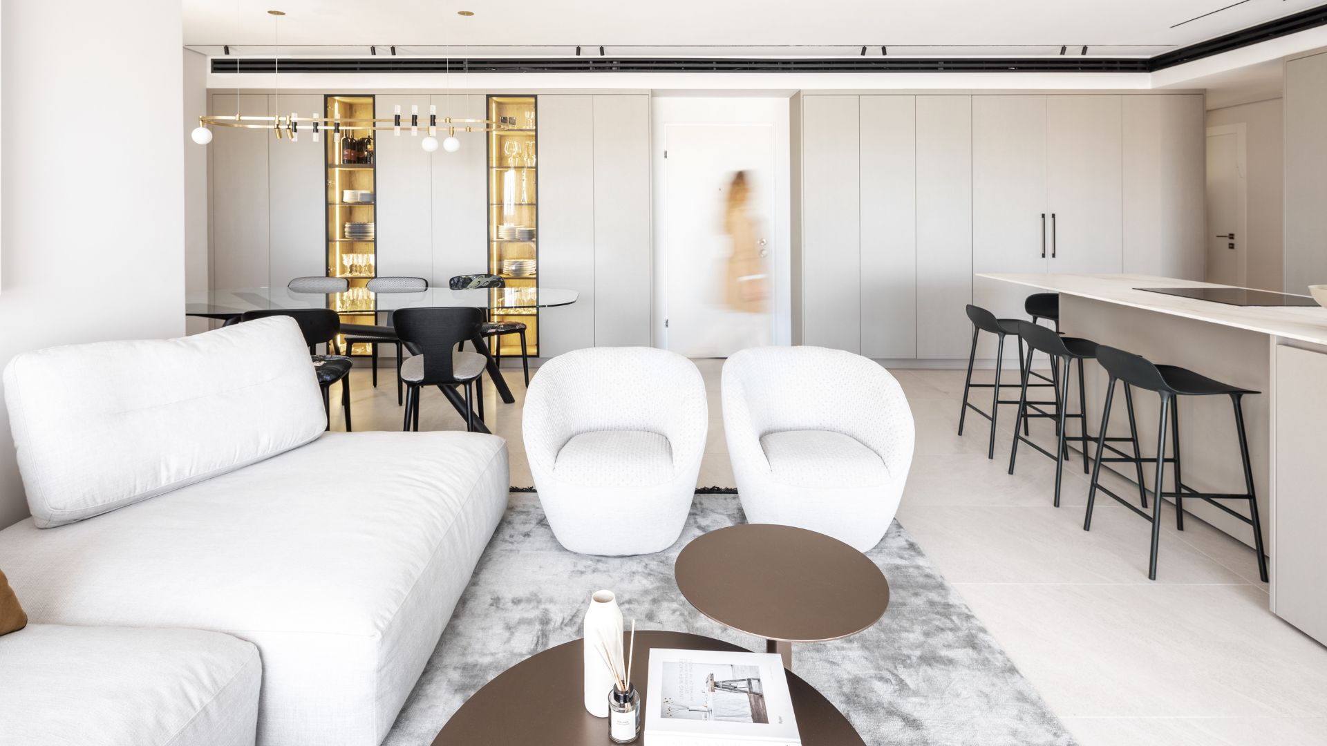
As you step through the entrance, the public space unfolds: to the right is the dining area, followed by the living room, and to the left, a spacious parallel kitchen. The door is positioned between two sets of wardrobes stretching from end to end. One serves as storage, concealing electrical closets and a refined coffee corner, with folding doors that can be closed at any time, maintaining a visual continuity. The second side of the entrance door was designed symmetrically, serving the dining area, mainly enclosed except for two glass facades displaying wines and serving dishes.
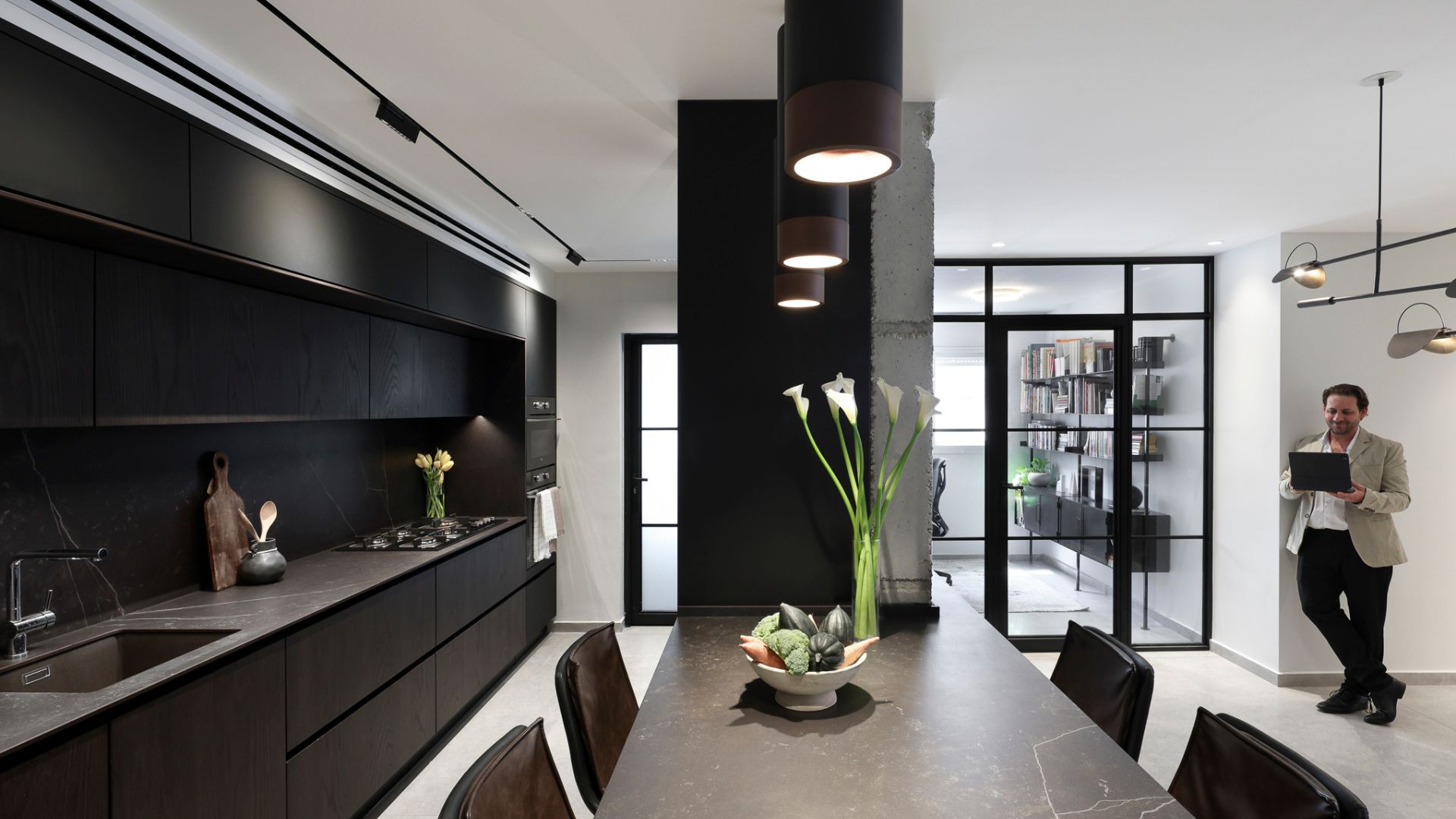
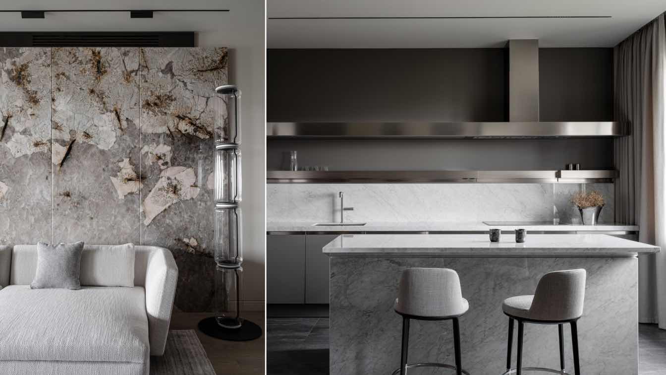
In the kitchen, two facades were designed to create an illusion of space and length. The taller one, abundant with storage spaces, hides integral electrical appliances, leaving the ovens exposed. At the center stands a wide-open island, allowing easy movement around it. The interaction between those seated in the living room and those working in the kitchen remains seamless. Similar to all the wardrobes in the public space, the kitchen cabinets were clad in 'Phoenix' – a material produced using nanotechnology, extremely durable and easy to maintain.
The light Dekton surfaces, embedded with golden veins, blend excellently with the sandy hue of the facades, creating harmony between tones and materials. The living room is designed as an open, luxurious, and inviting space. The television screen is mounted on a 360-degree rotating column, enabling viewing positions toward the terrace, kitchen, and dining area. The deep, indulgent swinging sofa is upholstered in a stone-colored fabric - on one hand, it's cozy and embracing, while its clean, straight silhouette doesn't overpower the space and connects with the modern lines.

Above it hangs a colorful, three-dimensional artwork by the artist Chen Songo, depicting a scene of a young couple, creating dynamism and movement in the space. Two swiveling armchairs in a coral hue flank the sofa, and at the center, two bronzed metal coffee tables harmonize with the glass in the vitrines in the dining area. A rug on the floor echoes the monochromatic color scheme in a slightly darker shade. The dark fringes on the sides contour and add interest.
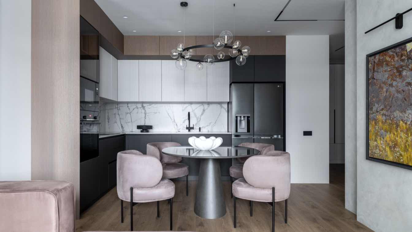
For the dining area, an amorphous table made of transparent glass and black-painted wooden legs was chosen. "The transparent glass is airy and doesn't overload the space. Its asymmetrical form aims to break the straight lines in the space," explains Popovski. The chairs we selected are from a collection inspired by beers from around the world; two of them are colorful, serving as color accents, while the others are in black and white, in two different textures, providing a contrast to the bright monotonous palette.
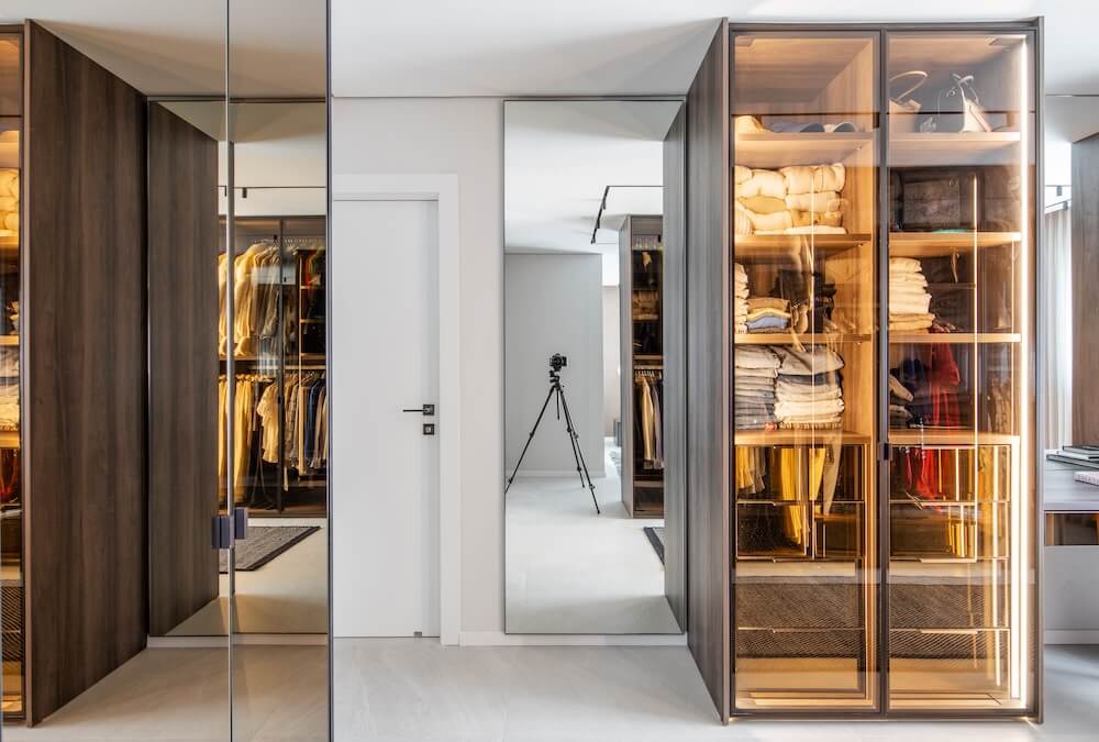
Above the table hovers an elliptical, minimalist lighting fixture made of metal. The couple's master bedroom, too, was meticulously planned: at its entrance stands a long wardrobe with mirrored doors for shoe storage, mirroring the other wardrobes in this space, designed by Delkoub wardrobes. "The wardrobes are a pivotal and central element in this space," explains Popovski. "Beyond their polished and impressive appearance, they define the functions in the space.

The apartment owner is a fashion enthusiast with exquisite taste, and as part of the brief, she requested a particularly large wardrobe with separate sections for hanging and folding, a separate shoe closet, and a vanity area with frontal lighting allowing for quality makeup. The space created is elegant and dark, and Delkoub knew how to provide internal lighting with dimming, allowing for control over its intensity and creating a flattering atmosphere in the space. To the left of the shoe closet, there's a space that serves as an entrance hall, separating it from the sleeping area. What separates it from the bedroom wing is an impressive clothes closet that can be navigated around.
The designers chose to clad the closets in a dark wood laminate; some of the facades were made of transparent glass, while others were dark and dramatic. For the toilet corner, a chair covered in a velvet fabric in shades of grey, designed by the Jewish-French designer Raphael Navot – known for breakthrough design and recognized worldwide – was chosen. The wardrobe wall defines the sleeping area: the back wall, facing the bed, is clad in a dark wood imitation laminate.
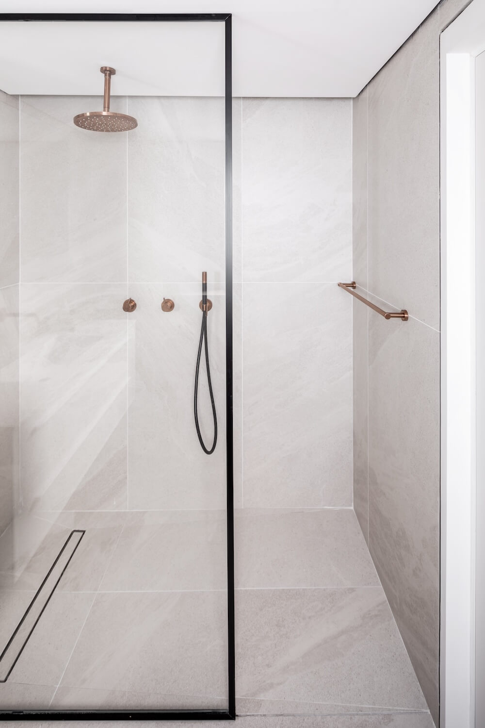
The bed has a prominent presence in the space; it is tall and impressive, upholstered in fabric, embracing and indulgent, and behind it hangs a fabric-like tapestry in a shade of terracotta. "On this wall, there's also an asymmetrical window, and we used it to create and reinforce an asymmetrical composition in the bedroom. We hung a curtain that reaches the center of the bed and placed two lamps on either side - one hanging from the ceiling and the other placed on the nightstand." The couple's bathroom extends the soft and monochromatic palette encountered in the public space.


