StudioCAN: The health center that is a "star of life" in blue concrete.
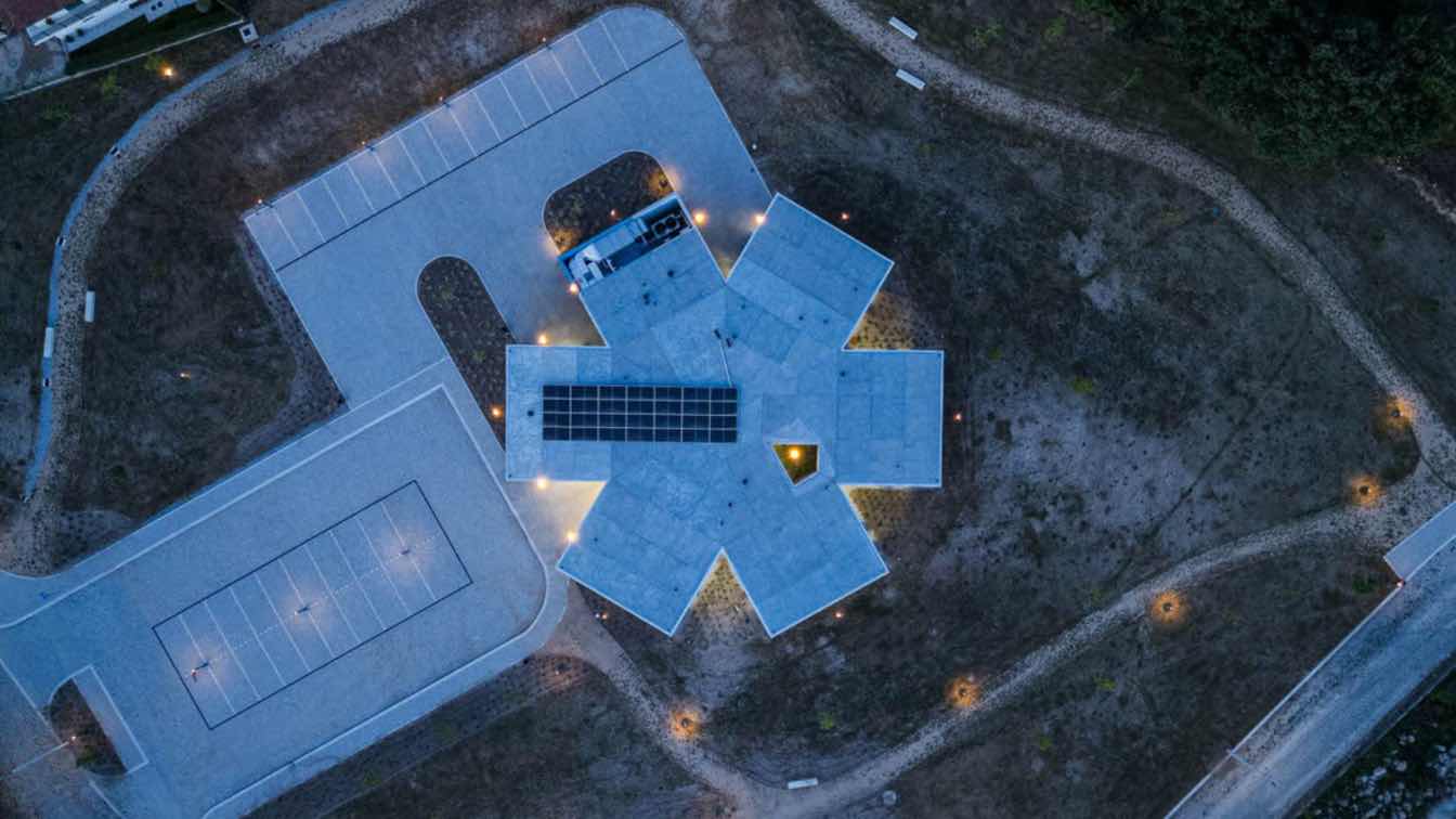
The new Moreira de Cónegos Health Center, in Guimarães from a volumetric point of view, is based on the shape of a “star of life”, an international symbol for medical services and equipment, clearly identifiable with the public health function. The program is developed on a single floor with direct access to parking and service entrances. The volumetric solution allows the Health Center to be highlighted both at ground level and from an aerial view.
The area surrounding the Health Center, excluding parking and road circulation areas, is made up of a public park for the enjoyment of the residents and users, consisting of tree and shrub vegetation, dry meadow and pedestrian paths, crossing and internal connection and external. From a functional point of view, the Health Center has three permanent entrances: the main entrance, to the North, for user access; the entrance to the East with two different types of access: one for service and waste and the other for the entry of medical personnel and assistants (employees), including the entrance of stretchers, if necessary.
The interior organization of the building is radial. The central arrival nucleus allows access to the reception/secretariat area, for controlling and checking, as well as directing them to the waiting rooms. From a functional point of view, the building is divided into wings, which respect the formal structure of the “star”, subdividing and organizing the program into smaller spaces.
The external coverings/finishes are: walls in colored reinforced concrete with a deactivated and bush-hammered finish, blue; black anodized aluminum facade system for external openings; inverted roof finished in blue, colored draining concrete. The external coverings/finishes are: walls in colored reinforced concrete with a deactivated and bush-hammered finish, blue; black anodized aluminum facade system for external openings; inverted roof finished in blue, colored draining concrete.


