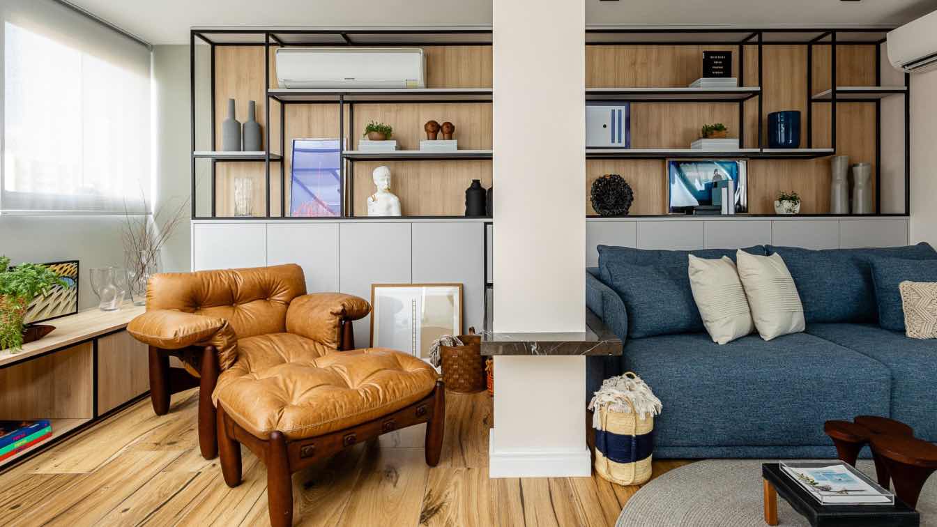
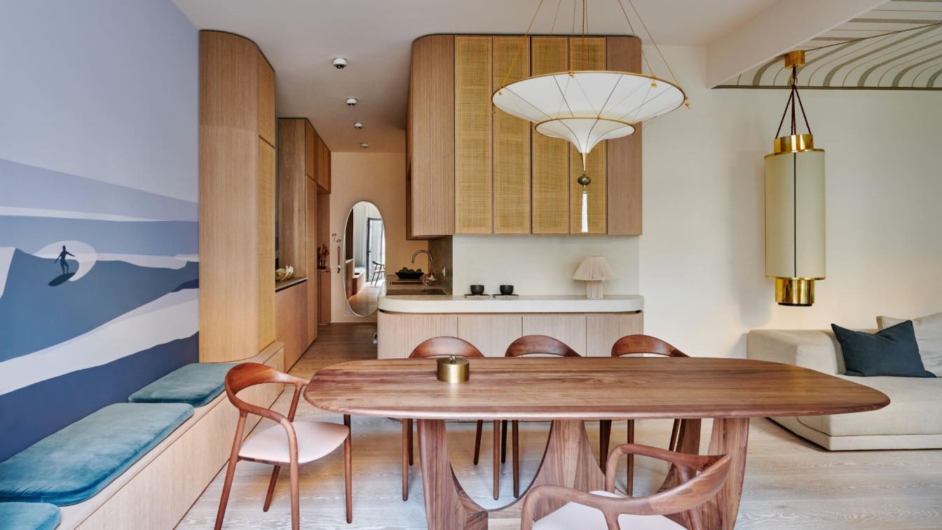
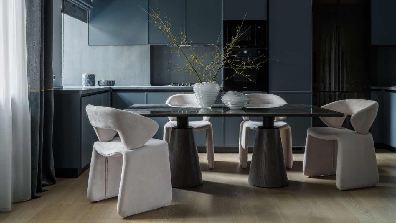
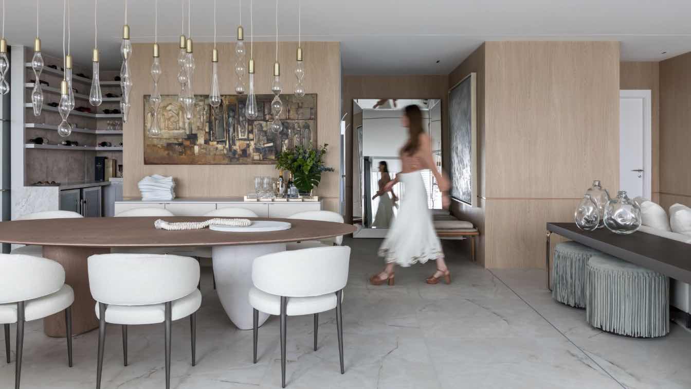
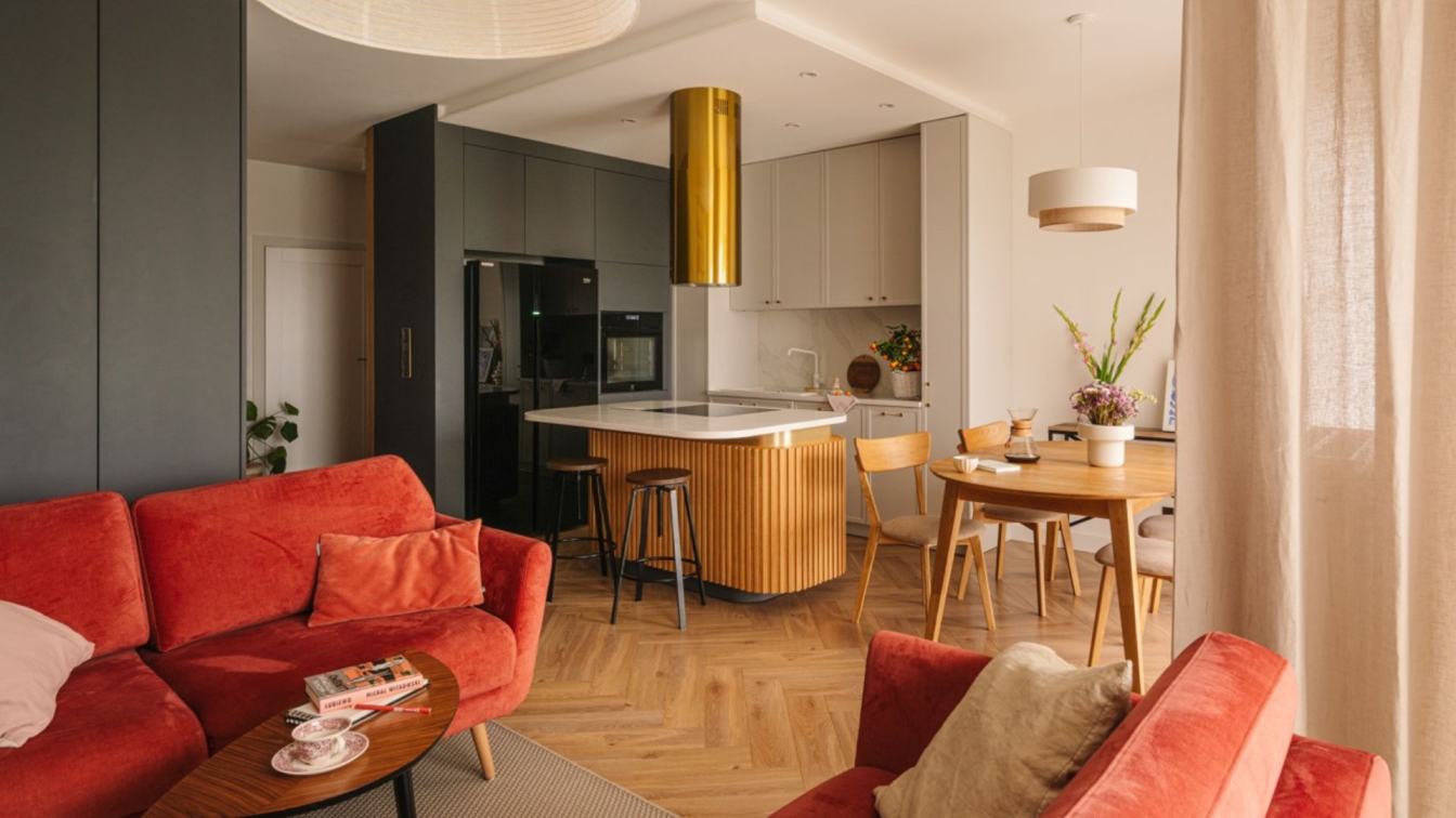
Developed for a chef, the RM apartment was designed to adapt to the different moments of daily life and family planning. An innovative project that transforms a challenging space into a versatile home that meets the diverse needs of its residents. This is the RM apartment, envisioned by Marcelo Macedo, head of Studio MEMM. With approximately 120 m² divided into two floors of about 60 m² each, the apartment was designed to maximize space usage and provide functionality without sacrificing aesthetics.
The definition of layout and usage flow strategy with the client was essential to ensure that the division of the program would work for their lifestyle. On the first floor, the design includes the service area and private area, which consists of bedrooms and a home office. The upper floor is dedicated to the social area, featuring a TV room, living room, dining room, and a balcony.
With a chef as a client, the kitchen island becomes the epicenter of the private floor. To expand this space, the office and reading room have sliding doors that allow the rooms to connect to the environment. These spaces include an office and a reading room, with the latter featuring acoustic doors to host guests and potentially serve as a future nursery. Acoustic movable walls ensure openness, spaciousness, and privacy, adapting to the client’s life stages. This reflects the architect's concern not only to meet current needs but also to consider the future planning of those who will use the space.
The spatial organization is designed to accommodate different uses, with family meals taking place at the table on the lower floor and dinners with guests at the table on the upper floor, integrating both levels.
One of the highlights of the project is the fixture designed for the gourmet area, made with pieces of varying heights and fabrics that filter natural light, providing sophisticated and functional lighting that further highlights the room's aesthetics. The use of wallpaper with a soft finish balances the black elements, and its texture contributes to the overall composition, ensuring a cozy atmosphere.
Inspired by a contemporary and practical lifestyle, the project sought to integrate functionality and aesthetics, using materials like polished concrete, wood, and black elements to create a harmonious and adaptable environment.
Te main challenge was the integration and functionality of the two levels, which was solved with intelligent and flexible design, making the most of the available space.
The apartment's color palette was carefully chosen to tie the project together with personality. Neutral tones punctuated by contrasting elements, such as black lines on the handrail, frames, and the kitchen countertop skirt, create a dynamic and contemporary visual composition.
The cabinetry was designed to provide functionality, especially due to the lack of storage spaces in the apartment. Thus, under the stairs, behind the TV room sofa, and throughout the dining room bench, there are volumes for storage and accessible doors, aimed at fulfilling the user's storage needs. Built-in cabinets under the stairs intelligently utilize every available inch, resembling the style of studio apartments. This contemporary approach offers comfort and functionality, allowing for a practical and efficient lifestyle.


