The new apartment of the couple - he owns a manufacturing company and she is a multi-disciplinary artist - is a tangible example of how even a residential environment located on the top floor of a sky-scraping tower can be turned into a home in every sense. Interior designer Nitzan Horowitz created for them a pleasant, balanced and wisely divided living space, now sharing the process.
After years of living in a private house in one of the pastoral towns near Jerusalem, the couple, both in their 50s with their children already grown up, decided to move into a spacious apartment located in a new tower in the central area overlooking the urban landscape. "Despite the geographical change and the change in the concept of living, the two wished that their new apartment would also convey a sense of home, and we did make sure to create elements for them that support the homely atmosphere," says interior designer Nitzan Horowitz, who was in charge of planning and designing the apartment.
"At the very beginning of the process, I visited them at their home and quickly understood that these were down-to-earth people who know how to appreciate materials and textures and give a respectable place to art and unique items - this created a quality dialogue between us that put the materials at the center and revolved around great appreciation and respect for the material. We went with this rationale until the end, both in choosing the materials and in how they were implemented in the space."

In general, it is apparent that the apartment contains quite a few complex details: "We worked with special techniques and relied on artists who created complex systems for us. For example, the harmonica door system with which we defined the son's bedroom suite, which he visits from time to time and is located near the entrance lobby, and the kitchen, which is located in the heart of the public space and can be separated from it when needed. Within that, we planned elements that give the space a homely feel as much as possible, and the peep holes are among the most prominent: something in the rhythm of the columns and the slots, as well as the materials, most of which have a deep and unique texture, manages to create a refined look on the one hand, and on the other hand, all of them together and each of them separately make this residential environment appear authentic and timeless. Essentially, the feeling is that this is a home that has been operating and existing for years; time certainly does not play a role here."
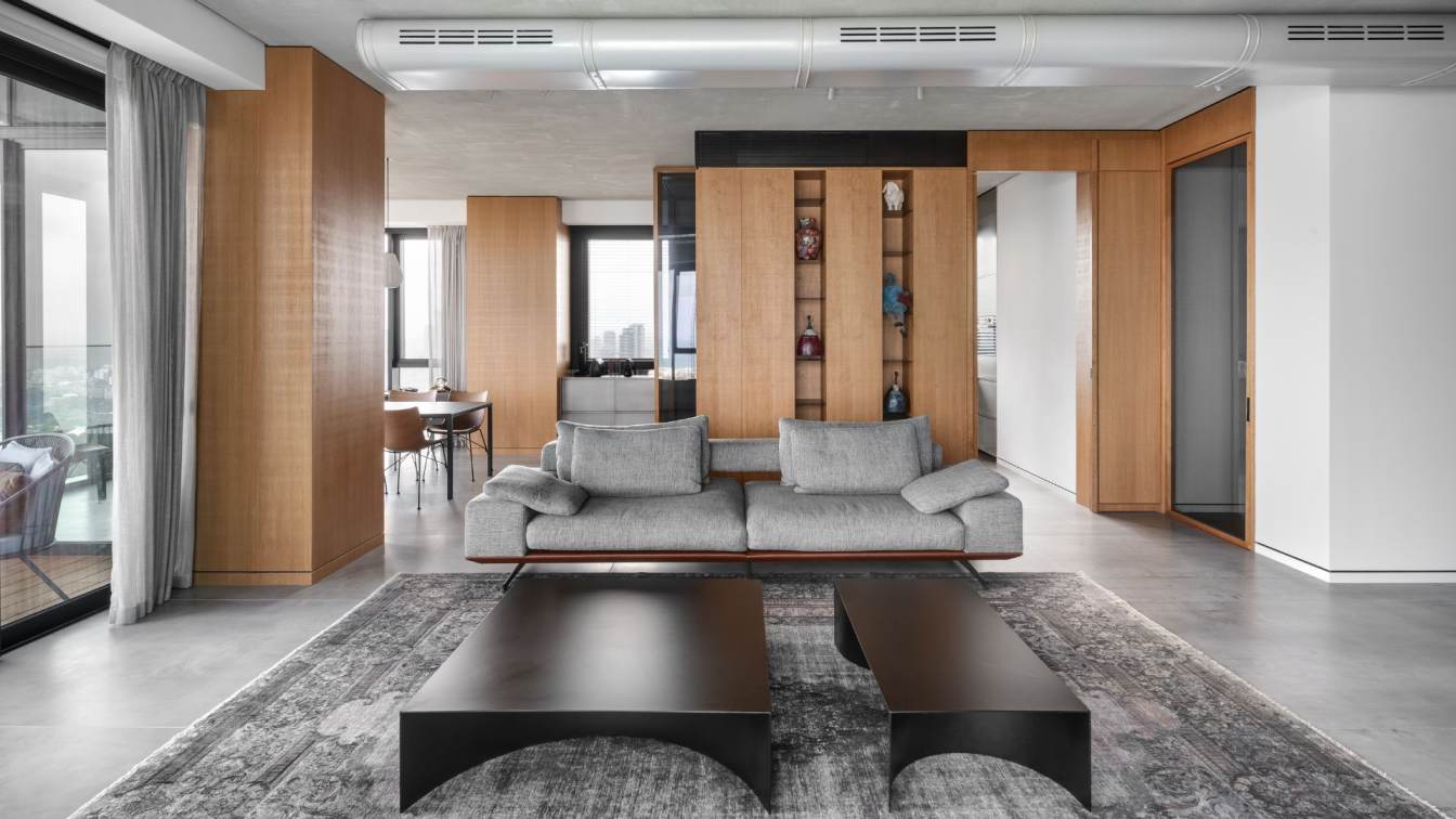
The view and the art, which is entirely the creation of the apartment's owner, were a central component in the planning from the very beginning, and they create the framing story: "For me as a designer, the paintings, sculptures, and ironworks were a huge advantage," explains Horowitz. "These two elements led us to create a calm and monochromatic platform, and in practice, the interior treatment aims to enrich the architecture of the building. We emphasized the columns and preserved the height dimension of the showcases and divisions. In general, there are almost no built walls throughout the apartment, and most of the divisions were made with woodwork elements, such as the separation between the kitchen and the living room and dining area, and between the master bedroom and the bathroom."

According to Horowitz's approach, although there are not many highlights in the apartment, it is the many layers that give it warmth: "The apartment is rich in textures, but the atmosphere created is very minimalist - we were careful to create the right balance that enhances the dimension of warmth while still maintaining a sophisticated look," he explains. "We worked with a limited color palette, but most of the materials have texture, as mentioned, whether the walls that are partially clad in scratched oak veneer that connect conceptually to the parquet floors in the rooms, or the public space where the ceiling is concrete and the floor is clad in large-format porcelain with a concrete look. Even the exposed air conditioning duct, the hidden lighting trough, the spotlights, and the lighting fixtures were all painted in a concrete shade, creating an organic look, free from current trends."
"Within that, the masses and balances between the materials change in each of the wings: in the public space, the floor and ceiling received a concrete look as mentioned, but once you enter the private wing, there is a change - the walls are pale, and the parquet floor interacts with the scratched oak veneer we used to clad the columns and woodwork elements - the same color scale that underwent a role reversal."
Upon opening the front door, the entrance hall is revealed, with the son's bedroom suite designed alongside it for when the couple's younger son visits from time to time. "The unit is completely autonomous and can be closed off by a harmonica door system made of wooden frames and a gray glass core. The overhead rail on which it moves was installed in the ceiling well in advance during the construction process. There is something about the exquisite woodwork, which is a masterful craft in itself, that creates 70s vibes in this apartment, but in a more modern and refined guise," explains Horowitz.

Next to it are the guest toilets, where one can see the interplay of colors - the range of stone, the reddish copper shade, and the gray hue of the tiles and concrete, a colorful scale that is woven throughout the apartment but in different doses.
From the entrance area, we move towards the public space where the living room, dining area, and kitchen are designed: "The transition from a private house to an apartment reinforced the desire and need to create a kitchen that can be closed off, so that when cooking, the preparation area can be hidden from view in relation to the public space. For this purpose, I created a two-sided unit that separates the public space from the kitchen, with a sliding door system in between that can open and close as needed. The kitchen may be hidden, but it is the one that defined the heart of the home and determined the locations of the dining area and living room. The kind of decisions that once you make them, all the others simply fall into place in terms of planning, so we managed to create the right dynamics and flow between the functions in the space while maintaining optimal visibility of the view."
Despite being confined, the kitchen is large enough and includes a low unit that protrudes outwards towards the dining area and connects to it when the doors are open: "The work is done on a strip of about 5.5 meters; we designed a tall cabinet in the kitchen corner and also have the two-sided unit, so overall, there is a lot of storage space. Nevertheless, despite being large, it is almost imperceptible, especially when it is closed," explains the designer. "We chose a stainless steel countertop for it, and the facades were painted with a metallic coating by a professional who created the exact shade for us using a sample of the stainless steel he received in advance - so the match between the top surface and the facades is perfect."

The Kartell dining area is also faithful to the design rationale and the color play that dominates the spaces. "It is clean and refined, and includes an elegant and dark-colored porcelain granite surface about 3 meters long, with wood veneer-upholstered chairs around it in a shade close to that of the facades in the space envelope."
The master bedroom also functions as a separate unit: "At the entrance to the private wing, there is a door that can be closed at any given moment, allowing the suite to become an independent unit," explains Horowitz. "In the hallway leading to the bedroom, an exceptionally long woodwork unit was designed, continuing to the end of the bedroom, and on the other side is the entrance door to the study. The front of the unit is clad in scratched oak veneer in a gray tone. In the hallway area, a door in the plane of the furniture piece was designed as part of it, leading to a storage area, and in the center of the unit protruding into the bedroom, there is a glass door through which you enter the bathroom."
The woodwork unit in it is a piece in itself. Its height is about 45 cm, and it folds and extends into the shower area, where it becomes a built-in seating bench: "The floor, walls, and drawers of the woodwork unit were all clad in porcelain, and the meeting of the edges was carefully planned and executed. The deeply recessed sink is made of Caesar stone."
"The dialogue with the clients was fruitful throughout the process, and thanks to it, we managed to address every detail at the highest resolutions. As such, it also allowed us to achieve an optimal and outstanding result, and I am proud of that," concludes Horowitz.