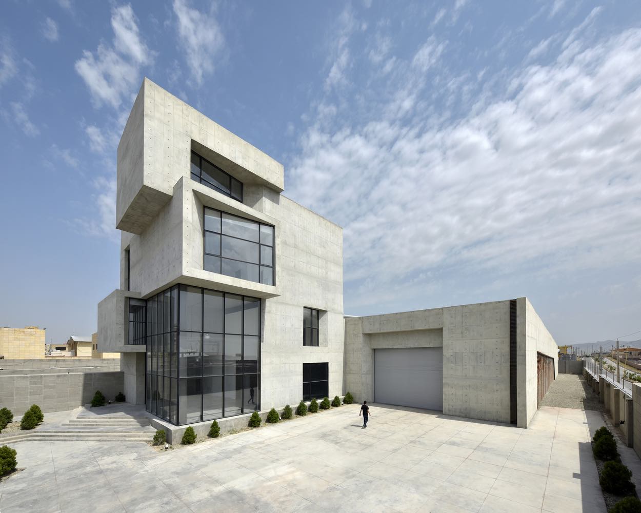
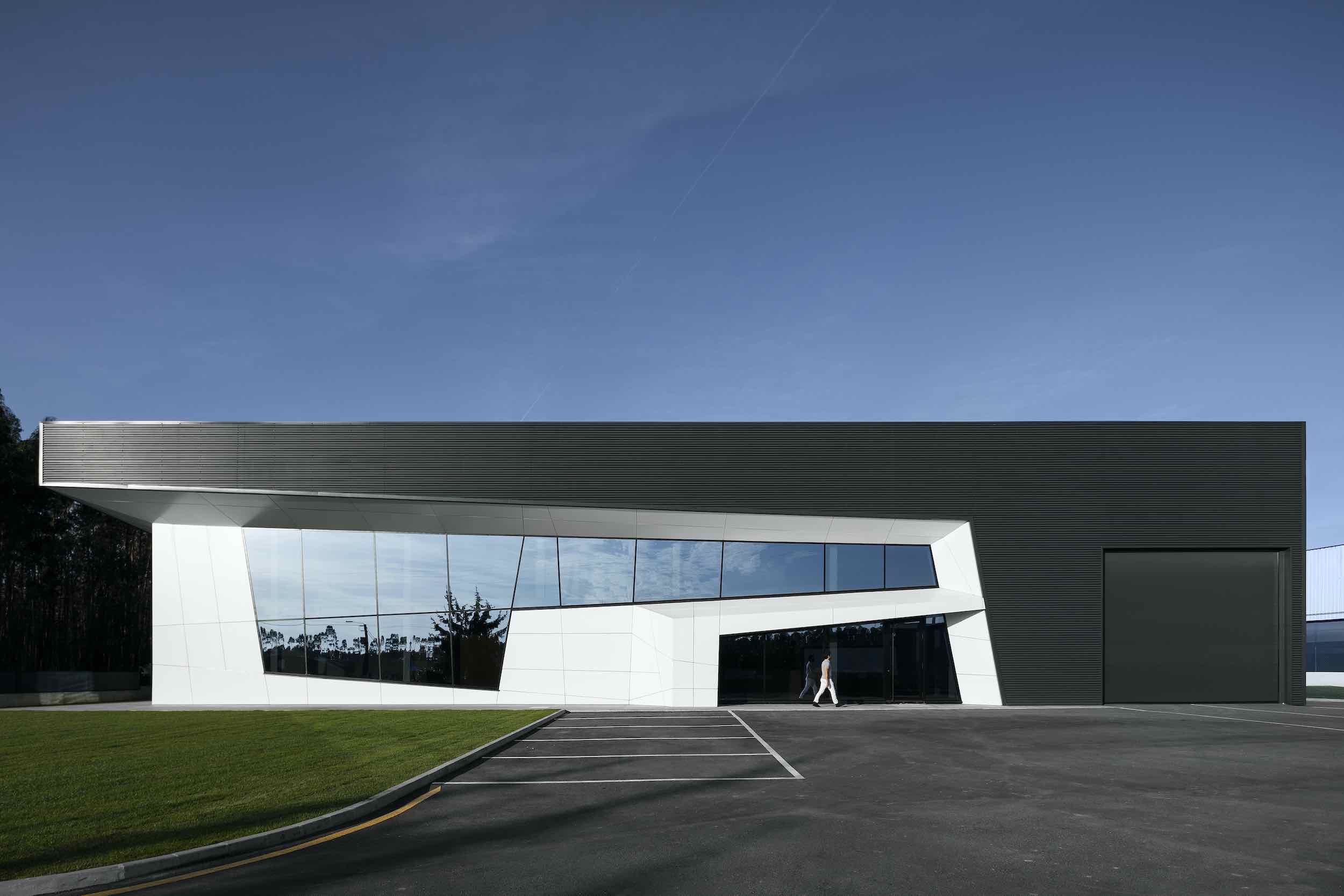
The Iranian architecture firm Nazar Idea Paidar Company has recently completed Cubes Warehouse located in Tehran, Iran.
Cubes is located on a plot of land with an area of 5015 square meters in Shamsabad Industrial Park, 5 km away from Imam Khomeini International Airport in the south of Tehran. Most of the buildings in the park are aesthetically lacking metal structures. Therefore, designing a concrete building with broken surfaces emerged as a bold way of breaking up this visual uniformity.
Since the function of this complex was to be the production and maintenance of abrasive stone, from the outset the client insisted on a building design that visually conveyed emotion to the viewer in accordance with the use of the building. Due to the similarity of the surface of abrasive stone and concrete in terms of color and texture, concrete naturally arose as the main material of the project. The client requested two large warehouses, of the same width but different lengths, that could be accessed from outside, as well as a separate office building with easy access to them. Consequently, the warehouses were situated along the length of the plot and the office building near the entrance in an L-shaped form to accommodate the different lengths of the warehouses.

image © Deed Studio
Optimal natural light is the main source of light in the design of the warehouses. Since in Iran eastern and southern light is preferable, a height difference between the two warehouses allows eastern light into the western warehouse, while an eastern facade and roof provide a light entrance for the eastern warehouse. The office building has five floors. The basement, ground, and second floors include office spaces, while the first and third floors are dedicated to rest and recreation. In addition to the main building entrance on the south, there is a second entrance leading to the basement where staff can eat and rest.
To create a visual connection between the ground floor and basement, a void was designed through which a metal bridge provides physical access from the lobby to the warehouse, while a glass window at the end of the bridge provides a glimpse into the eastern warehouse. Access to the western warehouse is possible via stairs. The client wanted a three-sided view of the grounds from the management office. For this purpose, the manager room was designed with large windows on three sides. Therefore, to reduce the intensity of direct light and create shadows, the windows were deeply angled into the facade.
One of the main design challenges was protecting the privacy of rest spaces on the first and third floors by ensuring no direct view into them from the main entrance. Consequently, protruding cubes were designed to house windows perpendicular to the facade as opposed to parallel. These and other cubes along the facade not only provide relief from the intense sunlight but also their shifting shadows splash fresh designs onto the facade all day long.

image © Deed Studio
 image © Deed Studio

image © Deed Studio

image © Deed Studio

image © Deed Studio
 image © Deed Studio

image © Deed Studio
 image © Deed Studio
 image © Deed Studio
 image © Deed Studio
 image © Deed Studio
 image © Deed Studio
 image © Deed Studio

image © Deed Studio

image © Deed Studio

image © Deed Studio

image © Deed Studio

image © Deed Studio
 image © Deed Studio

image © Deed Studio

image © Deed Studio
 Basement Floor Plan
 Ground Floor Plan
 First Floor Plan
 Second Floor Plan
 Third Floor Plan
 Site Plan
 Section 1
 Section 2
 Elevations
 Design Idea
 Design Idea
 Design Idea
 Diagram
 Diagram

