The Japanese architecture firm Yuji Tanabe Architects has recently completed WORK x ation Site KARUIZAWA, a renovation project of a commercial building which was used as a restaurant before into workation offices that was to support a flexible working style.
Architect’s Statement:
The building was located at the Roppon-tsuji roundabout in Karuizawa, Japan. The project was to renovation and refurbish the site together with a newly installed folly. The site with rich greenery was 1028 ㎡, and the total floor area of the existing building was 274 ㎡.
The V-form building has two extending wings, one is one story and the other two stories, which meet at the vertex point facing the roundabout. On the ground level each wing accommodates an office space of 50~60 ㎡, and they are placed sandwiching the entrance hall in between them together with the café and wet areas. The original plan placed the service area to the roundabout side and hence the façade was designed to be completely closed. Although it was bijou, we decided to place the main reception area to the façade area, and that provided the entrance hall filled with light and breeze. Furthermore, we have also set a café terrace around the entrance which also enhanced the attractiveness of the façade.
The first level was divided into small rooms before. We reinforced the structural columns, beams, and walls in order to remove the walls to create an extensive space of 60 ㎡. We have also inserted more windows and enlarged some existing ones so that the inside space could merge with the outside greenery.

From the renovation point of view, the Nageshi beams, beams running between columns in traditional Japanese rooms, which could be used as cabled racks were installed. This enabled us to install wires for the additional lights and projectors without removing the walls. Also, as we wanted to offer the office-support functions as part of the interior design we have set vertical frames in response to Nageshi to provide a wall where images from the projector could be presented and another which could be used as a white board.
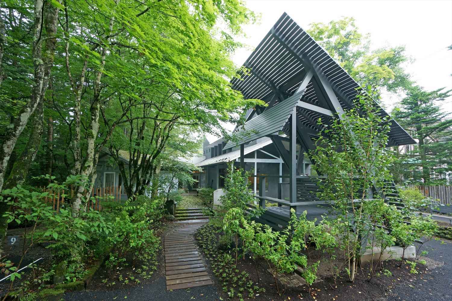
As the original structure lacked the floor heating system, we raised the floor level to form an insulation layer and set electric outlets. For the ventilation system we have replaced the original one to the more energy-friendly machine and additionally set a ventilator with total heat exchanging function. There were mirrors and fake stones used for some part of the exterior which was giving a sort of outdated somber image to the building. For that, we covered the part with cedar timber painted in grey that lent the building a blended charm with the surrounding trees.
For the landscape design we have reorganised the lines of flow without changing the placements of entrance and parking space. White birch has been the iconic tree of this facility, for that we arranged more of it to be planted to the site together with other plants. A folly which was to be used as a space for relaxation was added in a part of the outside space. The folly consists of six surfaces of varied angles applied for the roof, eaves, and walls. The size and angles of these surfaces were considered according to the human scale of the activities that would likely be performed by the people there as well as according to the angles of the sunlight and air pressure. Furthermore, the pitch width of plates was determined according to the simulation of the rainwater flow, which resulted in gradation from the top to the bottom.
There are two floor levels in the folly. The lower one allows people to sit leaning against the inclined wall…...it is like sitting on a large bench. The higher level allows people to sit more freely like sitting on an Engawa, an edging strip of floor surrounding the inner part of a house in Japanese traditional architecture. The folly is placed visible from the street, and it works as a plain billboard for the reborn facility in Karuizawa with their strict building regulation for landscape preservation.
The new owner/management company assumes letting these office spaces to corporate business purposes for a mid to long term period as well as to the individual business needs. We aimed to create spaces where clients would feel comfortable working there and at the same time a facility which would be able to respond to the ever-changing business demands.

The definition of Workation described by Mitsubishi Estate:
Workation is defined as working away from the main office particularly in a place where the environment is nature-friendly and touristic, and staying in such a place for a mid to long period of time to conduct their work including taking training. People can at the same time enjoy touristy activities on weekends and after work. Workation is said to be a coined word from the western culture which is a blend of work + vacation. Mitsubishi Estate particularly defines Workation as a combination of Vacation, Work, Location, Motivation, Communication, Innovation, and Working Style.
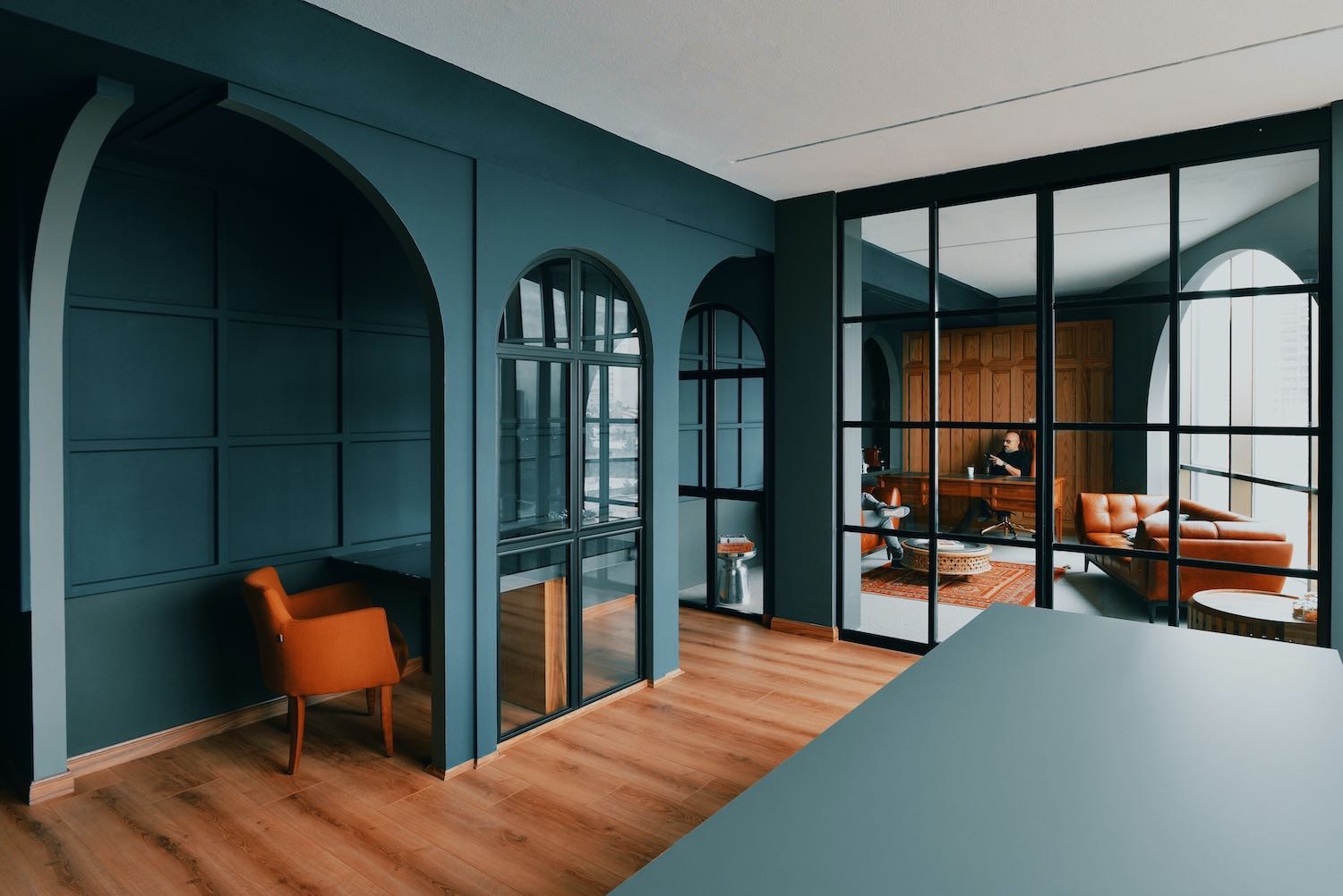
Karuizawa has been well known as a town for wealthy second houses, which has its roots originated from the arrival of western missionaries. Manpei hotel and historic Mikasa hotel are some of the fine examples of western style architecture built with Japanese wooden construction technology around the area. One thing that is common with the interior design for this facility is that we adopted wainscoting and Nageshi throughout. Wainscoting is developed in the western architecture from their lifestyle with tables and chairs, whereas the Nageshi is derived from the structural style with beams in the Japanese architecture. The mixture of wainscoting and nageshi is a blending of Japanese Western style, and it is representing the characteristic of Karuizawa which embraced such mixture from the early time in its history. In the entrance hall we wanted to represent the central column just as a streetlight or tower in a square in order to emphasise that the wings of the facility start spreading from the point. We deliberately chose the nature-friendly materials for the exterior and floors, and together with the overall grey colored tone for the entire facility we tried to make the surrounding rich nature to be the main character of this site.

The down-to-earth atmosphere created by the sequence of windows under the eaves. As the shape of the plan is rectangular with a small slenderness ratio it gives a wide variety of how the articles of furniture should be organised in the interior design such as for an occasion for small to large groups and lectures.
Three adjacent surfaces of the wall are all filled with windows. The shape of the plan is elongated rectangular, and working desks are arranged along the long line. There are places for the users to relax around the 1-seater armchairs and hung-chairs. Furthermore, the outside 22㎡ deck terrace is allocated for further relaxation as well.
It is the only first floor of the facility where people can particularly enjoy the view of the trees in breeze in the rich greenery. The shape of the plan is rectangular, and it consists of three components of different widths, and two of them accommodate for different purposes, i.e. sofa & high counter zone and the working desk zone. There is also a kitchen around the door facilitating the communication.
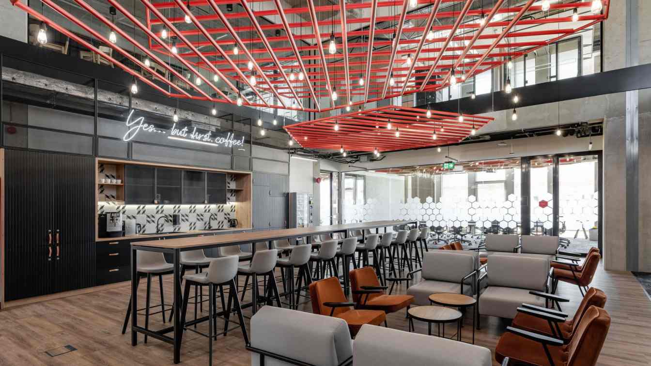
Café: As we suppose the entrance hall is like an open square, having an open café next to it makes it the entire space as a whole. In order to create various spots for privacy though small each maybe we have placed various types of furniture such as bench-sofas, chairs, high-chairs, and 1-seater sofa. On the roundabout side with a street view we have provided sitting spaces around the deck terrace.
 Detail
 image © Yuji Tanabe
 image © Yuji Tanabe
 Folly Diagram Drawing
 image © Yuji Tanabe
 image © Yuji Tanabe
 image © Yuji Tanabe
 image © Yuji Tanabe
 image © Yuji Tanabe
 image © Yuji Tanabe
 image © Yuji Tanabe
 image © Yuji Tanabe
 image © Yuji Tanabe
 image © Yuji Tanabe
 image © Yuji Tanabe
 image © Yuji Tanabe
 image © Yuji Tanabe
 image © Yuji Tanabe
 image © Yuji Tanabe
 image © Yuji Tanabe
 image © Yuji Tanabe
 image © Yuji Tanabe
 image © Yuji Tanabe
 image © Yuji Tanabe
 image © Yuji Tanabe
 image © Yuji Tanabe
 image © Yuji Tanabe
 image © Yuji Tanabe
 image © Yuji Tanabe
 image © Yuji Tanabe
 image © Yuji Tanabe
 image © Yuji Tanabe
 image © Yuji Tanabe
 Before Renovation
 Before Renovation
 Before Renovation
 Before Renovation
Project name: WORK x ation Site KARUIZAWA
Architecture firm: Yuji Tanabe Architects
Location: Karuizawa, Nagano, Japan
Principal architect: Yuji Tanabe
Interior design: Yuji Tanabe Architects
Design year: 2019
Completion year: 2020
Built area: 222 m² (building), 22 m² (folly)
Site area: 1027 m²
Landscape: hondaGREEN
Structural engineer: Low Fat Structure(building), Shelter(folly)
Environmental & MEP engineering: Comodo
Contractor: Takehanagumi
Photography: Yuji Tanabe
Client: Mitsubishi Estate

