Atlas Architects: Situated along the coastal foreshore of Inverloch surf beach, this 7.4 star energy efficient home represents a lifestyle change for our clients. Having recently purchased the site which contained a tired beach shack, we were engaged to renovate, extend and reimagine this family home. Our clients were seeking a peaceful dwelling, integrated into the beautiful surrounding landscape. We’ve called this project The Nest given its nestled-among-the-trees feel, and from its location near the stunning Eagles Nest beach on the Bunurong Marine National Park.
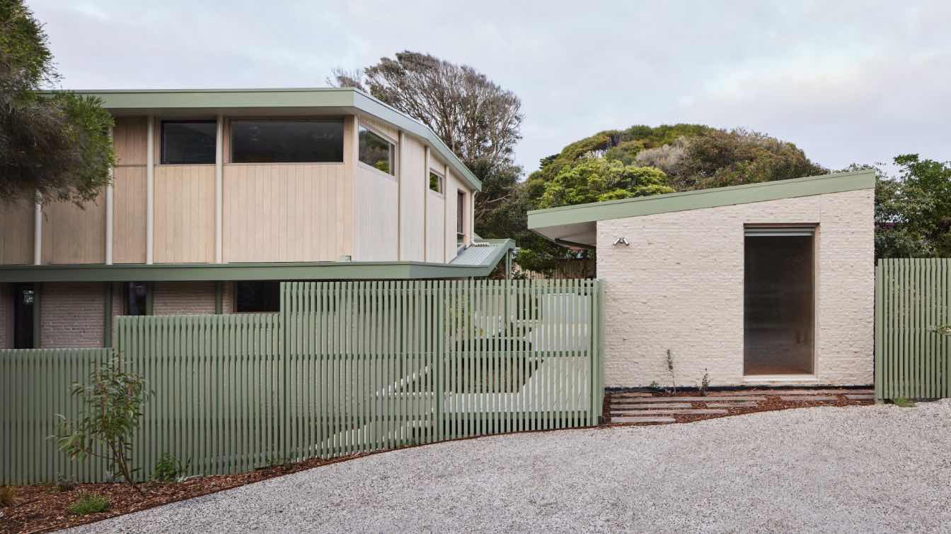
Creating this coastal dream home was a labour of love for us. Inspired by the quintessential Australian landscape, we used rustic tones of natural wood, split face brickwork and eucalyptus green in the external palette to create a symbiotic relationship between the built form and nature. A green awning wraps around the building, creating a ribbon from the ground floor to the first floor. Its colour continues inside the home, bringing the landscape indoors.
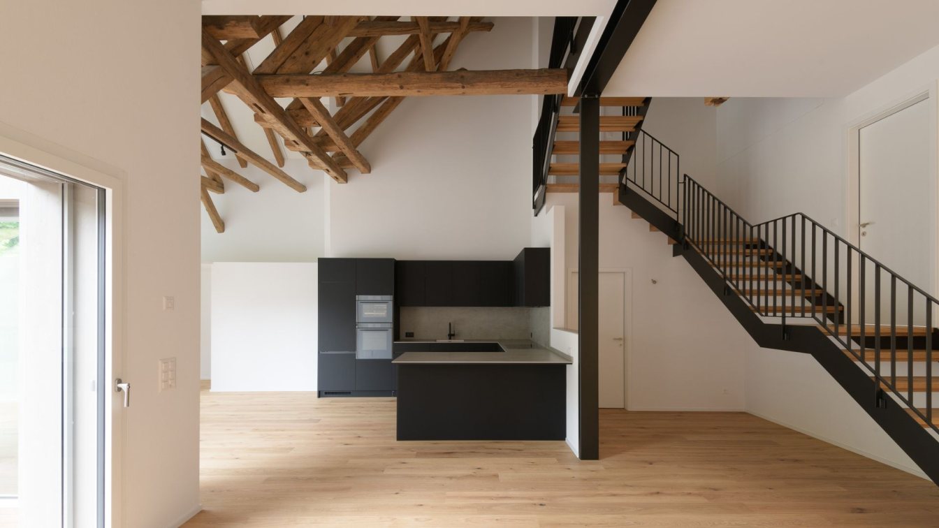
The Nest’s interior colour palette incorporates earthy tones such as olive green, mid-tone timber, blackbutt flooring, terrazzo tiles with brown, grey and black flecks, beautiful handmade Japanese tiles and grey-green finger tiles. This handmade, bespoke aesthetic suggests imperfection, bringing a humanness to the interior finishes.
While we were working within an existing space and its associated constraints, new spaces and elements were part of the design brief. A new yoga deck and studio forms a connection point between the upper storey living and downstairs master bedroom retreat. Long horizontal windows and an entry atrium with skylights welcome daylight in, offering filtered light from the northern and western facades. Coastal characteristics are referenced in the use of lining boards in the cabinetry. Each space is designed to maximise storage while maintaining an open, nature-focused feel.

How is the project unique?
The Nest is a home that encourages you to spend time outdoors. It integrates users with the external environment both visually and physically, to create a space fully embracive of nature. Furthermore, the house is designed to be multi-purpose and to facilitate the expansion and contraction of a family household.
Upstairs, a raised living space with children’s bedrooms sits amongst the established tree line, with a perimeter of glazing providing views of greenery in every direction. A modest footprint that operates as the heart of the family home. Light and natural ventilation filter through the space to create a comfortable environment. A recessed balcony softens the façade and provides a sensation of living in the trees.
Downstairs, the program is broken into different spaces, each separated with external space in between. There is a master suite retreat, a study bunker, a yoga studio, and a workshop. Each of which interact with nature in different ways. The master suite has an uninterrupted view of the northern yard. The study bunker sits behind a raised dune with ferns sheltering the space. The yoga studio connects to an entertainment deck and together become the social hub of the home. These pavilions are connected by walkways, platforms, decks, and gardens. It feels like you walk from one building to another when using this home, a similar experience to being in a resort.
Yet what is most interesting is the space between these programs. The separation of program allows for the infiltration of landscape throughout all areas of the home. This residual space is not seen as leftover but rather a connection of gardens stitching the program together. There is a sense of permeability and transparency, as a network of walkways pass through below the home. As you walk through, there is a subterranean feel as though you are underground or below the canopy of a rainforest.

What was the brief?
Our clients were a young family looking to make a sea change to the coastal town of Inverloch, Victoria. A few years ago, they had purchased this site, located one street back from Inverloch surf beach. The site contained a tired fibro beach shack that needed significant work. Having spent most of their holidays staying in the existing home, they loved the site and decided to renovate the property.
Their brief was to create a multi-functional family home that offered other facilities such as a music room, yoga studio, home office and workshop.
They loved their front yard; they loved its northern aspect and that it was never shadowed by anything other than trees. This was their playground, the perfect space for the kids to run around and play in. They wished to retain this yard, and further enhance it to become an oasis for relaxation.
Tell us about the functionality of the home.
The Nest is an intimate family space adaptable for overnight guests and extended family get togethers. The modest footprint draws the family together, yet the separation of program and in-between space provides users room to breathe and have quiet time.
The deck acts as the outdoor dining room, an entertainment zone that connects upstairs with downstairs. It is defined by a pergola frame that continues from the studio roof. The outdoor fireplace creates a bookend to this space, completing the external room.
There are no corridors in this home. Instead, we have used external circulation spaces, reducing the building footprint and ultimately the cost of works. There is no grand entrance to this home, but rather a series of arrival points for different zones.
How do you enter a building when the entrance is at the back of the home? How do you make this entrance have purpose and connection? These were some of the questions we explored throughout the design process. Through visual cues of colour and horizontal lines, we express direction in the building façade with awnings and undercover walkways to guide visitors to the main arrival point at the bottom of the stairwell.

Tell us about the building facade.
The building facade contrasts horizontal elements with the vertical elements playing on the site’s location and surrounding environment. When we first visited the site, we were drawn to its long horizontal street presence. This horizontal plane was contrasted by the repetition of vertical tree trunks.
The key horizontal element we see in The Nest is a green line that wraps around the building, changing in depth and angle as it transitions from an awning to a canopy, to a roof. The various downpipes create vertical repetition in the façade, juxtaposing this horizontal line. The downpipes act as vertical connectors between upstairs and downstairs and are different in colour depending on their placement. Functional services form a critical part of the architectural expression of this project. These horizontal and vertical elements create a dynamic façade that draws interest and curiosity from passers-by.
What materials have been used on this project?
Materiality is separated by a green line, which creates a break between upstairs and downstairs. Below, we see solid walls, consisting of split face pavers emulating a rough stone-like texture, reminiscent of the natural sand tones of the nearby shoreline. Above, we have a neutral palette of Accoya timber with a smooth finish. Accoya is a thermally modified timber, which is resistant to fungus and decay, it also doesn’t expand and contract as much as other hardwood cladding.
The materials neutral tones establish a link between the greens and browns of the surrounding vegetation. The materiality is based on its immediate environment. By using a neutral palette, the building does not feel artificial to the site but is sympathetic to its surrounds. Being on a prominent street corner, the home does not draw away from the tree line, but rather blends within it.

What are the sustainability features?
The home achieves a 7.4 star energy rating. It is powered by a 14kW solar system and battery, consisting of 26 solar panels, 12.6kW battery and energy efficient heat pump HWS. Under the studio there is a 7500lt water tank for the garden, laundry, and toilet usage.
The building envelope is insulated with R2.5 within the walls, R5.0 within the roof, R5.0 within the suspended floor and R1.5 underneath the concrete slab. All internal walls have R2.5 sound batt insulation, which also contributes to retaining the heat in each of the rooms. The glazed doors and windows have timber frames and double glazing, which means their thermal performance is much better than their aluminum counterpart.
Passive solar design principles are always considered and implemented, when designing homes for our clients. The Nest optimises its northern aspect to maximise heat gain in winter, whilst limiting heat gain in summer. The west and east windows are protected by continuous deep eaves, whilst natural cross ventilation is maximised through the use of louvre windows.
What were the key challenges?
Wherever possible, we have reused the old hardwood frame to avoid excess material wastage. Too often homes are pushed over and sent to landfill, without any thought of what can be repurposed. While there are challenges using the old structural frame, it is nice to know the renovated home is consistent in volume to what has been there for the past 50 years. We are not disrupting the existing streetscape, simply improving it, and giving it life for another 50 years.
Instead of increasing the building footprint, new rooms are added under the elevated house, within the building footprint. This retains the large and leafy garden which further encourages the biodiversity of the area.
What site features were taken into consideration during the design process?
Situated on a corner allotment and surrounded by established trees, The Nest has a large street presence. Its proximity to the nearby surf beach sees a large amount of foot traffic go by. The large northern yard was retained which provides a green buffer to the front of the home. The home is situated at the southern end of the site, to maximise north solar access.
Whilst much of the open space is visible to the street, strategic positioning of the main outdoor deck creates a private zone positioned between the home and yoga studio. This configuration is also sheltered from the cold south westerly winter winds that hit the Bass Coast.

The landscape play an integral role in the design of this home, tell us more.
As you approach the front yard, you can’t help but notice the effortless timber fence. The green and natural timber battens work harmoniously with the house cladding and colour palette. The transparency of the fence extends the private open space beyond the property boundary. This takes advantage of the lush green nature strip and its context.
The landscape, designed by Seyffer Designs, has meandering garden paths with organic curves, reminiscent of the nearby beach trails. The front garden has been enhanced with rock features, raised garden beds and a bohemian cubby house.
The garden bed ramps up and becomes a dune, which camouflages the home office behind it. When the plants and shrubs are fully grown, the bottom of the office window will be covered in green. The office window also allows for passive surveillance of the front yard and the street.
One of the striking features as you approach the house is the perfect marriage between the limestone crazy paving and textured split-face bricks in the external walkway. The light-coloured ground reflects the natural light and brightens up these walkways.
Who are the clients and what's interesting about them?
Our client was a highly skilled builder who had worked on many high-end residential projects. He was ambitious and excited to test different materials, such as the use of split pavers for the masonry walls. He did not shy away from difficult details and was able to execute a high-quality architectural finish.
This design was a collaboration of builder and architect. Several details and ideas were workshopped together on site, rather than heavily documented. This created practical design responses that achieved a balance between budget, timing, and architectural intent. The client was a long-time friend and this established relationship meant there was a high level of trust in the architecture. This reduced the common pressures of a regular project and allowed the creative process to flourish.

What was your inspiration behind the interior design concept?
The interior concept revolves around transforming the property into a sanctuary for nurturing, relaxation, and cultivating mindfulness. To achieve this, we implemented biophilic design principles.
We created a physical connection between humans and nature by inverting the conventional mode of circulation from the inside to outside. This creates a profound connection between the inhabitants and the landscape on a daily basis. Every room in the house has a direct view to the landscape. When looking to the northern garden from the first floor, treetops seem to surround the property ultimately giving the viewer a sense of being amongst the trees. The color palette of the interior is closely inspired by the local environment. The sandy off white, creeky green, natural timber, and raw concrete colors are all visual and tactile reminders of the external environment.
Furthermore, part of the brief is to optimise the functionality of each room, maximising storage while still maintaining a sense of spaciousness.
We notice the master bedroom suite is located on the ground floor, tell us more.
The ground floor bedroom is a retreat, separated from the rest of the house via an outdoor walkway and a luscious garden and lawn. The large northern sliding door, when open, extends this space into and amongst the front garden, whilst the louvre windows on the east enable natural cross ventilation.
The ensuite is not just a bathroom but it is also a recovery space. The challenge here is to make a small space work harder and feel bigger. It has an open shower, a storage cabinet, and a pull-out sauna. We tried to eliminate square edges within this space so that it feels more fluid. Instead of having a conventional vanity, we opted for a round concrete wall hung basin with a long shelf acting as benchtop, towel rail and shower shelf. This creates more space in the room while providing all the necessary functions. The landscape colours are again referenced in this space via the green hues of the cabinetry and feature tiles. The square terrazzo and Japanese tiles enrich the aesthetics and tactility of the room. The natural light is reflected off the white Japanese tiles and helps brighten up the room, while the terrazzo tiles reference the texture of the local sand and rocks.

Tell us about the laundry functionality.
The laundry is highly functional. It has various storage types, under bench, overhead cupboards, and broom cupboards. The corner is designed to maximise its functionality also. The glass door in the laundry allows natural light to enter whilst maintaining a visual connection to the walkway and entertainment deck.
What was the design intent for the entry of the home?
Once walking through the front door, you immediately feel at ease. The ceiling is elevated and there is an abundant amount of sunlight bathing this area. The focal point of this area is the cloak joinery which comprises of a bench seat, shoe storage, Mutto hooks for bags and coats, and floating shelves for plants. These are simple elements that are both functional and aesthetically pleasing.
How does the kitchen connect to the living and dining room?
The prior kitchen was secluded from the living area, lacked natural illumination, and had insufficient storage. Consequently, the new kitchen aims to address these shortcomings. It serves as a central point for family activities, featuring a breakfast counter where children can gather while parents cook. This counter seamlessly extends from the kitchen into the dining area, forming part of the open living and dining zone.
The windows achieve multi purposes: they not only allow for natural light and ventilation, but visually expand the space and offer passive surveillance. From here you can see who’s approaching the front door.
The living and dining room have an amazing outlook over the established tree-line, tell us more.
The living room space is dictated by the existing building structure. Working with this constraint, we lean further into the opportunities that present themselves around the building, the luscious green neighbourhood and the northern front yard. The large sliding door and the balcony extend the living space further into the northern front garden, while the other windows in the living room, kitchen and periphery frame the luscious greenery, giving that sense of living amongst the treetops. With these windows and doors strategically placed around the building, it not only creates a comfortable indoor environment, and conserves energy but also forms a poetic change in the light and shadow throughout the day.

What was your inspiration for the bathroom design in this home?
The small bathroom is designed to optimize storage, functionality, and natural light. The layout strategically accommodates both a bathtub and a walk-in shower, harmonizing with the presence of highlight windows. Ample storage is provided by generous mirror cupboards and full-height cabinets. Incorporating a high-level timber shelf introduces a touch of natural timber into the bathroom, offering space for potted plants and personal items. To enhance the room's visual appeal, terrazzo tiles create a captivating focal point, harmonizing with the warm tones of natural timber and the cool grey shades of concrete.
The studio and deck are the entertainment hub of the home, tell us more.
The studio is in the same location as the old shed. It is a flexible, multi-purpose room. It can be transformed from a music and yoga studio to an additional guest room with a fold out bed integrated in the wall cupboard. It also has its own powder room. This space opens directly out to the entertainment deck and the outdoor bath, making it perfect as a cabana for a party and family gathering event.
Tell us about Atlas Architects
Atlas Architects is a studio that focuses on architecture that is sustainable, innovative, and practical. Our mission is to deliver well-designed spaces that have a positive influence on the environment and the occupant’s wellbeing, and to provide uncompromised architectural support and guidance to our community.
We comprise of a close-knit team with diverse backgrounds in architecture and design. We work closely with our trusted consultants, builders and clients throughout the design and construction process to develop the well-suited solutions for projects. We pride ourselves on the personal, reliable, transparent, and professional relationships we build with all our clients and collaborators.


