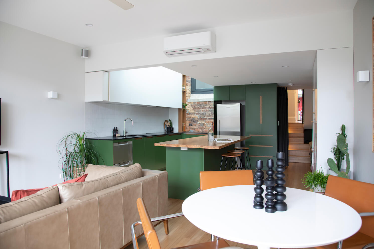
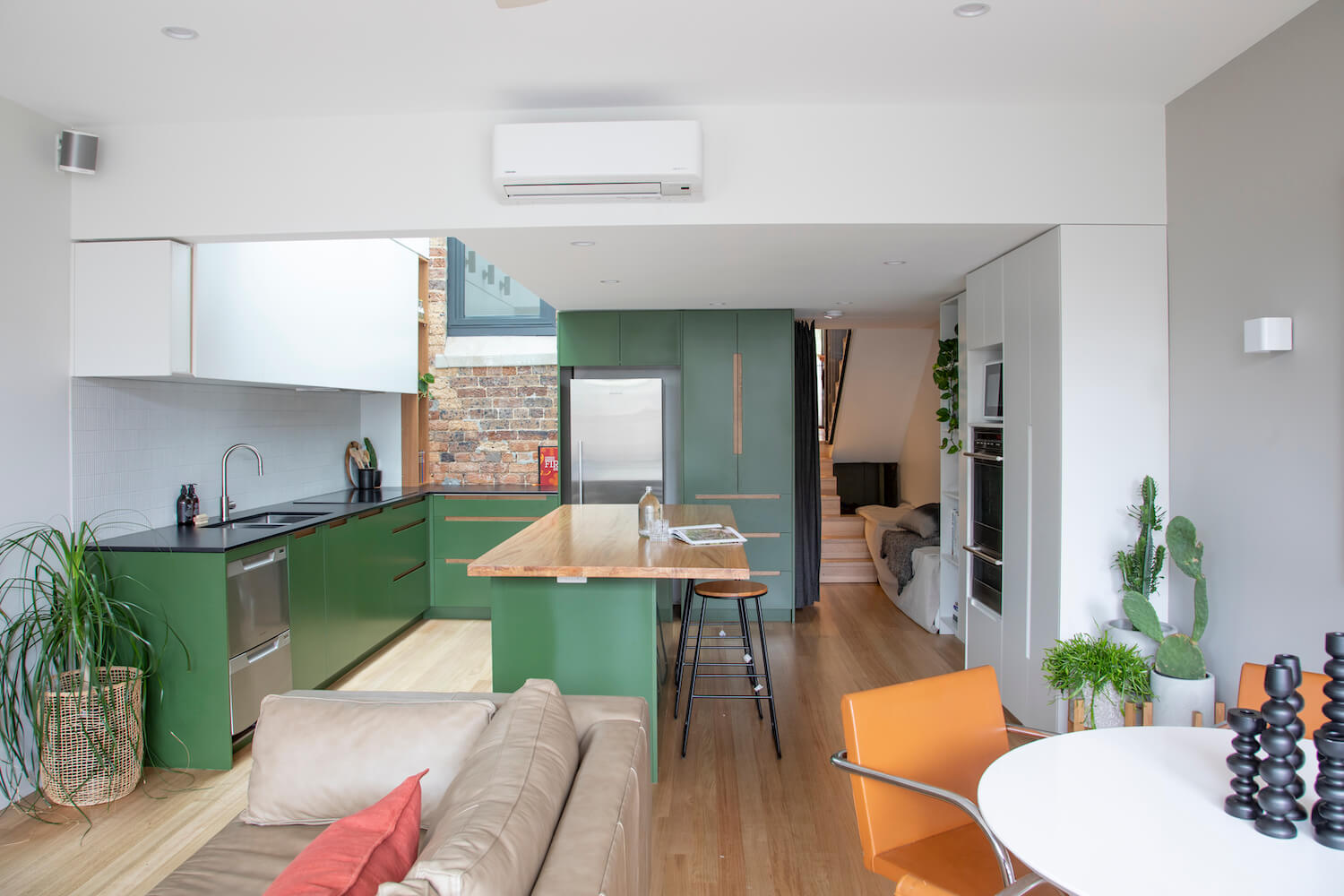
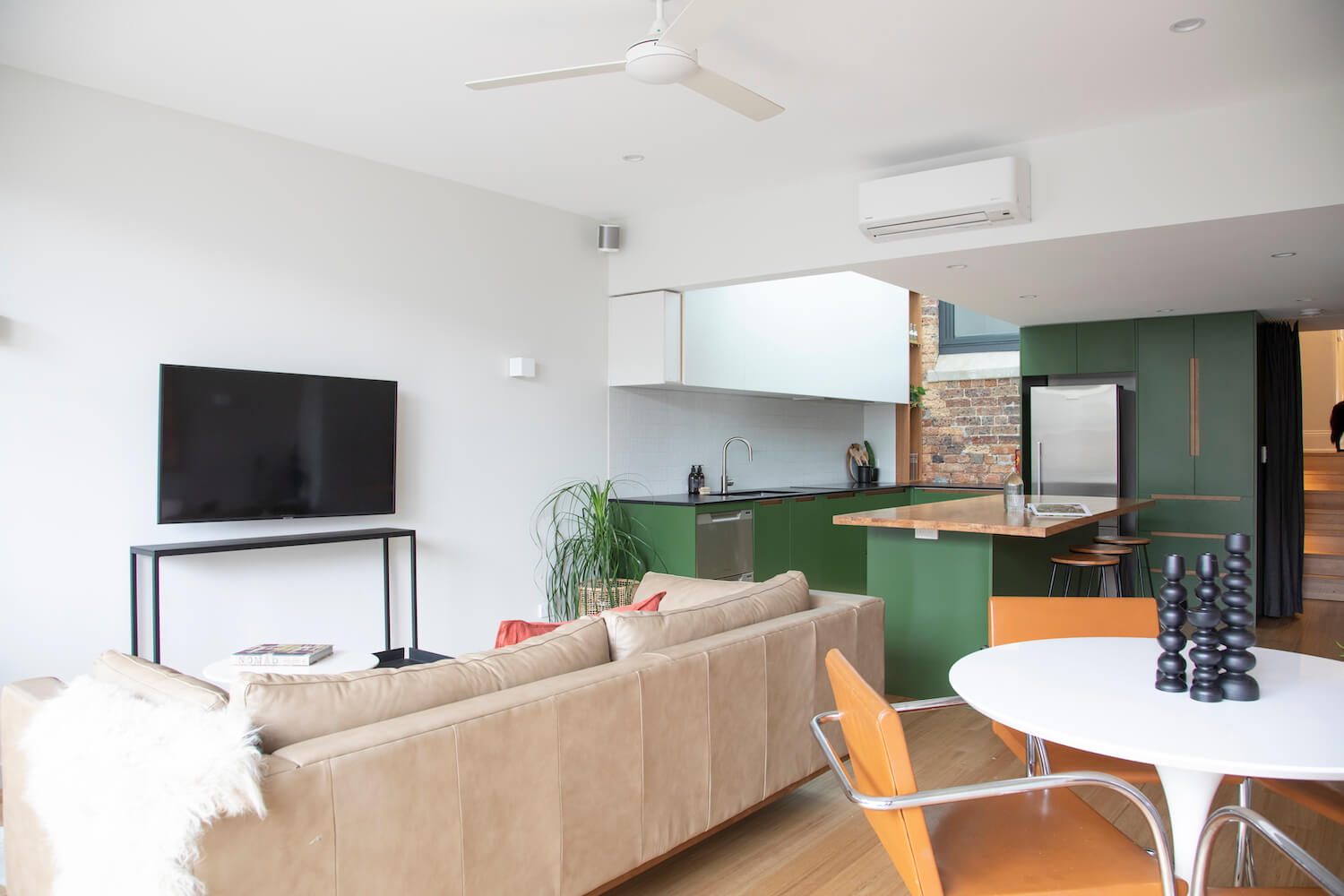
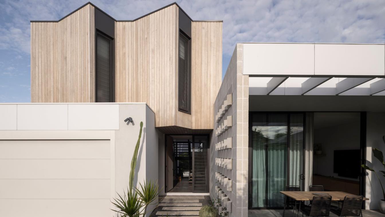
"Intersect House" 2019 Finalist for the prestigious Marrickville Medal for Conservation at the Inner West Council Built Environment Awards. Panda Studio Architecture with Design Collaboration featured on Houzz® Best of the Week: 24 Enticing Kitchen Colour Schemes. Panda Studio Architecture worked with Interior Designer Al Pinzone of Design Collaboration who envisioned the colour, materials and finishes palette for the kitchen at ‘Intersect House’.
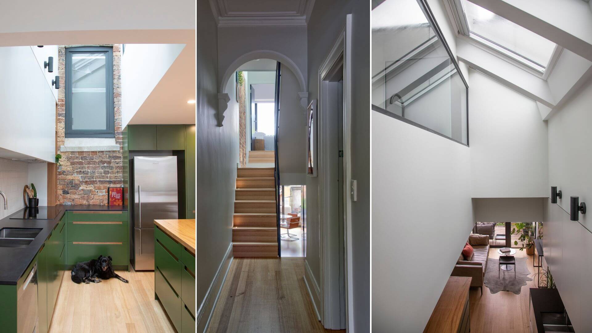
Located in a densely populated heritage conservation area, the heart and soul of a remodelled split level workers cottage is a new double-height void, dramatically toplit. Light rays laser beam across an exposed brick internal elevation adding to a delightful phenomenological experience of seemingly extended space and surprising vistas.
Compact subsidiary spaces enable the creation of the large void. The three large skylights work hard as a daylighting 'engine room', providing daylight to five connecting spaces and district views across the roofscape.
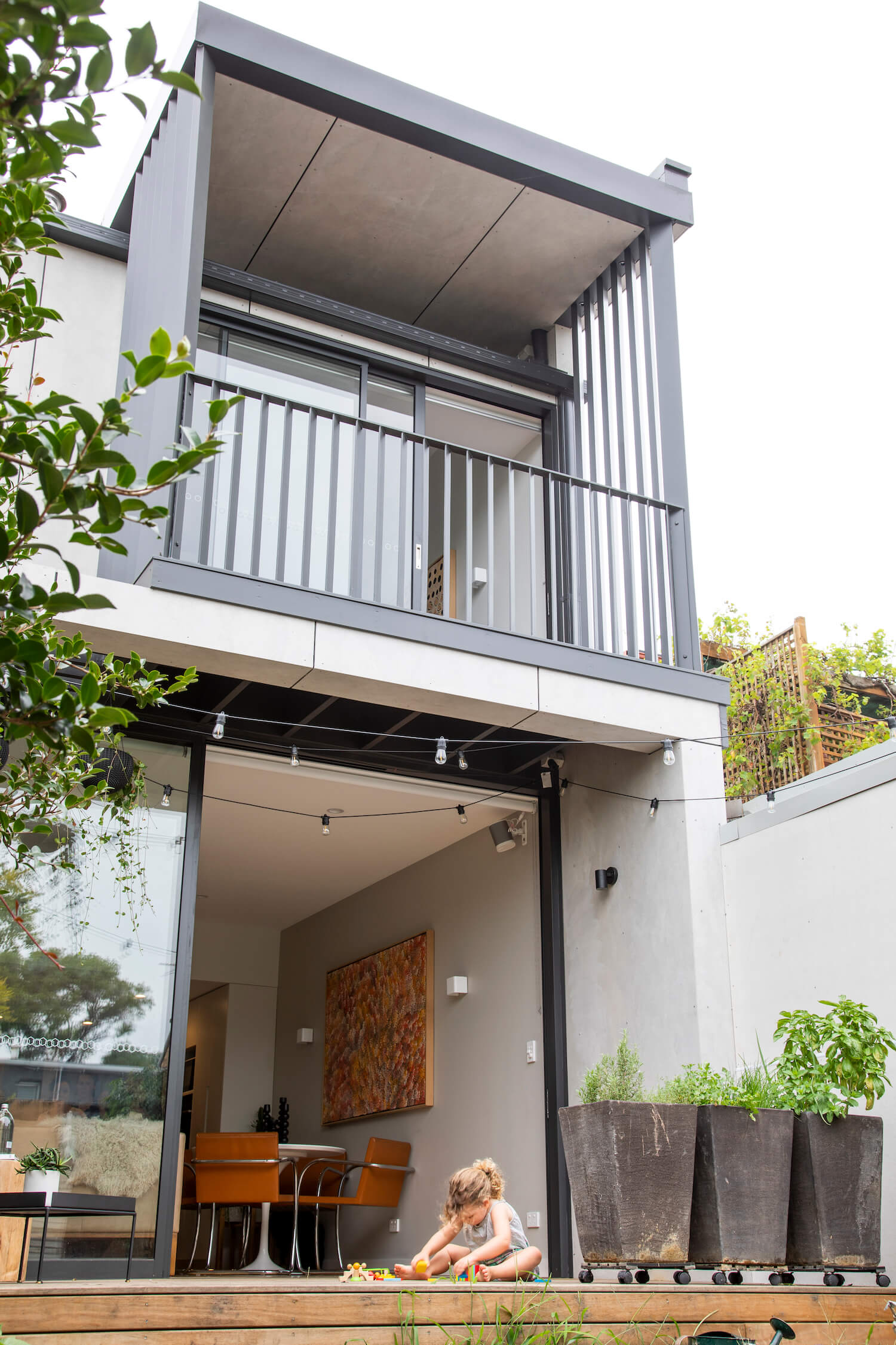
The new rear two storey addition on a limited 25x5m site is designed to dovetail into the heritage context while protecting neighbouring privacy and solar access. The rear elevation becomes activated, improving surveillance over the rear lane. The high quality addition contributes towards an improved urban environment and sense of wellbeing.

The principal building form remains completely intact and consistent with the heritage streetscape to which it belongs. The reconstructed secondary wing and enclosed breezeway void, transition between the dominant original frontage and pronounced rear addition; marrying old and new, referencing the retained chimney, while exposing the imprint of the first floor Victorian form above open plan living below.
Generous twenty first century volumes replace cellular rooms and dog legged circulation. The rear addition is similarly proportioned, yet is a contemporary departure from the secondary wing extrusion. Full-height privacy screens cradle an oversailing roof above at the point that two modern rectilinear volumes intersect.
Conserving original period features and revealing existing brickwork opened up a hidden reservoir of material richness, in turn addressing budget constraints related to finishes. Flaws and redundancies are unveiled, repurposed and celebrated.
Passive solar principles govern the design. Light and cross ventilation were a high priority. High levels of insulation were incorporated into the construction. The owners have reported using the clothes dryer and air-conditioning far less since moving into their new house at the height of summer.
Harnessing pockets of development potential on an inner city property has achieved greater urban density and helps to provide a high standard and variety of housing that will meet the future needs of the community. Originally a two bedroom house, the now four bedroom home can cater for families, reducing the need to move to the outer suburbs and thereby to reducing urban sprawl.
The clients expectations of what could be achieved in this project were greatly exceeded in practical and sensory terms. The reality of the subjective impact on the human senses was an unfolding delight during construction and continues to mesmerise. The built form has become a kaleidoscope that projects the seasonal conditions onto a textural canvas of both modern and heritage fabric.
Image Credit: Daniella Photography


