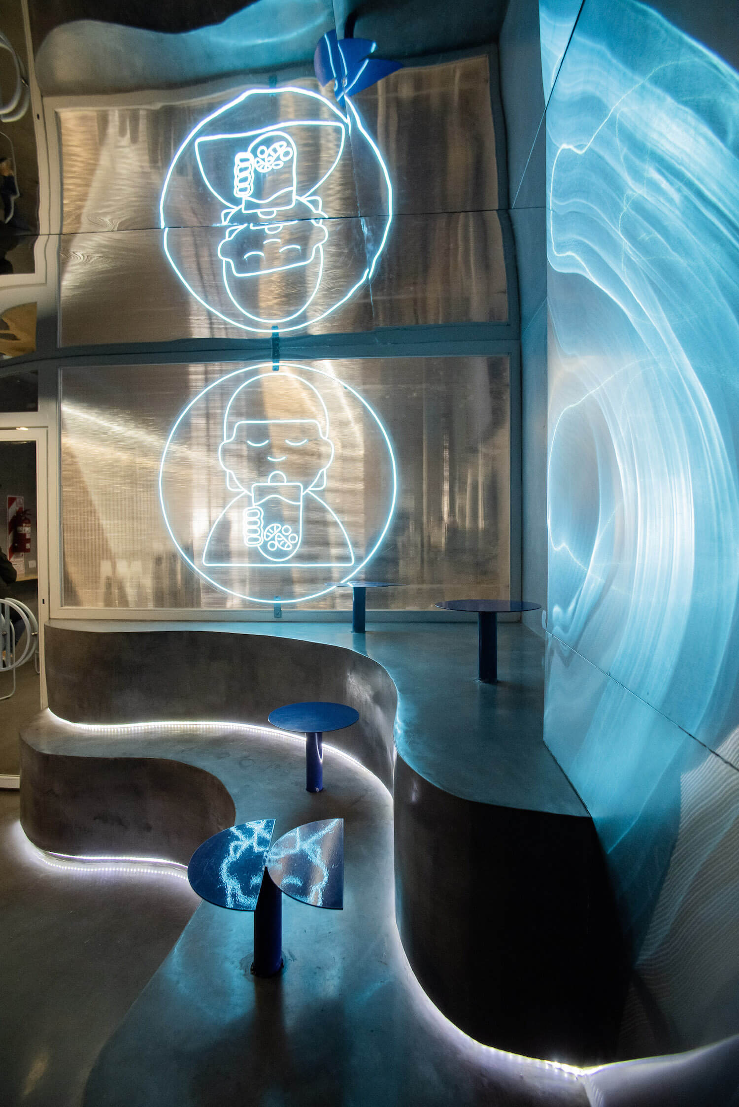
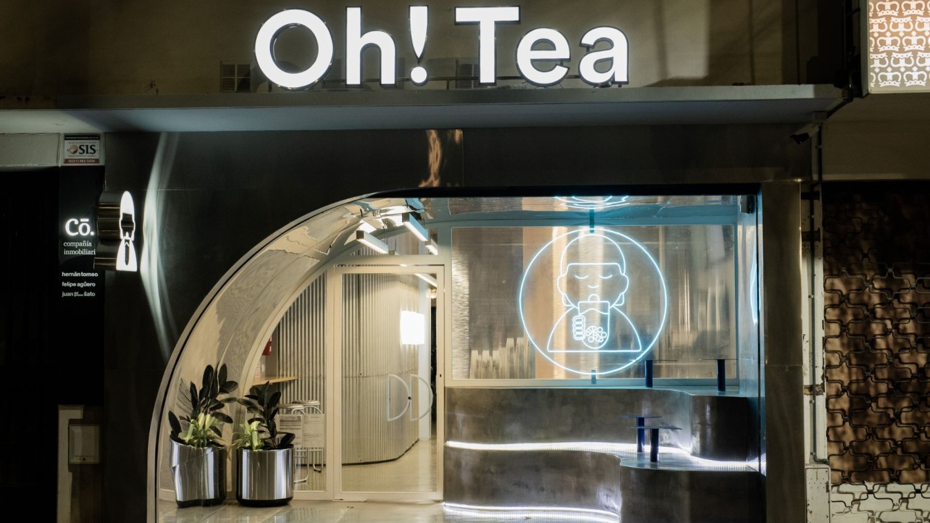
Vang Studios: Oh! Tea brings bubble tea, a sweet and refreshing beverage originated in Asia, to the Buenos Aires market. The brand's designed locations maintain a consistent theme—a technological and futuristic look inspired by cities like Hong Kong and Seoul. They are characterized by a hybrid identity that integrates cultural and local influences, infused with the youthful and playful perspective of the brand. Each location adopts a distinctive color, creating its own unique identity while being connected by a monochromatic aesthetic. The La Plata branch of the project features a vibrant blue color that evokes a virtual and immersive atmosphere. The use of indirect neon tube lighting floods the space, enhancing the ambiance.
This project is developed with a multi-programmatic approach. The first area is dedicated to take-away service, designed to create a strong visual and sensory impact. Continuing through the store, there is a designated co-working space. This second area provides a calm and focused environment, fostering a climate for study and collaborative work. The project as a whole is conceived with aesthetic and material coherence, and spatial calibration is prioritized based on functionality.
The entrance of the store exemplifies the various aesthetic elements proposed by the architecture, merging the tangible and the virtual. The curved floor-to-ceiling ceiling materializes as a mirrored surface, creating optical illusions and offering a dynamic visual journey within the space. Every corner of this project becomes a canvas where light and reflection create a new reality, transcending conventional boundaries. At Oh! Tea, customers immerse themselves in an atmosphere that challenges expectations, inviting them to explore a cutting-edge aesthetic and enjoy a visually and emotionally enriching experience.

What was the brief?
The project was commissioned by the brand OH! TEA, for whom the brand image had been previously designed. The brand's concept demands that each location has its own distinctive factor while always aligning with the brand's image. Additionally, this project needed to respond to a new environment, the city of La Plata.
What were the key challenges?
Integrating a co-working space within the premises while maintaining its independence from the take-away area. The relationship between these two programs needed to be carefully calibrated to ensure their seamless functionality
What were the solutions?
Placing the order counter and take-away area in the middle of the store, in close proximity to the entrance, while positioning the co-working area towards the back of the space to create a more private scale. This segregation allowed for a clear distinction between the different spaces based on their intended use. Recessing the facade behind the municipal line to create a sitting area, diversifying the enclosed spaces according to their functions.
Key products used:
The prominent use of blue color throughout the store, establishing a distinct identity that sets it apart from other branches. In areas where a more tranquil atmosphere was desired, the blue color transitioned to a lighter shade of blue. The curved mirror facade, which serves as a distinctive feature of the project. The utilization of stainless steel, polycarbonate, miniwave sheet metal, blue ceramics, and silver upholstery in the furniture.

Who are the clients and what's interesting about them?
The clients for this project are particularly interesting due to their target audience being young and playful, seeking unique experiences. The design aims to attract this audience through creativity and disruptive elements. The aesthetic theme of the project is closely tied to the virtual world that resonates with this target group.
How is the project unique?
The project is unique in several ways:
The most distinctive element is the semi-covered entrance area. Its unusual morphology, combining the functions of both a wall and a ceiling, along with its curved mirror materiality, creates optical illusions and visual distortions for anyone who looks at it.
The project relied heavily on dry construction methods, with the exception of the concrete stairs, which were cast on-site.


