KK Architecture: A dream of a modern, comfortable home: in a 100 square meter apartment, design and functionality meet to create open, warm and refined spaces. A project studied in detail, transforming every corner into an invitation to live well.
A young couple and their faithful four-legged friend decided to embark on an ambitious renovation project to transform a 100 square meter apartment into a modern and versatile space. Their vision was clear: a spacious living space that was elegant, functional and welcoming, without sacrificing quality, whose goal was to combine aesthetics and practicality in a visual and functional continuity. The project focused on a distribution of space aimed at creating an environment in which to relax, feel comfortable and live in a warm and refined atmosphere. However, the importance of respecting the budget was a priority from the outset, which is why they chose to rely on a professional capable of optimizing every resource and giving the spaces design continuity
The renovation focused on the living area, the focal point of the project. The demolition of a dividing wall made it possible to connect the kitchen and the living room, transforming these spaces into an open and bright environment. Thanks to this modification, the hallway, which was previously only intended to connect the entrance and the kitchen, has been transformed into an ante-bathroom that houses a minimalist sink with an essential design to give guests a first impression of cleanliness and elegance without immediately revealing the sanitary area
A distinctive element of the intervention is the enclosing fifth, created between the entrance and the living room. This functional element separates the living and sleeping areas, providing maximum privacy to the private spaces. This fifth, affectionately called “the white giant”, takes the form of a full-height piece of furniture that welcomes and leads into the living area, hiding the wardrobe, washing machine and other items inside, solving the storage problem and maintaining a tidy and refined appearance. The “empty-out” area greets and welcomes the entrance, while three open niches, facing the sofa area, dare to display small details while cleverly hiding everything else.

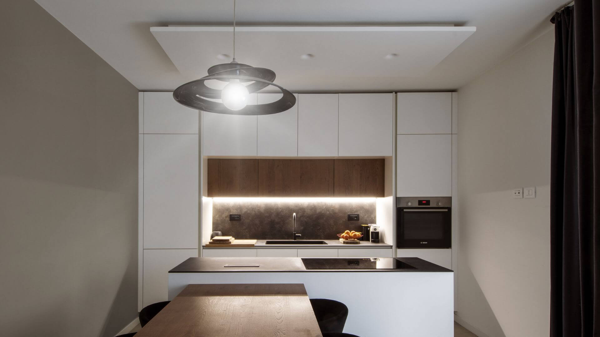
The kitchen is designed with an understated and refined aesthetic, dominated by white and enhanced by an island with an integrated table. The top of the island, with a dark stone effect, contrasts with the white of the wall units and the wooden details that add warmth and character to the space. This wood is also used in the shelves in the living area and in the emptying cabinet in the entrance, creating a textural continuity that blends harmoniously into the entire space. The play of contrasts is further enhanced by the use of black elements that frame the furniture and visually define the boundaries of the living area
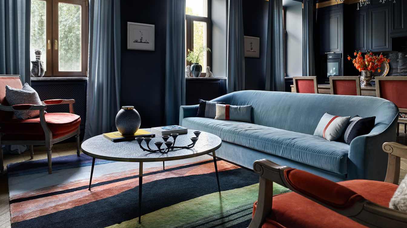
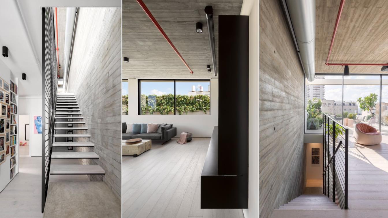
Plants and natural elements add a touch of color to the living area, bringing a spring-like warmth that contrasts with the dominant tones of concrete, white and black. This natural integration warms the space and enhances the play of contrasts that characterizes the entire project. From the entrance and the kitchen, one appreciates the visual depth that leads to the living area, where a large sofa, strategically placed, reinforces the perception of space and creates a welcoming feeling. Opposite, an equipped TV wall provides order and functionality. Framing the area, a plasterboard veil with light rails diffuses soft lighting that elegantly accompanies every moment of the day
As for the sleeping area, a more sober intervention was chosen, centered on a restyling of the furniture and a chromatic reinterpretation. The existing parquet flooring in the rooms was used as a reference for the design of this area, allowing continuity with the style of the entire apartment and giving warmth to the private spaces, in perfect harmony with the play of visual contrasts present throughout the house
The service bathroom is the real highlight of the project. In just 5 square meters, it has been possible to incorporate a sink, sanitary ware, storage cabinet, shower and even a bathtub, creating a space of great aesthetic and functional impact. A black Marquinia marble monolith stands in the background, housing a sunken bathtub and a shower area separated by a glass wall that gives the space depth and brightness. The washbasin, 30 cm high, was chosen to offer an unusual capacity while maintaining elegance and proportions in a refined contrast
This renovation shows how it is possible to optimize every aspect of the project, respecting the budget without sacrificing quality. Every choice, from the materials to the furnishings, was made with the aim of creating an environment where the owners can live in harmony, enjoying functional and welcoming spaces. The result is a home where design and functionality find a perfect balance, transforming the home into a place that welcomes, fascinates and invites you to fully enjoy the comfort of living.


