GOLDENE ROSE: A kaleidoscope of the past
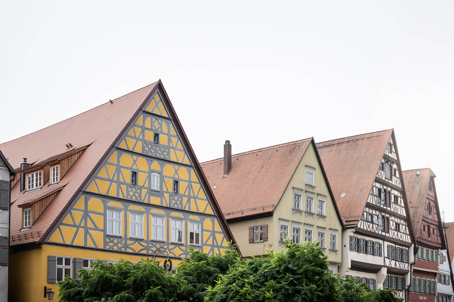
It is not unusual for adjoining buildings to become architecturally connected. But this project’s story is one of a kind: in the former imperial city of Dinkelsbühl, noa* network of architecture has succeeded in giving different architectural identities, each with its own history and peculiarities, a common face.
The medieval town of Dinkelsbühl lies along southern Germany’s Romantic Road and marks the centroid of the Stuttgart-Munich-Nuremberg geographical triangle. It is one of Germany's best-preserved historical centres, with ancient city walls, defensive moats and traditional half-timbered houses. In this unique urban fabric, opposite the Cathedral of St. George, the newly designed five-star hotel Goldene Rose welcomes its guests today. The house boasts a lively building history, which has now found a new perspective.
ARCHITECTURAL PATCHWORK
The property dates back to the 15th century and is said to have hosted Queen Victoria on her journey through in 1891. Goldene Rose was the first building purchased by the current owner of the hotel. It was by fortunate coincidence that the four neighbouring properties to the rear were also gradually put up for sale. This gave rise to the idea of grouping all the buildings under one roof, with particular attention paid to preserving the historic structure. For the planning and execution of the redesign, the client turned to noa*, which has a great deal of experience with projects in heritage listed contexts and is well-versed in dealing with building fabric where nary a right angle is to be found.

A TRICKY TASK
The five buildings previously served a wide variety of functions; while the hotel Goldene Rose has always accommodated travellers, the adjacent houses featured restaurants, warehouses, a brewery, a cinema, a ballroom, a casino, and apartments throughout the centuries. Developing a unified spatial concept from this mosaic of uses, without blurring historical traces, was the architects' first major challenge. The search for the essence of the building — always one of noa*'s central guiding principles — in tandem with overcoming differences in level, compounded by drafting of the functional programme while simultaneously preserving the original cubatures, were just some of the many intricately tricky tasks of the project.
OLD WALLS, NEW FUNCTIONS
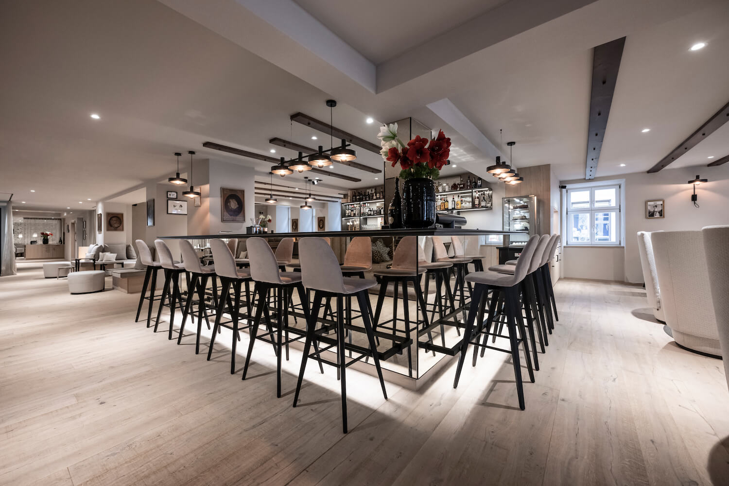
The front building of the Goldene Rose, which overlooks the town square and features a mustard-yellow half-timbered façade, welcomes both hotel guests and day visitors. Directly from the threshold, one encounters a design thought that permeates the entire hotel, which is all about the translation of the past into the present. As you enter, the visiting queen’s namesake bar, “Vicky”, with its black granite counter and antiqued mirror coverings, invites you to linger for a while in the armchairs that face the fireplace. Here, the architects chose to use rough plaster with an antique finish, white limed oak floors interspersed with darker planks running parallel to those on the ceiling, and displays of old guild signs that give the ensemble a unique identity. Adjacent to the bar and past the original main staircase, the lobby and spacious reception draw on the existing unevenness and maze of original walls, whose inherent design creates inviting and intimate seating spaces.
“The guest should be able to experience the building intensely – not only through the historic ceiling beams but also in its heights and various levels, by climbing up and down.” – Lukas Rungger, noa* founder and leading architect
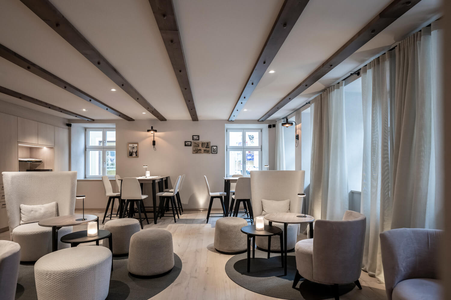
Passing through the second building, which is reserved for circulation areas and various service rooms, one enters house number three, which was also the location of the former 1870 ballroom. On the ground floor, hotel guests can have breakfast and dine in the Kantine Rosine restaurant. The ambience is enriched by wallpaper decorating the surrounding walls and ceilings, complimented by lightly transparent curtains for separate, quieter areas. The green inner courtyard offers a view of the cathedral, upper hotel floors, and the outdoor pool located on the top floor. The fourth building, a former residential building last used as a casino, houses a portion of the hotel's 43 rooms and closes the gap to the last building, formerly an inn and brewery, which houses externally designed flats, also part of the Goldene Rose.

SIMILAR YET DIFFERENT
Although the guest rooms at Goldene Rose are divided into three categories, they all share the same aesthetic and design concept. Each features a hanging sofa, a medieval period- inspired tapestry mounted behind the bed, and an open bathroom that flows into the room by means of mirrored, mosaic-like surfaces. The junior suites located in the first building are distinct, occupying two floors, the upper of which is an attic with exposed trusses where the sleeping area is located. Here the tapestry stretches out on the floor, creating a cosy alcove for the bed.
“Our sustainability concept is also about bringing old buildings into use. In this case, we felt it appropriate to maintain the original guest room function, which perpetuates the charm and radiance for the city." - Patrick Gürtler, Interior Designer
A true highlight of the house is the former ballroom and later cinema from the 1950s, whose bricked-up windows were reopened during the course of the project and whose space has been converted into a multifunctional hall for events. Unfortunately, the old folding row seating could not be reused due to its lack of multifunctionality. However, noa* reintroduced the original upholstery pattern by printing a new fabric with the same motif. In the middle of the two-storey room, which can also be rented for external events, there is a suspended box for private viewing — the “Kino Suite” — which features a large window facing the cinema screen and is accessible by footbridge. The hall itself can be darkened with huge blackout curtains that span the entire two floors. A pair of original glass ball lamps offer an added atmospheric illumination and touch of nostalgia.

AN UNEXPECTED ROOFSCAPE
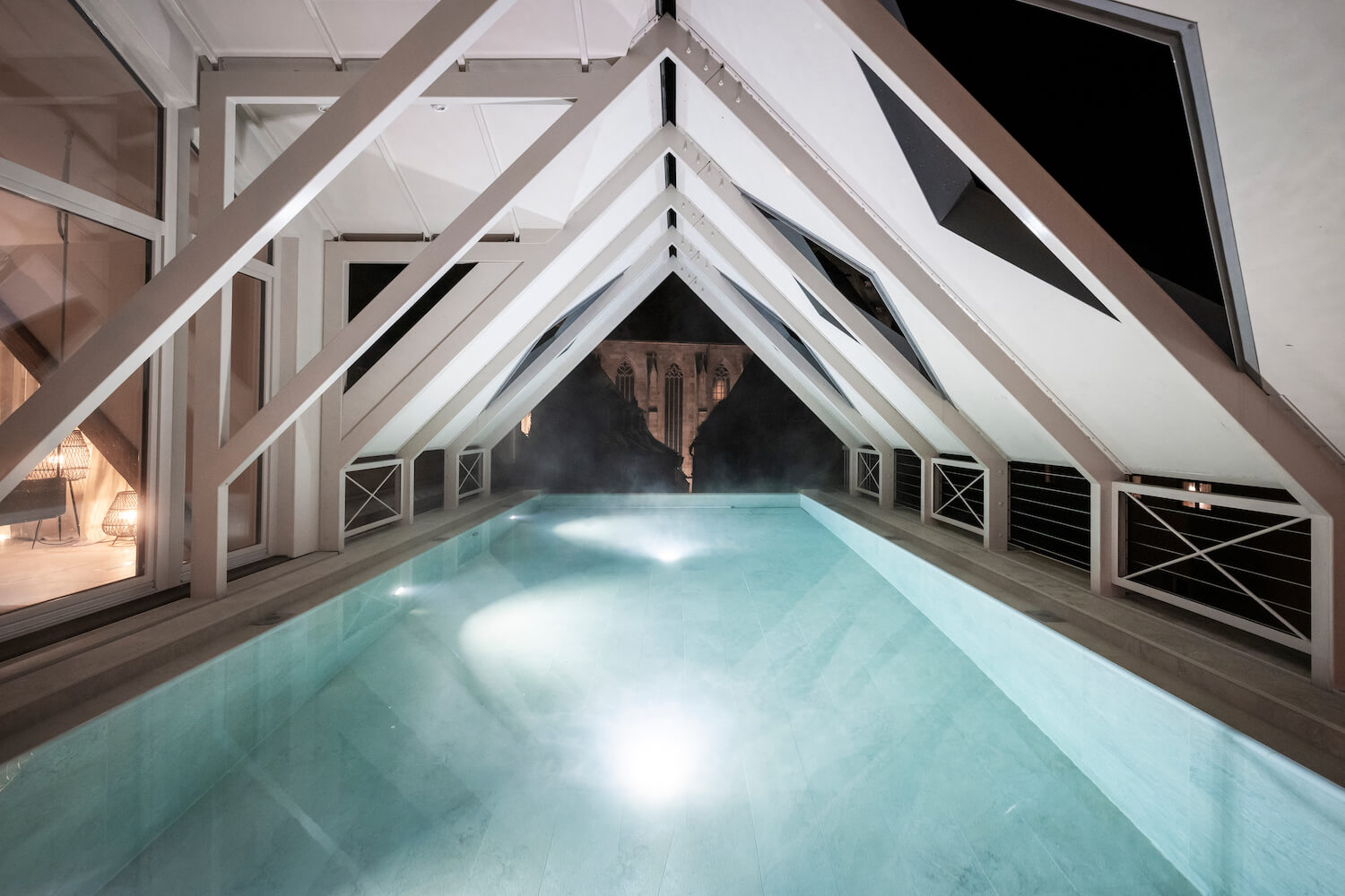
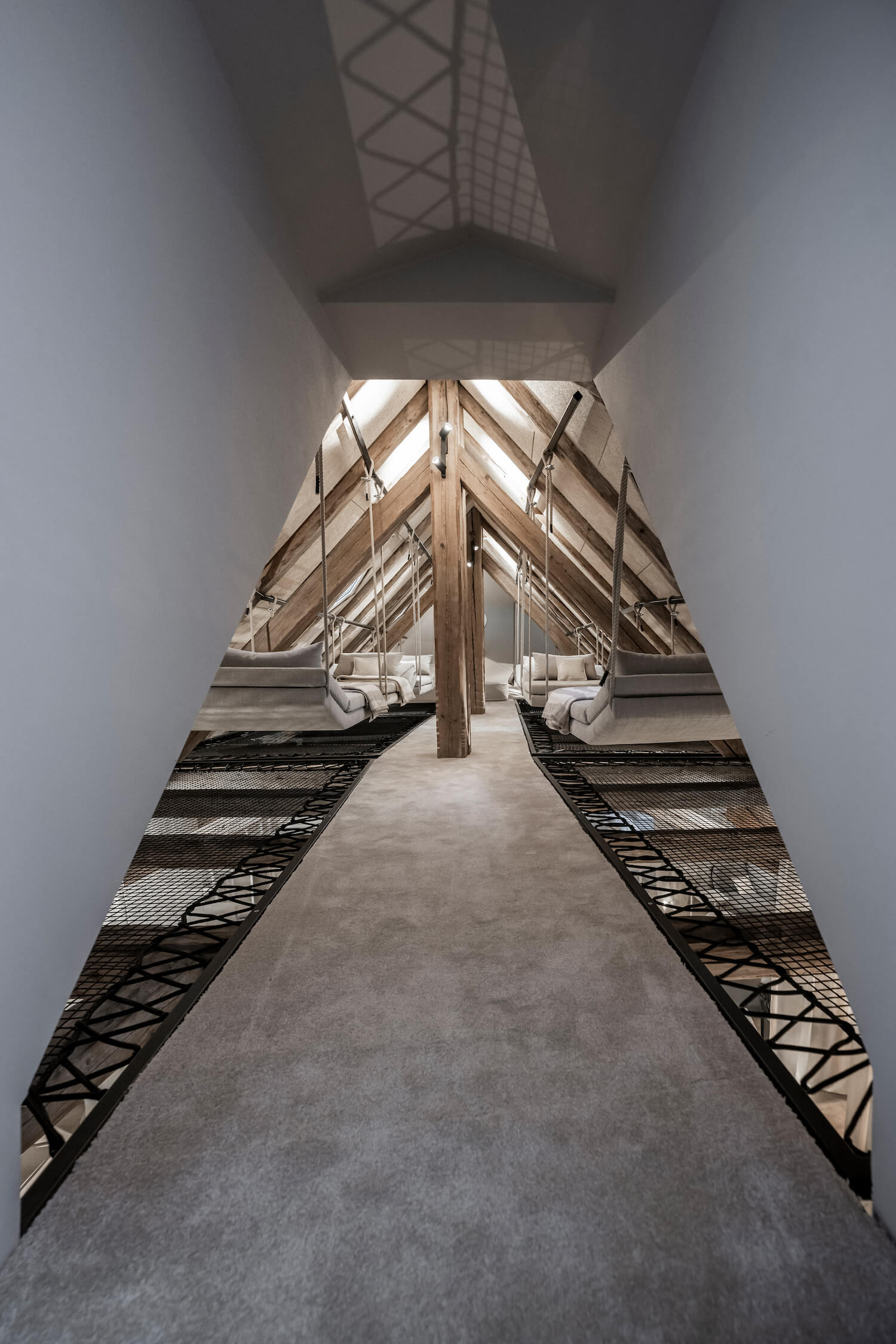
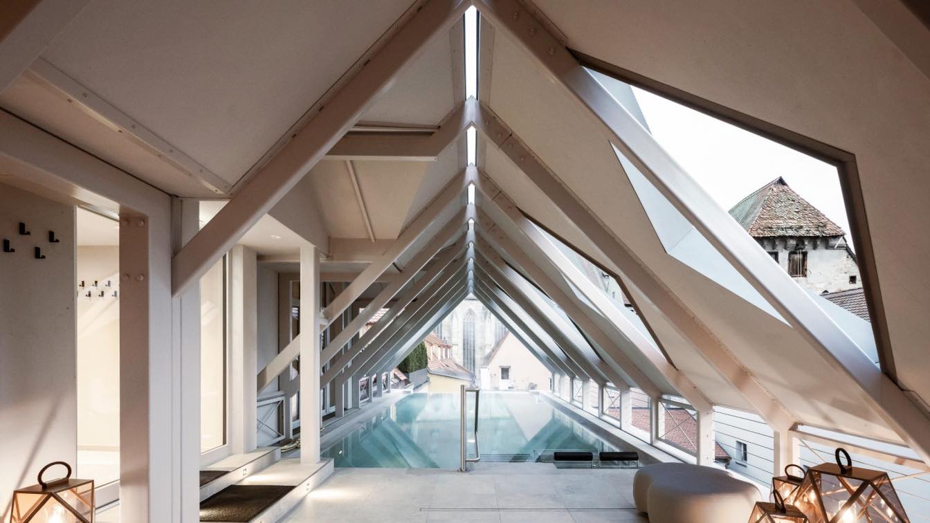
The wellness area is located on the hotel’s top floor and stretches across the entire roofscape. noa* worked with the utmost care to avoid making any major changes to the exterior’s appearance. Passing through a massage and treatment area with an adjacent terrace, one enters the Attic Spa. The ten metre-long outdoor infinity pool offers a unique view of the cathedral. In order not to make the pool appear as a foreign body from a bird’s-eye view, it was roofed over; through the gable roof’s holes, swimmers can see the clouds, but the pool remains invisible from above. The wellness area is completed by a large relaxation area located over two floors, a fruit bar and a separate sauna section. An interior staircase leads to the attic. Exposed wooden beams, intimate atmosphere, and cross-stretched netting in the uppermost peak of the attic space ensure a relaxing experience like no other.
