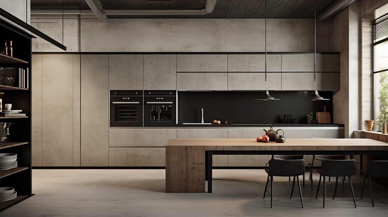
Typography in kitchen design has evolved from simple functional labels to becoming a cornerstone of modern interior aesthetics. This artistic approach to incorporating text in cooking spaces goes beyond mere decoration – it's about creating an atmosphere that reflects personality while enhancing the room's functionality. Today's kitchen typography serves as both a design element and a means of personal expression, transforming ordinary cooking spaces into unique environments that tell a story.
Why Kitchen Typography Matters in Modern Home Design
The impact of thoughtfully chosen text art and kitchen signs extends far beyond aesthetics. Research shows that environmental design elements can significantly influence mood and behavior. Strategic placement of inspiring quotes, clever wordplay, or vintage-style signage can create a welcoming atmosphere that encourages social interaction and creativity in the kitchen space. These typographic elements serve as conversation starters and can make the cooking environment more engaging and enjoyable.
Popular Kitchen Typography Styles and Trends
* Vintage-Inspired Typography: Retro fonts and distressed finishes that add nostalgic charm
* Modern Minimalist Text: Clean, simple letterforms in monochromatic schemes
* Neon Art Typography: Contemporary LED-based text art that adds a modern edge
* Quote-Based Designs: Motivational or humorous cooking-related phrases
* Custom Family Names: Personalized text art featuring family names or established dates
* Recipe Typography: Beloved family recipes transformed into artistic wall displays
Placement and Sizing: Strategic Typography Integration
The key to successful kitchen typography lies in strategic placement and proper scaling. Wall art should be positioned at eye level, typically 57-60 inches from the floor to the center of the piece. For areas above cabinets, maintain at least 6 inches of clearance to prevent visual crowding. Consider the viewing angles from different points in the kitchen and ensure text remains readable from primary activity areas.
DIY vs. Professional Typography: Making the Right Choice
1. Budget Considerations: Custom pieces typically range from $100-$500+
2. Installation Requirements: Complex installations may require professional expertise
3. Customization Level: DIY offers more flexibility for personal touches
4. Material Quality: Professional pieces often use higher-grade materials
5. Time Investment: DIY projects require significant planning and execution time
Maintaining and Updating Your Kitchen Typography
Proper maintenance ensures longevity of your typographic elements. Clean text art regularly with appropriate materials based on the medium – gentle soap and water for painted surfaces, specialized cleaners for metal signs. Consider rotating seasonal pieces to keep the space fresh and interesting throughout the year. Protected placement away from heat and moisture sources will extend the life of your typography investments.
Future-Proofing Your Kitchen Typography Design
As kitchen design continues to evolve, typography remains a versatile element that can adapt to changing styles. Focus on selecting timeless pieces that complement your overall aesthetic while remaining open to periodic updates. The future of kitchen typography points toward more personalized, sustainable options that can evolve with your space and style preferences.


