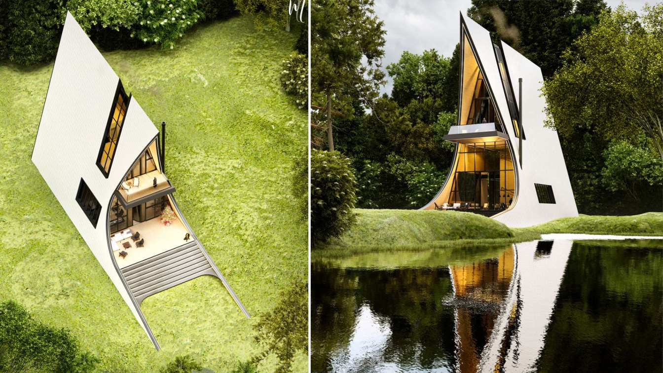
This cabin is designed on three floors, on the first floor is the living room, reception, kitchen and dining room, and on the second floor is the master bedroom with bathroom and closet, along with the play area. On the third floor, a special guest room is designed with a private bathroom and a good view of the nature outside at a height of twelve...
Project name
Zhobin Cabin
Architecture firm
Norouz Design Architecture Studio
Location
Mazandaran, Iran
Tools used
Autodesk Revit, Lumion, Adobe Photoshop
Principal architect
Mohammadreza Norouz
Design year
December 2023
Visualization
Mohammadreza Norouz
Typology
Hospitality › Tourist Complex
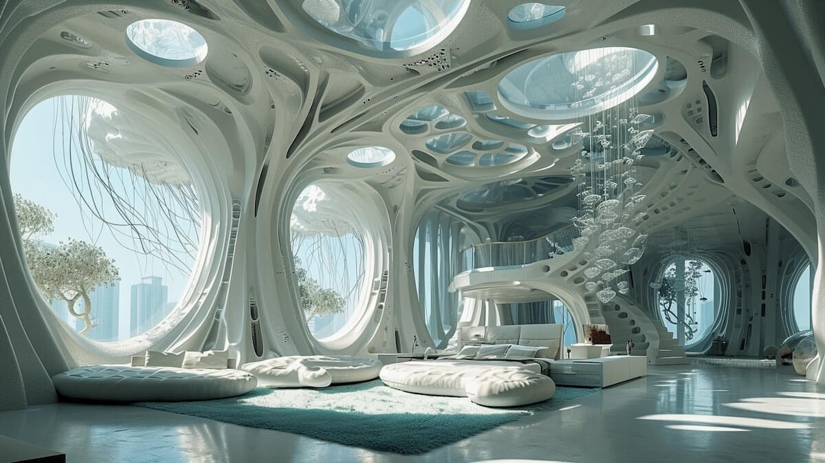
Embark on a journey through a city of the future where green architecture meets cutting-edge technology! Imagine iconic towers inspired by the ethereal beauty of jellyfish, their metal panels capturing the essence of movement and luminescence.
Project name
A Futuristic Symphony of Nature and Tech
Architecture firm
Artnik Architecture
Tools used
Midjourney AI, Adobe Photoshop
Principal architect
Niki Shayesteh
Design team
Studio Artnik Architects
Visualization
Niki Shayesteh
Typology
Futuristic › Bionic City
Selling your house doesn't have to be a stressful endeavor. By carefully considering your selling options, meticulously preparing your property, setting a competitive and realistic price, marketing efficiently, negotiating effectively, and navigating the closing process with caution, you can facilitate a seamless and favorable sale.
Construction businesses must adapt to the digital tools and technologies available in order to keep up with the industry's pace and demands. These tools can greatly improve efficiency, reduce costs, and promote a safer working environment for all stakeholders involved.
Photography
Racool Studio
The “Kaira Looro ” is an international architecture competition for students and young architects, the objective of which is to grow up careers of new architectural talent, raise awareness in the international community regarding the topics of emergency, and support humanitarian projects.
Organizer
Kaira Looro by Humanitarian Organization Balouo Salo
Category
Architecture, Interior design
Eligibility
Architects, students, designers, engineers and anyone who wants to propose a solution to the theme
Register
https://www.kairalooro.com
Awards & Prizes
1st Prize: 5.000€ + Construction + Internship at Kengo Kuma. 2nd Prize: 2.000€ + Internship at EMBT Architects. 3nd Prize: 1.000€ + Internship at SBGA Blengini Ghirardelli. 2 Honourable Mentions 100€: 5 Special Mentions+ 20 Finalists+20 Top 50
Entries deadline
11st June 2024
Price
60€/team (early registration)
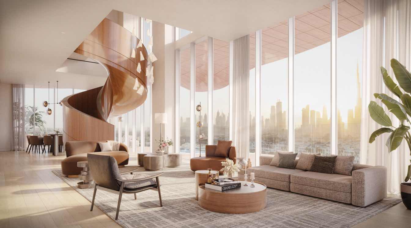
ALTA Real Estate Development, a global leader in real estate development, is proud to announce the successful completion of their most prestigious project of the year, Mr. C Residences Jumeirah.
Photography
ALTA Real Estate
Arada has purchased a prime land plot in Zabeel 2 adjacent to Dubai International Financial Centre (DIFC), marking yet another significant expansion milestone for the master developer into the high-end Dubai property market. Valued at AED600 million, the plot was purchased from Rital Properties, the real estate subsidiary of Emirates NBD.
Photography
From left: Abdulla Qassem and HRH Prince Khaled bin Alwaleed bin Talal
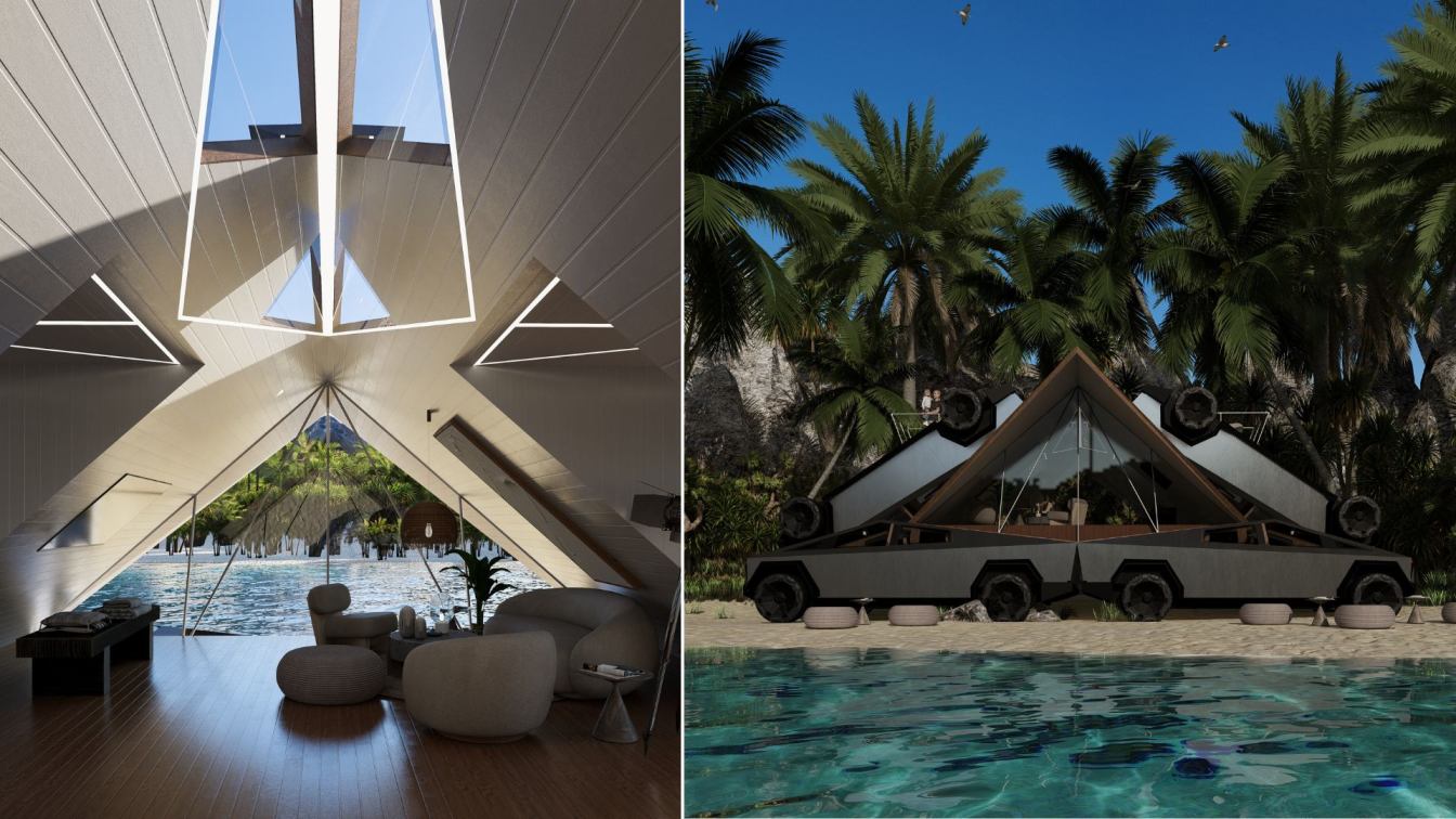
The project consists of the creation of an innovative habitable module using 12 Tesla Cybertruck prototypes. These vehicles provide the base structure for a habitable capsule that combines endurance, hybrid styling, and energy harvesting and management capabilities.
Architecture firm
Veliz Arquitecto
Tools used
SketchUp, Lumion, Adobe Photoshop
Principal architect
Jorge Luis Veliz Quintana
Design team
Veliz Arquitecto
Visualization
Veliz Arquitecto
Typology
Residential › House
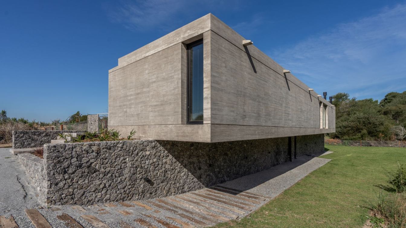
Casa Pirca is located within the neighborhood on a rectangular lot, with an abrupt difference in level longitudinally dividing it in two, an exponent of its greatest quality. Faced with this, a wall was thought to define the terrain on two levels and a volume supported on it. The term "Pirca" refers to the walls that act as containment of embankmen...
Architecture firm
En Obra Arquitectos
Location
Costa Esmeralda, Buenos Aires, Argentina
Photography
Mariano Imperial
Design team
Luis Cisneros, Rosario Hillebrand, Sofia Falcón, Eugenia Sosa Abab
Collaborators
Facundo Casales
Construction
Narciso González, Albaro Franco
Material
Concrete, Wood, Glass, Stone
Typology
Residential › House
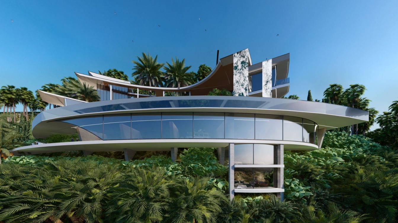
This project represents the creation of an exceptionally elegant mansion in Los Angeles, California. Located on an enviable plot, the residence offers panoramic views of the ocean and the impressive downtown. The architecture stands out for its intelligent use of materials and sustainable approach.
Project name
Mansion of the Angel
Architecture firm
Veliz Arquitecto
Location
Los Angeles, California, USA
Tools used
SketchUp, Lumion, Adobe Photoshop
Principal architect
Jorge Luis Veliz Quintana
Design team
Jorge Luis Veliz Quintana, Santiago Arana, Hooman Aliary
Collaborators
Santiago Arana, Hooman Aliary
Visualization
Veliz Arquitecto
Typology
Residential › House

