The Kyiv brand PODYH is relaunching by introducing the FW21 collection dedicated to the modernist architecture of its hometown.
The topic was not chosen by chance – the designer of the brand has a master's degree in architecture, which became the basis for all further creativity. The creation of the collection takes place at the junction of two worlds, reflected in the minimalist and verified design.
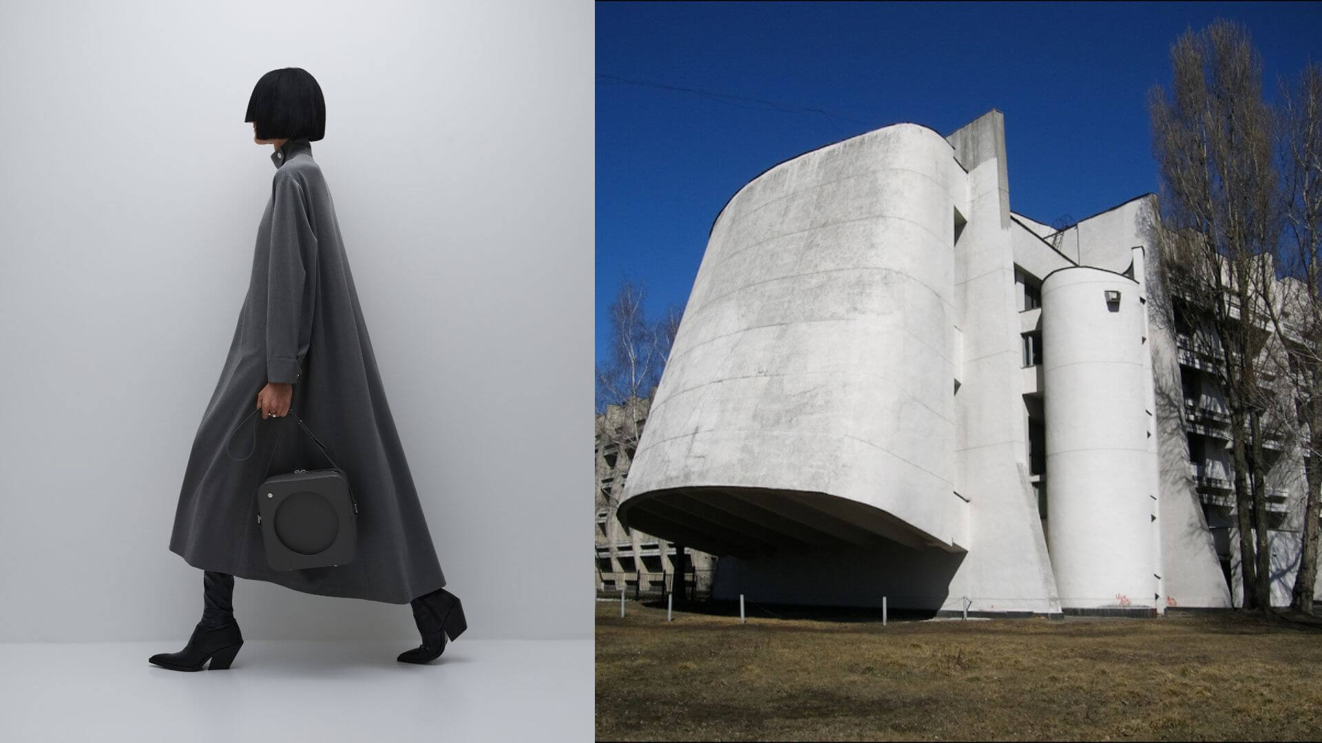
In the fall-winter collection Kyiv modernism, the designer reinterprets the famous Soviet modernism buildings in Kyiv, the Vernadsky library, "Salyut" Hotel, “Mir” Hotel, "Memorial Park", the building of the Faculty of Physics of KNU, the "Flying saucer" on Lybidska Square.
Creating a wardrobe for a woman who lives in a metropolis and combines several roles, the designer did not plan to directly cite objects. The main focus was on ensuring the functionality and convenience of things. So the foundation of the collection was: a trouser two-piece made of eco-leather, a suit made of elasticated trousers and a shirt with folds on the back, dresses inspired by the geometry of architectural objects, a wrap skirt with a decorative fastener in the form of a large eyelet.
The collection is complemented by several knitted positions - a knitted "ribbed" golf with holes for the thumbs on the sleeves. This element makes the thing even more comfortable in the conditions of the fall-winter season. A balaclava can also become an irreplaceable accessory: inspired by the architecture of the “Memorial Park”, the designer combined different knitting patterns; rib insert in the shape of a curved arc seems to support the back of the head and, at the same time, helps to create the correct flow around the shape of the head. Hand knitting was used to convey the cellular structure of modernist buildings
Bags are a separate passion of a designer, as the creation of each one resembles the design process - an integral routine of an architect. The collection features three bags, each of which is an allusion to a particular modernist building. So the ceiling of the Vernadsky library is reflected in the Caisson bag. The “Flying saucer” shape was quoted in an accessory designed for keys and cards. Particular attention is paid to the bag-backpack, which repeats the look of the "Salut" hotel. Crochet, large eyelets, the shape – all together create the thing that catches your eyes.
The color scheme of the collection was not chosen by chance: concrete is often used for buildings of this period, therefore the collection contains various shades of gray, black becomes a symbol of whimsical shadows, which are formed due to the thoughtful composition of architectural volumes, and become an integral part of the building.
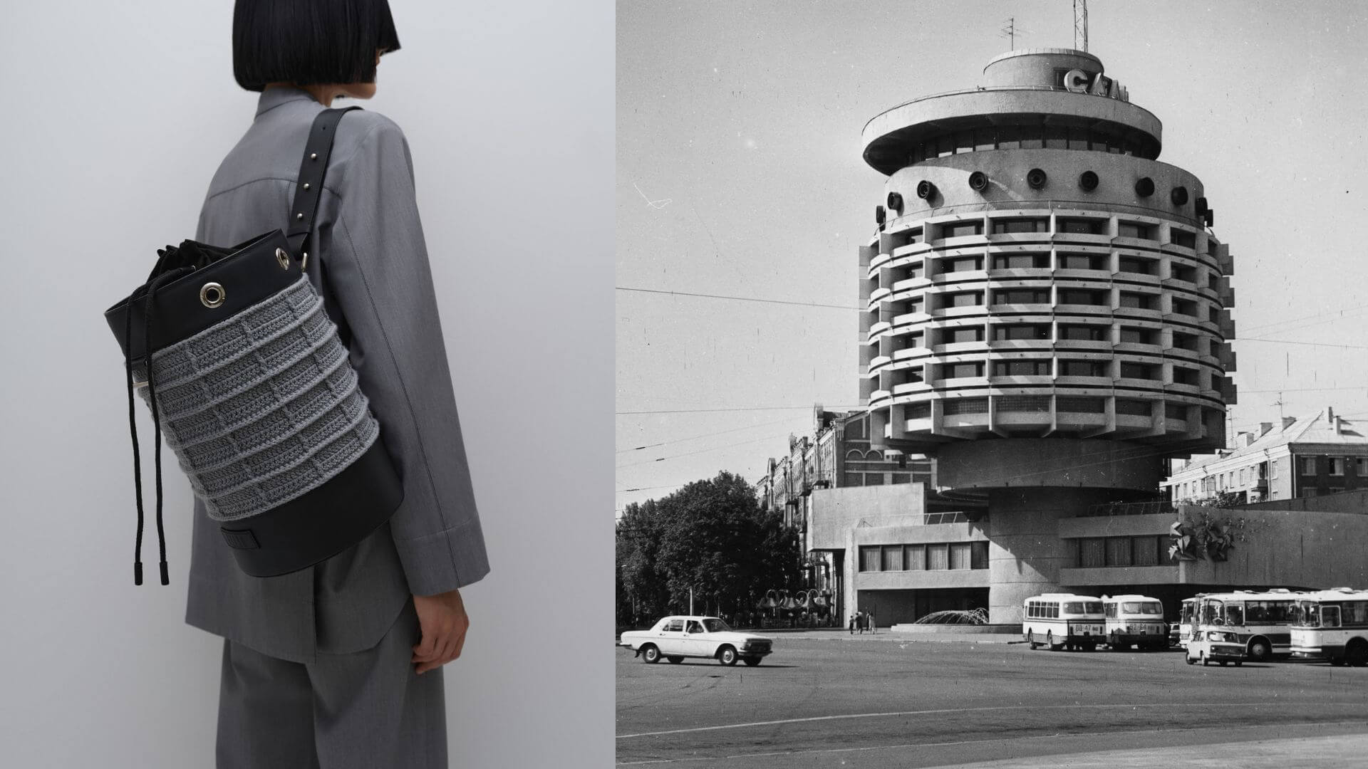
Object: Hotel "Salut"
Address: Kyiv, Ivan Mazepa str. 11-B
Years of construction: 1976-1984
Architects: A. Miletsky, N. Slogotskaya, V. Shevchenko
The Salut Hotel is one of the most striking examples of Kyiv modernism. It serves as the dominant feature in the composition of the Square of Glory.
At the heart of the building, there is a load-bearing concrete pipe, on which six residential floors are cantilevered. Inside the chimney, there are stairs, elevators, and a spiral ramp that leads down from the hotel floors.
There is a restaurant on the second floor of the building. Above, under the roof, there was supposed to be a second - a summer restaurant. There is a parking lot in the basement.
The decoration of "Salut" is made in the style of the 1980s - metal compositions in the form of stars symbolizing fireworks, and the walls are faced with marble chips and decorative bricks.
It is difficult to imagine, but according to the original project it was planned to build an 18-story hotel with an innovative cable-stayed structure. But at the construction stage, after the architects refused to add their government curator to the list of co-authors of the project, problems began - and as a result, the hotel was “cut off” three times.
But even in the "chopped" form Salute is striking and is one of the symbols of Kyiv.

Object: Institute of Scientific and Technical Information
Address: Kyiv, Antonovich str. 180
Year Built: 1971
Architects: F. Yuriev
"Flying saucer" near the Lybidska metro station was built as part of the Institute of Scientific and Technical Information (UkrINTEI). The Vienna Museum of Architecture has classified it among the outstanding projects of European architects.
The architect was going to make a light and music center inside the "plate", which combines music, light, and color. However, this was not approved by the Soviet political structures, and as a result, a cinema hall with Soviet frescoes was made.
Interestingly, the shape of the plate is not only an aesthetic feature, it solved the problem of a too narrow area and was lifted into the air, leaving room for pedestrians.
Now the "plate" is included in the registry of cultural heritage objects, but the construction of a shopping center behind it still threatens and spoils the perception of the building.

Object: 2nd building of the "Mir" hotel
Addresses: Kyiv, Goloseevskiy ave. 70
Years of construction: 1975-1977
Architects: V. Gopkalo, V. Grechina, M. Kantor
The second building of the Mir hotel is a vivid example of Kyiv modernism, which is characterized by simplicity of forms and designs, but at the same time, boldness and complexity of compositional solutions.
The hotel building is a combination of two parallelepipeds - horizontal and vertical. The horizontal part of the hotel is designed with massive, protruding ribs and inserts of large round windows, which set the rhythm and strict plasticity of the facade. The vertical part is a honeycomb structure, where each cell protrudes and creates an interesting play of light and shadow, which at the same time serves as protection from the sun.
The “Mir'' hotel complex plays a leading role in the architectural and artistic design of Goloseevskiy square, however, due to the appearance of new dominants, it was completely "lost".

Object: Memorial Park
Address: Kyiv, Baykova str. 16
Years of construction: 1968-1982.
Architect: A. Miletsky
Artists and authors of the concept: A. Rybachuk, V. Melnichenko
Engineer: V. Koval
When discussing the project of the crematorium, the architect Miletsky saw it as a purely functional structure. But the artists Rybachuk and Melnichenko proposed their own concept as a therapeutic space - they wanted to help the participants in the funeral ceremony to cope with psychological trauma, to cope with the loss.
This is how the Memorial Park appeared, where the crematorium itself was hidden in the relief and was excluded from sight, and the Farewell Halls avoid any association with the cremation process and resemble a sculpture made of reinforced concrete shells that rise above the hills and terraces.
But the central element of the Memorial Park was supposed to be the monumental Memorial Wall - a memorial 213 meters long and 4.5 to 16 meters high, covered with high reliefs with a total area of 2 thousand square meters. It was a kind of image of a person's life path. Here was depicted the feat of Prometheus, and the rise of Icarus and many more stories, not to hide the drama and tragedy of human life, thereby pushing for reflection and action, instead of simply accepting death.
The construction of the Memorial Wall lasted more than 10 years, but at the beginning of 1982, when its reliefs were finished and it was left to cover with glaze, the government leadership gave the order to liquidate this work due to "inconsistency with the principles of socialist realism." All reliefs were concreted.
The technical ability to remove this layer of concrete remains to this day, so the PODYH team decided that part of the proceeds from the collection will be donated to its restoration.

Object: Vernadsky National Library of Ukraine
Address: Kyiv, Goloseevskiy ave. 3
Years of construction: 1976-1989
Architects: V.I. Gopkalo, V.M. Grechina, V.P. Peskovsky
Outwardly, the library is a monumental skyscraper, an example of Soviet modernism, where everything is arranged simply - rectangular, square shapes, and aspire. But you can also see in it echoes of architecture from different eras - the gallery on the front facade resembles the ancient Greek Parthenon in Athens, where the layout of the tiles imitates flutes - a depression in the columns. The gallery ceilings are decorated with caissons, which were also often used during this period. A rose - a large round window above the entrance - is generally a standard element of medieval cathedrals.
In the lobby of the Library, there is a decorative panel "Pains of the Earth" with an area of 300 square meters on the ceiling. Its authors, artists Vladimir Pasivenko and Vladimir Pryadka, wrote a monumental and symbolic picture that science should protect all living things. In the panel, they used the encaustic technique, when paints are diluted in hot wax and immediately painted with them. And when the wax hardens, the image turns out to be bright, voluminous, playing with light and shadows.
The lighting in the reading rooms is also implemented unusually. Special skylights are installed in the ceiling here, allowing a lot of natural light to get into the reading rooms.
Although the Vernadsky National Library of Ukraine is one of the few objects of Soviet modernism that is still used for its intended purpose, its function must be rethought and changed to meet modern needs.

Object: Physical faculty campus of KNU
Architects: V.E. Ladny, M.P. Budilovsky, V.E. Kolomiets
Engineer: V.Y. Drizo
Year Built: 1973
Address: Kyiv, Academician Glushkov ave. 4
The project of the university campus on Kyiv Teremki in its original form is associated with the architecture of Japanese metabolism - blocks, different in form and function, are integral elements of a single structure.
The first object of the new campus was the building of the Faculty of Physics, which stands out for the plasticity of its forms. A kind of springboard rises above the entrance, which creates a mood of craving for knowledge and progress.
The southwest corner of the building is highlighted by an overhanging lecture hall. It is designed in soft, streamlined shapes, in harmony with the springboard above the entrance. In turn, these plastic details are challenged by the sharp sun-protection ribs above the auditorium windows.
Unlike most Soviet modernist buildings, the building is not clad in stone. Decorating with a fur coat brings it closer to Western representatives of this style. Such a building could stand anywhere: both in the United States and in South America.
It was assumed that the campus will actively develop in the future. Therefore, the plans were to replicate large educational buildings, building up the territory with a carpet. But this idea was not implemented, and in modern times reserve plots for future development were sold out and built up by private owners.
About
PODYH was founded in 2021. It positions itself at the crossroads of architecture and fashion. The patron of the brand – Daria Plaksyuk – graduated from architecture school. The architecture background has a strong influence on aesthetics and meaningfulness of brand clothes and accessories.
An architect always pays attention to the functionality, climate conditions, landscape, and environment of the future building. And make appropriate compositional and structural decisions. This is very similar to how clothes are designed. Season and local conditions dictate materials selection. Functionality and durability are achieved by technological and constructive decisions of various parts of ware, while being comfortable at the same time.
Similar to buildings devoid of the unnecessary aesthetic “noise” of advertising posters, PODYH wares are not oversaturated with details, color or decor. Each element is justified, corresponds to the idea and creates a complete composition of volumes and lines. Inspired by outstanding architects of the past and present, who often involve artists and sculptors to enrich the object with details and give it a feeling of completeness, the designer pays great attention to hand work – even slight hand-made stiches make the thing more meaningful and valuable.

